This Atmospheric Elevation Drawing Explores the Architectural Potential for Recycling Nuclear Waste
Sign up to be informed when the next One Drawing Challenge competition opens for submissions. Be sure to check out the incredible work by this year’s extraordinary Winners and Commended Entries
Sabina Blasiotti of The Bartlett, University College London, was named The Student Grand Prize Winner for the Third Annual One Drawing Challenge. Her highly detailed and enigmatic elevation, entitled Outlines of Nuclear Geography (pictured below), draws viewers through the nostalgic familiarity of its cartographic aesthetics; at the same time, the warmly hued palette evoke the passage of time, chemicals and decay associated with radioactive materials.
Upon closer inspection, the infographic illustration has a darker tone, exploring the cumulative nature of nuclear waste materials (e.g. spent fuel, i-graphite, metals, concrete and soil), which form the silhouette of the mountain. The annotations enumerate a number of different decontamination technologies and potential reuse projects, distinguished for each material. At the same time, the image is not all doom and gloom: detailed annotations offers various decontamination technologies and potential reuse projects, specified for each material in the pile.
The extraordinary details illustrate Sabina’s fascinating dissertation research about the value of recycling nuclear waste in the built environment. We delved into this subject in the conversation that follows, which also explores the potential for illustration to visually communicate complex research topics.
Hannah Feniak: Congratulations on your success with the One Drawing Challenge! What sparked your interest in entering the competition and what does this accolade mean to you?
Sabina Blasiotti: Thank you Hannah, I’m indeed highly honoured to be recognized as this year’s winner. And thank you for all the work you are doing within Architizer for our community.
To answer your first question, the prime reason that led me to enter the competition is the desire to share my work. I believe that for architects and architecture students, sharing one’s own work can be of great significance, both to further value the time spent in creating a project but mainly to collect feedback from colleagues and the public for personal improvement.
This accolade does mean a lot to me, it certainly boosts the faith in myself and cheers me to keep working and experimenting in my own style. On top of that, it further asserts that the international architecture community is supporting and encouraging youngsters to speak up against controversial prominent climate and societal challenges, such support is of great importance for our generation.

Tokyo 2014, Diorama-map by Sohei Nishino (Oct. 2013 – Mar. 2014, Light Jet Print / 2420×1810 mm)
Geological Map of Britain William Smith’s 1815
What were the primary challenges of conceiving your work, from forming the idea to the physical process of drawing?
This drawing is indeed an exceptional one, as it was conceived as visual aid for my dissertation. This dissertation was a 10,000 words research essay on nuclear waste, it ultimately argued for the importance and urgency of an architectural discussion on the potential value of recycling sheer volumes of nuclear waste in the built environment, in order to incentive and accelerate efforts towards its decontamination, therefore eliminating the existential threat it poses not just today, but across geological time.
In fact, in the present nuclear waste management scenario, architecture and design are being employed in the construction of temporary storage facilities or geological repositories, underground structures meant to protect the waste for over 100,000 years, and overground deterrence markers, designs to forewarn future generations of hidden radiological contamination. This contribution entails different issues, including the proliferation of geological racism and the deferral of the nuclear risk to future generations.
On the other side, scientists and atomic organizations are actively experimenting and developing technologies and policies to transmute, decontaminate or reuse radioactive materials. Although these developments comprise their limitations (i.e. economic incentives or public acceptance), they may be successful in the specific task of reframing architecture’s understanding of nuclear matter, from a material to hide, to a material to value.
Therefore, going back to your question, the primary challenge of conceiving this work was to find a medium to summarize the values and findings of this research visually. This was not easy for me and it took several weeks to arrive at the present conclusion. Among the initial ideas was an illustrated children’s book, with the aim of explaining a rather controversial issue in the simplest and most approachable way. The children’s book wasn’t quite the perfect answer, as it could give the impression of undermining such a delicate topic. After brainstorming on a few ideas, my thesis tutor Edward Denison, without whom this drawing certainly would not exist, introduced me to the magnificent photomontages of Sohei Nishino (pictured above), who employs the collage as a method to work with different times and scales.
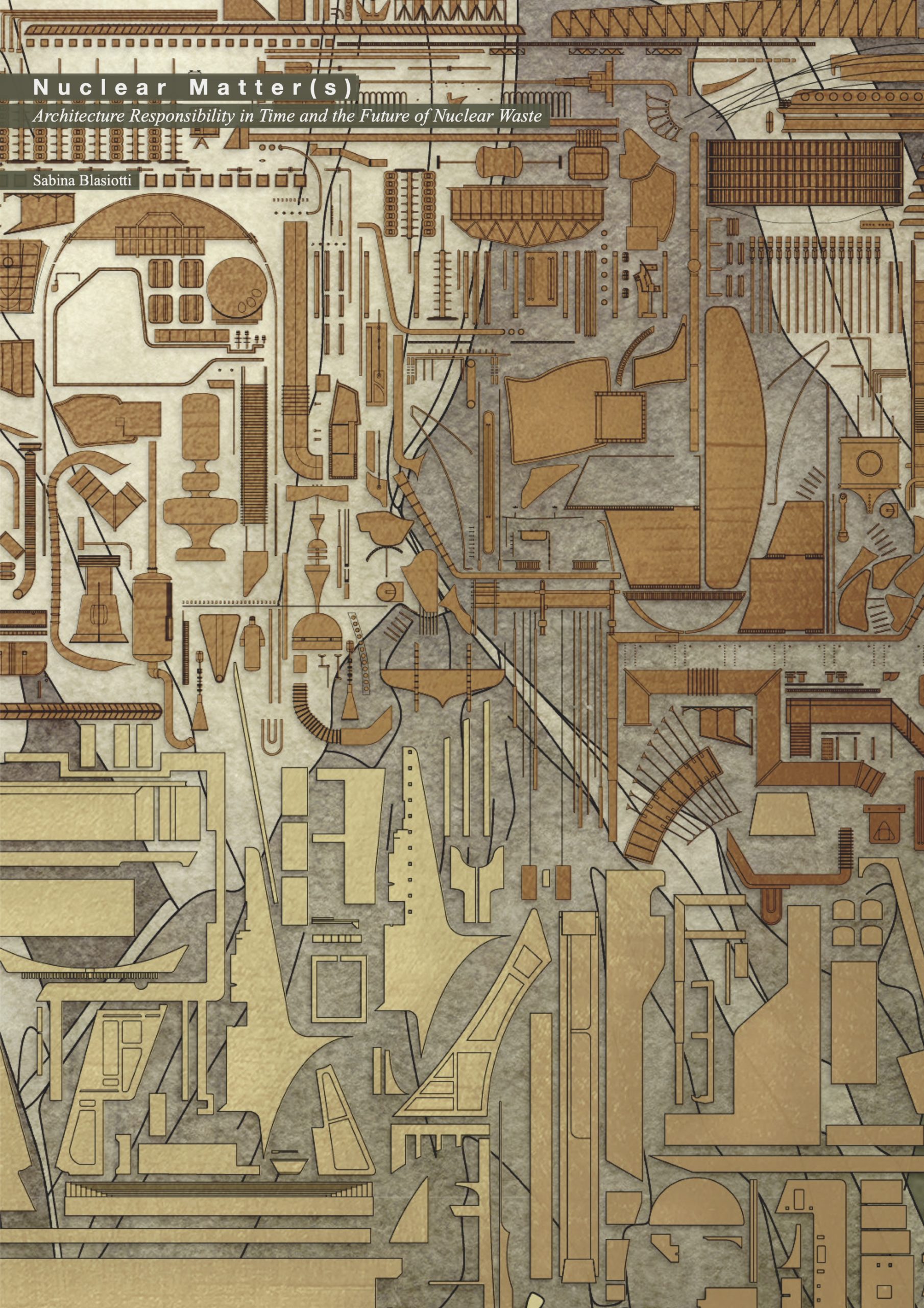
“Nuclear Matter(s), Architecture Responsibility in Time and the Future of Nuclear Waste” by Sabina Blasiotti. Front page for dissertation submitted to the Bartlett School of Architecture, 2020/2021.
The photomontage reminded me of a book I read a few years before, The Map that Changed the World, by Simon Winchester, which unfolds the story behind the first UK geological map, drawn by William Smith. If I remember correctly the book explained how William Smith for the first time in British history tried to spatialise his collection of fossils and his geological findings by coloring a map. At this point I knew that my answer was getting closer, as nuclear waste is inevitably and intimately connected to geology, not long after, the main idea behind Outlines of Nuclear Geography was born.
Once the main idea was formed, the physical process of drawing proceeded relatively smoothly. During my final year I made several 3D models of power plants and power plants components, I then drew a section from these models and distinguished the various modules according to their material. Similarly, the dissertation research fed the text annotations included in the drawing.
The biggest challenge in the physical process was perhaps to choose a color palette. While radioactivity itself is invisible, in the artistic world radioactive materials have often been depicted with flashy blues or greens. Initially I did in fact try to pursue the idea of a flashy green mountain, but this was without cause, as it didn’t have any connection to the research narrative. While radioactivity is invisible, abandoned nuclear waste is certainly prone to decay, and various chemicals used for the decontamination will themselves alter the materials’ appearance. Therefore, I tried to employ colors that would reflect the passage of time, chemicals and decay. This itself took dozens of variations before landing to the final palette, which I knew it was the right one when a critic in my project review said that the colors in my drawings reminded him of the colors used in the Chernobyl miniseries.
For your piece, why did you choose that specific illustration technique and format?
To summarize, as mentioned previously, the thesis research itself provided the hints to this specific illustration technique and format. The inclusion of annotations was essential in order to give a quick and clear access to important information and data collected during this research.
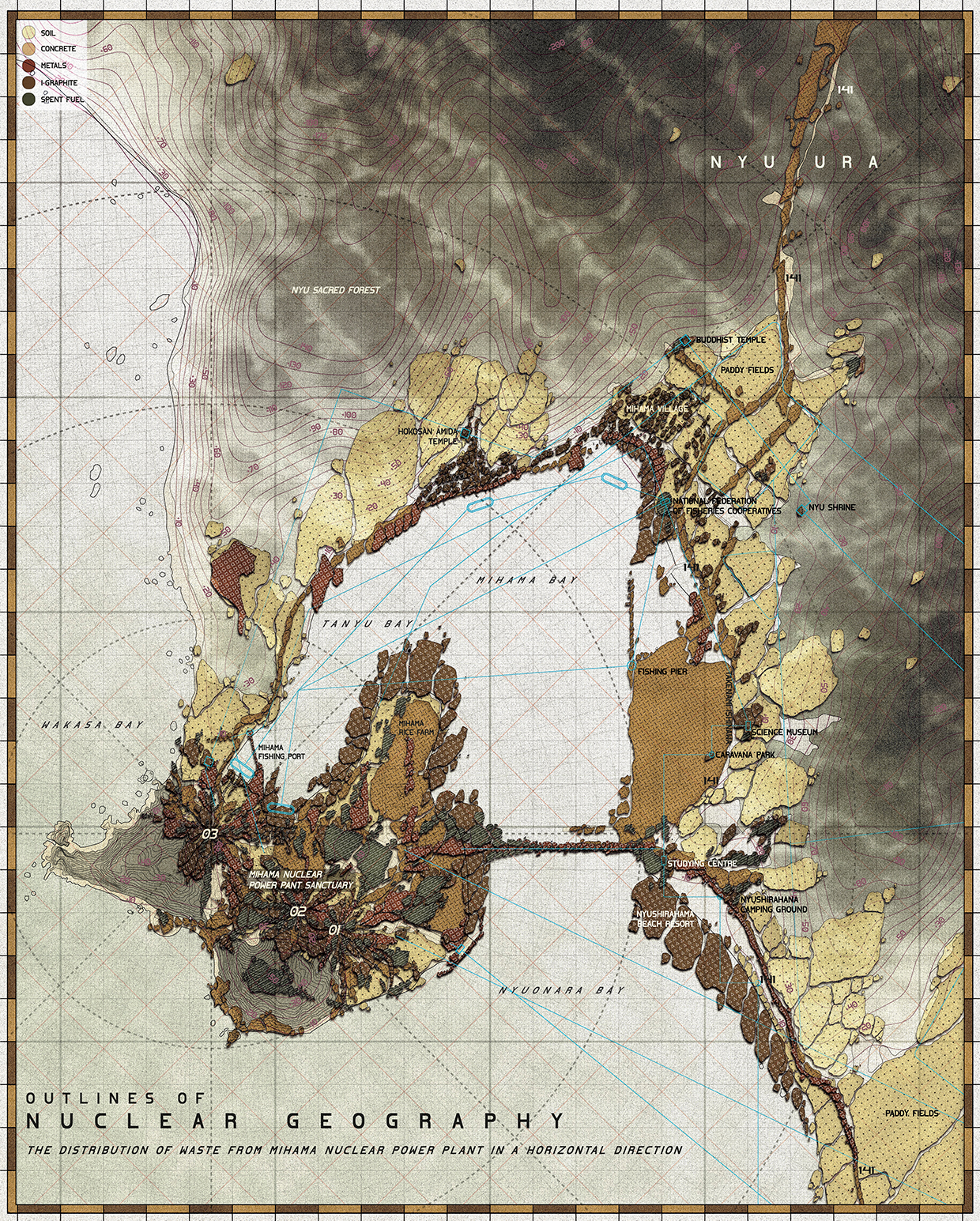
“Outlines of Nuclear Geography II, The Distribution of Nuclear Waste from Mihama Nuclear Power Plant in a Horizontal Direction Drawing” by Sabina Blasiotti.
Do you have any other architectural drawings as conceptual as this?
I do have one more, entitled Outlines of Nuclear Geography II, which straightforwardly recalls geological mapping. The two worked as a pair in my dissertation, one illustrating the distribution of nuclear waste in a vertical direction, and the other in a horizontal direction.
This second drawing was never as successful as the first one, perhaps because it appears to include less information and because it lost the ability to conceptually represent different times and scales, when I assigned it to a specific site, the Mihama Nuclear Power Plant in Japan.
Possibly, Outlines of Nuclear Geography would have not been the same without its counterpart. I often find that it is very helpful to simultaneously work on different drawings or designs so that my mind can benefit from some clearness when temporarily detaching itself from one idea, hoping into the next one and going back.
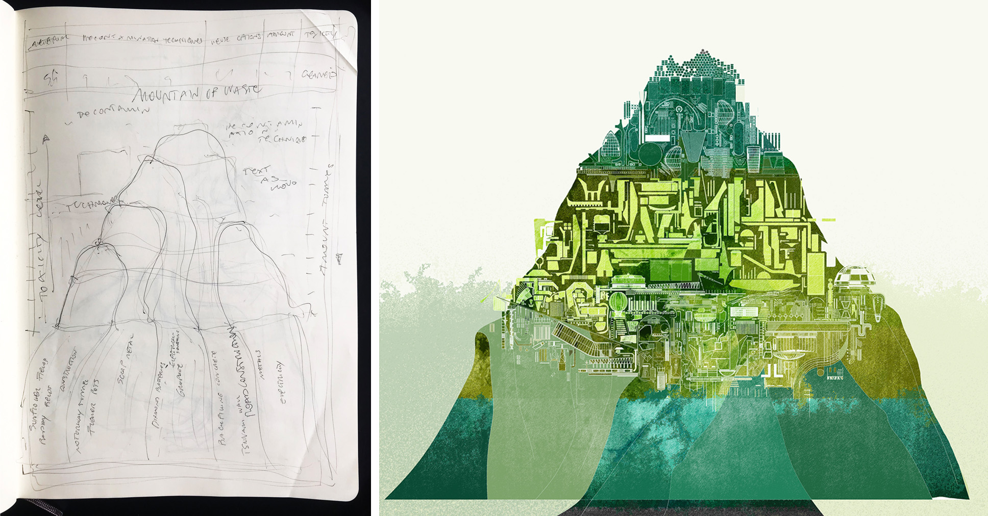
Study sketch for “Outlines of Nuclear Geography” by Sabina Blasiotti.
First draft of “Outlines of Nuclear Geography”, titled “A Fleshy Green Mountain” by Sabina Blasiotti.
How did the process and workflow of creating your drawing compare to traditional architectural drafting?
In the two processes we can find both parallels and dissimilarities. In traditional architectural drafting you respond to a brief, submitting your best design proposal. Similarly, this drawing was my best guess in front of a brief that I created for myself, in the architectural thesis. In architectural drafting, you’ll generally draft several options before arriving at the chosen one. Likewise, this drawing went through a number of iterations before reaching its present look.
Perhaps one dissimilarity is the drafting mean. While in architectural design we start drafting through plans, sections, axonometric etc., for this drawing there wasn’t a given medium that would best respond to the brief, so I had to find that first.
Certainly, in architectural drafting you are inclined to think spatially, while in conceptual drawings like this one you can think conceptually, in the first you can produce a set of drawings to represent the same design, in this one it’s one design combining several ideas. Not surprisingly, I think that drafting a conceptual drawing can take the same amount of time it would take to draft a building.
What one tip would you give other students looking to win next year’s One Drawing Challenge?
One first advice, but you probably heard this many times before, is to always ask! I remember the director of an animation company stating that the best animators in his office were the ones who asked a lot of questions. I started noticing whether this applied in my architecture school and indeed it does!
Asking other people’s opinion is always beneficial and I think is particularly beneficial for your drawing to submit for the One Drawing Challenge competition. In fact, this visual will need to tell a story to the viewer, and there isn’t a better way to test whether your story is being communicated successfully than directly asking a spectator. While you don’t necessarily need to agree on the other person’s opinion, it is important to start a conversation as it may lead you to key and unknown information and unexpected clues.
As second advice I’d like to encourage fellow students to develop and show their own language. I believe this is very important. When we succeed in creating our own language, instead of employing standardized ways of designing and drafting, inevitably we enrich the work with our own story and personality, ultimately succeeding in creating something unique.
A more practical suggestion on this would be to start by finding a feature that makes your work exclusive. This can be anything, from the way you format your drawing, to the kind of research you focus on, the materials you use etc. If you aren’t sure on what this could be and if you are quite self-conscious like me, you can always ask your friends’ or professors’ opinion. Personally, I was told that my color palette felt distinctive across my designs, as I liked that attribute, I then decided to make it a consistent and strong feature in my work.
Sign up to be informed when the next One Drawing Challenge competition opens for submissions. Be sure to check out the incredible work by this year’s extraordinary Winners and Commended Entries
The post This Atmospheric Elevation Drawing Explores the Architectural Potential for Recycling Nuclear Waste appeared first on Journal.
Pendleton ArtsBlock // Dake Wells Architecture
Project Status: BuiltYear: 2020Size: 25,000 sqft – 100,000 sqftBudget: 5M – 10M
Text description provided by the architects.
In 2014, the Housing Authority of Kansas City, Missouri obtained a federal grant to replace the 134-unit Chouteau Court Public Housing Project—a dilapidated series of structures anchoring a high-crime and low-hope neighborhood. As part of the Paseo Gateway Choice Neighborhood Transformation Plan, Pendleton ArtsBlock was envisioned as one of five new decentralized construction projects to replace the units that were demolished.
© Dake Wells Architecture
The 38-unit project includes six studios, 21 one-bedroom, and 11 two-bedroom apartments. The project reconsiders the concept of replacement housing and neighborhood catalyzation by including outreach to artists to be included in the tenant mix. The design team responded with a mix of unit types enclosed in a brick masonry block that plays into the material pallet of the neighborhood.
© Dake Wells Architecture
The residential units sit over a glass-wrapped, porous ground level of community and artist-occupied spaces designed to promote pedestrian interaction. The artist-occupied spaces are provided rent-free, helping to launch creative small businesses with a street-front presence on Independence Avenue. A large, divisible community room welcomes visitors on the ground floor and serves as a meeting place and community hub for the residents.
© Dake Wells Architecture
ArtsBlock was designed to specifically cater to the needs of the artist community. Each housing unit was designed to maximize daylight and flexibility to accommodate the specific needs of each artist. In addition to the large workshop and makerspace on the lower level, each floor is equipped with a shared utility room with artist resources in an effort to maximize square footage within each unit.
© Dake Wells Architecture
By sparking new life with multiple destinations on an important but under-performing street, ArtsBlock rethinks how a mixed-use typology with artists serving as change agents can provide dignity and a sense of pride for low-income residents while working to break a decades-old cycle of poverty. Through the redevelopment of the Chouteau Courts family public housing development, ArtsBlock works as a catalyst for the surrounding Paseo Gateway district by providing affordable housing and economic development, increased safety, and quality of life improvements to help transform an area of extreme poverty within Kansas City.
© Dake Wells Architecture
Throughout the design process, community members, stakeholders, and artists were actively engaged through public meetings, visioning workshops, focus groups, and one-on-one interviews. Resident surveys were conducted to understand resident’s needs in education, health, recreation, and economic resources. By implementing design strategies that address the specific needs of Chouteau Courts residents and the larger community, ArtsBlock has been successful in creating a safe, affordable, community-oriented, dignity-restoring housing complex that has sparked economic growth along Independence Avenue and in the Pendleton Heights neighborhood as a whole.
© Dake Wells Architecture
ArtsBlock is a sustainable, Enterprise Green Communities-certified building located on a blighted site that formerly housed a gas station. The project is largely designed to provide ample natural daylight and enhancing the human experience in an effort to encourage healing, restore dignity and promote a sense of community pride within an affordable housing complex..
© Dake Wells Architecture
Pendleton ArtsBlock Gallery
The post Pendleton ArtsBlock // Dake Wells Architecture appeared first on Journal.