Home » Articles posted by Kenneth Brown (Page 8)
Author Archives: Kenneth Brown
The Jennings Supportive Housing // Alexander Gorlin Architects
Project Status: BuiltYear: 2020Size: 25,000 sqft – 100,000 sqftBudget: 10K – 50K
Text description provided by the architects.
The Jennings creates safe, permanent, affordable housing for homeless domestic violence survivors and their families. It is owned and operated by New Destiny Housing, a non- profit organization dedicated to serving this population and which develops supportive housing to provide residents with the platform to live stable, violence- free lives.
© Alexander Gorlin Architects
© Eric Petschek
This project not only addresses the leading cause of homelessness in New York City – domestic violence – but also establishes a striking architectural statement on an intersection in The Bronx that was completely destroyed in the 1970’s.
The Jennings provides 42 affordable apartments ranging in size from one- to three- bedrooms.
© Eric Petschek
© Eric Petschek
Twenty-three are set aside for homeless domestic violence survivors. Tenant safety is of primary concern. Security features include electronic access- controlled entry, CCTV, video intercom and a manned security desk. On- site services for residents include counseling, case management, children and family programming, and job readiness coaching to foster housing stability and safety.
© Eric Petschek
© Eric Petschek
Amenities include a multi- purpose program space, staff offices, a library/computer room, secure landscaped courtyard with a children’s play area, and laundry room. The neighborhood is well- served by public transportation, critical for accessing employment opportunities, as well as daycare and after school programs that support parents and enable children to thrive.To keep costs down the project was designed with materials that were off the shelf/readily available, as well asenvironmentally sustainable.
© Eric Petschek
© Eric Petschek
Building systems such as block and plank were used to enhance the pace of construction. To lower long- term operational costs, we designed energy- efficient appliances and heating systems, as well as a green roof.In 1977, President Jimmy Carter visited this exact site to witness the destruction of the South Bronx (see final photo).
© Eric Petschek
© Eric Petschek
We are proud to be part of the meaningful renewal of this formerly devastated neighborhood..
© Eric Petschek
© Alexander Gorlin Architects
The post The Jennings Supportive Housing // Alexander Gorlin Architects appeared first on Journal.
Did you miss our previous article…
https://thrivingvancouver.com/?p=128
Future Art Lab of the Vienna University of Music and Performing Arts // Pichler & Traupmann Architekten ZT GmbH

Project Status: BuiltYear: 2020Size: 25,000 sqft – 100,000 sqftBudget: 50M – 100M
Text description provided by the architects.
Future Art LabPROJECT DESCRIPTION:Urban planning:The new building for the Future Art Lab will complete the development of this special campus, which is reminiscent of Anglo-American models and is unique for Vienna. On account of this, and due also to it location at a prominent position, this building has a special importance, which makes it possible to especially accentuate the canon of the buildings on the campus at this point.
On the other hand to exert a particular dominance here would be inappropriate.
© Pichler & Traupmann Architekten ZT GmbH
A moderate height, integration with the neighbouring buildings in terms of volume, and spatial and functional references to the central open area, the “campus” in the literal sense of the term, appeared important.
© Pichler & Traupmann Architekten ZT GmbH
The building is seen as a pavilion which makes a gesture of opening towards the middle of the university and which can also respond to urban references.
The result is a free-standing, embedded building which can very much be understood as an apparatus, an appliance for playing, composing and experimenting with and on film and music.
Function:
The internal organisation is based on the requirements in terms of function and building acoustics, and the aim is to give each institute the greatest degree of compactness combined with maximum exposure to daylight.
For reasons of acoustics the Institute for Electro-acoustic Music and Composition with the large halls (the Klangtheater (sound theatre), and the recording hall) which form its nucleus is placed at basement level, along with a generously sized foyer zone.
© Pichler & Traupmann Architekten ZT GmbH
Through a sunken courtyard its teaching spaces receive sufficient natural east light. The institute’s administration rooms are also east-facing and are located on the ground floor as is the main foyer. In terms of floor area the Film Academy is the largest institute with the greatest number of rooms that must be lit naturally.
© Pichler & Traupmann Architekten ZT GmbH
It takes up the entire 1st floor, which, in accordance with the building regulations, is also the largest in area. To generate more facade area for daylight a wing is folded inwards, creating a large terrace as a side effect. The Art House cinema is placed so that the public can access it directly at ground floor level.
© Pichler & Traupmann Architekten ZT GmbH
The lower level of the cinema is directly connected with an intermediate level inserted in the void of the basement. At this point a direct pedestrian connection to the neighbouring Building G is possibleThe recessed 2nd floor, the roof level, is reserved for the Institute for Keyboard Instruments, which in terms of floor area is the smallest but which has a relatively high proportion of areas that must receive daylight.
© Pichler & Traupmann Architekten ZT GmbH
It, too, is grouped around its nucleus, the concert hall. In terms of ceiling height the concert hall exploits the roof volume allowed by the building regulations, and it is naturally lit. Circulation:In the southeast there is a double flight staircase with a goods lift that connects all the areas to which heavy items must be transported with the delivery bay.
© Pichler & Traupmann Architekten ZT GmbH
The main staircase is a spatially composed circulation and encounter zone which relates to the campus and the city and brings students and teachers to the institutes and interested members of the public to the halls. If you take the route downwards you pass the seminar area of the Film Academy to arrive in the Klangtheater of the Institute for Electro-acoustic Music and Composition.
© Pichler & Traupmann Architekten ZT GmbH
If you take the route upwards you reach the centre of the main level of the Film Academy. Continuing along the stairs you have crossed the building on the diagonal and arrive at the concert hall with a view outside. The main staircase is flanked by a glazed passenger lift that allows all levels to be reached barrier-free.
© Pichler & Traupmann Architekten ZT GmbH
Despite the routes across the building each institute can be closed off, while the halls that are accessible to the public and their foyer zones are kept accessible. Both staircases are designed as escape stairs with all the necessary measures such as glazing, sprinkler systems, fire protection curtains or pressure ventilation.
© Pichler & Traupmann Architekten ZT GmbH
As they are positioned in such a way that all areas can be easily evacuated, two staircases are sufficient.Building acoustics:For all rooms and halls with exacting acoustic requirements a space-in-a-space building method is proposed. The load-bearing reinforced concrete structure is completely separated from the structure (also solid) that forms the interior space, and is carried by a mass-spring system.
© Pichler & Traupmann Architekten ZT GmbH
The three biggest producers of sound, the Klangtheater, the recording room and the Art House cinema, are positioned independently of each other at basement level so that no structure-borne sound can be transmitted to other parts of the building. The loads of the concert hall, which, of course, is also built according to the space-in-a-space method using the mass-spring system, are transferred through the building and down to the foundations by a separate structure, so that here, too, no adverse effects can arise.
© Pichler & Traupmann Architekten ZT GmbH
The entire Institute for Keyboard Instruments is placed on its own floating reinforced concrete slab, independent of the primary reinforced concrete slab. All the rooms with exacting acoustic requirements are separated from each other by solid walls of the requisite thickness.To meet the stringent demands with regard to soundproofing buffer areas, such as corridors and intermediate rooms, are used.
© Pichler & Traupmann Architekten ZT GmbH
For example: the concert hall is separated by a less acoustically sensitive corridor area from the recording spaces below it, which is essential to achieve the level of soundproofing required. As regards acoustics door constructions often represent weak spots but that is not the case here, as sufficient room for door air-locks is planned in order to achieve a very high standard of sound proofing.Room acoustics:For the room acoustics two fundamental construction principles are taken into account: diffusion and sound damping in a space.
© Pichler & Traupmann Architekten ZT GmbH
The requisite diffusion is achieved by means of suitable acoustic wall and ceiling claddings, for example concave elements. This creates sound focuses and offers a basis for good audibility. In those spaces that are used for research and teaching, variable acoustics are employed to allow an experimental experience of different room acoustics.
© Pichler & Traupmann Architekten ZT GmbH
In large areas of the building the degree of sound damping in the rooms can be changed by means of sound-absorbent curtains.
The concert hall is fitted with solid wood elements on the walls and ceiling that reflect sound back into the public. These elements also function as their own “resonating bodies”.
© Pichler & Traupmann Architekten ZT GmbH
The floor is a heavy wooden floor. In order to be able to control the reverberation time acoustically highly effective and movable textile elements or curtains are envisaged for a defined zone between the top edge of the wall elements and the ceiling elements.
In the Art House cinema an absorbent lining is envisaged for all the main surfaces, ensuring good audibility of loudspeaker sound.
© Pichler & Traupmann Architekten ZT GmbH
In addition the floor has absorbent perforations through which the intake air can rise silently.
The Klangtheater is a space for experiments and is therefore completely equipped with sound-absorbent blinds that are fitted at a sufficient distance to the inner shell of the space-in-a-space construction and ensure maximum variability of the room acoustics.
Clearly, all these measures listed are not made at the cost of the usable floor area but are located within the construction thicknesses.
Building services:
The building services must meet highly complex demands in terms of room and building acoustics.
© Pichler & Traupmann Architekten ZT GmbH
Very large ventilation cross sections are required in order to serve the halls at extremely low air speeds. This is the only way of ensuring that the building services plant operates almost completely silently. On the other hand it is essential that the individual halls be served separately in order to make the transmission of sound between the halls impossible.Building physics – facades:As the internal loads (heat sources) are very large, it is most important to reduce the entry of (solar) energy from outside.
© Pichler & Traupmann Architekten ZT GmbH
This is achieved by the extensive use of sun protection louvers that also play an important, form-shaping role in the architectural design. On the north facade facing towards the campus a second glass plane with a sun protection coating is used, as here, too, solar energy can enter from the east and west.
© Pichler & Traupmann Architekten ZT GmbH
This also gives the building’s principal elevation a strikingly open appearance.
The high proportion of solid building parts, necessitated by the acoustic concept alone, allow the internal heat balance to be well managed. Fitting-out:Parquet floors in the halls and practice rooms, carpeting in the studios and offices, epoxy resin floors in the circulation areas.
© Pichler & Traupmann Architekten ZT GmbH
Walls are skim coated and painted. Exposed service runs on the ceiling slabs without suspended ceilings, as is commonly found in experimental culture buildings. The walls and ceilings in the halls are described under the room acoustics concept. Structural system:The structural and constructional system is strongly shaped by the requirements of the building acoustics.
© Pichler & Traupmann Architekten ZT GmbH
Flat reinforced concrete ceiling and floor slabs are envisaged, the principal load-bearing and bracing element is the box-shaped primary structure of the halls. Other loads are transferred by reinforced concrete pin-ended columns. Projecting areas are carried by angled columns in the floor above..
© Pichler & Traupmann Architekten ZT GmbH
Future Art Lab of the Vienna University of Music and Performing Arts Gallery
The post Future Art Lab of the Vienna University of Music and Performing Arts // Pichler & Traupmann Architekten ZT GmbH appeared first on Journal.
Did you miss our previous article…
https://thrivingvancouver.com/?p=110
Thinking Outside the (White) Box: 8 Sculptural Designs for Cultural Spaces
Celebrate a Decade of Inspirational Design with us! Architizer’s 10th Annual A+Awards program launches this fall — sign up to receive key program updatesand deadline reminders.
Amorphous white silhouettes are on the rise in architectural projects around the world. Their minimal nature stands in stark contrast with the grandeur that their form exudes. Parametric design applications and technologies like 3D printing have made the visualization of these spaces very easy, allowing architects to experiment and play with forms like never before.
The following A+Award winners challenge conventional ideas to craft spaces that have a unique character, experience and visual appeal. These designs change the way we look at circulation and redefine how we see and use basic structural elements like walls and roofs. Projects in this collection not only serve as functional buildings but also as works of art.

Yinchuan Sunac City Exhibition Center by Arch-Age-Design (AAD), Yinchuan, China
Popular Choice, 2021 A+Awards, Commercial – Showrooms
Perched at the edge of Gedi Lake, this minimalist structure is shaped like a crescent moon with a roof that gradually slopes down towards the water. The roof is held up by perforated columns that create the illusion of it being suspended in the air. Glass walls along the inner circumference of the ring help users become one with nature.
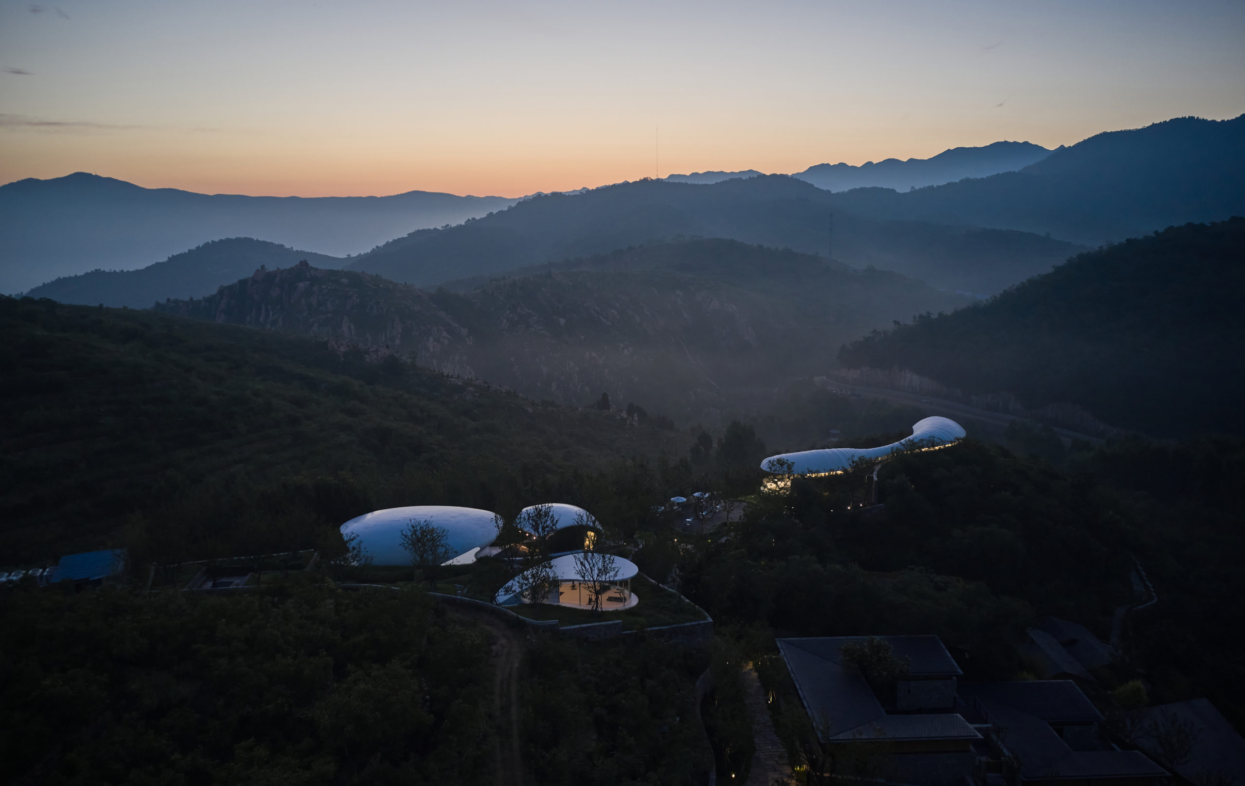
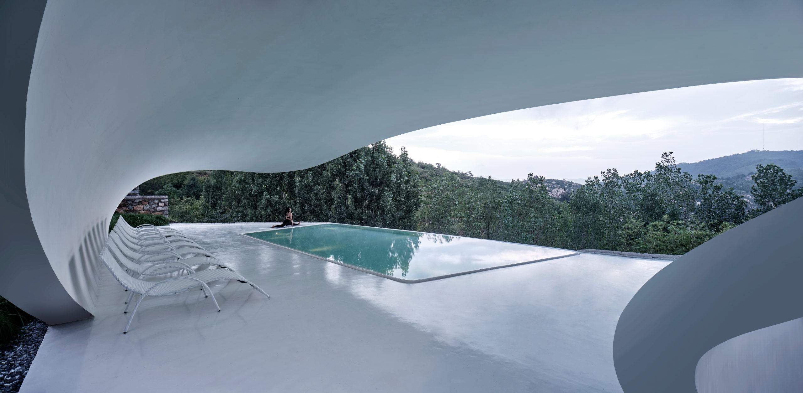
Jiunvfneg Bubble Pool and Supporting Facilities on Mount Tai by line+, Tai’an, China
Popular Choice, 2021 A+Awards, Hospitality – Spa & Wellness
The bulbous column-free form of the structure is created using special curved steel keels. The overhanging roof with wide openings or glass panels below enables unhindered views of mountains and forests around it. The openings of each white shell are oriented in different directions to create privacy.
Images by Walter Mair
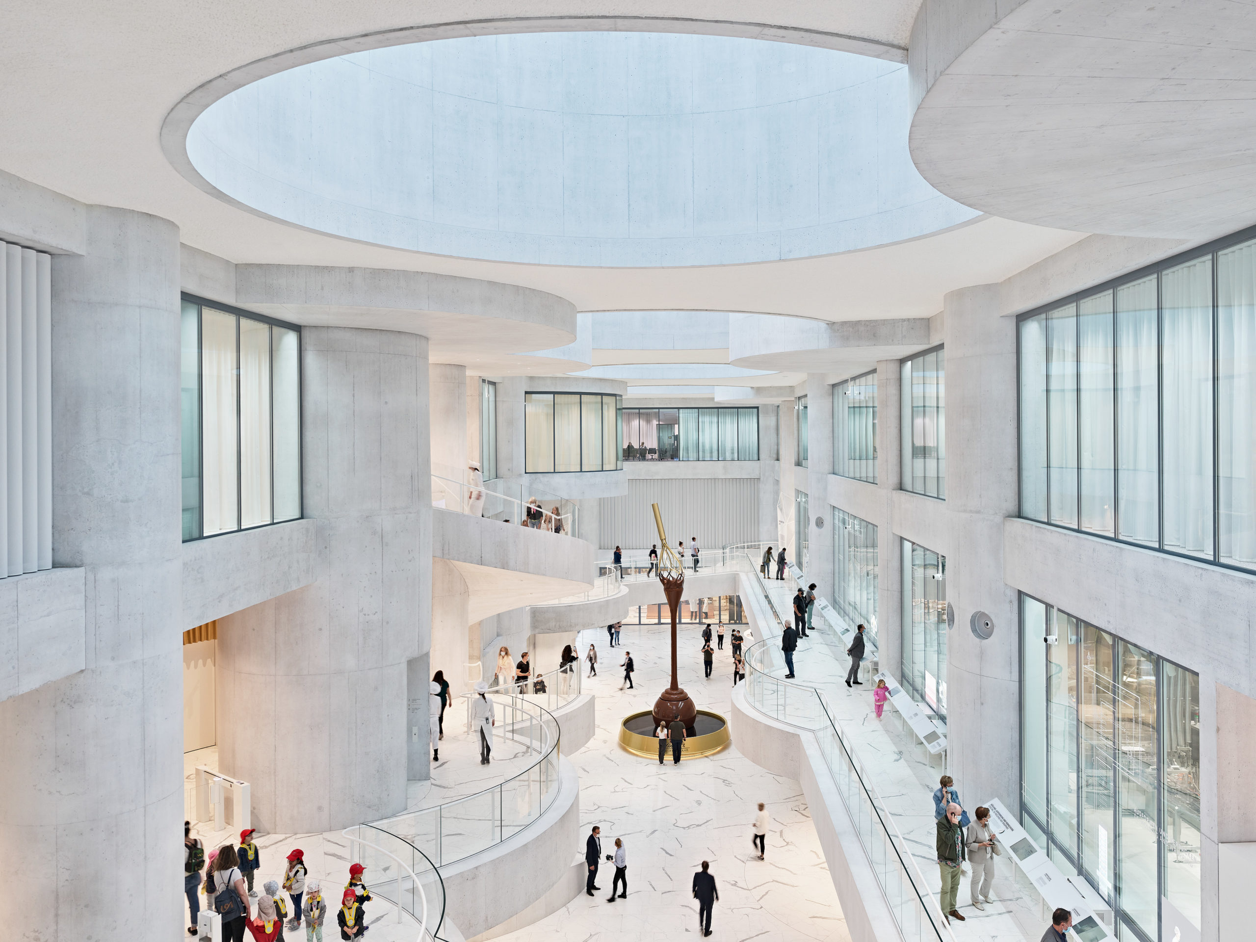
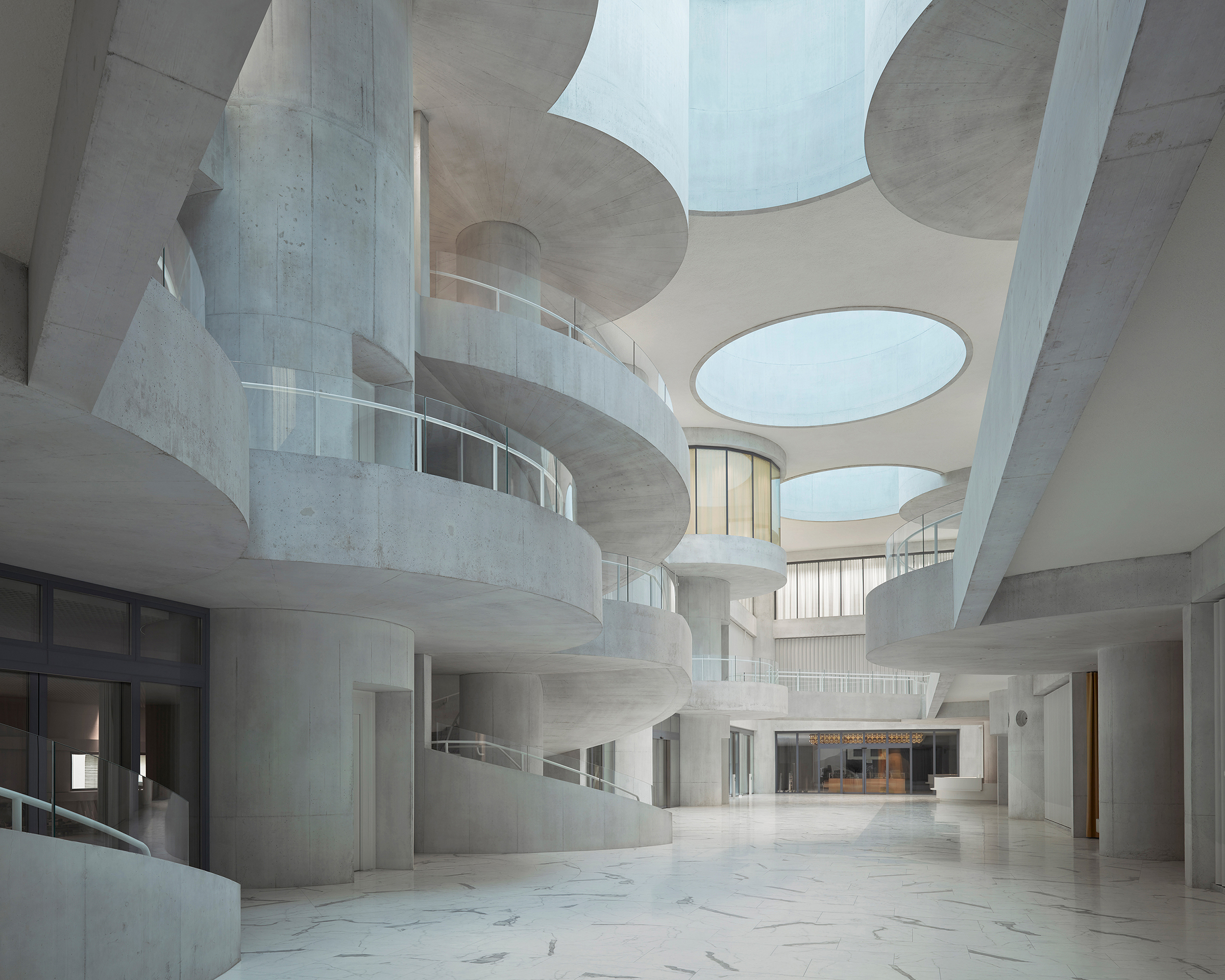
Lindt Home of Chocolate by Christ & Gantenbein, Kilchberg, Switzerland
Jury Winner, 2021 A+Awards, Commercial – Mixed Use
The structure allows for a mixed-used space that comprises an exhibition area, R&D facility, production plants, offices and recreational facilities. Its dominant feature is an open atrium with circular projections. A large golden chocolate fountain in the center stands out against the calm white interiors.
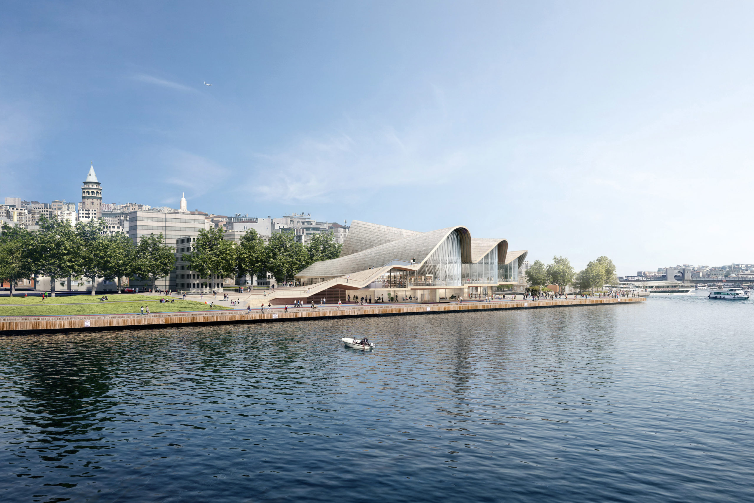
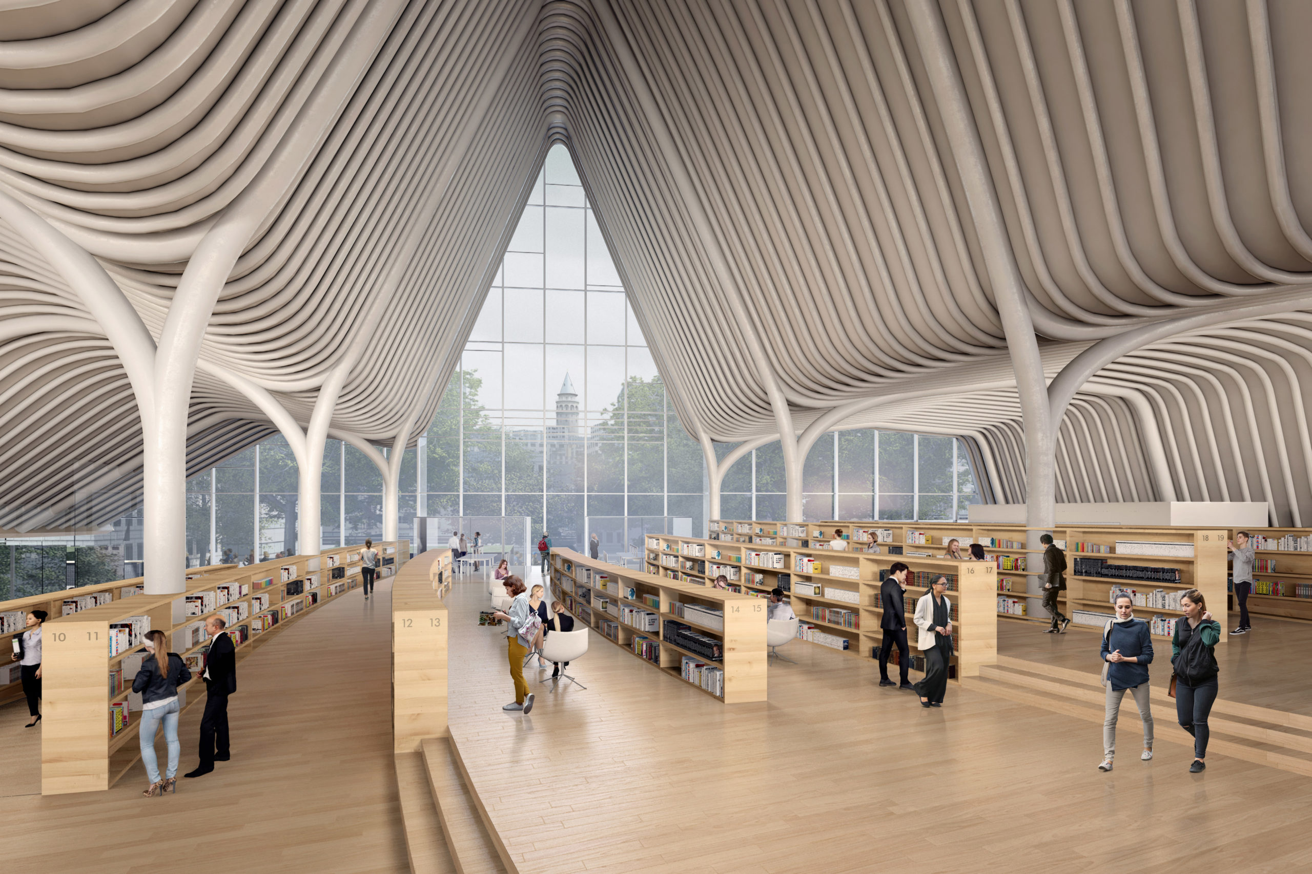
The Golden Horn Library by Aytac Architects, Istanbul, Turkey
Jury Winner, 2021 A+Awards, Institutional – Unbuilt Institutional
The conceptual design is formed to look like a floating Turkish carpet, while also referencing the seven hills of Istanbul. The curved roof is supported by columns that branch out at the top and ribs that go along the roof section. The profile gradually reduces in height to merge into the landscape while also acting as a platform to walk on.
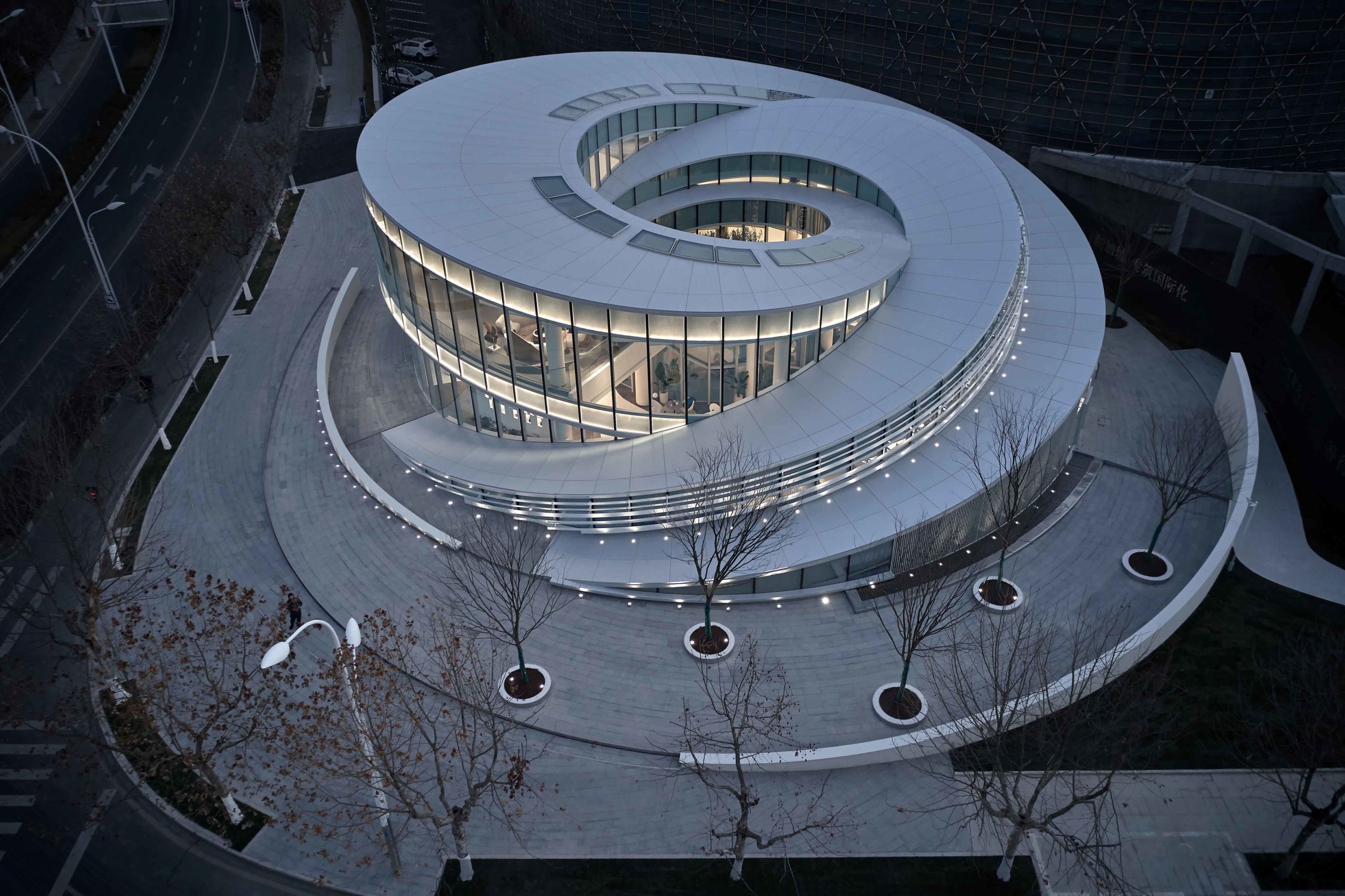
Yanlord Central Lake by HWCD & TIANHUA, Taicang, China
Popular Choice, 2021 A+Awards, Office Building – Low Rise (1-4 Floors)
The design for this structure draws inspiration from the ripples in water. Curved segments at different levels are put together to create a spiral form. The building also features large windows on the side to allow expansive views of the lake around it.
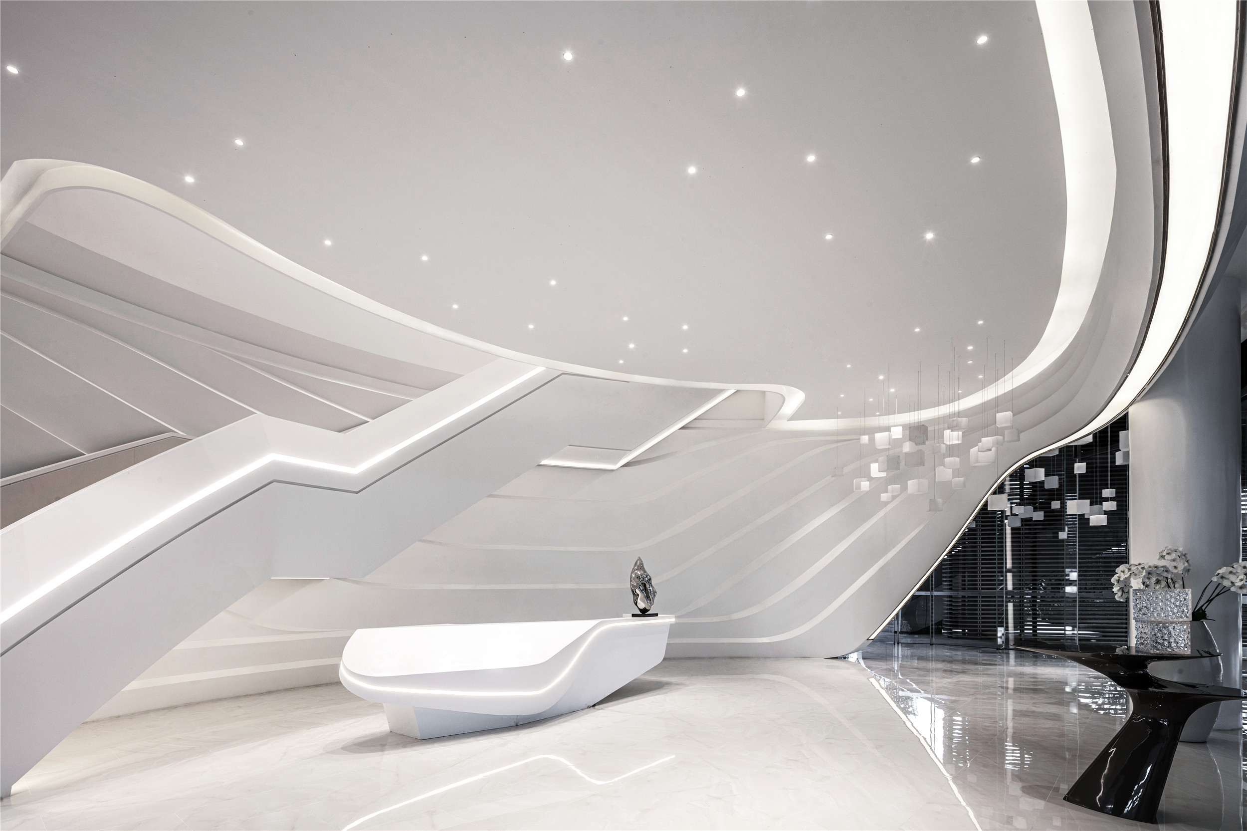
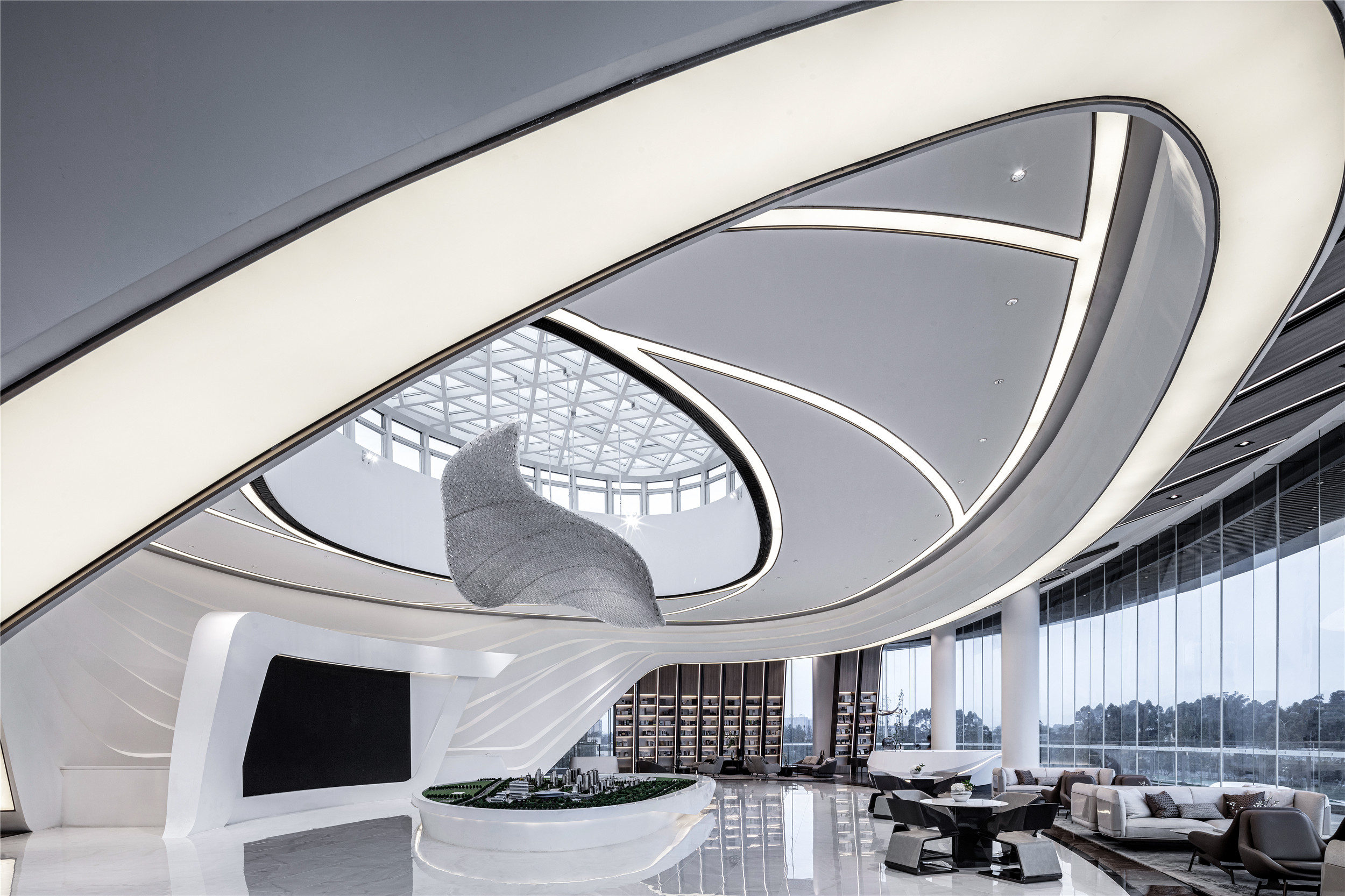
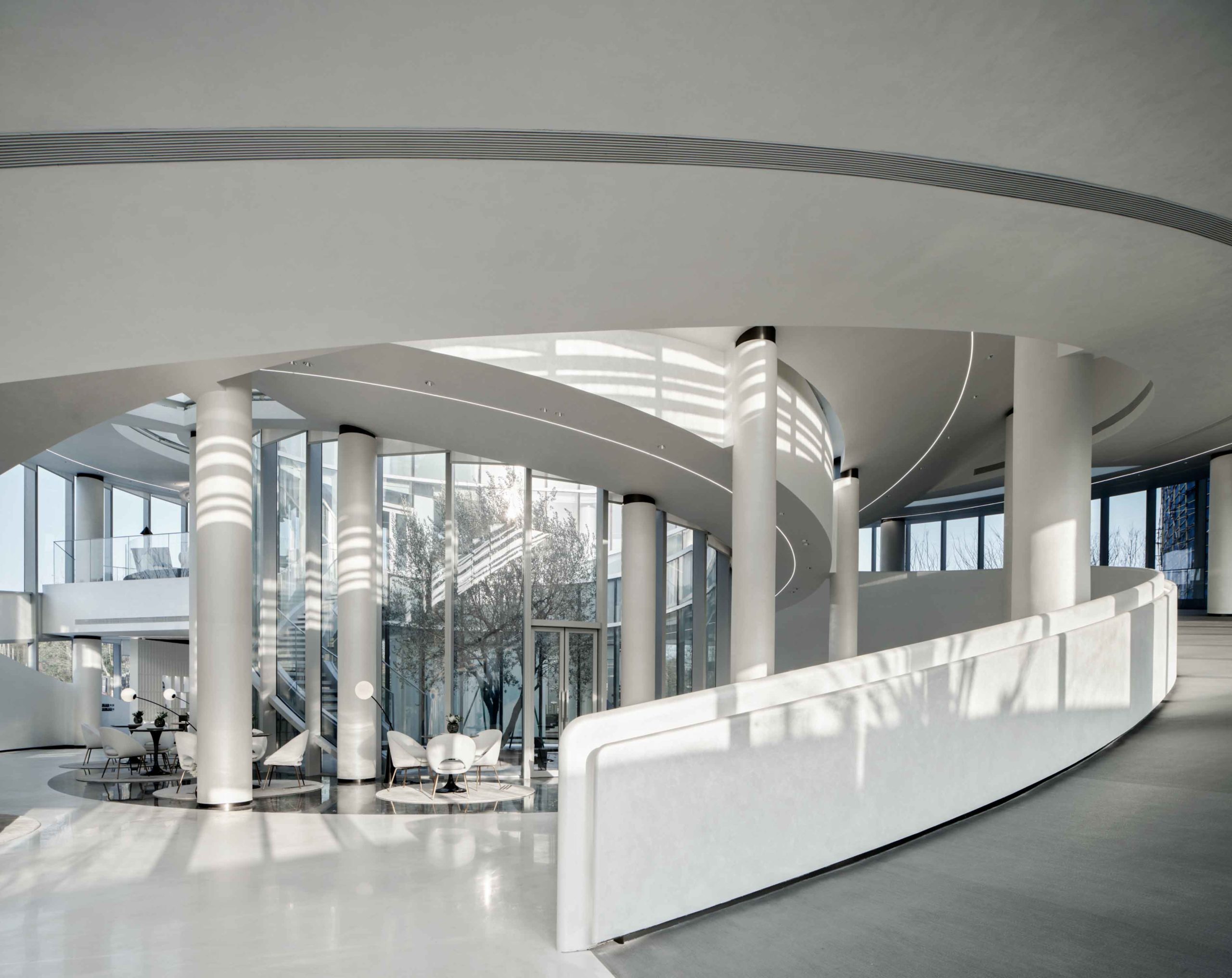
Flow by Kris Lin International Design, Chengdu, China
Jury Winner, 2021 A+Awards, Commercial – Showrooms
Staying true to its name, this exhibition space is composed of fluid lines that create and separate various functions. Curved white surfaces and a cleverly concealed staircase are favored over traditional walls to create better circulation and connectivity.
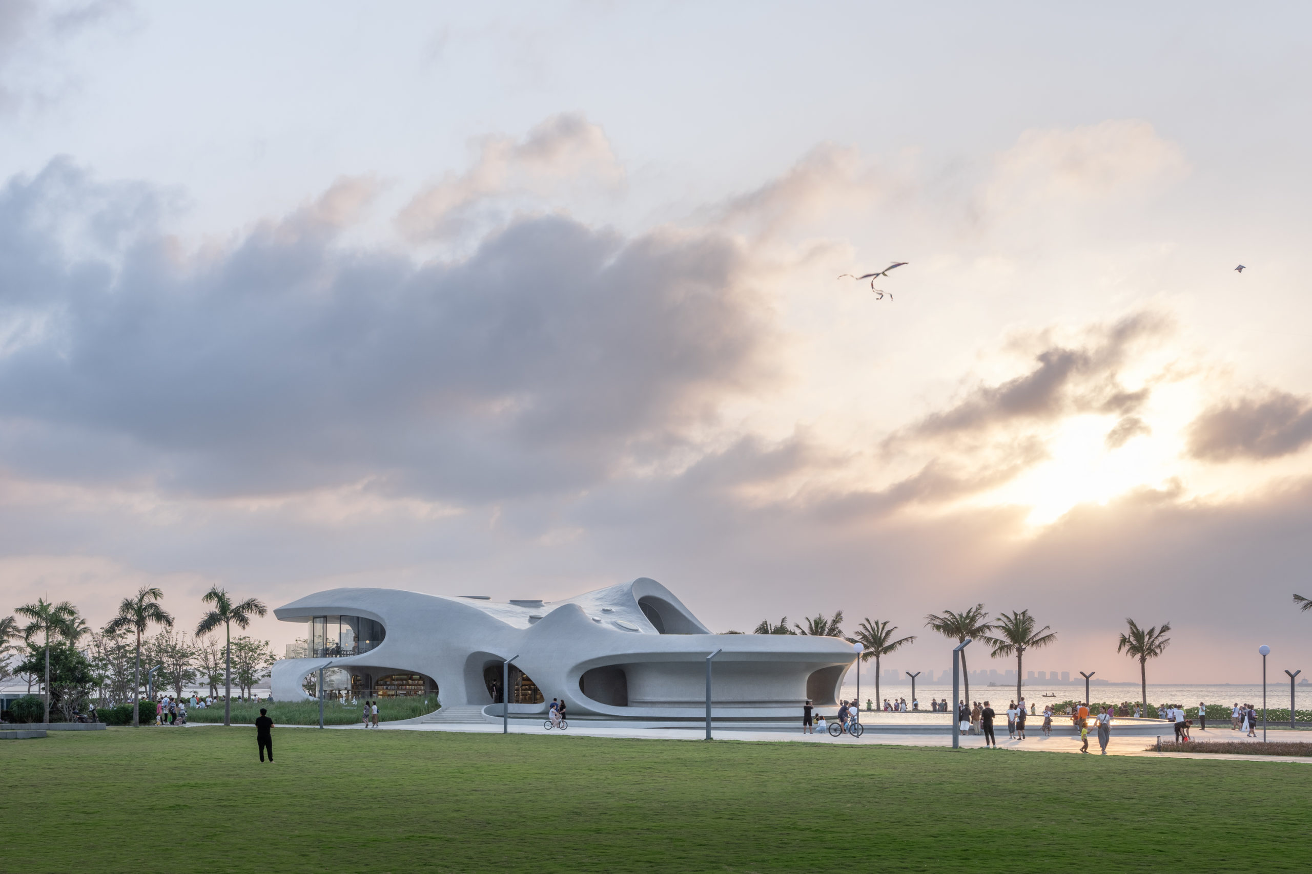
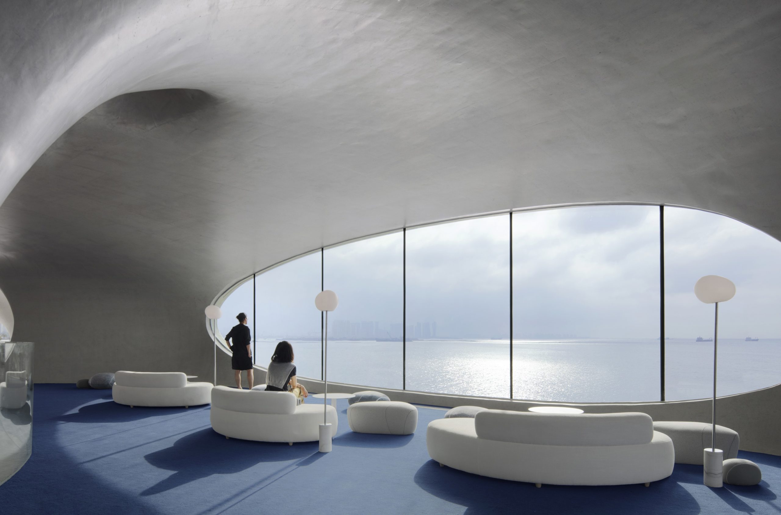
The Cloudscape of Haikou by MAD Architects, Haikou, China
Jury Winner, 2021 A+Awards, Detail – Architecture +Concrete
The nebulous shape of the library was built using fair-faced concrete. The form’s identity is further retained by concealing all the mechanical, engineering and plumbing features within the surfaces. Its sculptural nature creates unique spatial experiences in every nook within.
Celebrate a Decade of Inspirational Design with us! Architizer’s 10th Annual A+Awards program launches this fall — sign up to receive key program updatesand deadline reminders.
The post Thinking Outside the (White) Box: 8 Sculptural Designs for Cultural Spaces appeared first on Journal.
Did you miss our previous article…
https://thrivingvancouver.com/?p=91
Technical Details: An Architect’s Guide to Setting Out Brickwork
Emma Walshaw is the founder of First In Architecture and Detail Library, and has written a number of books aiming to facilitate a better understanding of construction and detailing. The Detail Library provides architects with a database of fully resolved construction details.
Brick is one of the most common materials used in architecture. It’s inexpensive, durable and versatile. The way brick is detailed and set out can transform the way a building looks. Here we will explore simple techniques to make sure your brickwork is always set out perfectly.
Setting Out Stretcher Bond Brickwork
Stretcher bond brickwork is one of the most common bonds used in modern buildings. When designing these masonry walls, the designer should set out openings, window and door dimensions to full or half brick lengths where possible. This will avoid wasting material and the unnecessary cutting of bricks on site whilst making the wall as structurally stable as possible.
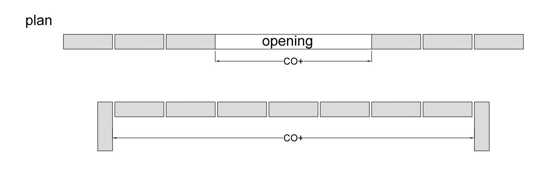
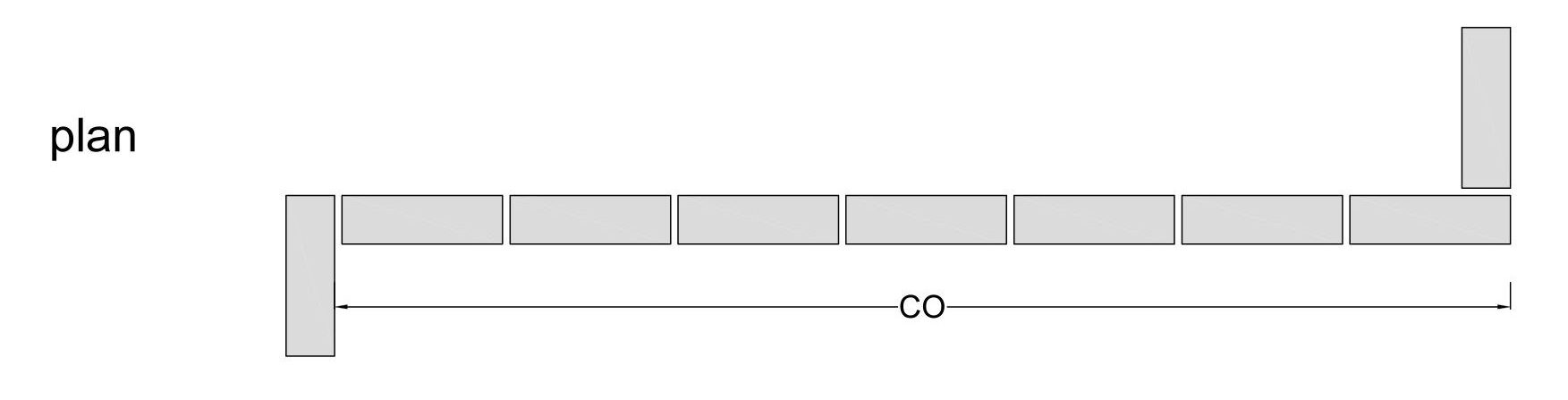
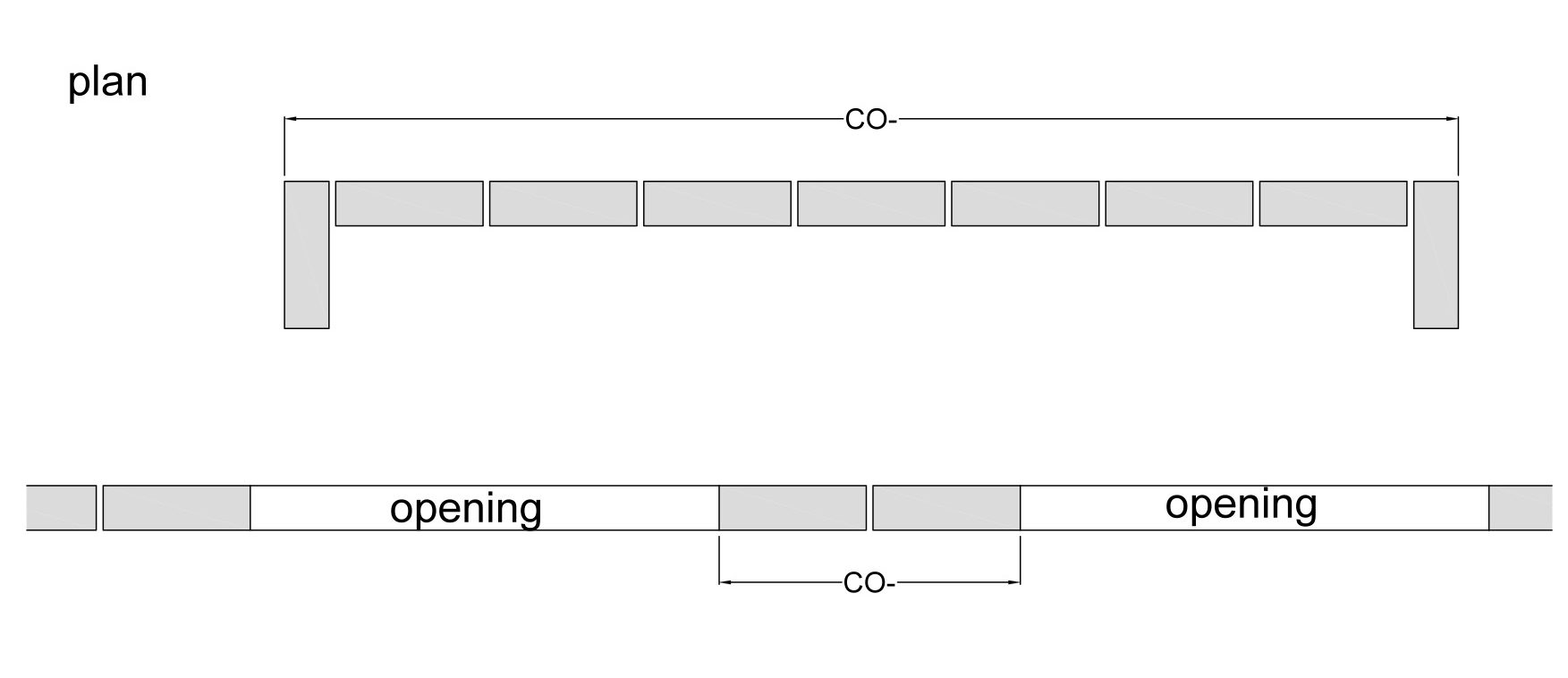
The following illustrations demonstrate the difference between using the correct coordinating, and using an uncoordinated approach. 
The image above shows how when not co-ordinated correctly you can be left with cut bricks and poorly finished openings. All the grey bricks in the example above represent bricks that are neither whole or half bricks and would have to be cut to size on site.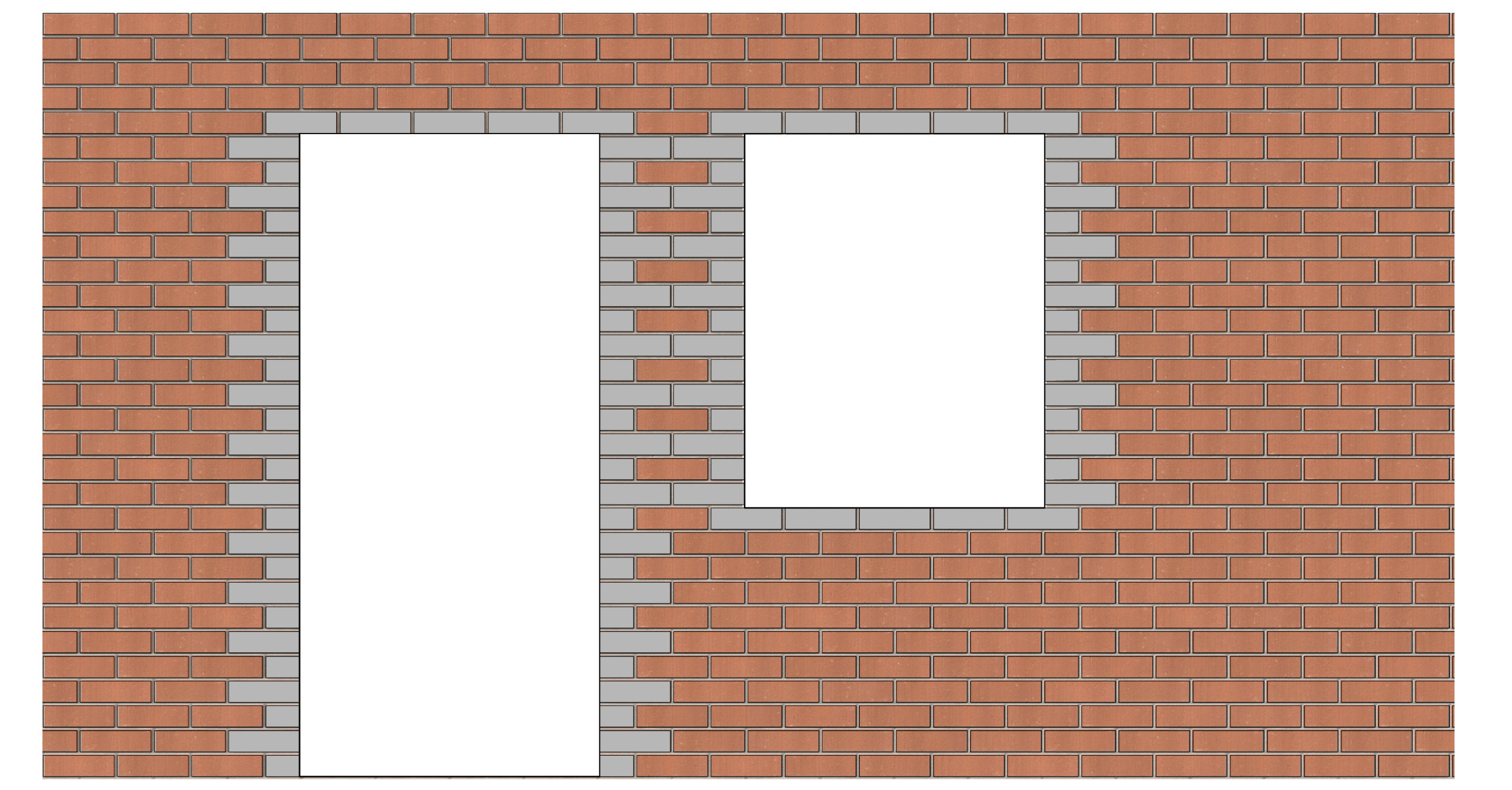
The above image shows co-ordinated brick sizing to ensure all openings align to 1 or 1/2 brick size.
In early design stages, brick dimensions are often not considered, leaving the complete external envelope needing to be re-adjusted or re-drawn at detailed design stage. However, setting out the building to brick dimensions as early as possible — even before planning — can save time and money!
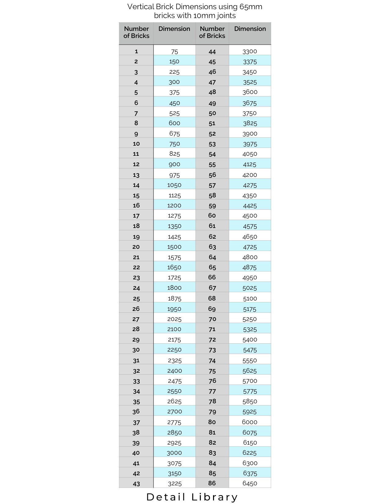
Brick Dimension Tables
There is plenty of help out there to assist in setting out your façade to brick dimensions so that you don’t need to draw each brick in the façade (although it is always a good option to have a couple of courses on a hidden layer in your drawing to double check). Ibstock’s Brick Dimension Table and the Brick Association’s Dimension Table are the most popular.
Below is a short guide on how to use all these numbers.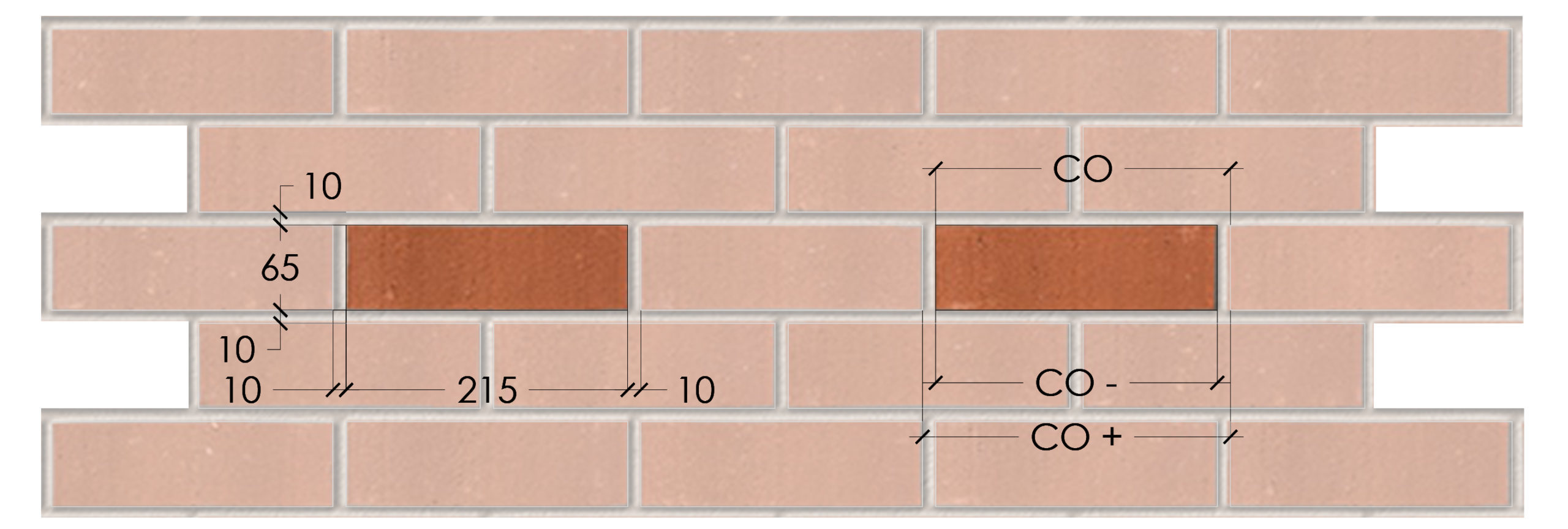
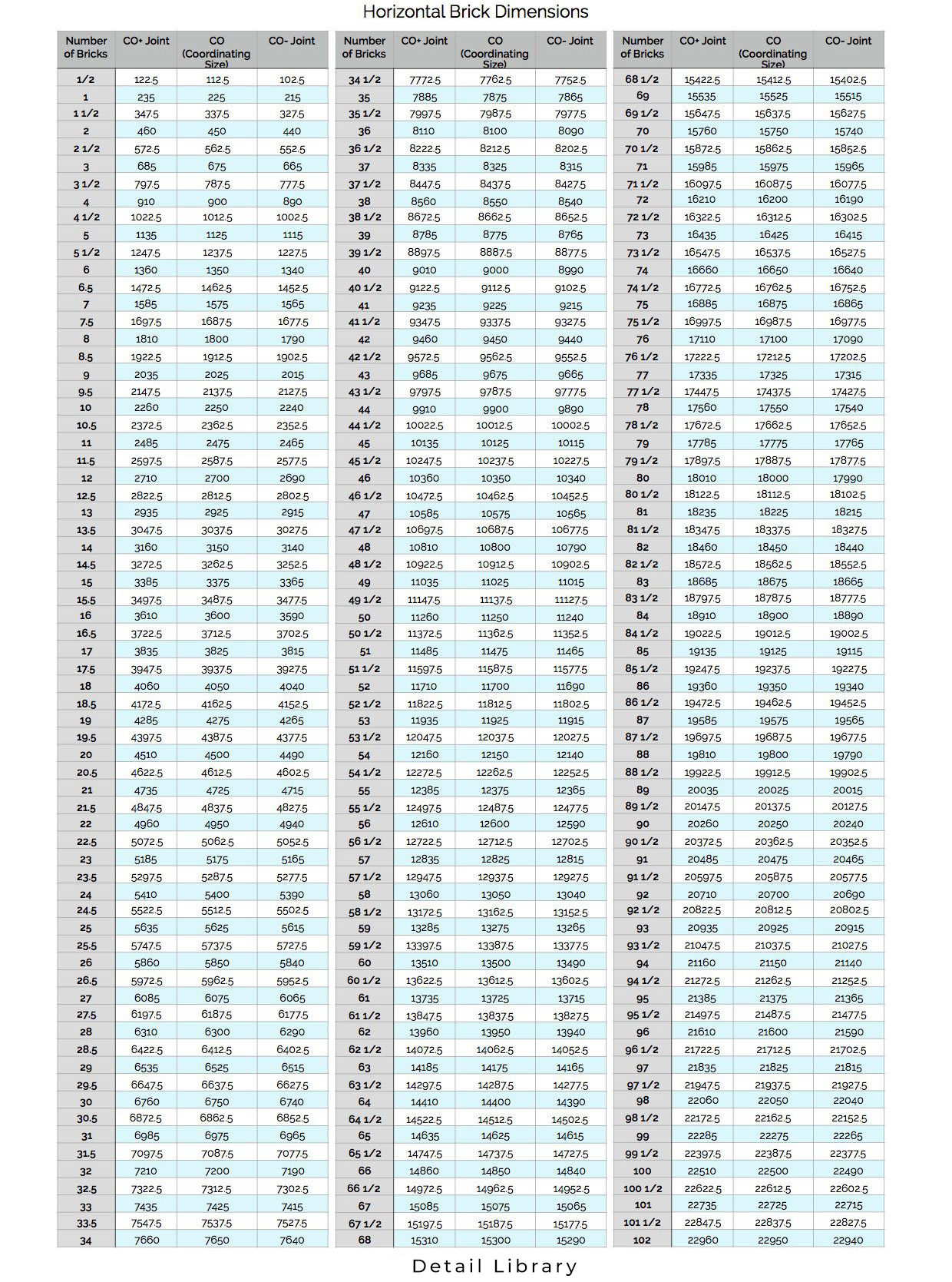
Note: for large areas of brickwork, a movement joint will be needed every 10 – 12m or as recommended by the structural engineer.
Setting Out Flemish Bond Brickwork
For other types of bonds, different techniques and measurements have to be applied to set out brickwork correctly. Another very common type of bond is Flemish Bond.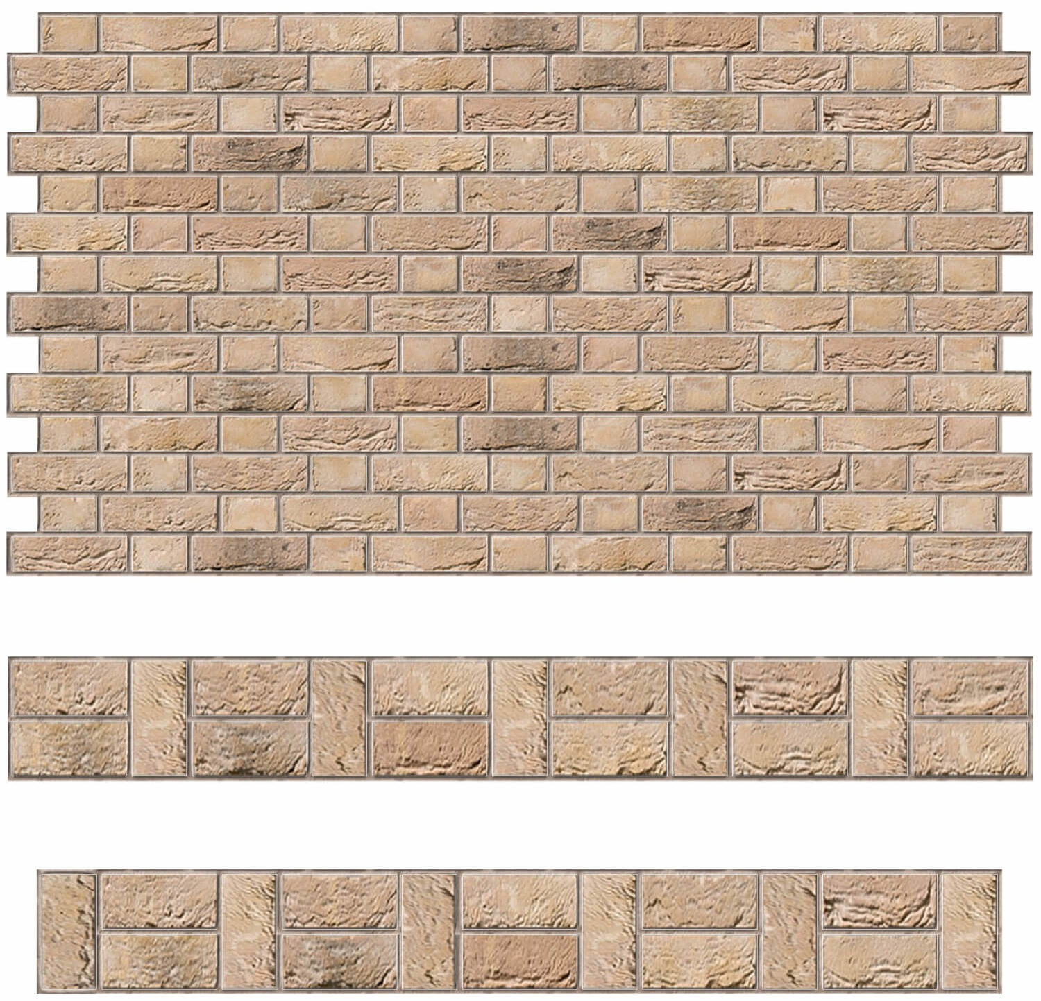
Whilst Flemish walls must also try to maintain as many whole bricks as possible when being set out, when creating corners or openings, ¾ bricks and closer bricks may need to be used.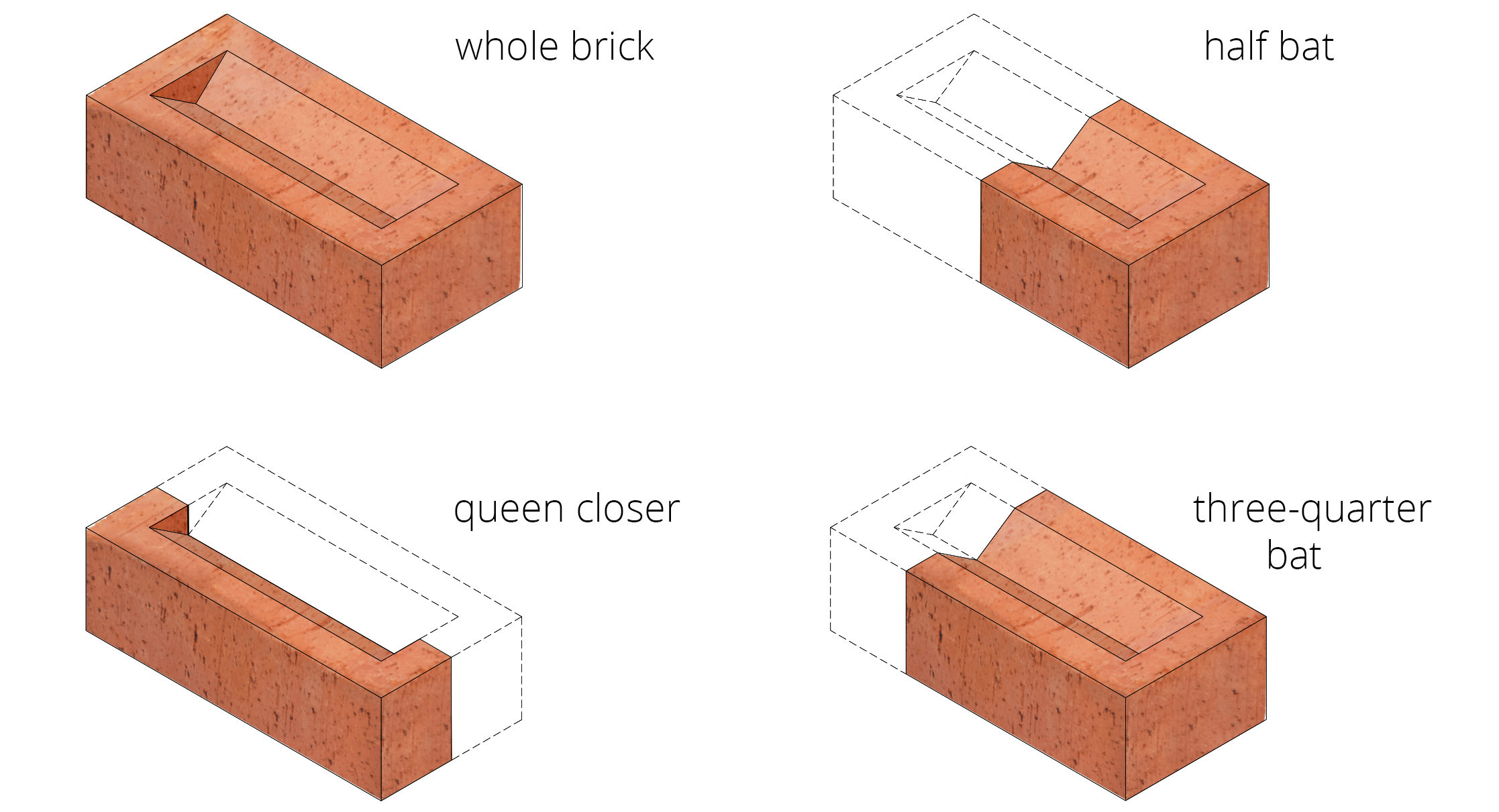
Traditionally these types of walls were one brick length deep and require a queen closer or king closer at corners even out the brickwork whilst maintaining a structurally strong wall. Below is an example of a section of wall showing a brick return, end of wall and internal wall junction along with the queen closers where necessary. Other forms of Flemish bond setting out exist depending on the desired elevation required.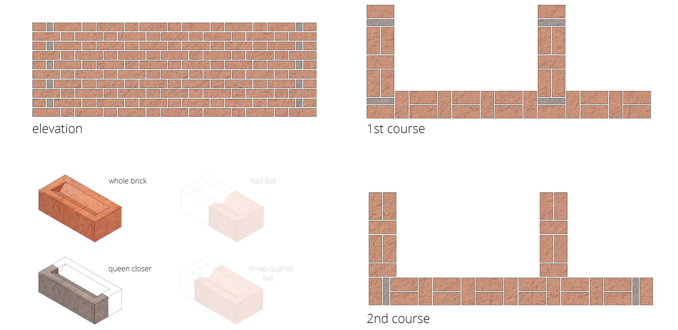
Flemish bond walls can also be built out of single-leaf brickwork (half brick thickness), although this does require different types of cut bricks and possible extra wall ties as advised by the structural engineer. Below is an example of a section of wall showing a brick return, end of wall and internal wall junction.
Conclusion
The setting out of brick is an important part of the design process and will guide the dimensions of walls, windows, doors and other features on a building’s elevation. Setting out varies according to the different bonds and patterns used in the brick work. The more complicated the brick pattern or arrangement, usually the more complicated the setting out. There are plenty of guides available some of which listed below.
Emma Walshaw is the founder of First In Architecture and Detail Library, and has written a number of books aiming to facilitate a better understanding of construction and detailing. The Detail Library provides architects with a database of fully resolved construction details.
Useful Information
https://www.brick.org.uk/technical/guides
https://www.brick.org.uk/admin/resources/designing-to-brickwork-dimensions.pdf
https://www.brick.org.uk/technical/design-details
https://www.brick.org.uk/technical/structural-brickwork
https://www.brick.org.uk/technical/brick-calculator
https://www.ibstockbrick.co.uk/technical-services-technical-information/
https://www.ibstockbrick.co.uk/wp-content/uploads/2015/08/TIS-A2-BRICKWORK-DIMENSIONS-TABLES-STANDARD-BRICK.pdf
https://www.ibstockbrick.co.uk/wp-content/uploads/2015/08/Ibstock-TIS-A2-BRICKWORK-DIMENSION-TABLES-Standard-brick-sizes.pdf
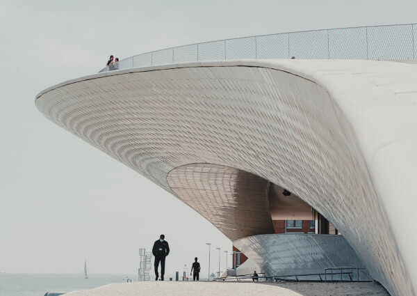
Top image: House of Bricks by Jolson, Melbourne, Australia
Celebrate a Decade of Inspirational Design with us! Architizer’s 10th Annual A+Awards program launches this fall — sign up to receive key program updatesand deadline reminders.
The post Technical Details: An Architect’s Guide to Setting Out Brickwork appeared first on Journal.
Did you miss our previous article…
https://thrivingvancouver.com/?p=75
Imatra Electricity Substation // Virkkunen & Co Architects

Project Status: BuiltYear: 2020Size: 5000 sqft – 10,000 sqft
Text description provided by the architects.
The project is composed of an electricity substation building and five transmission towers and terminals, extending over two tributaries of the river Vuoksi in the city of Imatra in Eastern Finland. The design and development of the new facilities required special care due to their proximity to the Imatrankoski rapids, a conservation site, and a national landscape as decreed by the Ministry of the Environment.
© Tuomas Kivinen
© Max Plunger
The rapids were harnessed for power generation in the 1920s when the Imatra hydropower plant was constructed, and the river was directed into a power plant canal. The plant is still in operation and with an output of 192 MW, the most powerful of its kind in Finland. Simultaneously with the construction of the power plant, a 110 kV power line leading from the plant to consumption areas in Southern Finland was built.
© Tuomas Kivinen
© Max Plunger
This landmark industrial site is the historical starting point of the Finnish main power grid.The hydropower plant buildings represent the Nordic Classicist style, and they were designed by architects Oiva and Kauno Kallio. The outstanding feature of their red brick-clad facades is the rhythmic arrangement of window bays and doors.
© Max Plunger
© Tuomas Kivinen
Rhythm also became the main feature of the new substation facades and powerline structures. The old air-insulated switchgear, completed in 1929, was coming to the end of its operational life cycle and had to be replaced with gas-insulated switchgear housed in a new substation building. New powerline structures replaced old lattice-type towers to the east and west of the new substation.
© Max Plunger
© Tuomas Kivinen
The substation site is an accessible part of the surrounding city, as it is not shut off from it by fences. Besides the location of the new powerlines, the scale and coordinates of the old hydropower plant buildings were primary factors in the positioning and layout of the new substation building.
© Tuomas Kivinen
© Max Plunger
The lower floor of the substation is set underground to make the building as low as the nearest section of the old power plant. The design of the new transmission structures also seeks balance with the surrounding built and natural landscape. Except for one tall tower, they are lower in height than the surrounding treetops.
© Tuomas Kivinen
© Tuomas Kivinen
The new substation building has a concrete frame and double-skin facades. The outermost facade layer consists of hand-made long bricks laid in a zigzag profile, a motif which the building shares with the triangular steel profiles of the new powerline towers and terminals. The top of the masonry wall consists of a porous lattice pattern that lets light and air pass through.
© Tuomas Kivinen
© Tuomas Kivinen
The inner layer of the double facade consists of in-situ and prefabricated concrete walls cut by a continuous strip window set behind the brick lattice.
Inside the building, the main process equipment room and the lobby receive natural light via the clerestory window strip through which the brick lattice of the double facade can be seen.
© Tuomas Kivinen
© Tuomas Kivinen
The interior is defined by the structural logic, detailing and materiality of the exposed, prefabricated concrete parts.
The project features three types of transmission structures: a tall tower with vertically arranged cross-arms, two low pylons with a horizontal configuration of cross-arms, and two terminals that connect overhead lines with underground cables.
© Tuomas Kivinen
© Tuomas Kivinen
They are architectural in form and similar in structural principles but different in functions. The structures consist of prefabricated sections of triangular steel profiles in repetitive configurations. The different parts of the project are spread over a large area, and the main design challenge was to form a coherent whole that fits in the setting.
© Tuomas Kivinen
© Tuomas Kivinen
The design breaks apart aspects of the built context and reassembles them in a new abstracted form. The derived design language gives a unified identity to the new project and places it in the context..
© Tuomas Kivinen
© Tuomas Kivinen
Imatra Electricity Substation Gallery
The post Imatra Electricity Substation // Virkkunen & Co Architects appeared first on Journal.
Did you miss our previous article…
https://thrivingvancouver.com/?p=72
This Atmospheric Elevation Drawing Explores the Architectural Potential for Recycling Nuclear Waste
Sign up to be informed when the next One Drawing Challenge competition opens for submissions. Be sure to check out the incredible work by this year’s extraordinary Winners and Commended Entries
Sabina Blasiotti of The Bartlett, University College London, was named The Student Grand Prize Winner for the Third Annual One Drawing Challenge. Her highly detailed and enigmatic elevation, entitled Outlines of Nuclear Geography (pictured below), draws viewers through the nostalgic familiarity of its cartographic aesthetics; at the same time, the warmly hued palette evoke the passage of time, chemicals and decay associated with radioactive materials.
Upon closer inspection, the infographic illustration has a darker tone, exploring the cumulative nature of nuclear waste materials (e.g. spent fuel, i-graphite, metals, concrete and soil), which form the silhouette of the mountain. The annotations enumerate a number of different decontamination technologies and potential reuse projects, distinguished for each material. At the same time, the image is not all doom and gloom: detailed annotations offers various decontamination technologies and potential reuse projects, specified for each material in the pile.
The extraordinary details illustrate Sabina’s fascinating dissertation research about the value of recycling nuclear waste in the built environment. We delved into this subject in the conversation that follows, which also explores the potential for illustration to visually communicate complex research topics.
Hannah Feniak: Congratulations on your success with the One Drawing Challenge! What sparked your interest in entering the competition and what does this accolade mean to you?
Sabina Blasiotti: Thank you Hannah, I’m indeed highly honoured to be recognized as this year’s winner. And thank you for all the work you are doing within Architizer for our community.
To answer your first question, the prime reason that led me to enter the competition is the desire to share my work. I believe that for architects and architecture students, sharing one’s own work can be of great significance, both to further value the time spent in creating a project but mainly to collect feedback from colleagues and the public for personal improvement.
This accolade does mean a lot to me, it certainly boosts the faith in myself and cheers me to keep working and experimenting in my own style. On top of that, it further asserts that the international architecture community is supporting and encouraging youngsters to speak up against controversial prominent climate and societal challenges, such support is of great importance for our generation.

Tokyo 2014, Diorama-map by Sohei Nishino (Oct. 2013 – Mar. 2014, Light Jet Print / 2420×1810 mm)
Geological Map of Britain William Smith’s 1815
What were the primary challenges of conceiving your work, from forming the idea to the physical process of drawing?
This drawing is indeed an exceptional one, as it was conceived as visual aid for my dissertation. This dissertation was a 10,000 words research essay on nuclear waste, it ultimately argued for the importance and urgency of an architectural discussion on the potential value of recycling sheer volumes of nuclear waste in the built environment, in order to incentive and accelerate efforts towards its decontamination, therefore eliminating the existential threat it poses not just today, but across geological time.
In fact, in the present nuclear waste management scenario, architecture and design are being employed in the construction of temporary storage facilities or geological repositories, underground structures meant to protect the waste for over 100,000 years, and overground deterrence markers, designs to forewarn future generations of hidden radiological contamination. This contribution entails different issues, including the proliferation of geological racism and the deferral of the nuclear risk to future generations.
On the other side, scientists and atomic organizations are actively experimenting and developing technologies and policies to transmute, decontaminate or reuse radioactive materials. Although these developments comprise their limitations (i.e. economic incentives or public acceptance), they may be successful in the specific task of reframing architecture’s understanding of nuclear matter, from a material to hide, to a material to value.
Therefore, going back to your question, the primary challenge of conceiving this work was to find a medium to summarize the values and findings of this research visually. This was not easy for me and it took several weeks to arrive at the present conclusion. Among the initial ideas was an illustrated children’s book, with the aim of explaining a rather controversial issue in the simplest and most approachable way. The children’s book wasn’t quite the perfect answer, as it could give the impression of undermining such a delicate topic. After brainstorming on a few ideas, my thesis tutor Edward Denison, without whom this drawing certainly would not exist, introduced me to the magnificent photomontages of Sohei Nishino (pictured above), who employs the collage as a method to work with different times and scales.
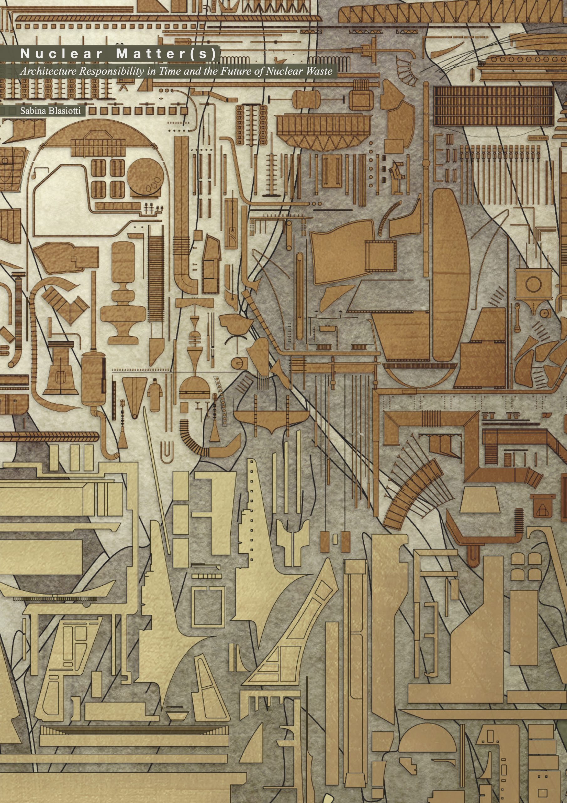
“Nuclear Matter(s), Architecture Responsibility in Time and the Future of Nuclear Waste” by Sabina Blasiotti. Front page for dissertation submitted to the Bartlett School of Architecture, 2020/2021.
The photomontage reminded me of a book I read a few years before, The Map that Changed the World, by Simon Winchester, which unfolds the story behind the first UK geological map, drawn by William Smith. If I remember correctly the book explained how William Smith for the first time in British history tried to spatialise his collection of fossils and his geological findings by coloring a map. At this point I knew that my answer was getting closer, as nuclear waste is inevitably and intimately connected to geology, not long after, the main idea behind Outlines of Nuclear Geography was born.
Once the main idea was formed, the physical process of drawing proceeded relatively smoothly. During my final year I made several 3D models of power plants and power plants components, I then drew a section from these models and distinguished the various modules according to their material. Similarly, the dissertation research fed the text annotations included in the drawing.
The biggest challenge in the physical process was perhaps to choose a color palette. While radioactivity itself is invisible, in the artistic world radioactive materials have often been depicted with flashy blues or greens. Initially I did in fact try to pursue the idea of a flashy green mountain, but this was without cause, as it didn’t have any connection to the research narrative. While radioactivity is invisible, abandoned nuclear waste is certainly prone to decay, and various chemicals used for the decontamination will themselves alter the materials’ appearance. Therefore, I tried to employ colors that would reflect the passage of time, chemicals and decay. This itself took dozens of variations before landing to the final palette, which I knew it was the right one when a critic in my project review said that the colors in my drawings reminded him of the colors used in the Chernobyl miniseries.
For your piece, why did you choose that specific illustration technique and format?
To summarize, as mentioned previously, the thesis research itself provided the hints to this specific illustration technique and format. The inclusion of annotations was essential in order to give a quick and clear access to important information and data collected during this research.

“Outlines of Nuclear Geography II, The Distribution of Nuclear Waste from Mihama Nuclear Power Plant in a Horizontal Direction Drawing” by Sabina Blasiotti.
Do you have any other architectural drawings as conceptual as this?
I do have one more, entitled Outlines of Nuclear Geography II, which straightforwardly recalls geological mapping. The two worked as a pair in my dissertation, one illustrating the distribution of nuclear waste in a vertical direction, and the other in a horizontal direction.
This second drawing was never as successful as the first one, perhaps because it appears to include less information and because it lost the ability to conceptually represent different times and scales, when I assigned it to a specific site, the Mihama Nuclear Power Plant in Japan.
Possibly, Outlines of Nuclear Geography would have not been the same without its counterpart. I often find that it is very helpful to simultaneously work on different drawings or designs so that my mind can benefit from some clearness when temporarily detaching itself from one idea, hoping into the next one and going back.
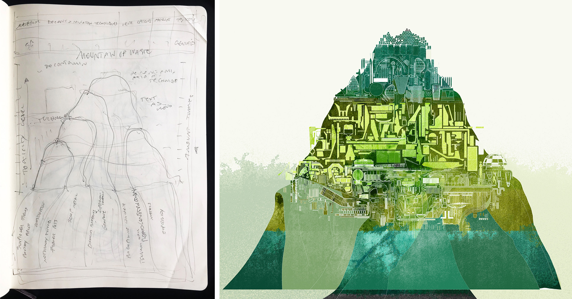
Study sketch for “Outlines of Nuclear Geography” by Sabina Blasiotti.
First draft of “Outlines of Nuclear Geography”, titled “A Fleshy Green Mountain” by Sabina Blasiotti.
How did the process and workflow of creating your drawing compare to traditional architectural drafting?
In the two processes we can find both parallels and dissimilarities. In traditional architectural drafting you respond to a brief, submitting your best design proposal. Similarly, this drawing was my best guess in front of a brief that I created for myself, in the architectural thesis. In architectural drafting, you’ll generally draft several options before arriving at the chosen one. Likewise, this drawing went through a number of iterations before reaching its present look.
Perhaps one dissimilarity is the drafting mean. While in architectural design we start drafting through plans, sections, axonometric etc., for this drawing there wasn’t a given medium that would best respond to the brief, so I had to find that first.
Certainly, in architectural drafting you are inclined to think spatially, while in conceptual drawings like this one you can think conceptually, in the first you can produce a set of drawings to represent the same design, in this one it’s one design combining several ideas. Not surprisingly, I think that drafting a conceptual drawing can take the same amount of time it would take to draft a building.
What one tip would you give other students looking to win next year’s One Drawing Challenge?
One first advice, but you probably heard this many times before, is to always ask! I remember the director of an animation company stating that the best animators in his office were the ones who asked a lot of questions. I started noticing whether this applied in my architecture school and indeed it does!
Asking other people’s opinion is always beneficial and I think is particularly beneficial for your drawing to submit for the One Drawing Challenge competition. In fact, this visual will need to tell a story to the viewer, and there isn’t a better way to test whether your story is being communicated successfully than directly asking a spectator. While you don’t necessarily need to agree on the other person’s opinion, it is important to start a conversation as it may lead you to key and unknown information and unexpected clues.
As second advice I’d like to encourage fellow students to develop and show their own language. I believe this is very important. When we succeed in creating our own language, instead of employing standardized ways of designing and drafting, inevitably we enrich the work with our own story and personality, ultimately succeeding in creating something unique.
A more practical suggestion on this would be to start by finding a feature that makes your work exclusive. This can be anything, from the way you format your drawing, to the kind of research you focus on, the materials you use etc. If you aren’t sure on what this could be and if you are quite self-conscious like me, you can always ask your friends’ or professors’ opinion. Personally, I was told that my color palette felt distinctive across my designs, as I liked that attribute, I then decided to make it a consistent and strong feature in my work.
Sign up to be informed when the next One Drawing Challenge competition opens for submissions. Be sure to check out the incredible work by this year’s extraordinary Winners and Commended Entries
The post This Atmospheric Elevation Drawing Explores the Architectural Potential for Recycling Nuclear Waste appeared first on Journal.
Pendleton ArtsBlock // Dake Wells Architecture
Project Status: BuiltYear: 2020Size: 25,000 sqft – 100,000 sqftBudget: 5M – 10M
Text description provided by the architects.
In 2014, the Housing Authority of Kansas City, Missouri obtained a federal grant to replace the 134-unit Chouteau Court Public Housing Project—a dilapidated series of structures anchoring a high-crime and low-hope neighborhood. As part of the Paseo Gateway Choice Neighborhood Transformation Plan, Pendleton ArtsBlock was envisioned as one of five new decentralized construction projects to replace the units that were demolished.
© Dake Wells Architecture
The 38-unit project includes six studios, 21 one-bedroom, and 11 two-bedroom apartments. The project reconsiders the concept of replacement housing and neighborhood catalyzation by including outreach to artists to be included in the tenant mix. The design team responded with a mix of unit types enclosed in a brick masonry block that plays into the material pallet of the neighborhood.
© Dake Wells Architecture
The residential units sit over a glass-wrapped, porous ground level of community and artist-occupied spaces designed to promote pedestrian interaction. The artist-occupied spaces are provided rent-free, helping to launch creative small businesses with a street-front presence on Independence Avenue. A large, divisible community room welcomes visitors on the ground floor and serves as a meeting place and community hub for the residents.
© Dake Wells Architecture
ArtsBlock was designed to specifically cater to the needs of the artist community. Each housing unit was designed to maximize daylight and flexibility to accommodate the specific needs of each artist. In addition to the large workshop and makerspace on the lower level, each floor is equipped with a shared utility room with artist resources in an effort to maximize square footage within each unit.
© Dake Wells Architecture
By sparking new life with multiple destinations on an important but under-performing street, ArtsBlock rethinks how a mixed-use typology with artists serving as change agents can provide dignity and a sense of pride for low-income residents while working to break a decades-old cycle of poverty. Through the redevelopment of the Chouteau Courts family public housing development, ArtsBlock works as a catalyst for the surrounding Paseo Gateway district by providing affordable housing and economic development, increased safety, and quality of life improvements to help transform an area of extreme poverty within Kansas City.
© Dake Wells Architecture
Throughout the design process, community members, stakeholders, and artists were actively engaged through public meetings, visioning workshops, focus groups, and one-on-one interviews. Resident surveys were conducted to understand resident’s needs in education, health, recreation, and economic resources. By implementing design strategies that address the specific needs of Chouteau Courts residents and the larger community, ArtsBlock has been successful in creating a safe, affordable, community-oriented, dignity-restoring housing complex that has sparked economic growth along Independence Avenue and in the Pendleton Heights neighborhood as a whole.
© Dake Wells Architecture
ArtsBlock is a sustainable, Enterprise Green Communities-certified building located on a blighted site that formerly housed a gas station. The project is largely designed to provide ample natural daylight and enhancing the human experience in an effort to encourage healing, restore dignity and promote a sense of community pride within an affordable housing complex..
© Dake Wells Architecture
Pendleton ArtsBlock Gallery
The post Pendleton ArtsBlock // Dake Wells Architecture appeared first on Journal.
Innovation Nation: Small Architecture Firms Can Now Enter the A+Awards for Less
This year, Architizer is striving to make the A+Awards — the world’s largest architectural awards program — more accessible for talented architects and design teams around the globe. One of the ways in which we’re doing this is to offer small firms — those with 1-10 members of staff — a special discount through October 29th, giving them an additional $50 off Early Bird pricing. If you fall into this category, we cordially invite you to apply for global recognition and international publication through the A+Awards program this year. To get started, hit the blue button below to log in to the Entry Portal, and make sure to enter the coupon code APLUSSMALL at check out to receive your discount:
Enter the A+Awards [Discount Code: APLUSSMALL]
Small firms matter to the architecture industry. According to the data, more than 80% of American architecture firms employ less than 10 members of staff, and, according to the AIA, the number of firms in this category is increasing all the time. The average firm size has declined in the past decade, driven by opposing factors: Economic challenges have led to many mid-sized firms downsizing, while there has been a proliferation of smaller firms run by young, tech-savvy architects seeking greater autonomy and flexibility.
And yet, despite their diminutive size, these firms have a dramatically outsized impact on the creative and technical progression of the profession. For evidence, one need look no further than the extraordinary work submitted for last year’s A+Firm Awards in the “Best Small Firm” category, ultimately won by Shulin Architectural Design of China with Finalist spots for Faulkner Architects, META-Project, Cherem Arquitectos and He Wei Studio/3andwich Design.
Among the submitting firms — the Best Small Firm Award was one of the most popular in last season’s program — a total of 18 architectural practices were recognized as either a Winner, a Finalist or a Special Mention, granting them a permanent spot in the iconic A+Awards Winners’ Gallery

Works by last season’s A+Awards Best Small Firms, clockwise from top left: Shulin Architectural Design, Cherem Arquitectos, META-Project and Faulkner Architects
The submitted works by these firms oozed with innovation, exhibiting a creative courage that belied the size of the design teams that brought them to life. In fact, it’s arguable that their size puts them in a unique position to pioneer new ideas in a way that is simply not possible for many internationally renowned, corporate firms. Freed from the administrative shackles associated with much larger firms, these architectural thinkers and makers are able to forge new paths, experimenting with new materials and conceptualizing details that are uniquely adapted to meet the needs of their clients.
On the flip side, it’s hard to be small. Firms with less resources often have to deliver built projects without the safety net of having dozens of other big projects on the go, something larger firms can do to reduce financial risk and manage their cashflow. The economic facts are sobering: According to Architectural Record, half of small architecture firms fail after five years, and 70 percent are closed by year 10. For those that do make it, the challenge to remain relevant, sustainable and resilient enough to withstand wider challenges (COVID anyone?) remains a constant.
Despite and perhaps because of these hurdles, the work of small architecture practices demands our attention. Time and time again, it is the smallest firms that submit the most, thought-provoking, precedent-setting, avant-garde projects in the A+Awards each year. These projects are what the program is all about — celebrating architecture at the cutting edge of the profession, highlighting buildings and designers that others can look to for inspiration in the decades to come.
For this reason, we encourage architects from small firms to enter their work for this special anniversary edition of the program, and help set the benchmark for the industry. We invite you to apply for both the “Best Small Firm” category, an integral part of the A+Awards this year, and any number of the individual Project Categories — hit the blue button below to access the Entry Portal and get started:
Start Submission [Discount Code: APLUSSMALL]
Note: The special discount code can be applied for up to 3 submissions through October 29th, and will reduce the price of each submission by $50. This coupon is eligible for entrants from firms of 10 staff or less only. Good luck from all of us at Architizer, and if you have any questions, please don’t hesitate to reach out to us at [email protected]!
Top image: Lookout House by Faulkner Architects, 2021 A+Firm Awards Finalist in the Best Small Firm category.
The post Innovation Nation: Small Architecture Firms Can Now Enter the A+Awards for Less appeared first on Journal.
Modern Architecture
Modern architecture is one of the most recognizable forms of modern architecture. It is characterized by skyscrapers, concrete walls, and flat roofs. Modern architecture, or modernism, was an artistic architectural movement or architectural practice based on the new and innovative technology of building, specifically steel, glass, and aluminum. The modernists hoped that these new materials would help eliminate or reduce traditional wood and brick. This movement came into effect in the late 1890s.
Throughout the history of modern architecture, there have been several different designers, architects, and developers. Often the design aesthetic would be dictated by a desire for efficiency. Thus, the layouts would be smaller but more efficient and would use the most available materials. Other times, there was a loss of design flair, and more emphasis was placed upon building functionality. The result was often a more generic appearance. The result was generally not very appealing, so the modern architecture is sometimes described as sterile and boring.
The style that is recognized today as modern architecture was born out of the need for space and innovation. A lack of space in previous buildings meant that the designs had to be smaller and more streamlined. Aesthetics also became more important with the creation of spaces such as parks and museums. While the styles and concepts of contemporary architecture and modern homes are similar, they differ greatly in a few aspects. Contemporary homes are usually energy-efficient, while modern architecture tends toward building more mass-producing structures. The former is more focused on making a building stand the test of time, while the latter tends toward a constant state of change.
The focus on efficiency is not a new occurrence. In fact, it was present in the works of architects like Louis Sullivan, Sr., and John Van Groningen. Modern homes are built to last longer than ever before. New advancements in modern architecture design aesthetics allow modern homeowners to create an aesthetic that will survive and thrive for years to come.
As previously stated, the purpose of modern architecture is to make sure that a building can live up to its full potential. One key element to modern architecture design is the focus on space. This means that modern homes are designed with efficient floor plans. Each room is designed to work as efficiently as possible, which leads to a very high level of productivity. This is in stark contrast to traditional designs that often neglect function and instead concentrate on form.
The focus on productivity does not end at the workplace, though. Most modern homes will also be designed to provide the best comfort level for the homeowners and family members who will be living inside them. This is because modern architecture makes use of the most efficient methods of heating and cooling. Energy efficiency has become a priority in modern homes because the rising energy cost makes it a vital necessity. The result of this is that modern homeowners will be more conscious about what they spend on heating and cooling their homes and are generally more careful about how much they spend on utilities.
Another aspect of modern home construction that focuses on efficiency is the emphasis on building durable and long-lasting materials. Many modern homebuyers believe that building a home that lasts will ultimately lead to more long-term savings. This holds when the modern home is designed to function well in all areas of society. This includes heating and cooling, plumbing, ventilation, and many other aspects of everyday life.
For anyone interested in the future of modern architecture, the first step is to get in touch with an architect who can help you design your dream home. An architect can look over your home and make recommendations about what types of buildings you should be looking at, as well as what kind of style you should be going for. Architects will usually give you ideas about the best way to incorporate technology into your modern home. They will work closely with you throughout the entire construction process to be completely happy with your modern home. A good modern architect will also recommend various contractors and remodeling services that would best suit your needs.