Home » Architecture Services
Category Archives: Architecture Services
Shenzhen Longhua District Science and Education Institute affiliated experimental school // CAPOL INTERNATIONAL & ASSOCIATES GROUP
Project Status: BuiltYear: 2020Size: 500,000 sqft – 1,000,000 sqft
Text description provided by the architects.
Shenzhen Longhua district Science and education institute affiliated school project is located in Longhua District, Shenzhen. The project area is 2,039.93 ㎡, with a total construction area of about 48,000 ㎡, a height of 24m, 5 floors above ground, and 1 underground floor. It is a nine-year school with 45 classes, offering about 2,100 degrees.
In terms of functional setting, the campus is centered on the resource center centrally arranged on the east side, connecting teaching areas, sports fields, and dormitory areas.
© CAPOL INTERNATIONAL & ASSOCIATES GROUP
© CAPOL INTERNATIONAL & ASSOCIATES GROUP
Different spaces are connected in series and interact with each other, thus breaking the traditional corridor-style cross-sectional spatial relationship. The teaching area adopts a single corridor layout, which is efficient and practical; other teaching auxiliary rooms adopt a more flexible layout, with free circulation and interesting experience. Dislocation between the platform and the room to create more public spaces.
© CAPOL INTERNATIONAL & ASSOCIATES GROUP
© CAPOL INTERNATIONAL & ASSOCIATES GROUP
The plan creates a complex and efficient campus space.
The resource center near the playground is designed into a form of stepping back,creating an interesting facade on the side of the sports field. According to the timeline of school users, the stepped area has analyzed and sorted out the story line of the resource center, forming a rich spatial form; the boundary layer changes, echoing each other, lush plants are planted on the edge of the platforms.
© CAPOL INTERNATIONAL & ASSOCIATES GROUP
© CAPOL INTERNATIONAL & ASSOCIATES GROUP
East facade creates the image of an ecological and green natural academy.
On the side of Meilong Road, main road of city, is the west facade, which is also the main image. Adopting the prefabricated architectural design, using simple and clean lattice language, several large holes are selectively “cut out” in the neat facade, which becomes the window to view the city, creating a colorful activity space for students.
© CAPOL INTERNATIONAL & ASSOCIATES GROUP
© CAPOL INTERNATIONAL & ASSOCIATES GROUP
It also solves the problem of rigid facade image caused by lattice structure..
© CAPOL INTERNATIONAL & ASSOCIATES GROUP
© CAPOL INTERNATIONAL & ASSOCIATES GROUP
Shenzhen Longhua District Science and Education Institute affiliated experimental school Gallery
The post Shenzhen Longhua District Science and Education Institute affiliated experimental school // CAPOL INTERNATIONAL & ASSOCIATES GROUP appeared first on Journal.
Did you miss our previous article…
https://thrivingvancouver.com/?p=1126
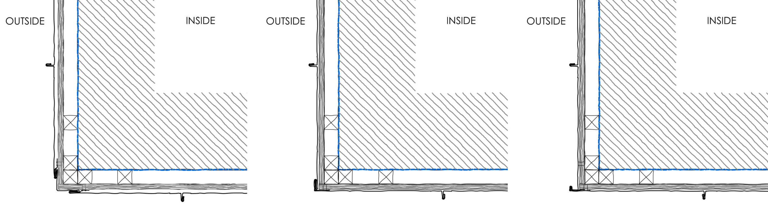
Technical Details: An Architect’s Guide to Hidden Gutters and Building Corners
Emma Walshaw is the founder of First In Architecture and The Detail Library, and has written a number of books aiming to facilitate a better understanding of construction and detailing. Contributions by Aida Rodriguez-Vega, architect and researcher at the Detail Library.
It is becoming increasingly popular to create a solid building volume by using cladding materials for both the roof and the façades. When doing so, a key junction to consider is the eaves — that is, where the wall meets the roof. Traditionally this would have an overhang and gutters. To avoid the common look of visible gutters (as an addition to a building rather than a thought through design element), hidden gutters are becoming an integral part of architectural design. Hidden gutters, if detailed correctly, can be extremely functional.
When using cladding materials across the entire building, another important junction are the corners of the building. Depending on the material chosen, location, use of the building, a detail should be chosen which is robust, weather tight and frames the entire building. This article offers key insights into detailing hidden gutters and buildings corners in a variety of materials, including timber, zinc and tile.
Four Key Design Considerations When Detailing Hidden Gutters:

1. Roof Pitch
The angle at which the roof pitch is designed is key in deciding if a hidden gutter is suitable. Too steep and the rain can struggle to run off into gutters, too shallow and some materials may not help drain water into gutters.
2. Roof Drainage Calculation
The size and number of rainwater downpipes required will depend on a number of factors. It is key to undertake a rainwater calculation on your roof before designing hidden gutters. Most manufacturers provide this service. The calculation is based on the area of the roof, slope, materiality, location, safety factor and BS EN12056:2000 requirements amongst possible others.
With this information the flow rate of roof, diameter and frequency required for the outlets can be calculated.
3. What to Do With the Downpipe?
Once a hidden gutter has been detailed, there are three main was of detailing any downpipes required.
I. Adding a visible hopper and downpipe to the façade.
II. Integrating a downpipe into the cladding zone so that it is outside but not visible externally.
III. Integrating the downpipe internally.
4. Access to Downpipes
It is very important, especially in option 2 and 3 that the downpipe has suitable access for maintenance, including leaf clearing and possible leaks. For internal pipework, it is especially necessary to consider thermal bridging, sounds transfer and that more internal space will be used up with the boxing out of pipework.
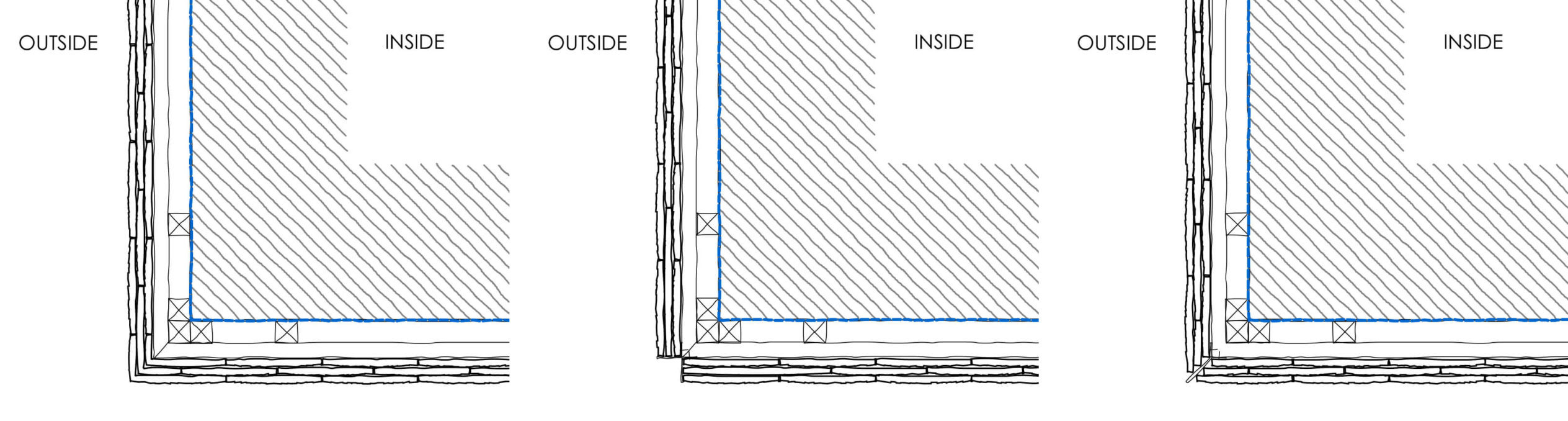
Detailing Timber Corners
The most important design considerations when detailing timber corners is that there are enough support battens for the cladding, as well as leaving movement joints throughout the cladding and corners to allow for movement. Timber cladding should always have continuous ventilation gap behind to prevent moisture buildup.

There are a huge range of timber corner details that can either be bought pre-formed or cut to size on site. Additionally, other timber sections can be used such as solid timber corners, which create a more framed and robust edge.
Detailing Hidden Gutters in Timber Cladding
Due to the versatility of timber and ease of adaptability on site, timber cladding can be one of the easiest façades to use when integrating hidden gutters. Within timber cladding, downpipes can be designed externally and internally. It is also relatively easy to design downpipes into the cladding zone, just as making an area of timber cladding removable is an easy way to allow for maintenance of the down pipe.
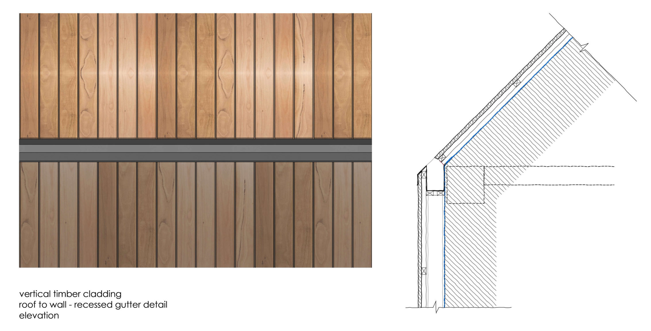
Depending on how much flashing you want visible and how robust you require the detail to be, there are a number of options when detailing timber cladding and hidden gutters. For a more robust option, a bespoke gutter can be installed with the suitable dimensions according to the drainage needed. This should have continuous flashing with a drip detail which drapes over the façade timber cladding. Breather membranes should always be draped into the gutter to allow for any water infiltration into the cavity to drain away from the building.
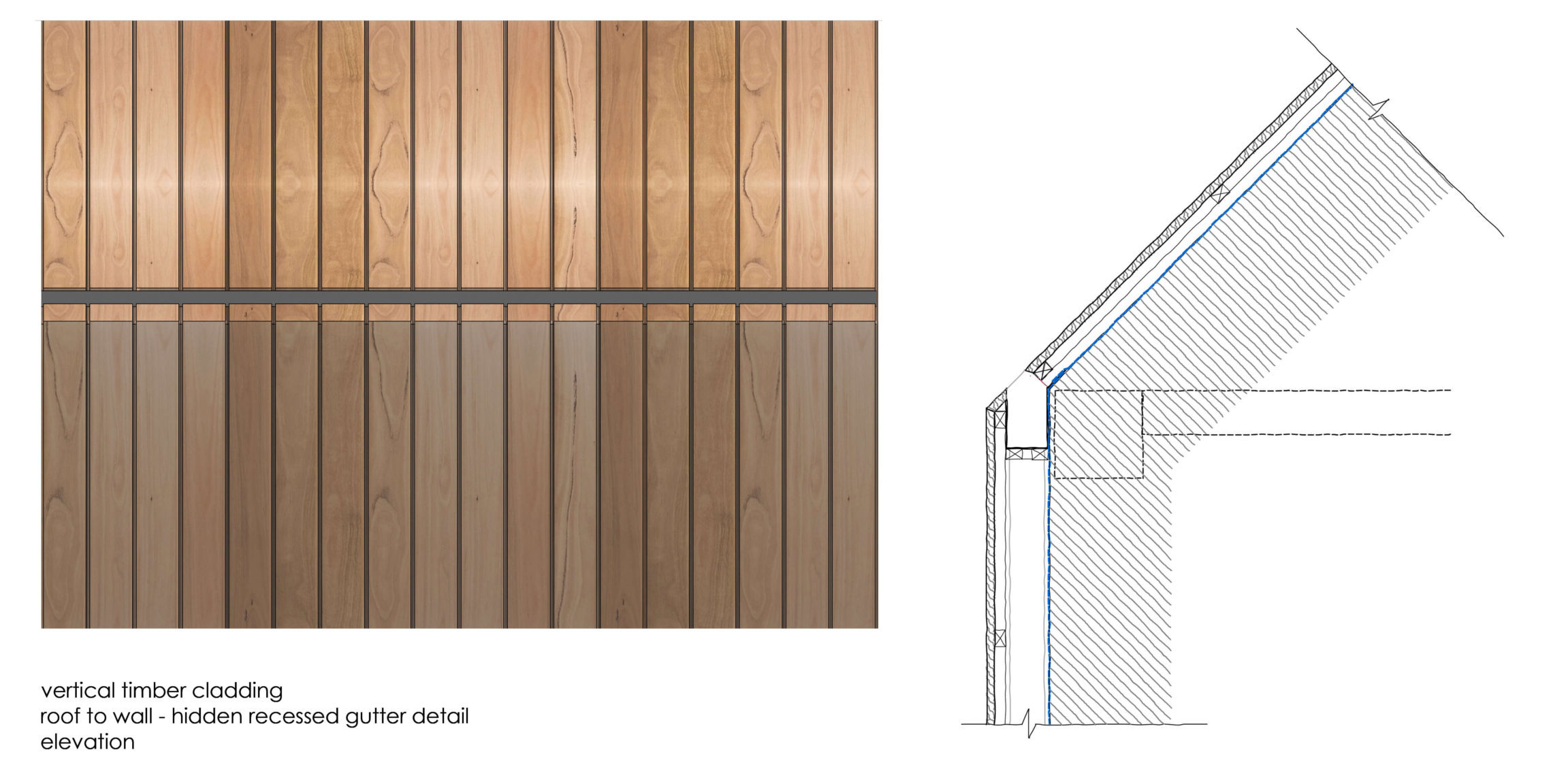
A less robust option is to clad timber over the gutter. The junction between the gutter and timber can be weak and it is therefore key to seal the junction in accordance with the roofing / cladding manufacturers’ recommendations.
Detailing Zinc Corners
When detailing vertical and horizontal standing seam zinc panels, there are a huge range of corner options to choose from. An important consideration when picking the corner design is the proximity to people passing.
If the corner is in an area of high foot traffic, it is desirable to have a folded option so that it is not affected by any knocks from people walking past. If the corner is away from where people have access, a more decorative option can be selected to enhance the edge of the building. It is also important to consider how this corner detail will work with the window surrounds and general standing seam details.
Detailing Hidden Gutters in Zinc Cladding
Most zinc manufacturers can provide generic details for hidden gutters and even calculate the roof drainage requirements. The width, depth and slope of gutters will vary from project to project depending on circumstance such as location and roof pitch.
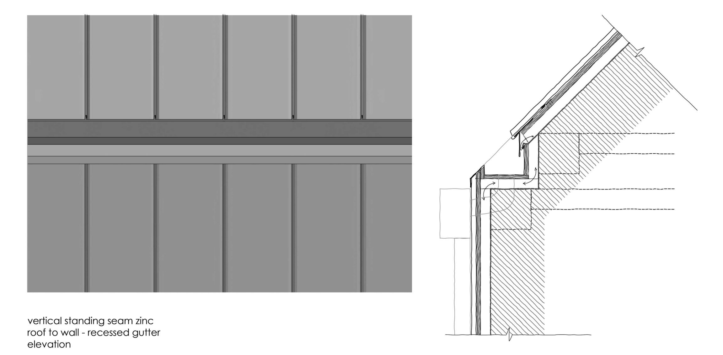
A key considerations when detailing zinc hidden gutters is maintaining the ventilation throughout — from the base of the cladding to the highest most point. Zinc cladding is normally built over a plywood base and requires ventilation behind. As the gutter and cladding are made from the same material, zinc creates excellent continuity between façade and roof.
Detailing Clay Tile Corners
If detailed correctly, corners to clay tiled buildings can be very elegant. There are a number of options for corners, including using a solid timber corner. Options such as bespoke corner tiles, or painted galvanized steel 45° and 90° angles are more popular options.
Galvanized steel can be factory painted to match the clay tiles and window surrounds and provide a robust corner to set out the tiles from and avoid the edges becoming damaged.
Detailing Hidden Gutters in Clay Tiled Cladding
It is harder to adapt clay tiles to hidden gutters due to the difficulty in cutting clay and need for flashing. There are a number of options when detailing clay tile cladding and hidden gutters depending on how much flashing you want visible and how robust you require the detail to be.
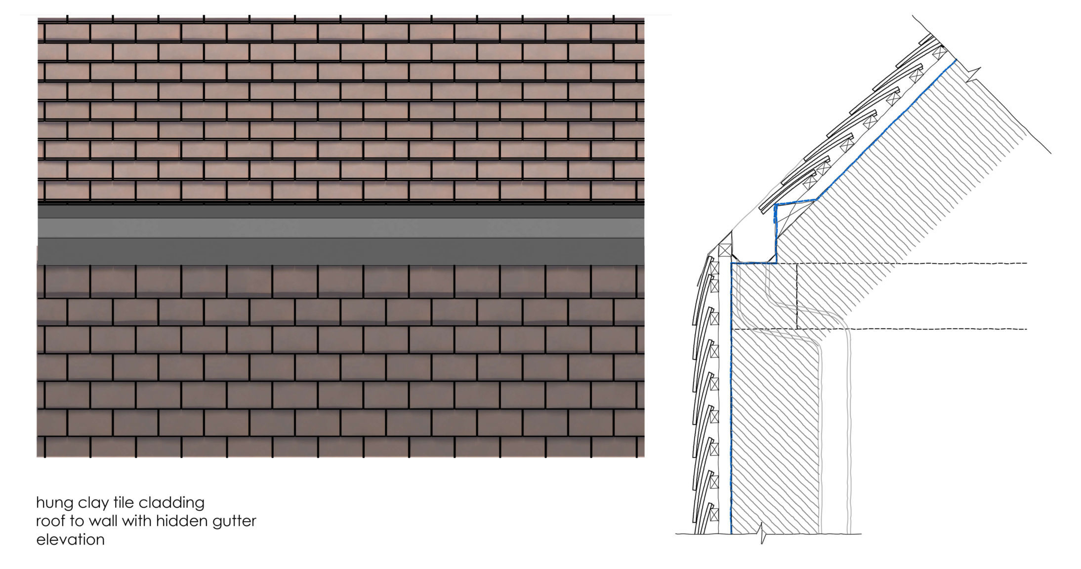
It is not recommended to take rainwater pipes internally due to the need for suitable thermal and sound insulation whilst creating access for regular maintenance. If this option is chosen, care must be taken so that pipes do not clash with structure whilst maintaining an adequate slope to allow water to drain properly.
Resources
If you want more inspiration on hidden gutters, styles and applications, be sure to follow Detail Library on Pinterest where we have hundreds of modern hidden gutters and rainwater, and roof ideas!
There are plenty of resources to help in choosing and how to detail hidden and visible gutters for each specific project. Below is a small selection of links.
https://detail-library.co.uk/september-2021-new-details/
https://www.dreadnought-tiles.co.uk/Vertical-Tiling-Details
Get your work published internationally this year through the 10th Annual A+Awards! The Final Entry Deadline is January 28, 2022. Click here to start your entry today.
The post Technical Details: An Architect’s Guide to Hidden Gutters and Building Corners appeared first on Journal.
Three Taverns Imaginarium // Square Feet Studio
Project Status: BuiltYear: 2020Size: 5000 sqft – 10,000 sqft
Text description provided by the architects.
An old-world cabinet of curiosities meets a modern working brewery: this project is all about escaping into the mind of our client, a creative brewmaster. Our shared philosophy was to feature the beer-making process in a theatrical way, and to create a space that encourages visitors to be curious and embrace new and sometimes unusual styles of beer.
© Square Feet Studio
© Square Feet Studio
Located in an historic adaptive reuse development, the volume of the space our client selected was perfect for the requisite large stainless steel brewing tanks. Our biggest challenge was working with the small but tall footprint to accommodate our client’s desire to maximize guest seating. So, we designed a mezzanine that allows for the complete beer-making process to be viewed from a variety of vantage points.
© Square Feet Studio
© Square Feet Studio
Upon entry, a series of repurposed factory windows delineate the tasting room and draw the curtain back on the production area like a performing arts stage. Rows of polished tanks are arranged below a custom golden mural which artfully hints of the molecular science behind beer-making. Like Alice heading down the rabbit hole, gleaming high gloss blue paneling throughout harkens to old railway carriages, capable of transporting you to another place and time.
© Square Feet Studio
© Square Feet Studio
Following upstairs along a tactile, leather-wrapped handrail, the upper level is tucked beneath the structure of the old building where we created a lounge dotted with intimate seating and glowing lighting. Similar to a theatre mezzanine, here guests can appreciate the art of brewing from above as they peer into the production area.
© Square Feet Studio
© Square Feet Studio
We designed a smaller scale bar upstairs as a true cabinet of curiosities, complete with apothecary paraphernalia and monk figurines, a nod to the Trappist beermasters of Europe. Custom wallpaper features the brightly colored fruits and herbs used to make the flavorful beers produced in the brewery..
© Square Feet Studio
© Square Feet Studio
Three Taverns Imaginarium Gallery
The post Three Taverns Imaginarium // Square Feet Studio appeared first on Journal.
Did you miss our previous article…
https://thrivingvancouver.com/?p=1006
The New St. Pete Pier // ROGERS PARTNERS Architects+Urban Designers
Project Status: ConceptSize: 100,000 sqft – 300,000 sqftBudget: 10M – 50M
Text description provided by the architects.
The vision for a new St. Petersburg pier creates a destination that embraces the pier’s role both as an icon for the City of St. Petersburg and an integral part of the vitality of downtown – a place for tourists and the local community alike, one that honors its history, while establishing a new icon for a 21st century public place.The New St.
© ROGERS PARTNERS Architects+Urban Designers
© ROGERS PARTNERS Architects+Urban Designers
Pete Pier is a 13-acre armature of rich, local and destination-based programming adaptable over time as recreation and quality of life grow and change with generations. Activities are diversified through flexible planning and programming that elevates and establishes a sustainable relationship between the natural and built environments. A variety of unique spaces enable active and passive connections to the bay: a coastal thicket, wet classroom, water lounge, tilted lawn, and places for dining, fishing, kayaking, boating and swimming.
© ROGERS PARTNERS Architects+Urban Designers
© ROGERS PARTNERS Architects+Urban Designers
A water lounge at the end of the pier – a floating dock with a porous bottom that allows in a small pool of bay water – becomes a place for people to dip their feet and kids to safely splash around. The breakwater calms the water and creates more suitable environments for marine animals and plant life.
© ROGERS PARTNERS Architects+Urban Designers
© ROGERS PARTNERS Architects+Urban Designers
The one-acre coastal thicket offers opportunities for new microecologies, created as part of the pier’s educational center, which includes 300 linear feet of new, artificial reef. Hydrodynamic modeling will allow for the production of calmed water and a naturalized beach frontage, enhancing both recreational use and seagrass habitats.The design reconnects the pier to the daily life of downtown St.
© ROGERS PARTNERS Architects+Urban Designers
© ROGERS PARTNERS Architects+Urban Designers
Petersburg, tying into transportation and recreation systems such as bike paths, jogging trails, parking locations, and public transit systems. It also overlays new transport options such as the Looper Trolley and a potential high-speed ferry. .
© ROGERS PARTNERS Architects+Urban Designers
© ROGERS PARTNERS Architects+Urban Designers
The New St. Pete Pier Gallery
The post The New St. Pete Pier // ROGERS PARTNERS Architects+Urban Designers appeared first on Journal.
Did you miss our previous article…
https://thrivingvancouver.com/?p=997
Reader’s Choice: The 10 Most Popular Architecture Projects On Architizer in 2021
Architects: Want to have your project featured? Showcase your work through Architizer and sign up for our inspirational newsletter.
Architizer’s journal is fueled by the creative energy of the thousands of architects from around the world who upload their stunning work throughout the year. From conceptual designs to projects under construction to completed buildings, we are proud to serve as a platform for showcasing global architectural talent and the brilliance of visualizers, engineers, manufacturers, and photographers who are crucial members of the industry. A stellar drawing, rendering or photo, as well as a detailed project description, can go a long way in making a project stand out, as does tagging the stellar contributors on a project.
Firms who upload to Architizer share their work with professionals and design enthusiasts through our Firm Directory and Projects database. They also gain exposure by having their projects shared on our FacebookInstagram, and Twitter pages, as well as in our Journal feature articles. Indeed, through these various channels, hundreds of thousands of people in the global design community have come to rely on Architizer as their architectural reference and source of inspiration. As 2021 draws to a close, we’ve rounded up our database’s top 10 most-viewed, user-uploaded architecture projects:
1. Harbour Plaza Residences
architects–Alliance, Toronto, Canada


Harbour Plaza is a ‘vertical community’ aimed at transforming a former business district — a dead zone after dusk — into community for 9,000 residents, workers and visitors. A four-storey mixed use podium supports the elegant residential towers, whose bright white skin of pierced aluminum echos the rippling reflection of sunlight on the nearby Lake Ontario.
The façade’s woven texture can also be read symbolically, expressing the interrelationship between social, cultural, professional and recreational activity promoted by the development.
2. Beaver Lake Kiosks
perraultarchitecture (atelier urban face), Montreal, Canada

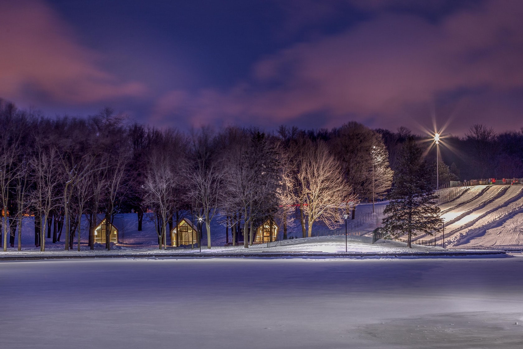
Mount Royal Park is to Montreal what Central Park is to New York. What is more, both were designed by Frederick Olmsted in the late 19th century. Fast forward to today, and 3 new kiosks at the Beaver Lake are reinvigorating the beloved Canadian green space.
Nestled in a glade on the top of the urban mountain, the trio imbues the natural surroundings with a poetic air. Their expressively slanted forms seemingly respond the elements, as if gusts of wind were pushing their volumes. Glazing at their front and rear ends transform the structures into glowing beacons that guide late night skaters and tubers in the dark.
3. Nancy and Rich Kinder Museum Building – Museum of Fine Arts Houston
By Steven Holl Architects, L’Observatoire International, Kendall/Heaton Associates, Houston, TX
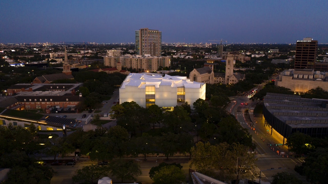
The new Nancy and Rich Kinder building stands as the central showpiece in the Museum of Fine Arts Houston campus redevelopment. The iconic structure is the final addition to the diverse portfolio of buildings on the Fayez S. Sarofim campus at the heart of Houston’s museum district.
The lighting concept for the new 164,000 square foot museum was carefully curated not to overpower this cultural district with its large scale. Its glass facade offers a muted backdrop for the lush green live oak trees of the museum grounds during the day, and softly glows as a lantern beacon at night.
4. Îlot Balmoral
Provencher_Roy, Montreal, Canada


This vibrant icon acts as a visual anchor for the pedestrians who wander through Montréal’s Quartier des spectacles — a favorite festival destination and the cultural heart of the vibrant northern city. The structure actually consists of two volumes, which are at once physically connected and visually separated by an emphatic, oblique fault line.
This divide is highlighted by large-scaled, bright red facets, which fold outwards and are oriented diagonally to the urban grid. This full-height atrium also invites light to deeply pierce into the building’s interior, revealing the zigzagging walkways that bridge the two volumes.
5. Phoenix Pavilion
Jiangzuo Studio of Huazhong University of Science and Technology, Gao Xin Da Dao, China
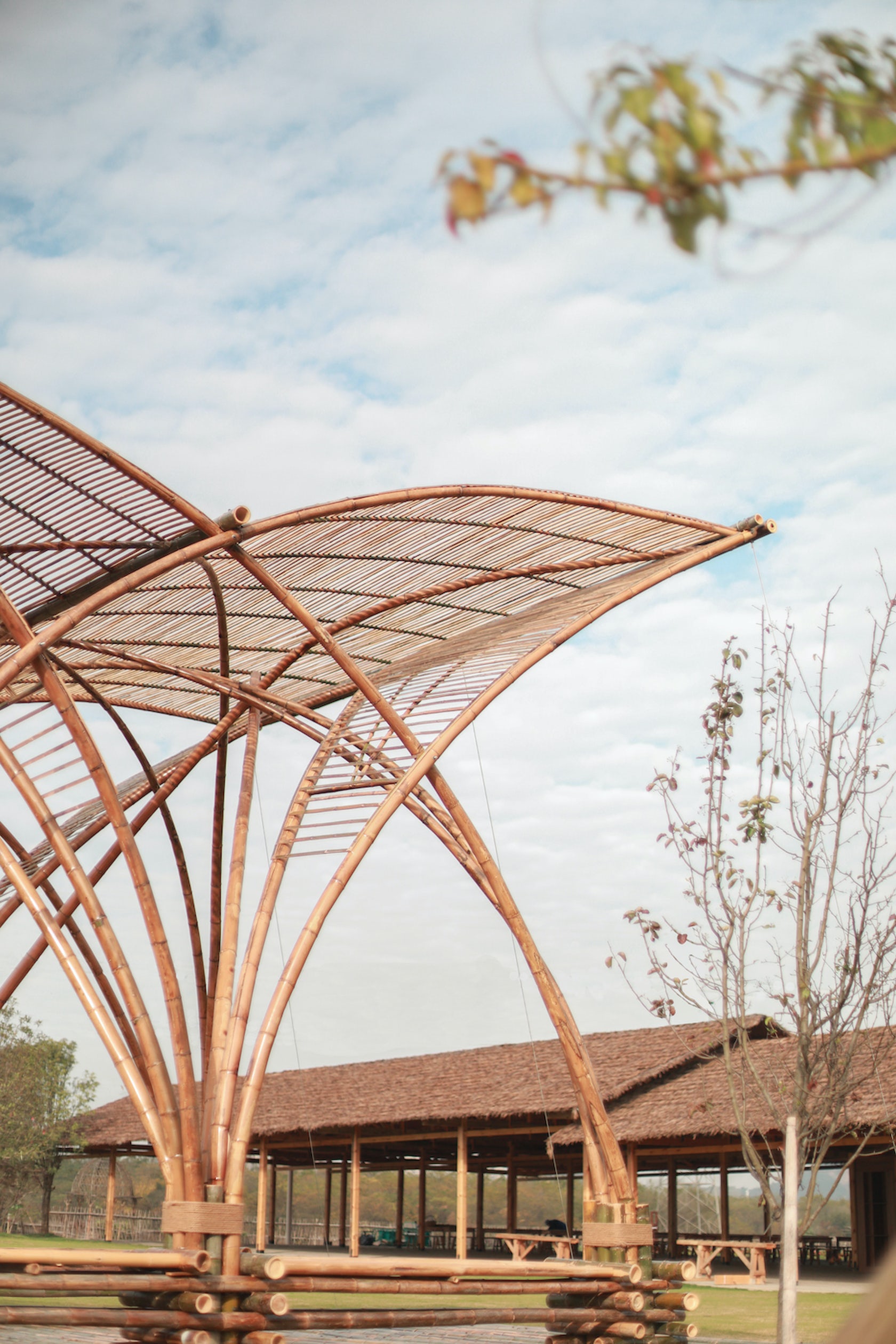
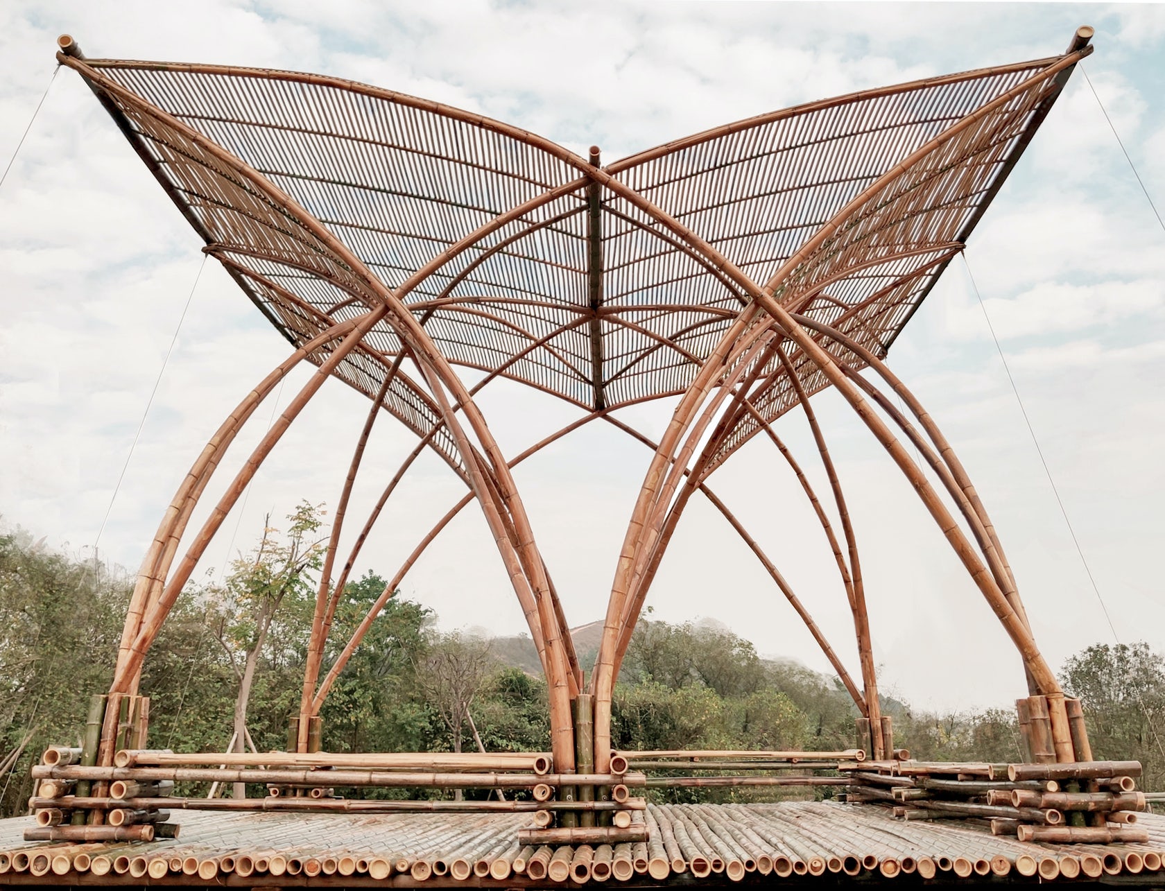
Sited on what was once a large refuse landfill, this pavilion marks the area’s transformation into an outdoor education place for students after its ecological restoration. Fittingly, the design of the Phoenix Pavilion articulates the intersection of three different lines of investigation: sustainable construction, heritage context and modern technology.
Bamboo grows abundantly in the area and it was thus used as the main built material. Exploring the possibilities of hot bending techniques, the large-span arch structure expresses the materials pliability and strength. Open and elegant, the pavilion takes the form of a phoenix spreading its wings in an allusion to traditional Chinese structures.
6. YAO Concept Restaurant
AAN Architests, Shenzhen, China
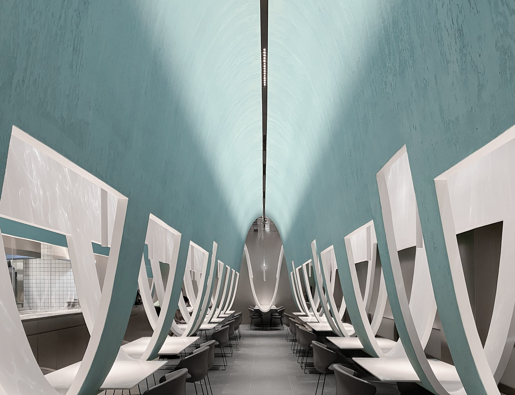
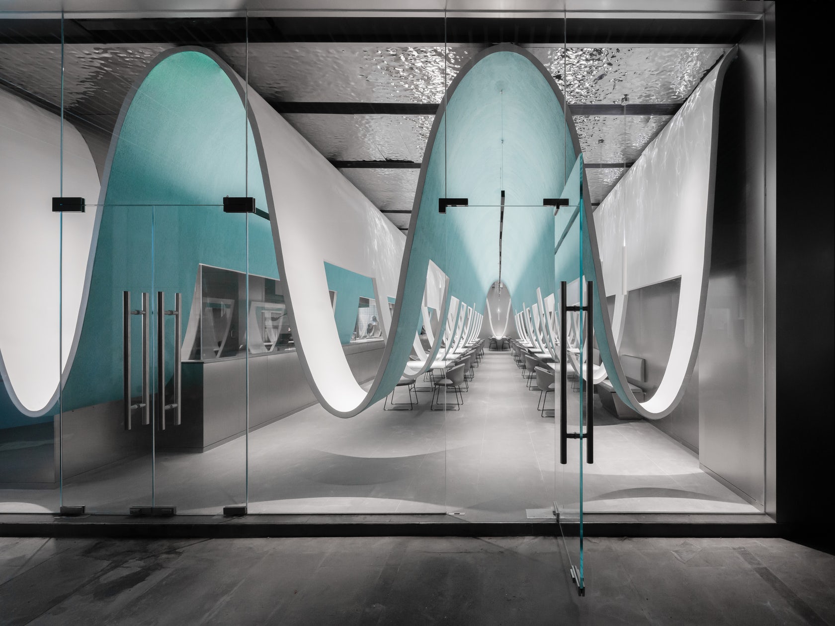
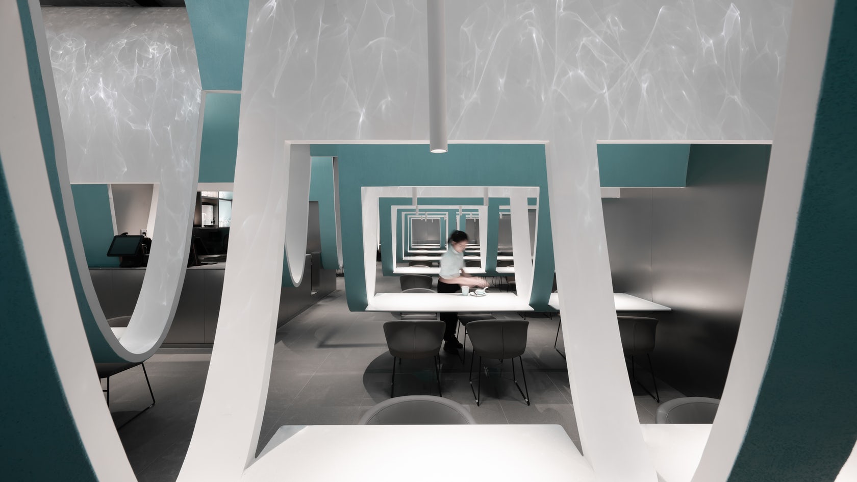
While interior architects are constantly advancing the spatial experience of hospitality interiors, tables and chairs are basic standards for most restaurants. This Chinese restaurant meditates on the expectation that diners eat at separately spaced tables. Curved partitions swoop down from the ceiling, simultaneously uniting and separating the various tables. The result is a net-like landscape which entangles hungry visitors and holding them together apart.
7. Cultural Center of Beicheng Central Park
Shenzhen HuaHui Design, Hefei, China

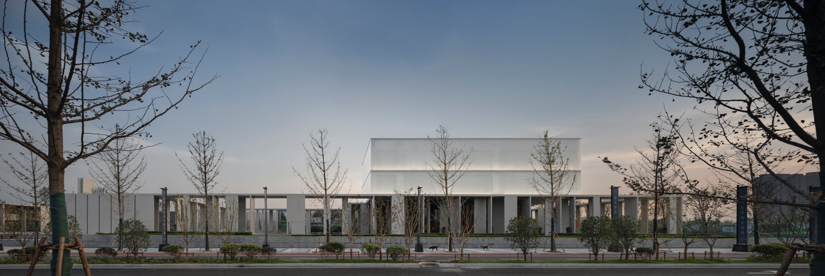
This cultural and educational facility reimagines the powerful tradition of the Chinese courtyard. Wall and corridor serves as interface for the courtyard, redefining the architectural space through a combination of different forms and modules that create rhythms of opened and closed space.
8. The Bicycle Garage
Tengbom, Uppsala, Sweden
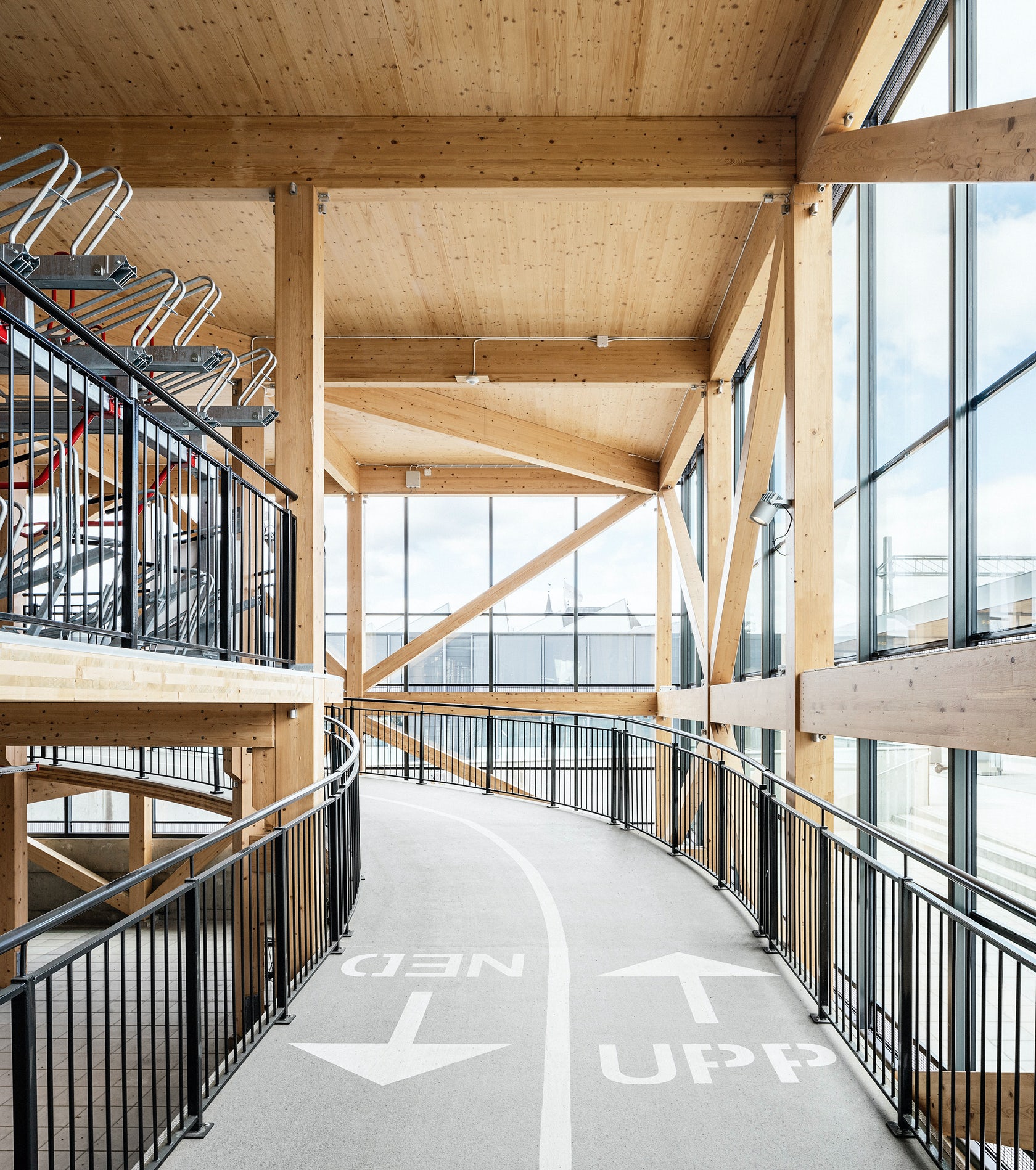
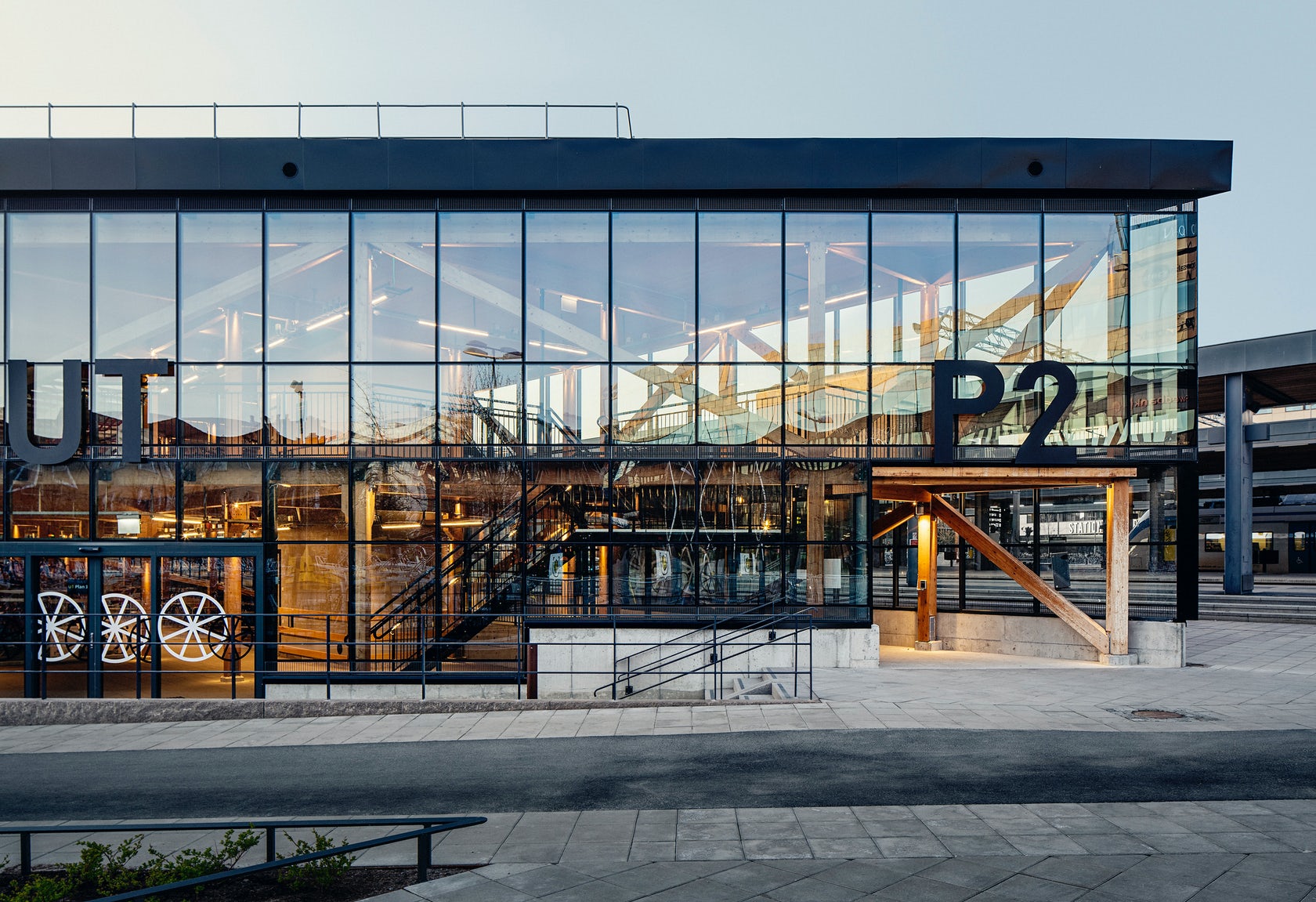
Located next to the platforms of Uppsala Central Station, this bicycle garage is both a symbol and an attestation of the city’s action-oriented sustainability ambitions. The building is a practical functionality piece of infrastructure, but at the same time, it powerfully represents a strong design concept. Two floors hold 1, 200 bicycles at once; they are connected by a wooden bike ramp which melds into the building’s exposed wood skeleton. Clad in glass façades with black steel moulding, the handsome building greets commuters at the platform of the city’s central railway station.
9. A Surfer’s House
Christiana Karagiorgi Architects, Peyia, Cyprus

This design ingeniously moves beyond the binaries of inside/outside to explore what it means to live in between indoor and outdoor space. Natural materials and claddings — including movable screens made of reeds — enclose exterior spaces, transforming the structure into a light and almost transparent cubical volume that overlooks the sea.
The building’s ground imprint is minimized in order to preserve the local microclimate and natural flora, while the timber slats visually elide the distance between the natural and built environments. The Akamas Peninsula is carpeted with plants and rocky fields. The house embraces both, inviting them to rest amongst the living spaces.
10. The Wall House
Guedes Cruz Architects, Lisbon, Portugal


Concrete, glass and wood form a protective but open barrier that cocoons the patio of this remarkable home. Privacy was less of a concern than the harsh Atlantic winds. To this end, extensive glazing opens the house to scenic sea views, which are visible from both interior and exterior spaces. The tour de force are two stacked, exterior pools that crisscross over one another on the patio — one in the ground and the other floating in the air.
Bonus: Toyath Residence
Webber + Studio, Architects, Austin, TX
Infrastructural issues, size constraints and stylistic inconsistencies plagued this twice-renovated Freedman’s cottage in Austin’s historic Clarksville neighborhood. Although it may be a common challenge, preservation is an art form, and this intervention is a masterclass in balancing modern updates and expansion with sensitivity to historic value. This project responds by reimagining the home as a series of smooth and luminous interconnected spaces that culminate a spacious, modern addition at the rear.
Architects: Want to have your project featured? Showcase your work through Architizer and sign up for our inspirational newsletter.
The post Reader’s Choice: The 10 Most Popular Architecture Projects On Architizer in 2021 appeared first on Journal.
Architizer Gift Guide: 12 Perfect Presents for Architects and Designers
Architizer Journal is reader-supported. When you buy through Amazon links on our site, we may earn an affiliate commission. Learn more.
Here at Architizer, we know picking presents can be hard work, especially when the person you’re choosing for has very specific taste — I’m looking at you architects! So this year we’ve put together a handy list full of gift ideas that are sure to please any of your architecture enthusiast friends, family or colleagues. From books to office supplies to whimsical surprises, we have you covered. Without further ado, here’s our list of thirteen perfect gifts for architects and designers, in no particular order:
Moleskine Pen+ Ellipse Smart Writing Set Pen & Smart Notebook
Moleskin, but not as you know it. The staple of every architect’s arsenal has moved into the 21st century. Note-taking has gone digital. Ideas can now translate off-page and evolve on screen with the new generation Moleskine Paper Tablet, Pen+ and companion app. For the analog architect that embraces the traditional pen to paper but works in the electronic era. NCoded technology embedded within each page of the Paper Tablet allows the Pen+ to record each pen stroke as you capture your thoughts, sketches, designs and doodles.
Learn more and buy >

Ember Temperature Control Smart Mug 2
Ember has revolutionized the way people eat and drink. Founded by inventor and serial entrepreneur Clay Alexander, Ember creates, designs and develops temperature-controlled products that provide complete customization. Never again will you need to reheat your coffee — or accept it’s now an iced latte. Smart Mug 2 is the latest in the product line and the award-winning mug and coaster allow you to keep any drink perfectly hot for up to 80 minutes at a chosen temperature. Its sleek design and beautiful matt finish ceramic coating make it a perfect addition to any desk.
Learn more and buy >

Race and Modern Architecture: A Critical History from the Enlightenment to the Present Edited by Irene Cheng, Charles L Davis II, Mabel O Wilson
Race and Modern Architecture is far from a curated coffee table book of aesthetically pleasing images. The book comprises 18 essays over six chapters that address topics like the enlightenment, organicism, nationalism, representation, colonialism and urbanism. It is a challenging read without question, but one that is an incredibly worthy time investment.
Interpreting and illuminating the hidden histories of race in western architecture, this expertly edited history seeks to fill in the gaps of historical knowledge, while illuminating racial injustices playing out in contemporary construction. Race and Modern Architecture will undoubtedly be a key text assigned in architecture and cultural studies courses that aims to reframe the study of high architecture and examine vernacular-built landscapes.
Learn more and buy >

Flourish: Design Paradigms for Our Planetary Emergency by Sarah Ichioka and Michael Pawlyn
With the weight of responsibility sitting firmly on the shoulders of architects, Flourish: Design Paradigms for Our Planetary Emergency offers crucial insights to help point the profession in a new direction. It is a pragmatic and well-considered book that looks to reach beyond ideals of sustainability and regeneration to transform how we design, think about, make and manage our buildings, infrastructure and communities. Written by climate experts Sarah Ichioka and Michael Pawlyn, the book looks to urgently educate and drive architects to restore balance to our world, strive to repair past injustices and support the planet for future generations at a time where each of those things have never been more vital.
Learn more and buy >

Herman Miller Aeron Chair, B, Graphite
A design classic, remastered. The Aeron Chair by Herman Miller has always been and still remains one of the most comfortable, well-designed office chairs on the market. At the cutting edge of human-centered design, the Aeron chair takes economics to the next level. It is an office chair that is fully adjustable to suit any body, shape, height or position. If you’re blessed with office space (or even just a desk) and you’re working from home, the Aeron office chair is the answer to the nagging back problems that have developed over the last two years.
Learn more and buy >

Frank Lloyd Wright City by The Sea Jigsaw Puzzle
The Frank Lloyd Wright City By The Sea 1000-piece jigsaw puzzle from Galison is just the right level of challenge for a few days of activity. The foil accents combined with Wright’s striking image will bring joy and relaxation to amateur and pro puzzlers alike. It’s an art jigsaw puzzle that, when finished, can be framed and mounted as a beautiful wall piece.
Learn more and buy >
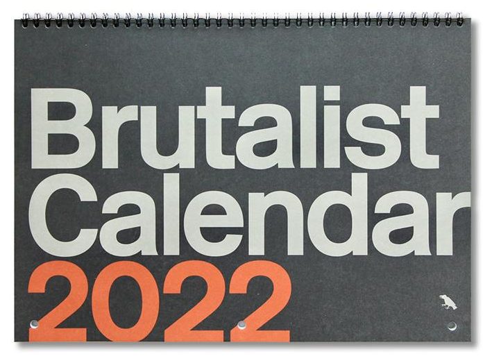
Brutalist Calendar 2022
Brutalism at its best. This year’s wall calendar celebrates the brutalism’s comeback with 12 prime slabs of concrete hewn by the likes of Le Corbusier, Breuer and Rudolph. Their hulking aesthetics will inspire and delight throughout the year while also providing a welcomed additional grey hue to any sleek, monochrome space.
Learn more and buy >
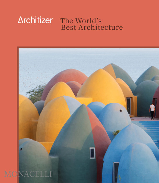
Architizer: The World’s Best Architecture by Architizer
Each year, select winners from the A+Awards are honored in this fully illustrated compendium which features the best architecture of the year. Entries for the competition are judged by more than 400 luminaries from a diverse range of fields such as fashion, publishing, product design, real-estate development and technology. The result is a beautiful digest full of information and inspiration that is a perfect gift for any architecture enthusiast.
Learn more and buy >
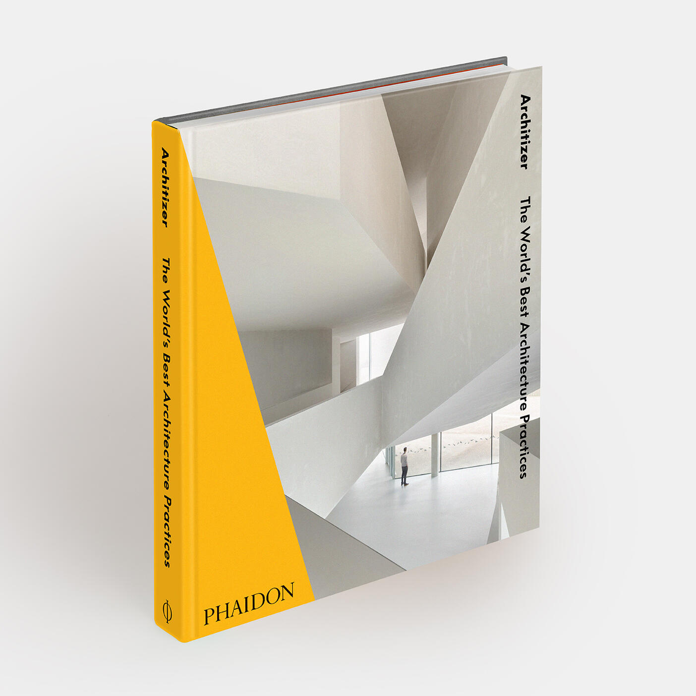
Architizer: The World’s Best Architecture Practices 2021: Architizer
Celebrating the work of 31 of the most outstanding contemporary architecture practices and design firms from around the globe. Featuring the finest and most innovative contemporary architecture practices around the world Architizer’s The World’s Best Architecture guide accompanies the annual A+Firm Awards program. Chosen by an international panel of experts, the winners include a plethora of industry stars, such as Foster + Partners, Neri & Hu Design and Research Office and Michael Green Architecture, alongside emerging talents like Shulin Architectural Design and OfficeOffCourse. The ultimate accolade for collaborative creativity, recipients include architecture firms, landscape architects, engineers, interior designers, photographers and real estate developers.
Learn more and buy >
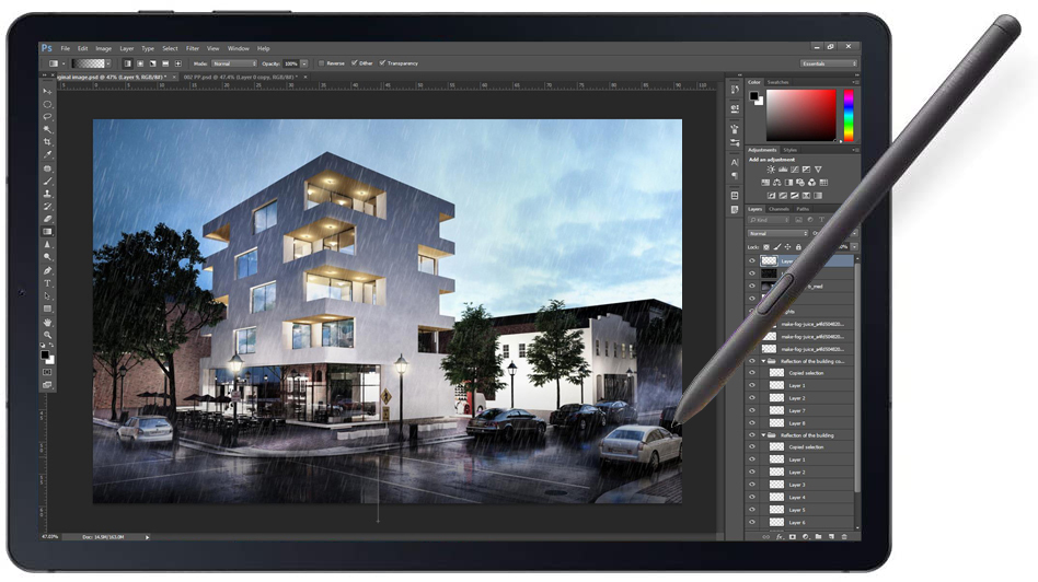
SAMSUNG Galaxy Tab S6 Lite
Arguably the best non-premium tablet SAMSUNG has ever put out. Pipped as a great competitor to the iPad, the Galaxy Tab S6 Lite is an excellent piece of tech for any architect on the move. It is the most affordable Samsung tablet to come with a stylus so is ideal for sketching, annotating and note taking and also comes with plenty Android UI customization options making it a fantastic option in the design world. Robust yet sleek in its appearance this tablet is an excellent present for any architect who hates being chained to their desk.
Learn more and buy >

MasterClass: Architecture by Frank Gehry, Interior Design by Kelly Wearstler and more
From sessions with Frank Gehry to courses by Kelly Wearstler, there are over 100 Masterclasses available on the MasterClass platform. An annual subscription allows you to access courses from some of the most recognized names in not only architecture and design but music, business, writing and food, and everything in between. Each series of 10 to 15-minute episodes serves as an insight into how the minds of the great and the good got to where they are today. MasterClass is a platform of inspiration and education that you can binge over a few hours or refer to when mentorship and guidance are what you need.
Learn More and Buy >

Sigurd Lewerentz Architect of Death and Life by Kieran Long (Editor, Contributor), Johan Örn (Editor, Contributor), Mikael Andersson (Contributor)
Enigmatic, mystical and technical are the words are often used to describe Swedish architect and craftsman Sigurd Lewerentz. A man — and a poet to some — who was characterized as aloof and stubborn in private, he did little writing or public speaking and was renowned for letting his work do the talking for him. The book includes insightful detail about Lewerentz’s research and working methods, such as the influence of ancient Persian masonry techniques on his work and how he sketched over photographs of partially built works to refine the design. The book offers a detailed perspective into the life and work of one of the worlds most revered architects to sit alongside the exhibition of his career showing at ArkDEs, Sweden, until 28 August 2022.
Learn more and buy >
Bonus:

Nintendo Entertainment System NES Classic Edition
Rediscover a love of 8-bit graphics with the system that started it all and the characters that shaped a generation. NES is back and as good as ever. Perfect for every millennial you know, the NES Classic Edition system is a miniaturized version of the groundbreaking NES, originally released in 1985. Just plug the NES Classic Edition into your TV, pick up the iconic gray controller and bring back the joy of thirty classic NES games.
Learn more and buy >
The post Architizer Gift Guide: 12 Perfect Presents for Architects and Designers appeared first on Journal.
Maggie’s Leeds // Heatherwick Studio
Project Status: BuiltYear: 2017Size: 3000 sqft – 5000 sqft
Text description provided by the architects.
Maggie’s Centres are places where people with cancer, and their friends and families, can go to find free practical and emotional support. They follow the approach to care set out by Maggie Keswick Jencks – a belief that people should not “lose the joy of living in the fear of dying”.
© Hufton+Crow Photography
Heatherwick Studio was commissioned to design a new centre at St James’s University Hospital in Leeds. Jimmy’s, as it is known locally, is Europe’s largest teaching hospital and home to the Leeds Cancer Centre, which serves a diverse community across Yorkshire. The hospital staff had been working to improve the experience for patients; bringing a piano into the Bexley Wing, for example, and hanging paintings from the city gallery.
© Hufton+Crow Photography
The studio wanted to support this by providing further respite from the clinical environment. The brief was to create “a home that people wouldn’t dare build for themselves” to welcome an expected 110 visitors each day.
The site chosen for the new Centre was the last patch of greenery at the hospital – a grassy hill next to the car park, bounded by roads on two sides and surrounded by large buildings.
© Hufton+Crow Photography
The six-metre difference in level across the site would typically dictate a building dug into the slope – instead, the studio chose to follow its natural contours, so that at the highest point, visitors would have views of the Yorkshire Dales, and a connection with the world beyond the hospital.
© Hufton+Crow Photography
The pillars of support at Maggie’s are the counselling rooms, so these were placed, like three pavilions, at different levels on the slope to support the roof. The space between them became the natural heart of the Centre, with views into each area, making it simple for visitors to find their way around and connecting every room with the garden – externally, this gives the building a different character from every angle.
© Hufton+Crow Photography
Two entrances were also created: a front door, and a rear entrance for staff and regular visitors. The challenge was to span and enclose the level changes and reinstate the greenery. Instead of a single, monolithic canopy, the roof is composed of three overlapping gardens, which step down and overhang to shelter communal areas.
© Hufton+Crow Photography
In this way, the hospital does not lose its last green space – it is lifted up, filled with woodland plants and made more accessible and inviting. The relationship between the Centre’s architecture and the experience for visitors extends beyond the uplifting effect of its garden. The front door, for example, is a psychological threshold – the point at which someone might start to accept a cancer diagnosis.
© Hufton+Crow Photography
Not everyone will be ready to open the door straight away, so there is a bench to sit outside, or a private path to wander quietly through the gardens. The entrance wall is transparent and the door is moved to the side, where it is less intimidating. Inside, visitors are not confronted by a conventional reception space; instead, they find a welcoming window seat, a noticeboard, and a view through to the heart of the Centre, with its communal table in the arc of a staircase leading to the kitchen.
© Hufton+Crow Photography
The kitchen table, a feature of all Maggie’s Centres, represents another threshold; the point where visitors feel ready to share their experiences. Everything is on display, so there is no awkward rummaging through cupboards to find a mug, and a clerestory fills the space with natural light. Above this, there is a private space for staff to rest and gather strength, and a sheltered roof garden.
The road running along the lowest point of the site presented a challenge for the building’s construction – as the main ambulance route, it could not be disrupted by months of heavy vehicles.
© Hufton+Crow Photography
The team designed a structure that could be built off-site and assembled quickly on a concrete slab and retaining wall, with minimal disruption. The pre-fabricated insulated timber cassettes were manufactured in Switzerland and fixed together on site in just eight weeks. These are supported by glulam fins, whose modulations give the feeling of trunks rising up from the ground to support the gardens overhead.
The structure is made entirely of sustainably forested spruce, a material that will expand and contract with the seasons, as if alive, and the floors are made of durable engineered timber (CLT). The studio looked at the qualities that make a building a home; the use of warm, natural materials, the way that objects are used to express individuality, the combination of private spaces and places where people can come together, and gentle lighting.
Between the timber fins are shelves, lined, as you might at home, with nick-knacks, pot plants and the interesting things that people bring to the Centre. When it came to lighting, the studio had the idea that the wooden fins could glow, as if they were emitting light. This is achieved by integrating the lighting with the shelves.
To achieve this, the designers had to work backwards, specifying how the lights, handrails and services would be integrated at an early stage in the process, as the building was still taking shape.
The rooftop garden, designed by award-winning landscape designers Balston Aguis, is inspired by Yorkshire woodlands and features native English species of plants, alongside areas of evergreen to provide warmth in the winter months.
Inspired by Maggie Keswick Jencks’ love of gardening, visitors are encouraged to participate in the care of the 23,000 bulbs and 17,000 plants on site..
The post Maggie’s Leeds // Heatherwick Studio appeared first on Journal.
Centennial College – A-Block Expansion // DIALOG

Project Status: ConceptSize: 100,000 sqft – 300,000 sqft
Text description provided by the architects.
Located on Centennial College Progress Campus in Ontario, Canada, the A-Block Expansion Building’s design will be a new landmark with the objective of enriching the campus entrance, promoting the future of education in a diverse and inclusive environment and embodying the College’s deep commitment to Truth and Reconciliation.
When it is completed in 2023, this building is designed to become the first net-zero carbon, mass timber, LEED® Gold higher education facility in Canada.
The building includes classrooms, labs, spaces for student engagement, administration and faculty offices.
© DIALOG
© DIALOG
Over 133,000 sq ft of that space is new construction, and 16,000 sq ft is renovation of the existing facility. It will respond to a broad range of cultural and gender needs with spaces that include an Indigenous Commons, gender neutral washrooms, Indigenous offices, an elder room, a multi-faith room and lactation rooms.
© DIALOG
© DIALOG
The building form is inspired by Indigenous principles and the Mi’kmaq concept of two-eyed seeing. Across the North of the building, the Wisdom Hall emerges from east to west; a highly transparent, four-storey diagonal atrium space for faculty, staff, students and visitor engagement and study zones. Connected to the atrium at Level 2 is the Indigenous Commons, a large multi-purpose space that serves to organize the building program around it and forms the heart of the building.
The new building connects to the existing street edge including a large landscaped area with native plantings that transforms the south-west corner of the campus, forming a gateway, and yielding greater pedestrian connections that enhance the public realm.
Interior planning ensures equitable design for all.
© DIALOG
© DIALOG
It is characterized by flexible, engaging, diverse, inclusive and sustainable environments. Planning standardization and modularity are used to allow spaces to be reconfigured, while maximizing daylight, natural ventilation, and creating a place of community and networking for all..
© DIALOG
© DIALOG
Centennial College – A-Block Expansion Gallery
The post Centennial College – A-Block Expansion // DIALOG appeared first on Journal.
Did you miss our previous article…
https://thrivingvancouver.com/?p=844
Saint Joseph church // ENIA ARCHITECTES

Project Status: BuiltYear: 2019Size: 0 sqft – 1000 sqftBudget: 1M – 5M
Text description provided by the architects.
St. Joseph’s Church is a Catholic place of worship with a modular capacity of 200 to 400 places, complete with religious education rooms, additional spaces for celebrations and staff accommodation.The architectural design of this place is simple but recognizable. This simplicity expresses an abstraction: two rectangles touching each other at the corner, precisely; but also, a signifier, the stone rising to open the sepulcher.
© ENIA ARCHITECTES
© ENIA ARCHITECTES
Above, verticals of color project at night a light from within. The treatment of the building envelope, with sobriety and precision, conveys the public and the religious character of the building. A limited palette of materials – light-colored glass, wood, light-colored concrete brick, stained glass – gives a certain timeless abstraction to the volumetric composition and reinforces the symbolism of the building.
Inside the church, the light is modulated to accompany the hierarchy of spaces.
© ENIA ARCHITECTES
© ENIA ARCHITECTES
Through architectural devices, the sections of “matter” seem to detach themselves from each other to let the light in, always transformed. The ceiling does not touch the walls for the light must pass through, the choir wall stops because the light is there. The ceiling is pierced by skylights, the one of the altar lights, the one of the baptistery lights, and the walls are lined with 14 openings, a Way of the Cross of light.
© ENIA ARCHITECTES
© ENIA ARCHITECTES
This light is there to pass through us, to warm us. The stained-glass window expresses the “Space of Glory” which extends the mystical and gathering space; it transforms and converts light into the expression of the spiritual atmosphere.
The space articulates a contradiction: the church is a public space and a mystical space.
© ENIA ARCHITECTES
© ENIA ARCHITECTES
The space of the congregation is covered with wood to welcome the community of Montigny in its diversity. The back of the nave opens onto the garden to extend the space..
© ENIA ARCHITECTES
© ENIA ARCHITECTES
Saint Joseph church Gallery
The post Saint Joseph church // ENIA ARCHITECTES appeared first on Journal.
Did you miss our previous article…
https://thrivingvancouver.com/?p=823
Sir Michael Uren Hub // Allies and Morrison

Project Status: BuiltYear: 2020Size: 100,000 sqft – 300,000 sqft
Text description provided by the architects.
The Sir Michael Uren Hub is a new facility for Imperial College London on its White City Campus.
The building provides flexible accommodation for translational research initiatives at the interface of biomedical sciences and engineering, including research laboratories, a potential outpatient clinic, a 160 seat seminar room and a series of social spaces to encourage informal exchange of ideas between researchers.
© Allies and Morrison
© Allies and Morrison
The building’s triangular footprint is in response to its site geometry along London’s Westway.
It memorable exterior brings to life its prominent location along a busy motorway and railway with 1,300 precast concrete fins echoing the movement of the city below.
TEAM
Client: Imperial College London
Architects: Allies and Morrison
© Allies and Morrison
© Allies and Morrison
Services and façade engineering: Buro Happold
Structure: Curtins
Laboratory planning: Abell Nepp
Contractor: ISG
Project Manager: Turner & Townsend
Cost: Faithful + Gould
Façade subcontractor: Felix/ Loveld.
© Allies and Morrison
© Allies and Morrison
Sir Michael Uren Hub Gallery
The post Sir Michael Uren Hub // Allies and Morrison appeared first on Journal.
Did you miss our previous article…
https://thrivingvancouver.com/?p=806