Structural Expressionism: Richard Rogers’ Design Theory Illustrated in 8 Projects
Get your work published internationally this year through the 10th Annual A+Awards! The Final Entry Deadline is January 28, 2022. Click here to start your entry today.
When one thinks about the works of Italian-born British architect Richard Rogers, the Pompidou Centre and Millennium Dome are some of the first structures that come to mind. Along with British architect Norman Foster, Rogers was well-known for the popularization of high-tech architecture – also known as structural expressionism. This style is best exemplified in Lloyd’s building, where the edifice’s structural and mechanical components were placed on the external surfaces instead of being hidden in the core.
Additionally, Rogers’ early ideas about sustainability and proposals for urban planning, where public spaces were a dominant feature, made him a popular name in the United Kingdom. For his revolutionary ideas and remarkable design, Rogers received several accolades like the RIBA gold medal, Praemium Imperiale, Pritzker Prize and the Minerva Medal before he retired from the firm Rogers Stirk Harbour + Partners (formerly called Richard Rogers Partnership) in 2020. Below are a selection of his firm’s less canonical works that showcase the late architect’s emblematic concepts and design details.

B&B Italia, Como, Italy
In the early 1970s, the young firm was asked to create a design with open-ended systems to assure flexibility. The solution was a streamlined structural framework comprising lightweight portal frames that were used to suspend a glazed office container. This system helps the interior remain column-free and partition-free with the services being placed in the peripheral areas.
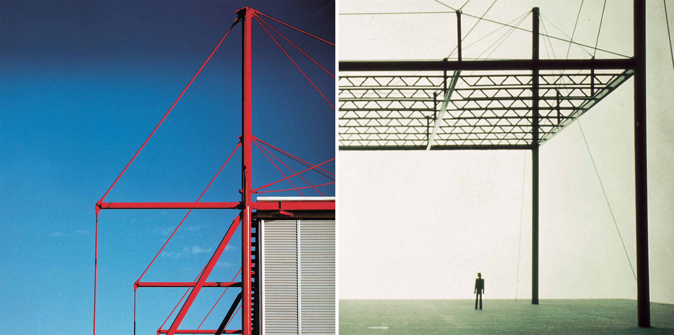
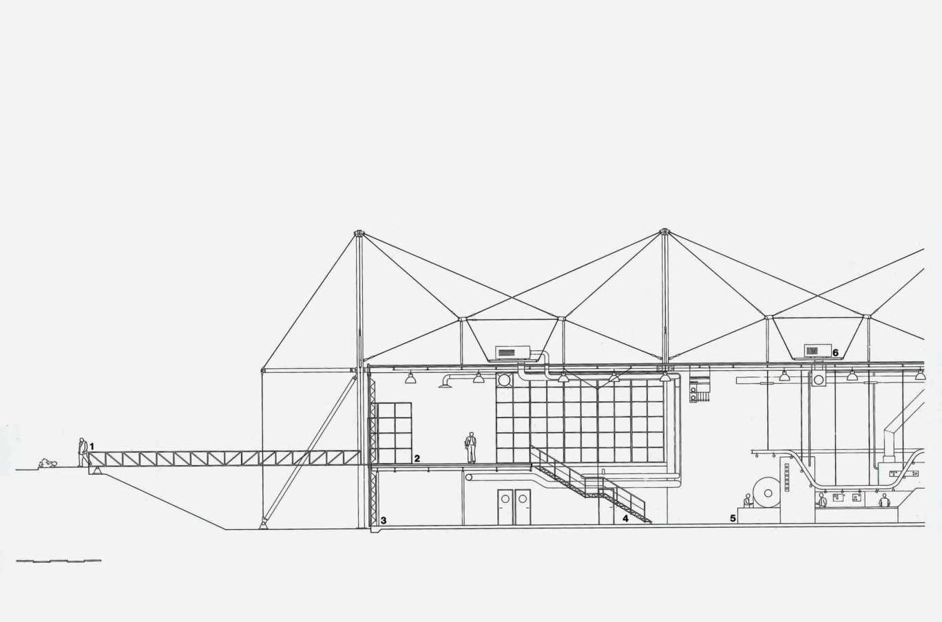
Fleetguard, Quimper, France
This 1981 project is a manufacturing plant for air, fuel and oil filters. Along with these production facilities, it also includes storage facilities and administrative offices. The design was created keeping in mind the potential growth in the future. One of the main focal points was a minimal intrusion on the surrounding landscape, which was achieved by using excavated soil to create a landscaping scheme that segregated industrial and regular traffic.
The main structure is formed using a suspension system of prefabricated elements to reduce roof span and structural depth. This allows the easy addition of functions without disrupting the ongoing work in the building. The emerging firm’s design won a couple of awards including the Premier Award for Exceptional Steel Structure, France and the Constructa-Preis for Overall Excellence in the Field of Architecture.
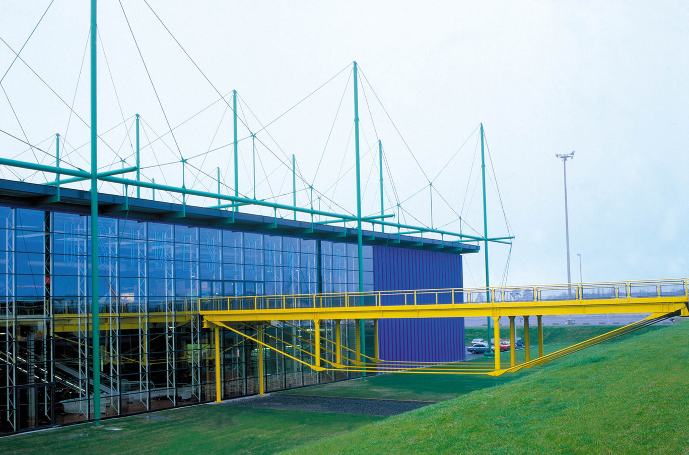
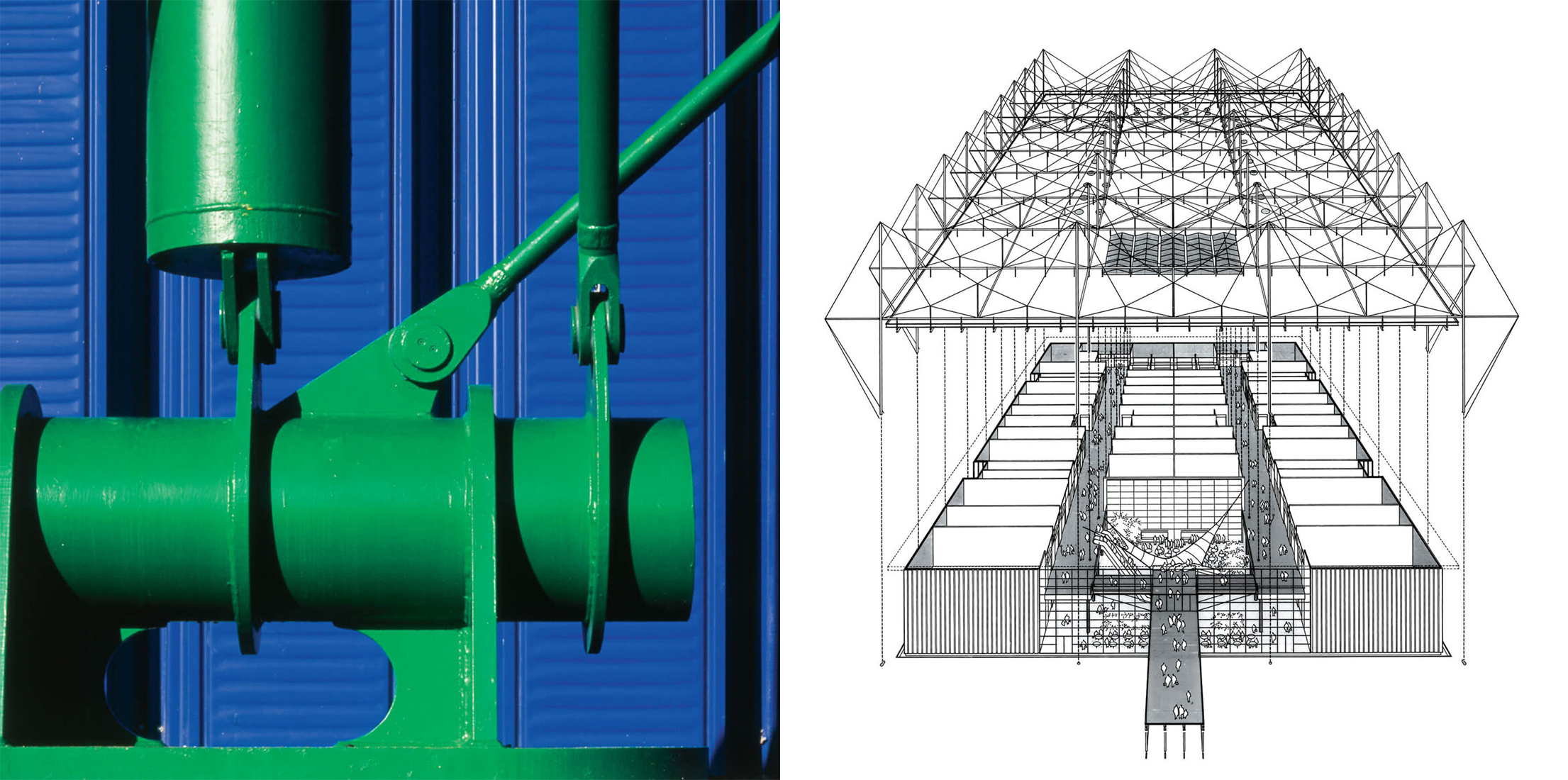
Centre Commercial St Herblain, Nantes, France
Less than a decade after completing the Fleetguard factory, Rogers’ firm undertook the design of a low-cost shopping center featuring a suspended system with bright turquoise masts in 1987. A metal bridge, painted in a vibrant yellow, guides users to a double-height reception area. All the structural elements outside and services within have been kept exposed to give the building more character. The interior is organized similar to a regular mall, with stores placed on two sides and in a row in the center.
Tomigaya, Tokyo, Japan
Built during the property boom in Tokyo in the 1980s, Tomigaya is a structure on a small triangular site surrounded by low-rise buildings, a highway and a park. Due to certain floor and height constraints, the proposal uses transparency to create vertical exhibition spaces that are visible from the highway. Additionally, two steel trusses on one side of the triangle hold up a large crane that can be used to change floor heights to accommodate different exhibits.
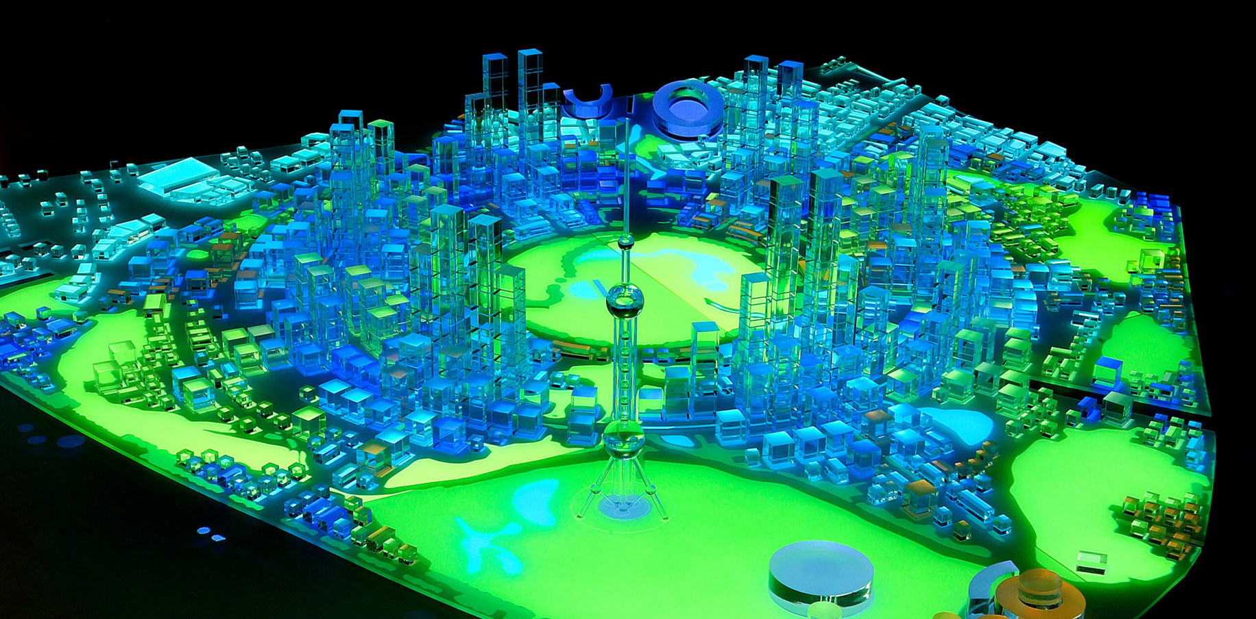
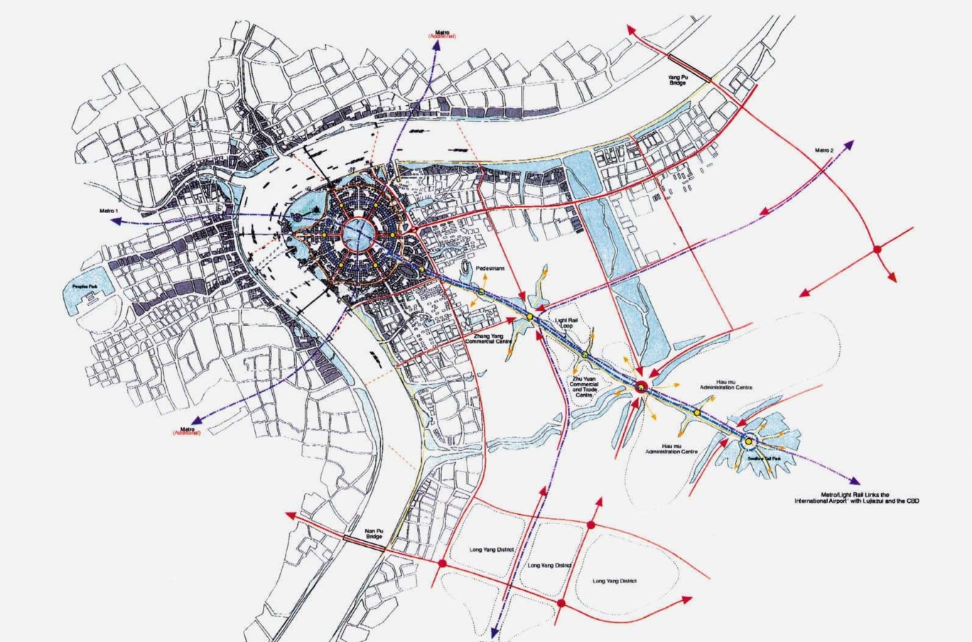
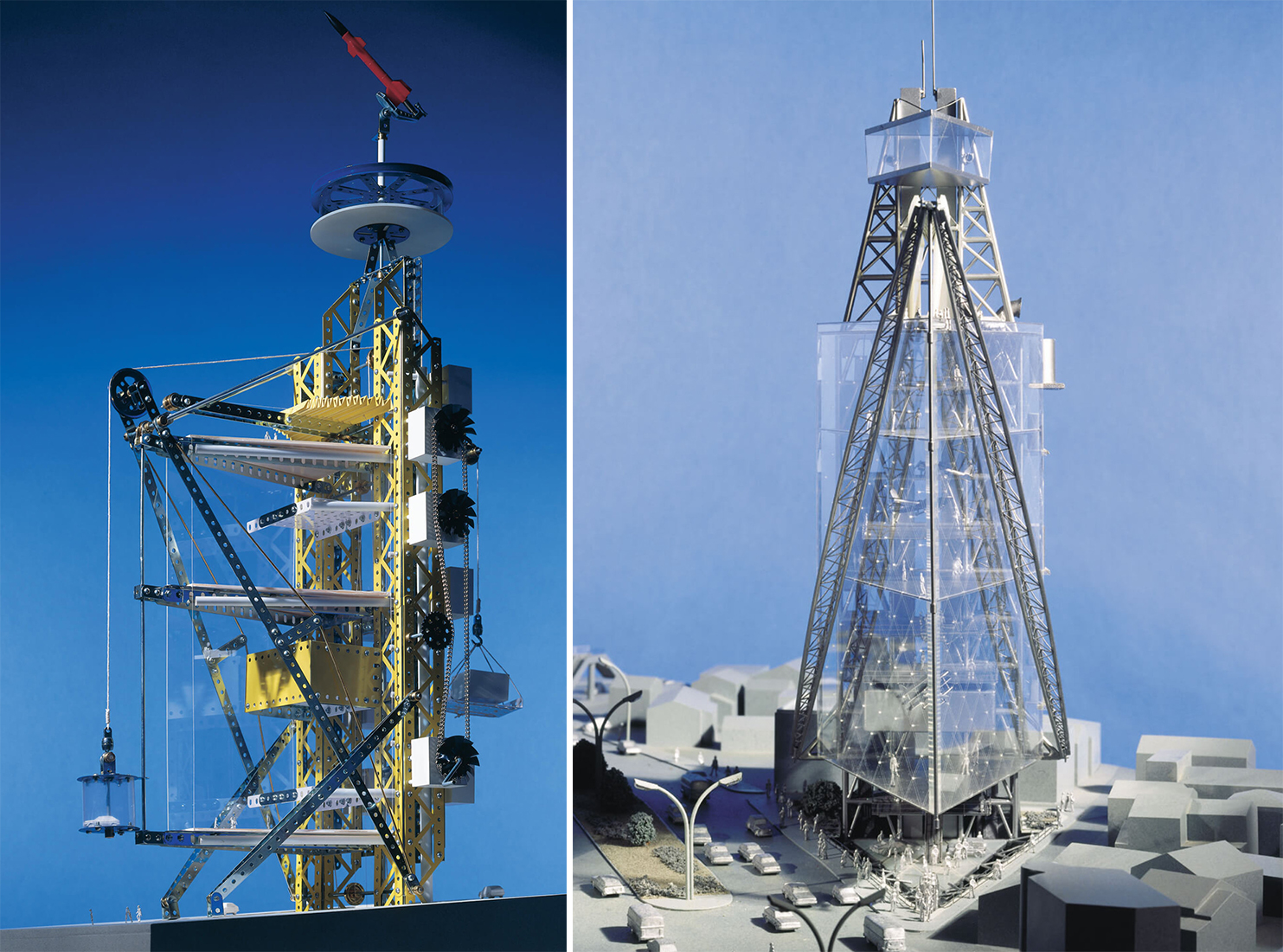
Shanghai Masterplan, Shanghai, China
Well known for his theories on urban design, Rogers also conceptualized several masterplans for cities across the world. When Pudong was identified as the new financial district in the early 1990s, shipyards and industries occupying the area were removed. This proposal for redevelopment is a residential and commercial area that is tied together with several parks and public spaces. The plan uses a circular core with a park at its center and boulevards forming concentric rings around it. These rings are separated and divided into segments by public transport routes and nodes. This results in easy access and better connectivity.
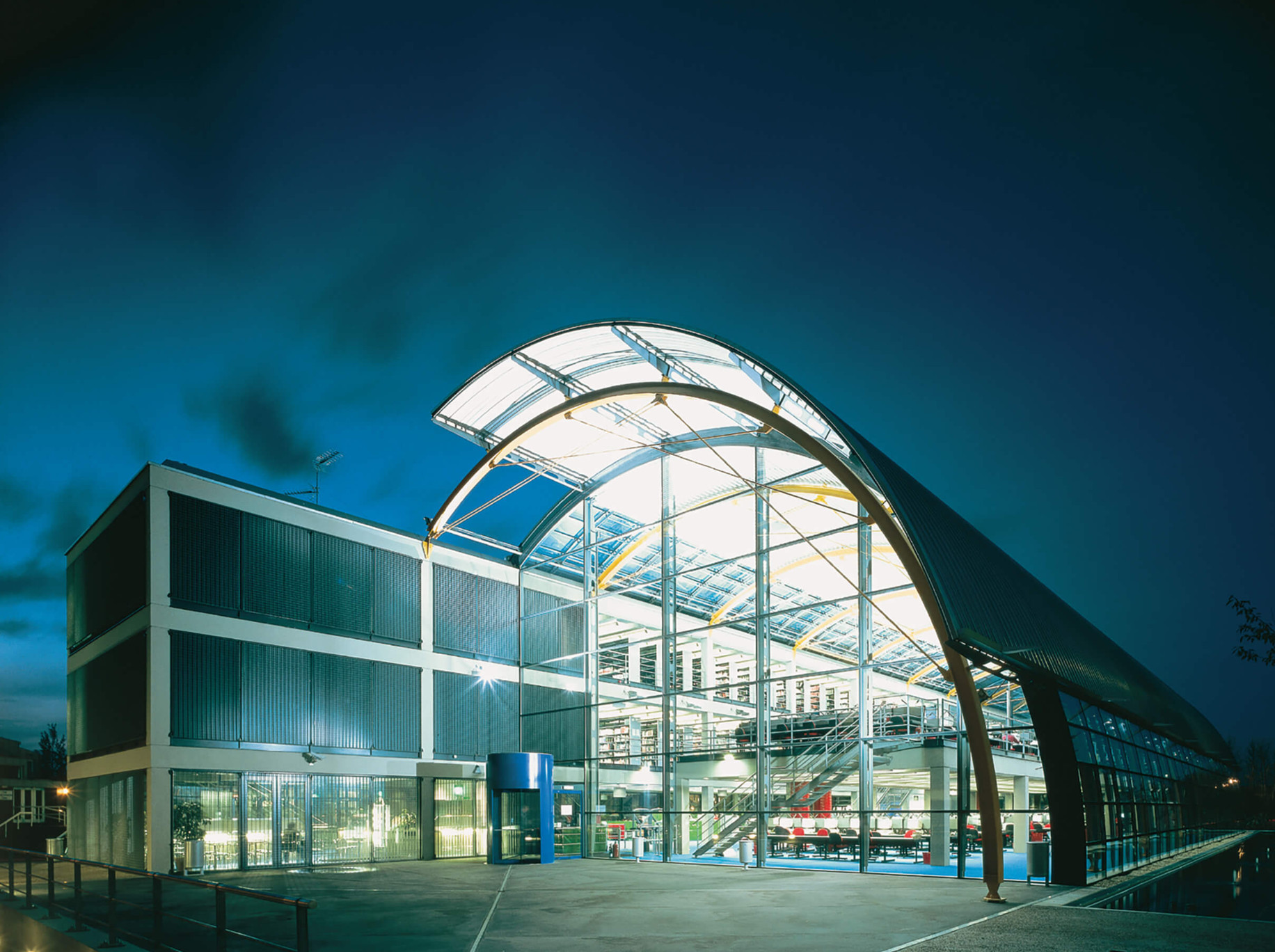
Thames Valley University, Slough, UK
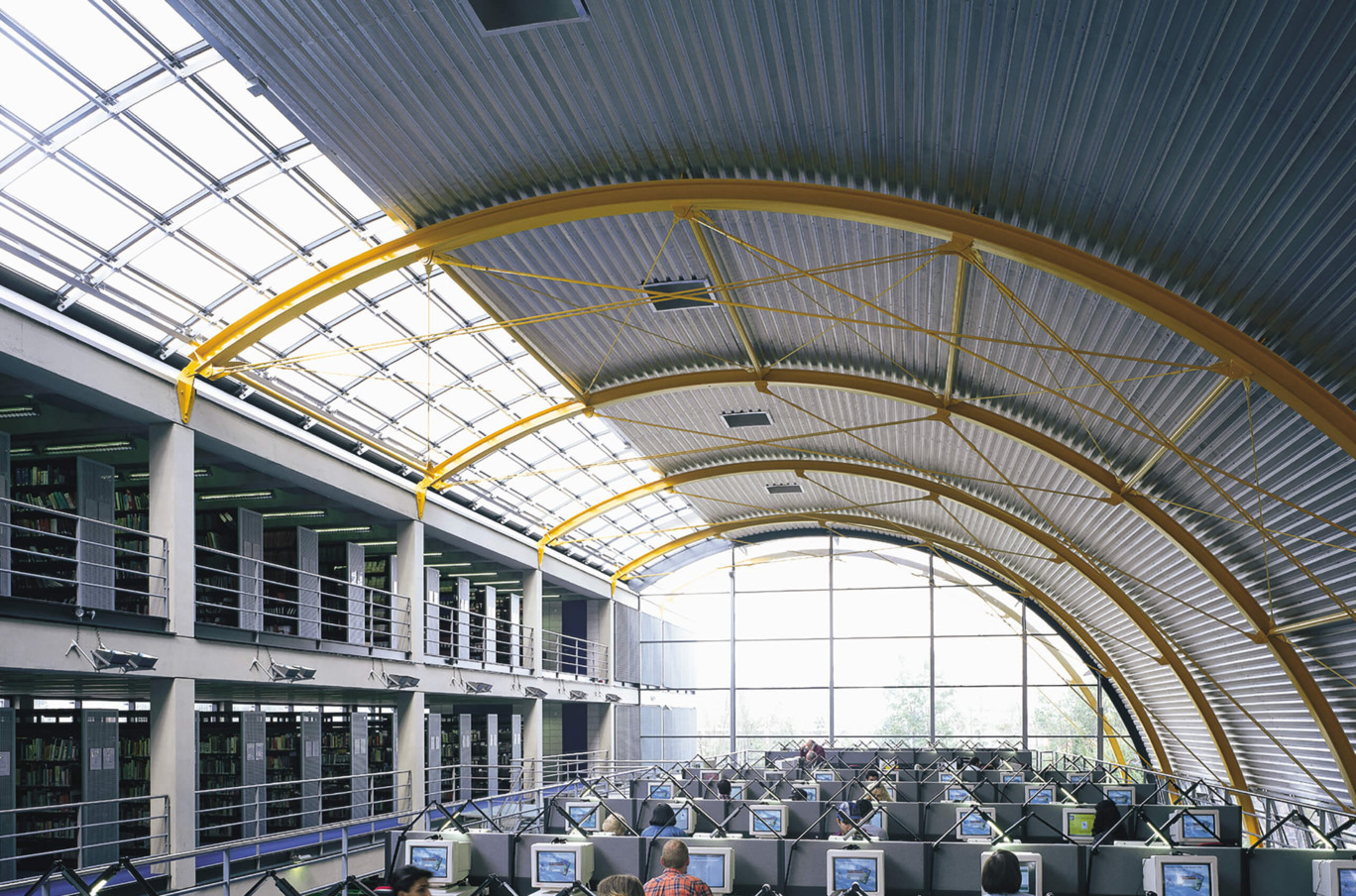
What makes this iconic 1996 structure very recognizable is the large covered dome that is connected to a rectangular block. It is equipped with internal motorized fabric blinds for solar control and is also designed to collect rainwater. The facility contains spaces for books, CDs, laptops, open working areas and seminar rooms. To ensure connectivity with the landscape outside, this curved surface also has a large opening at the base.
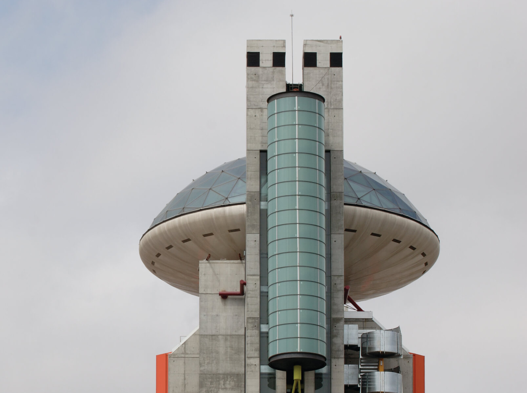
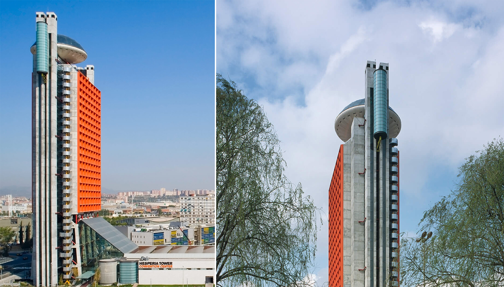
Hesperia Hotel, Barcelona, Spain
This large tower features a bubble-shaped restaurant on the top. Completed in 2006, the tower is broken up into two parts: the vertical arm houses all the hotel rooms whereas the horizontal block at its base contains the offices and other supporting facilities. A large atrium at the base is topped with an angled roof to create a spacious entrance space. The most striking feature is the gridded orange façade of the tower which can be spotted even from a distance. And like Lloyd’s building, the circulation block is added to the eternal surface, running along the entire height of the tower.
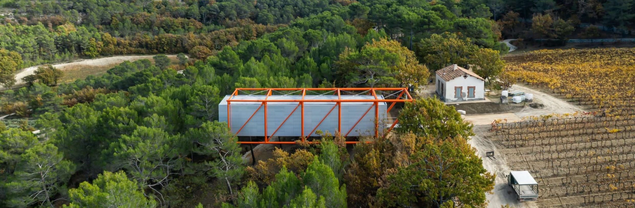
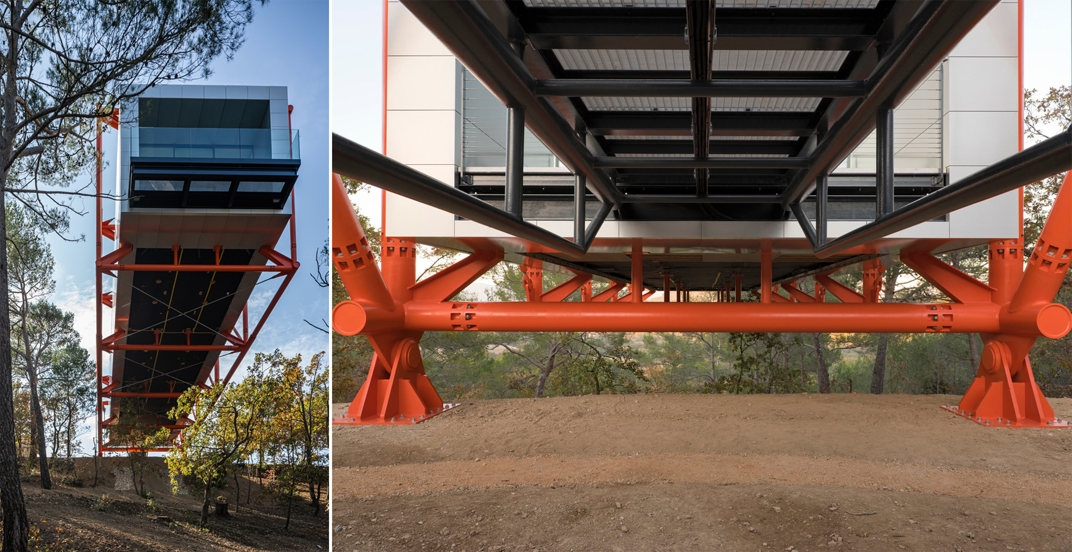
The Richard Rogers’ Drawing Gallery, Provence, France
For the final built project in his long and distinguished career, Rogers picked a remote, elevated site with dense vegetation. A cantilevered concept was chosen to ensure minimal disturbance to the ground below. The mostly opaque block is held up in the air using a contrasting orange structural cage which is anchored to the ground. The building was completed in 2021. Visitors can access this viewing space through a small bridge and then walk onto the other end of the building for spectacular views.
All images used are via Rogers Stirk Harbour + Partners.
Get your work published internationally this year through the 10th Annual A+Awards! The Final Entry Deadline is January 28, 2022. Click here to start your entry today.
The post Structural Expressionism: Richard Rogers’ Design Theory Illustrated in 8 Projects appeared first on Journal.
Did you miss our previous article…
https://thrivingvancouver.com/?p=1020
nine rising City bridges // FCHA
Project Status: BuiltYear: 2020Size: 300,000 sqft – 500,000 sqftBudget: 100M +
Text description provided by the architects.
FCHA collaborates with Vanke Urban Research Institute to plan, design and implement the system, a total of 9 overpasses and weatherproof corridors along the street are set up in the central urban area of Longgang, connecting subway stations, bus stations, businesses and residential areas, which has the originally isolated and closed urban functional groups connected together in a three-dimensional way, which realizes the all-weather three-dimensional and convenient traffic network.In order to achieve a three-dimensional connection in the city, overpasses need to adapt flexibly to the site by turning, extending, undulating and zooming in, that is to adapt to different design conditions through variation and growth on the basis of the same underlying logic.
© FCHA
© FCHA
The enlightenment brought by the Nine Dragons Picture is also the same.
© FCHA
© FCHA
The image of the dragon presents and highlights different emphases in different positions.With “dragon” as inspiration, combined with different locations of the overpasses, different streamline types will be different, four different types of bridges are used in the nine overpasses of the slow traffic system..
© FCHA
© FCHA
nine rising City bridges Gallery
The post nine rising City bridges // FCHA appeared first on Journal.
Did you miss our previous article…
https://thrivingvancouver.com/?p=1017
Building Connection: Cumulus Studio On Crafting Award-Winning Architecture Across Australia
Get your work published internationally this year through the 10th Annual A+Awards! The Final Entry Deadline is January 28, 2022. Click here to start your entry today.
Having recently celebrated their tenth anniversary, Cumulus Studio is a young practice. Established in 2011, this Tasmania-born business has only grows stronger by the year. What started as four individuals with one residential project and big dreams is now a diverse and distinct collaborative workforce distributed across Australia in four studios — Hobart, Launceston, Melbourne, and Adelaide.
Cumulus Studio works in a range of disciplines, although they have distinguished themselves in tourism, social housing and design-led projects in particular. As a practice, they are well known for the collaborative approach that they take to each of their projects, working in teams of mixed specializations and actively encouraging input from external specialists. Thorough workshopping of ideas and initial discussions is the backbone for a program of work that launches with masses of information that can be explored and developed to create concepts that are synergistic to their projects’ culture, heritage, and location. Their specialist process plays a huge part in their distinctiveness and ongoing success.
As Cumulus Studio has regularly been featured in Architizer content and one of the most successful firms in the A+Awards, we spoke with one of the studios four directors, Peter Walker, to discuss the progression of the practice and how winning multiple prestigious awards have helped in the studio’s development and in finding their identity.

Devil’s Corner by Cumulus Studio, Apslawn, Australia; photographs by Tanja Milbourne
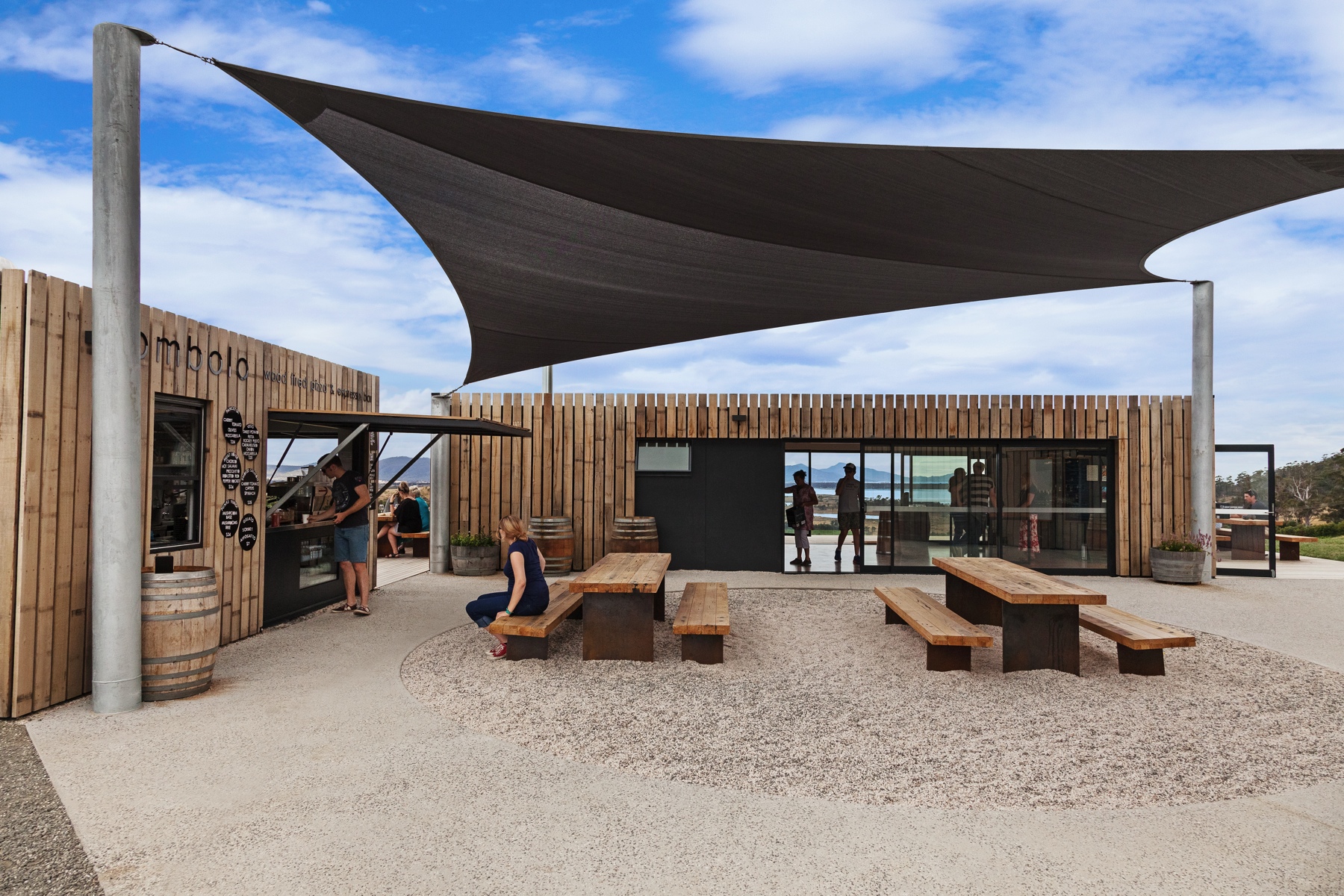
Speaking on their first A+Award win, Peter said, “We first entered the A+Awards program with our Devil’s Corner Cellar Door project which we had recently completed and were really proud of. At the time we were a relatively new practice and, being from a small island state at the bottom of the world, we saw the A+Awards as a way of showcasing our projects to a larger audience.”
Devil’s Corner and its cellar door are a unique tourist experience on the East Coast of Tasmania. Sitting on the boundary of one of Tasmania’s most extensive vineyards, the dynamic modular building is a destination spot for many travellers. Timber-clad shipping containers are positioned and fitted out for a host of functions, from wine tasting, food markets and even weddings. As noted by Peter, the unique project is featured regularly in publications for its well-considered design, function and individuality in a market that can sometimes lack expression. The project deservedly won our Jury Award for a Commercial, Mixed Use space in 2017.
Most recently, the team won the Jury Winner A+Award for Cultural and Expo Centres for their project, The Cradle Mountain Visitor Centre. A stunning piece of geometric work that aimed to honor the significance and sensitivity of the world-renowned Cradle Mountain national park. The project is challenged by its unique and special location. Deep understanding and careful strategy were essential ingredients in their approach, which sought to ensure that the visitor location would be sympathetic to its backdrop while still functioning as a thriving tourist attraction and the attendant heavy footfall.
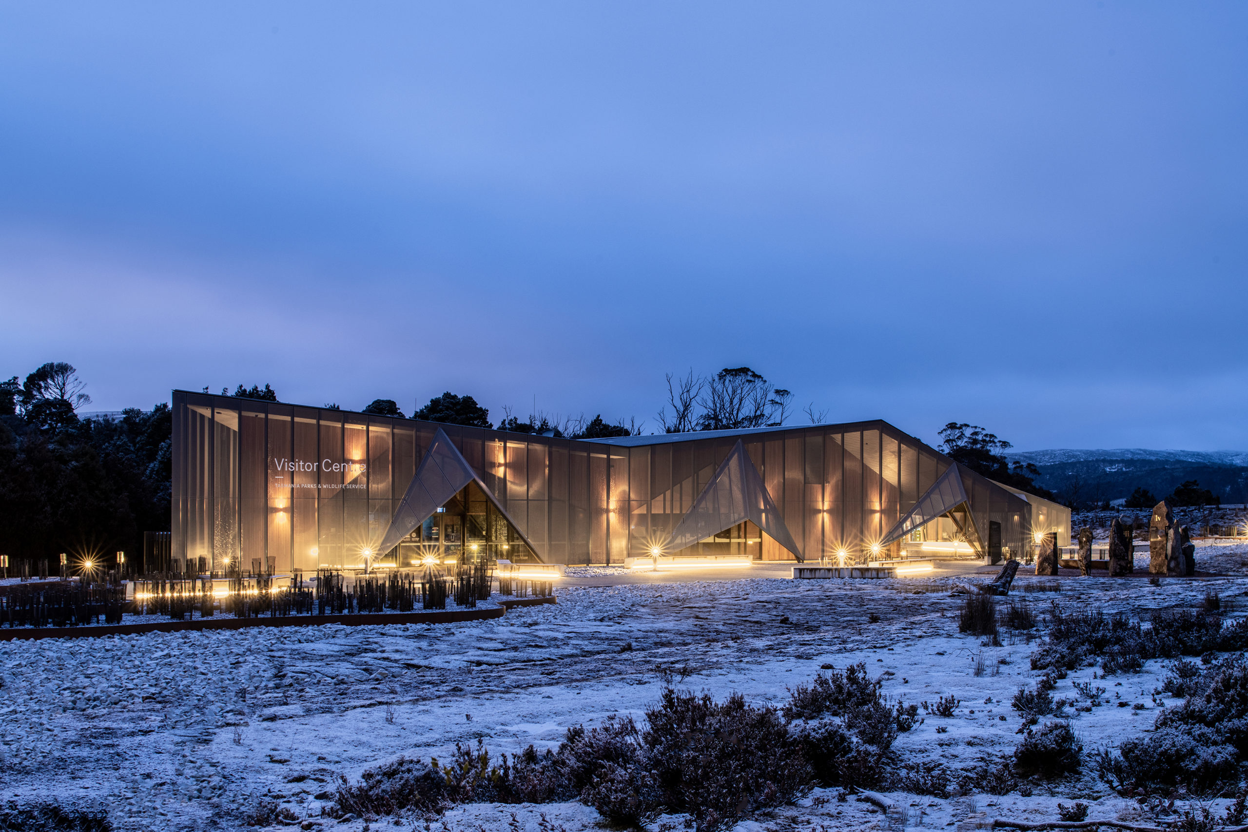

Cradle Mountain Visitor Centre by Cumulus Studio, Tasmania, Australia, 2021 A+Awards Jury Winner in the Transportation Infrastructure and Cultural & Expo Centers categories; photographs by Anjie Blair
The building was designed to feel grounded as if carved from a solid rock by a glacier. The form of the umbrella rain-screen was used to reference the folding angular geology of the mountainous site, while the warm, cave-like timber interior has an Alpine-Esque attraction that is familiar in the glacial landscape. The choice of timber for the interior is about the poetics and qualities of the place. It allows visitors to feel connected to the beautiful all around them, evoking an emotive response while moving through the spaces.
When asked about his favorite detail from their latest win, Peter was keen to discuss the roots of the project as well as recognize the collaboration involved in bringing a project like this to life.
“We have now won three A+Awards. Our most recent project, The Cradle Mountain Visitor Centre, evolved over six years, from an initial feasibility study through Master Planning and the completion of the first stage – the Visitor Services Centre. We worked with artist Alex Miles to create a hanging installation in the main space that interprets the Nothofagus Gunii — Australia’s only cold climate winter deciduous tree and a remnant of the island’s connection to Gondwana. The installation casts shadows and reflects a subtle dappled light, creating texture and depth in the space.”

Goulburn Street Housing by Cumulus Studio, Hobart, Australia; photographs by Adam Gibson
Cumulus Studio has a portfolio of unique and distinct projects which will, without doubt, ensure that they continue to grow, develop and surprise for many years to come. However, I believe it is their confidence in what they do and their trust in their well-established process that continue elevating them above their peers, allowing them to bring us exciting and engaging projects like the past winners they have showcased.
Like me, Peter trusts that the future for Cumulus Studio is one that will be bright and momentous. “A large percentage of the work that Cumulus undertakes is within the tourism industry where architecture has the potential to create a meaningful connection or dialogue with the place, landscape, culture, and/or people. We seek to design unique architecture that emerges from and interprets a deep understanding of place and the way that people experience it.”
He add that, “there are some really exciting projects in the studio at the moment and it is exciting that they are spread across a wide range of budgets, locations and typologies.” It is safe to say that we cannot wait to see the inspiring new places that Cumulus Studio has in the works.
Get your work published internationally this year through the 10th Annual A+Awards! The Final Entry Deadline is January 28, 2022. Click here to start your entry today.
The post Building Connection: Cumulus Studio On Crafting Award-Winning Architecture Across Australia appeared first on Journal.
Three Taverns Imaginarium // Square Feet Studio

Project Status: BuiltYear: 2020Size: 5000 sqft – 10,000 sqft
Text description provided by the architects.
An old-world cabinet of curiosities meets a modern working brewery: this project is all about escaping into the mind of our client, a creative brewmaster. Our shared philosophy was to feature the beer-making process in a theatrical way, and to create a space that encourages visitors to be curious and embrace new and sometimes unusual styles of beer.
© Square Feet Studio
© Square Feet Studio
Located in an historic adaptive reuse development, the volume of the space our client selected was perfect for the requisite large stainless steel brewing tanks. Our biggest challenge was working with the small but tall footprint to accommodate our client’s desire to maximize guest seating. So, we designed a mezzanine that allows for the complete beer-making process to be viewed from a variety of vantage points.
© Square Feet Studio
© Square Feet Studio
Upon entry, a series of repurposed factory windows delineate the tasting room and draw the curtain back on the production area like a performing arts stage. Rows of polished tanks are arranged below a custom golden mural which artfully hints of the molecular science behind beer-making. Like Alice heading down the rabbit hole, gleaming high gloss blue paneling throughout harkens to old railway carriages, capable of transporting you to another place and time.
© Square Feet Studio
© Square Feet Studio
Following upstairs along a tactile, leather-wrapped handrail, the upper level is tucked beneath the structure of the old building where we created a lounge dotted with intimate seating and glowing lighting. Similar to a theatre mezzanine, here guests can appreciate the art of brewing from above as they peer into the production area.
© Square Feet Studio
© Square Feet Studio
We designed a smaller scale bar upstairs as a true cabinet of curiosities, complete with apothecary paraphernalia and monk figurines, a nod to the Trappist beermasters of Europe. Custom wallpaper features the brightly colored fruits and herbs used to make the flavorful beers produced in the brewery..
© Square Feet Studio
© Square Feet Studio
Three Taverns Imaginarium Gallery
The post Three Taverns Imaginarium // Square Feet Studio appeared first on Journal.
Did you miss our previous article…
https://thrivingvancouver.com/?p=1006
The New St. Pete Pier // ROGERS PARTNERS Architects+Urban Designers
Project Status: ConceptSize: 100,000 sqft – 300,000 sqftBudget: 10M – 50M
Text description provided by the architects.
The vision for a new St. Petersburg pier creates a destination that embraces the pier’s role both as an icon for the City of St. Petersburg and an integral part of the vitality of downtown – a place for tourists and the local community alike, one that honors its history, while establishing a new icon for a 21st century public place.The New St.
© ROGERS PARTNERS Architects+Urban Designers
© ROGERS PARTNERS Architects+Urban Designers
Pete Pier is a 13-acre armature of rich, local and destination-based programming adaptable over time as recreation and quality of life grow and change with generations. Activities are diversified through flexible planning and programming that elevates and establishes a sustainable relationship between the natural and built environments. A variety of unique spaces enable active and passive connections to the bay: a coastal thicket, wet classroom, water lounge, tilted lawn, and places for dining, fishing, kayaking, boating and swimming.
© ROGERS PARTNERS Architects+Urban Designers
© ROGERS PARTNERS Architects+Urban Designers
A water lounge at the end of the pier – a floating dock with a porous bottom that allows in a small pool of bay water – becomes a place for people to dip their feet and kids to safely splash around. The breakwater calms the water and creates more suitable environments for marine animals and plant life.
© ROGERS PARTNERS Architects+Urban Designers
© ROGERS PARTNERS Architects+Urban Designers
The one-acre coastal thicket offers opportunities for new microecologies, created as part of the pier’s educational center, which includes 300 linear feet of new, artificial reef. Hydrodynamic modeling will allow for the production of calmed water and a naturalized beach frontage, enhancing both recreational use and seagrass habitats.The design reconnects the pier to the daily life of downtown St.
© ROGERS PARTNERS Architects+Urban Designers
© ROGERS PARTNERS Architects+Urban Designers
Petersburg, tying into transportation and recreation systems such as bike paths, jogging trails, parking locations, and public transit systems. It also overlays new transport options such as the Looper Trolley and a potential high-speed ferry. .
© ROGERS PARTNERS Architects+Urban Designers
© ROGERS PARTNERS Architects+Urban Designers
The New St. Pete Pier Gallery
The post The New St. Pete Pier // ROGERS PARTNERS Architects+Urban Designers appeared first on Journal.
Did you miss our previous article…
https://thrivingvancouver.com/?p=997
Designs of the Decade: The World’s Best Retail Spaces From 2012 to Today
Celebrate a decade of inspirational design with us! The 10th Annual A+Awards is officially underway, and the Finaly Entry Deadline is January 28, 2021. Click here to start your entry today.
Over the past ten years, the A+Awards has been collecting impressive retail designs for commercial spaces around the world. Designing good retail not only entails creating a unique, memorable store that stands out from the rest, but also creating a space that contributes to impactful branding for your client. Award-winning commercial spaces create appealing experiences for visiting customers; they showcase products while acting as spatial representations of the brands’ identity. From façade to interior, the selection of forms and colors and the logic behind the display and circulation all play important roles in shaping the relationship between customer and brand.
This collection brings together a retrospective of the top retail spaces from last decade. Be inspired by these clever — oftentimes innovative — design solutions tailored for their clients and sites.
2012-13: Sugamo Shinkin Bank / Shimura Branch
emmanuelle moureaux architecture + design | Azusawa, Itabashi-ku, Japan
Popular Choice, 2012-13 A+Awards, Retail
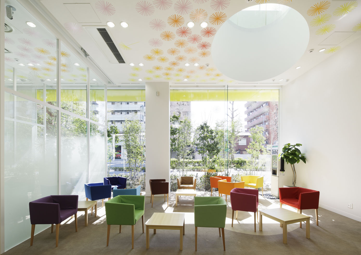
In response to the third commission from Sugamo Shinkin Bank, the design team continued with their iconic rainbow color swatch to create a building that best echoes the bank’s motto: “We take pleasure in serving happy customers.” The façade features twelve layers of color that stretch out from the white walls following an energetic rhythm. At night, the layers are illuminated from inside, and the building appears like a vibrant neon beacon whose colors vary from season to season.
Upon entering the building, three elliptical light-wells invite skylight into the rooms. The whimsical, technicolor palette extend from the façade onto the internal walls and ceiling, taking the form of dandelion puffs and rainbow chairs.
2014: Sokol Blosser Winery Tasting Room
Allied Works Architecture | Dayton, OR, United States
Jury Winner, 2014 A+Awards, Commercial – Retail
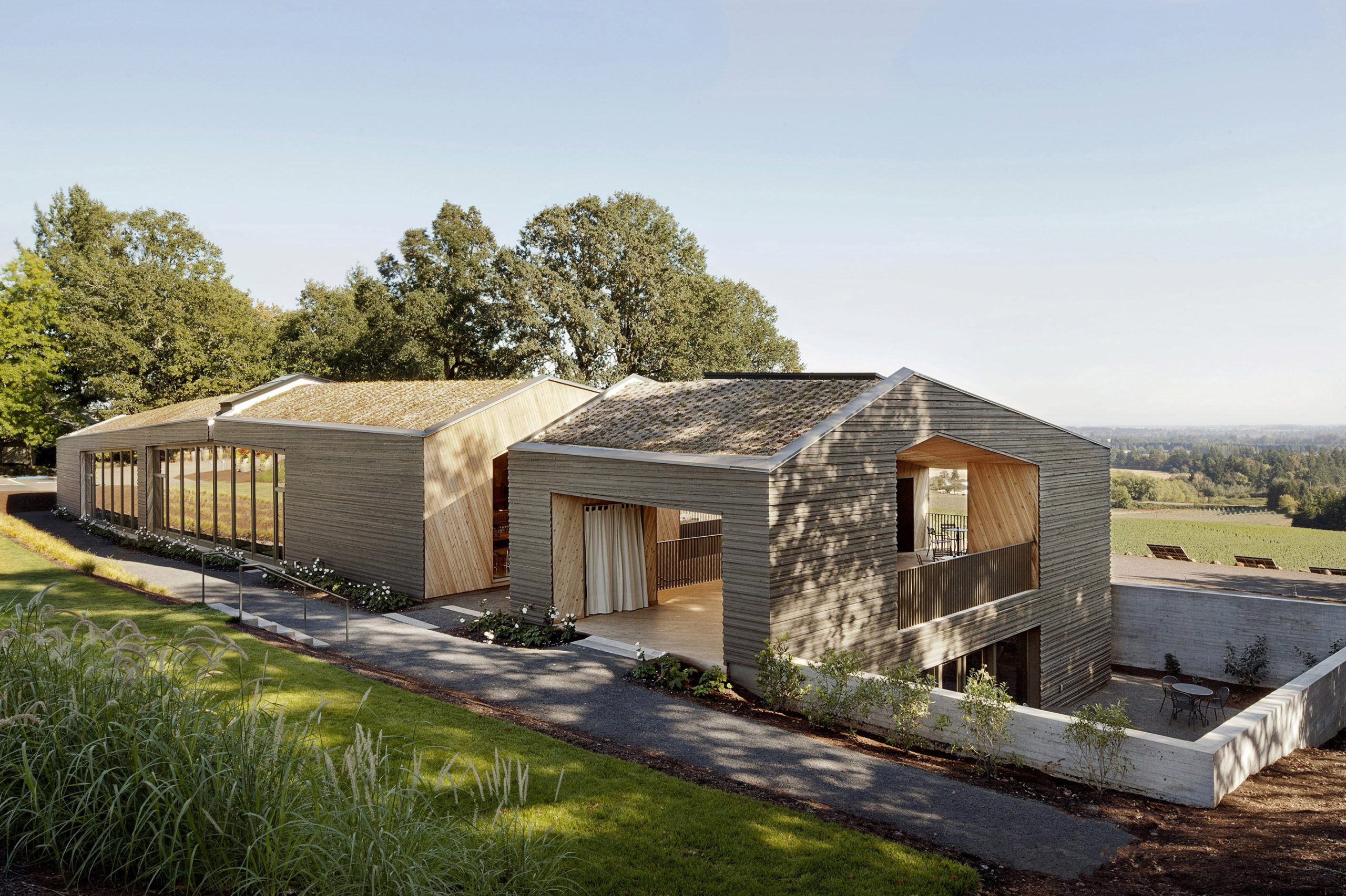
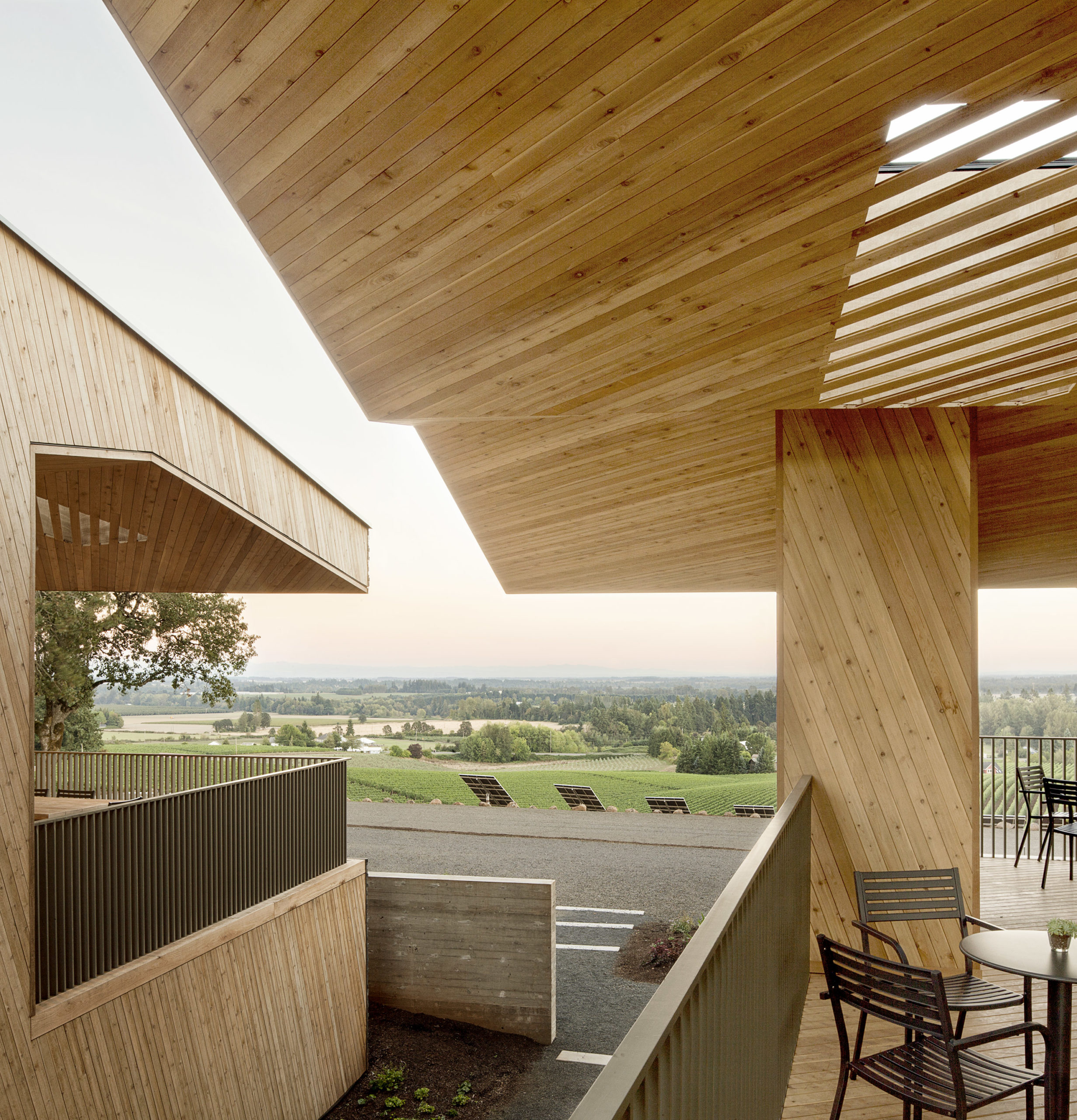
This timber structure houses the tasting room of Sokol Blosser Winery on the Dundee Hills; it also functions as an event space with views of the family’s vineyards and the whole estate. The timber’s warmth and intimate scale contribute to a welcoming, home-like atmosphere. The building is centered around the main tasting room, with a bar, hearth, library, kitchen and other functions. Meanwhile, the seating areas are strategically arranged to ensure nice views of the landscape, both indoor and outdoor.
2015: Wild Turkey Bourbon Visitor Center
de Leon & Primmer Architecture Workshop | Lawrenceburg, KY, United States
Jury Winner and Popular Choice, 2015 A+Awards, Commercial – Retail
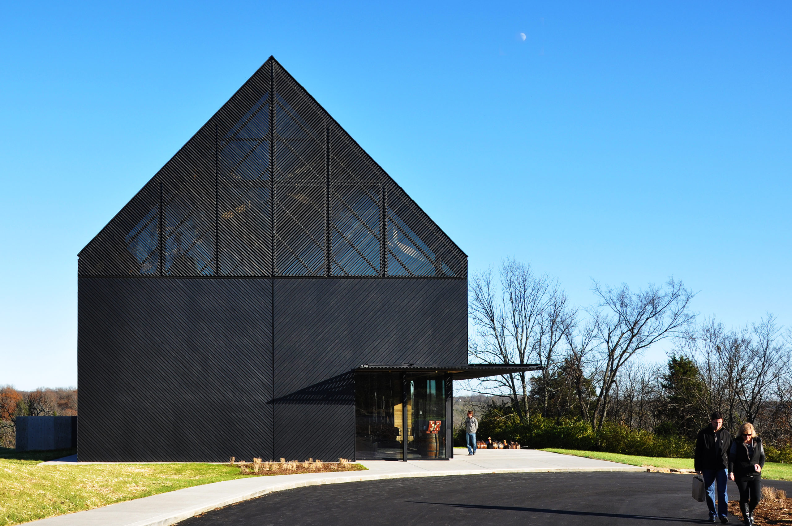
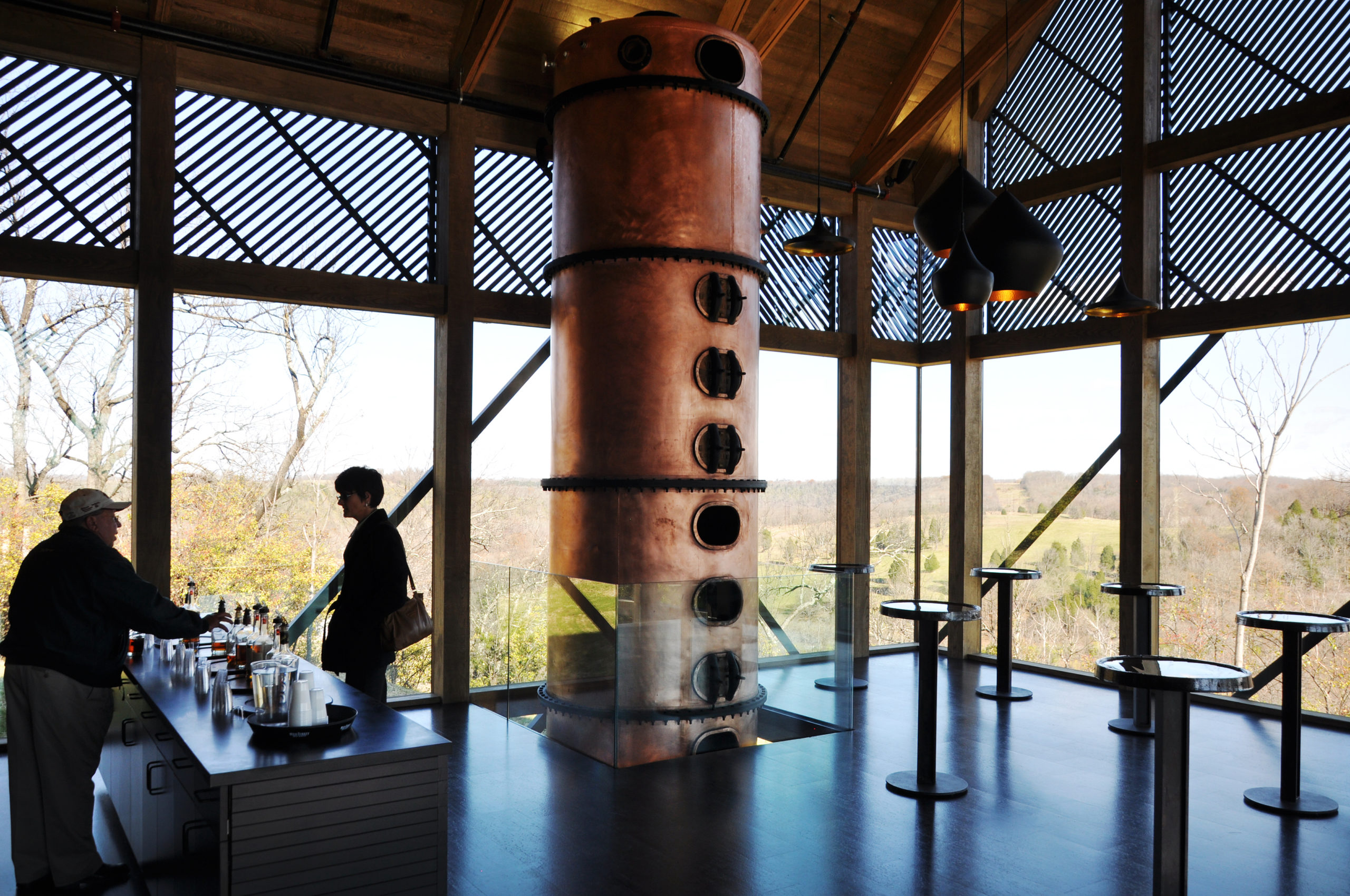
The dark silhouette of the latest addition to the Wild Turkey Bourbon Distillery complex stands out on the unsheltered landscape of Kentucky River. The Visitor Center houses exhibitions, a gift shop, event venues, a tasting room and offices, with a generous view of the river. Expertly combining simplicity and complexity, the building takes on the simple shape of the local tobacco barns while employing a rich façade consisting of clear glazing, opaque panels and light-filtering lattice. By thematizing the juxtaposition between the traditional and the new, the design gies expression to the distillery’s rebranding program which favors both devoted old friends and new fans of bourbon.
2016: UNILUX
SOMA | Beirut, Lebanon
Popular Choice, 2016 A+Awards, Commercial – Retail
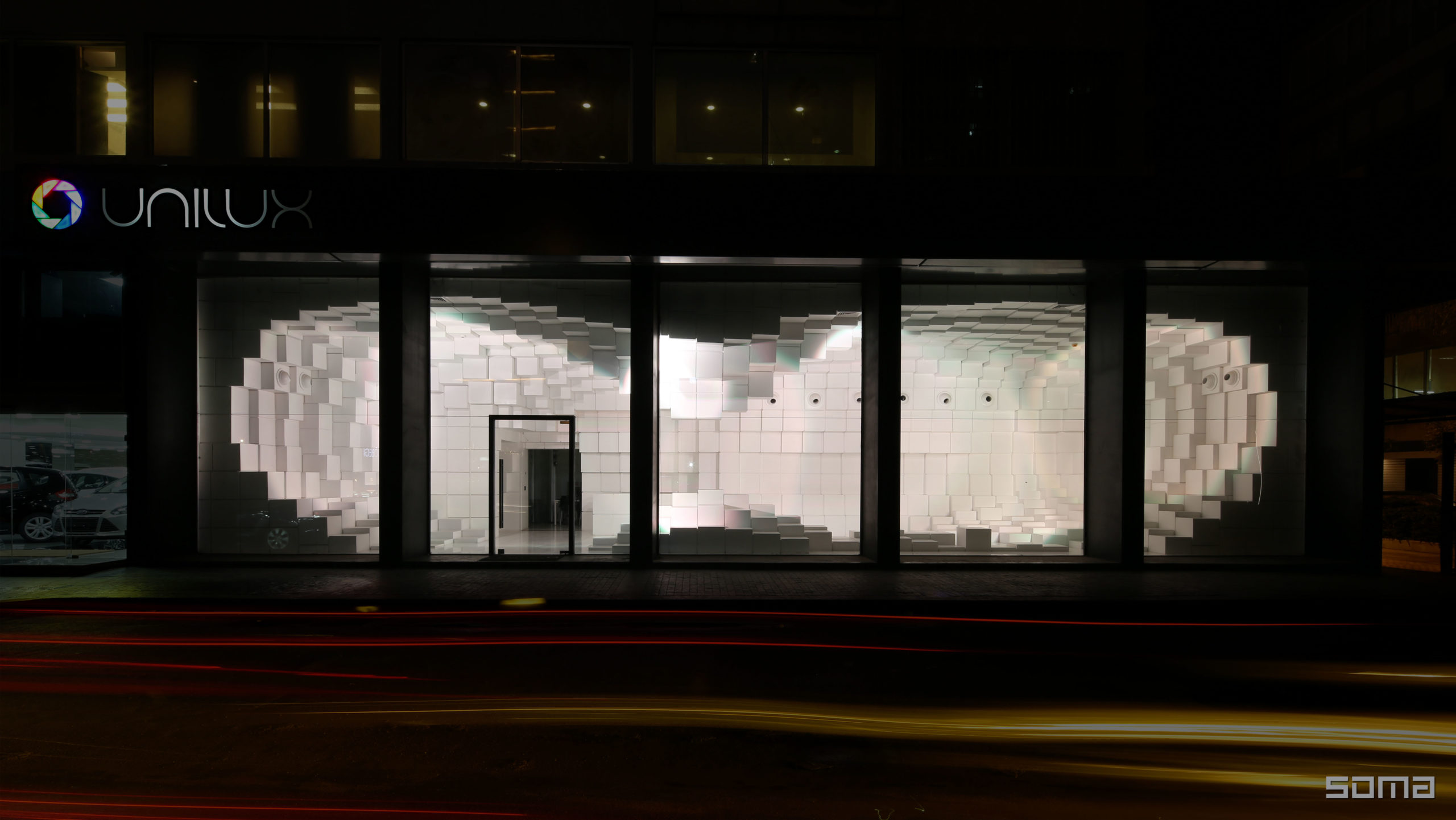
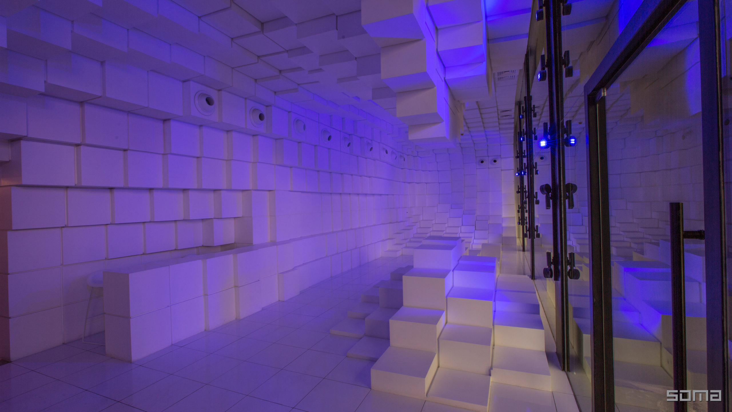
The Unilux showroom is located on a long and thin site of 65 x 13 feet (20 x 4 meters). The ground floor is designed as an interactive lighting showroom to exhibit the effect of Unilux’s lighting products. Furnished with geometric patterns of stacked white cubes, the showroom captures the light with its dynamic 3D form. Visitors can walk through the space and experience the lighting from different perspectives.
The space thus presents lights of different characteristics to the visitors while itself is also a showpiece that is visible from the street, inviting people in. Below ground is a catalog room that showcases a collection of products in a rather static way. The windows occupied by lights are colored white to present the lights in the best quality possible, while the floor and walls are made of a reflective black, which makes the space appear visually taller.
2017: Östermalm’s Temporary Market Hall
Tengbom | Stockholm, Sweden
Jury Winner, 2017 A+Awards, Commercial – Retail
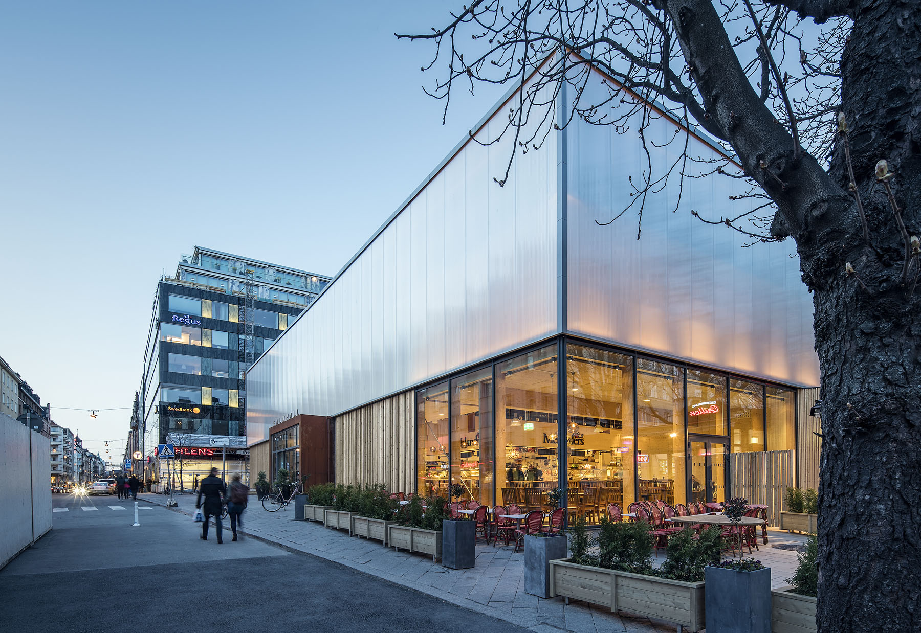
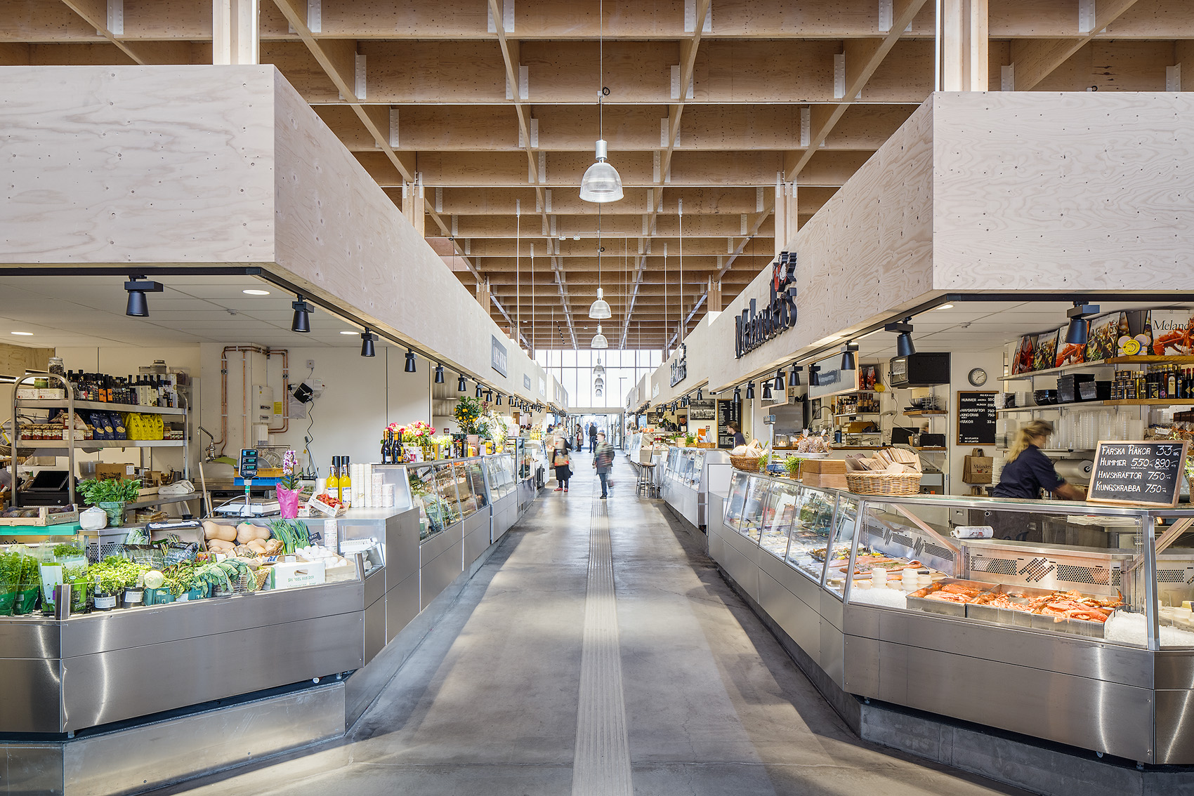
This temporary structure was built as a temporary home for stalls from the adjacent old market while it was being refurbished. Due to its temporary nature, the architects opted for lightweight, cost-efficient and reusable materials such as timber and polycarbonate. A modular mounting system allowed the building to be quickly set up, dismantled and transported to and from the busy Östermalm’s square, where it was located for a spell. To minimize the disturbance to the original pedestrian traffic on the popular public space, all four facades have an entrance for people to pass through the market area during its open hours while introducing new customers to the market.
2018: Cheese Tart Shop “BAKE”
07BEACH | Ho Chi Minh City, Vietnam
Jury Winner and Popular Choice, 2018 A+Awards, Commercial – Retail
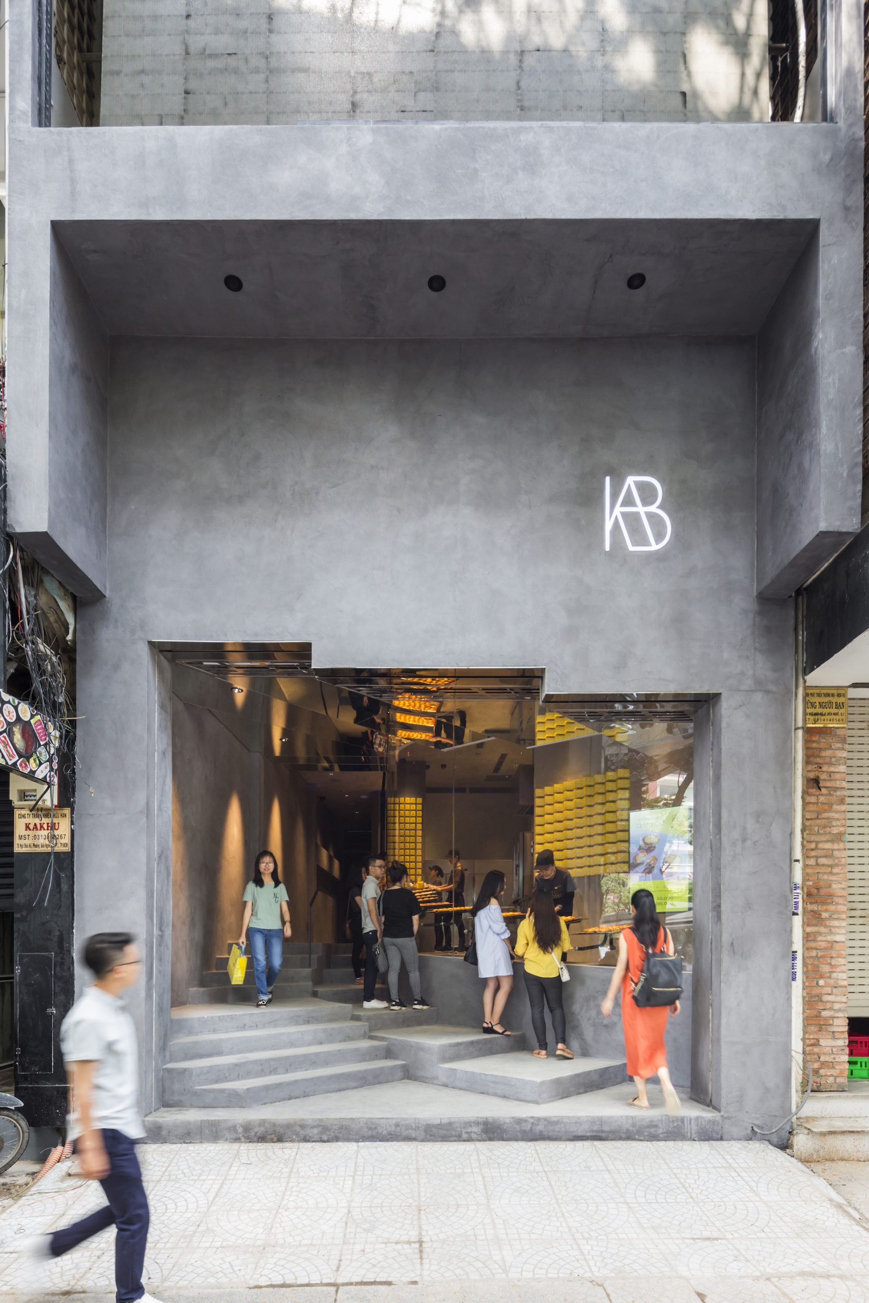
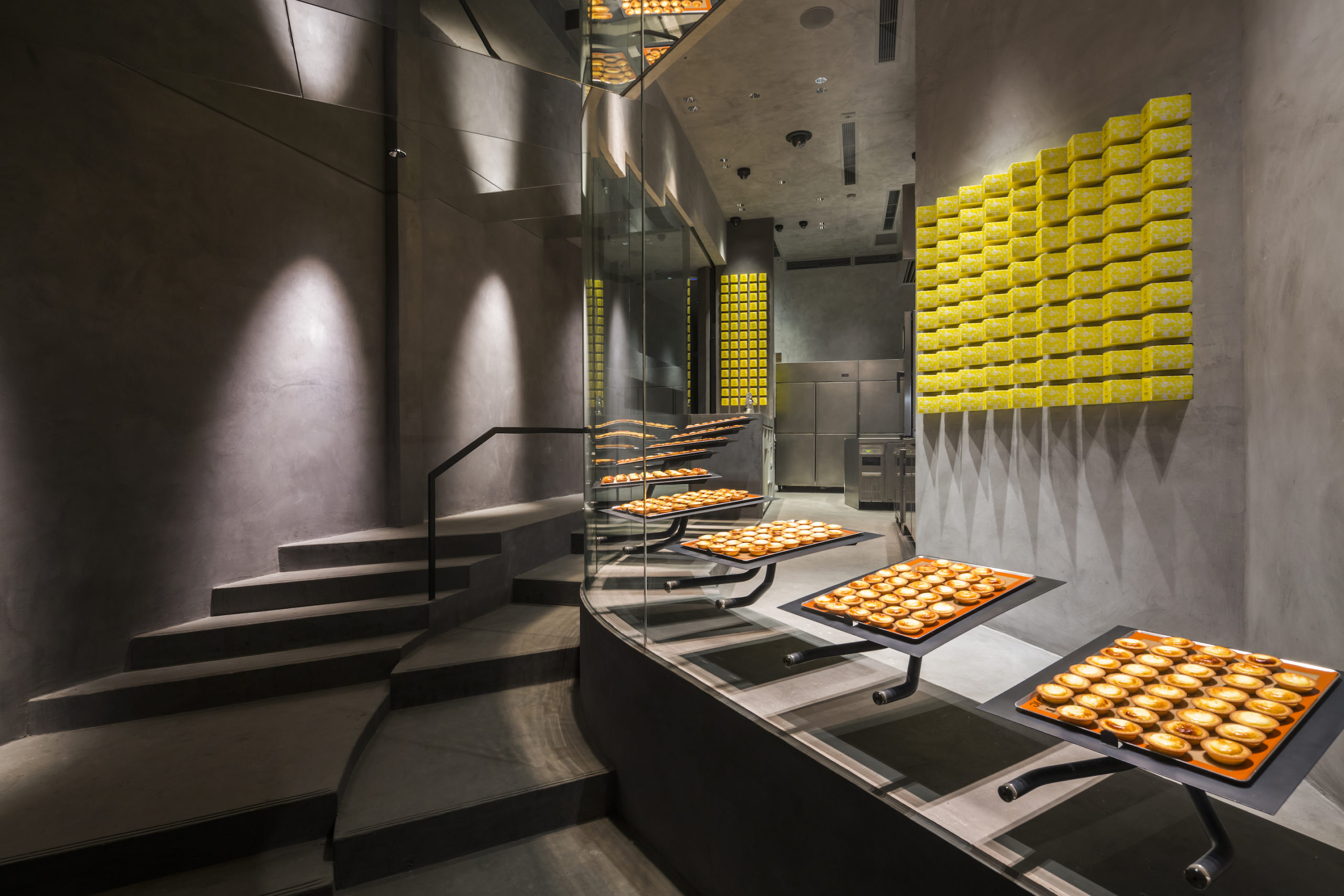
This project is carefully designed to display cheese tarts. The shopfront features a floor-to-ceiling window that curves inwards towards the inside of the shop, providing a sheltered queueing area while maintaining the exhibition function of the window. The glazing separates the circulation of staff and customers, while keeping the two visually connected. Customers can closely observe the tarts being packed as they queue; the design makes the store’s activities a source of entertainment in and of itself. The wall behind the staff is finished with light color of mortar, which guides customers’ sight towards the tarts. To better present the tarts to passersby on the street level, the ceiling above the stairs are also clad with mirrors that reflect the tarts in the window.
2019: THE DRAPE
GARDE Co., Ltd. | Osaka, Japan
Jury Winner, 2019 A+Awards, Commercial – Retail
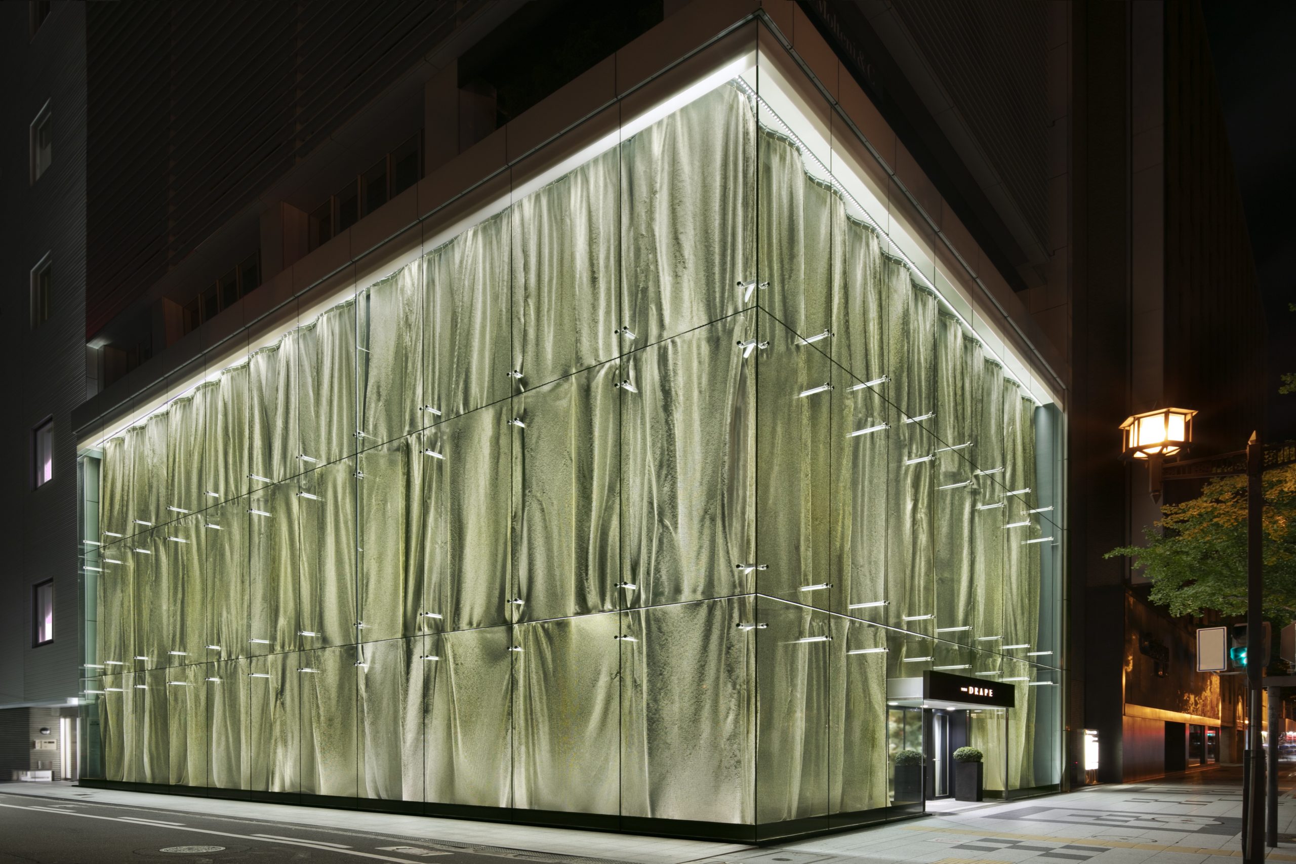
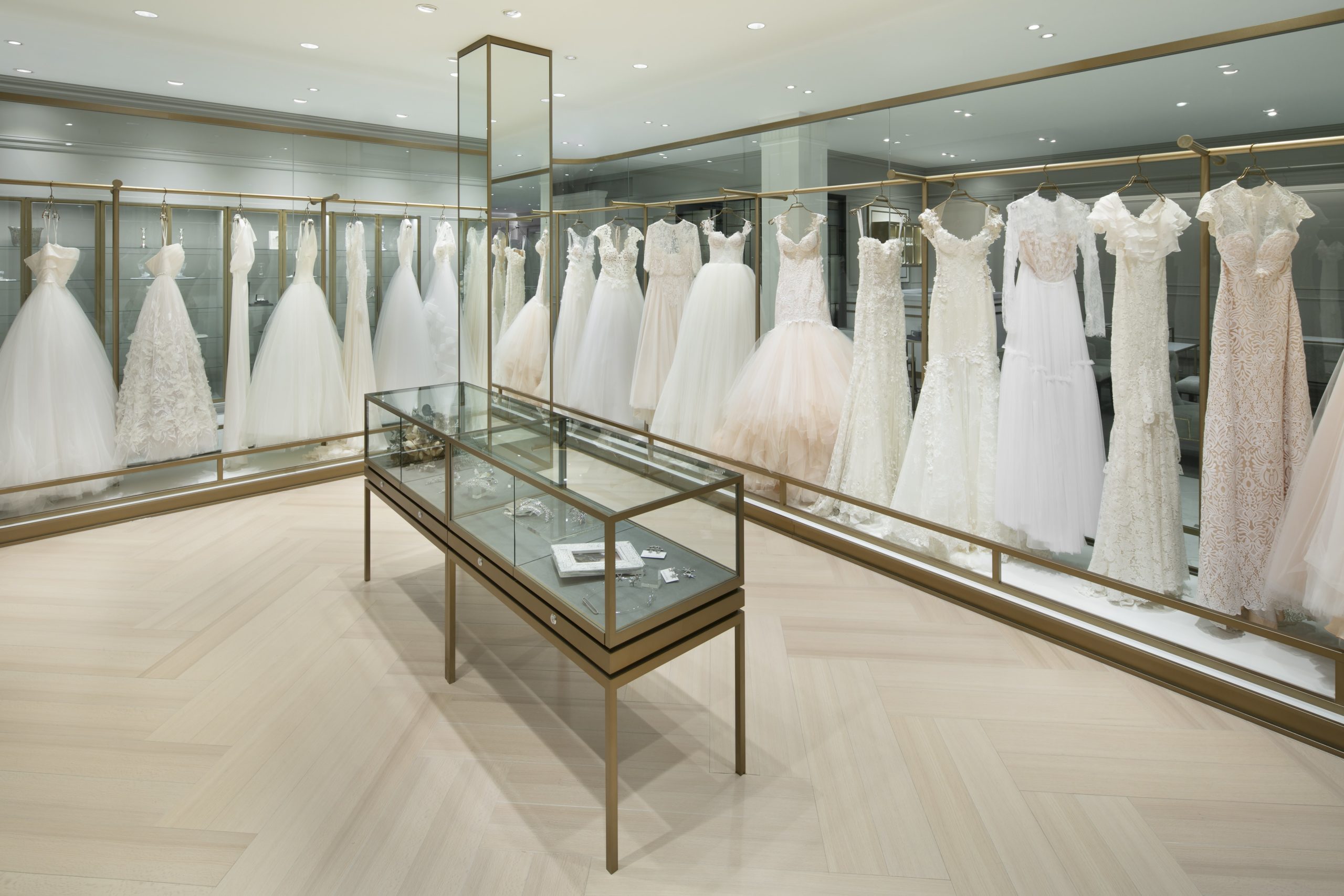
The Drape is a store of the Japanese wedding company Takami Bridal that provides high-end wedding clothing and event organizing services. Curtains of ring-mesh fabric drape down behind the full-height glazing, creating a patterned, eye-catching façade of metallic reflections. The interior is done with simplistic forms and colors that highlight the design of the dresses. Moreover, the kimono area of the shop is framed with warm timber finishing that differs from the showrooms of western bridal dresses. Kimonos are presented flat on shelves, to provide a straightforward comparison between colors and patterns.
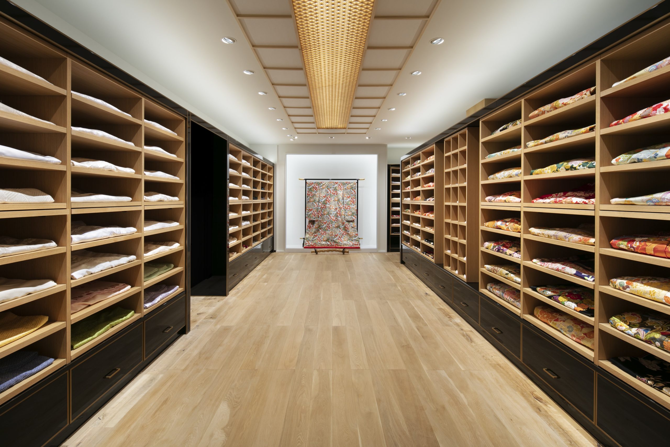
2020: National Museum of Qatar Gift Shops
KOICHI TAKADA ARCHITECTS | Qatar
Jury Winner, 2020 A+Awards, Commercial – Retail
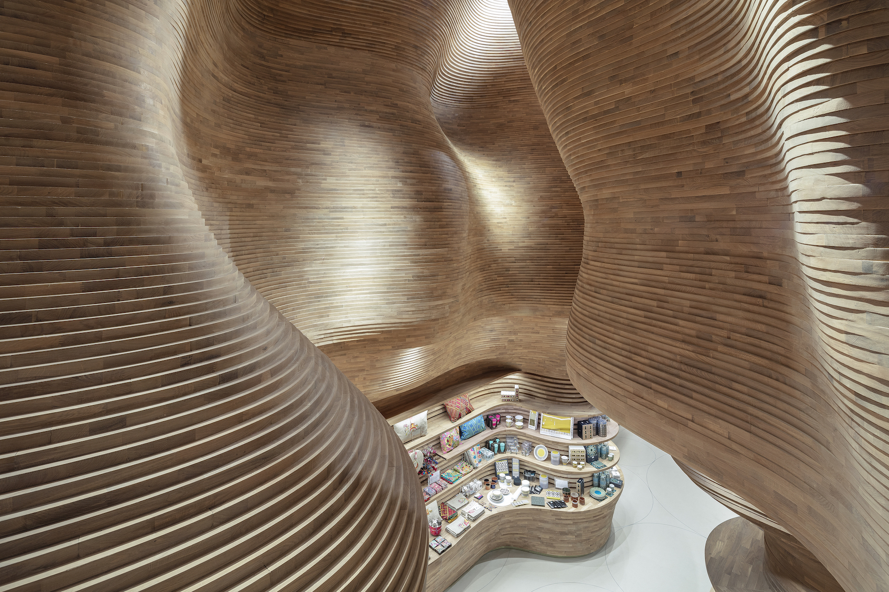
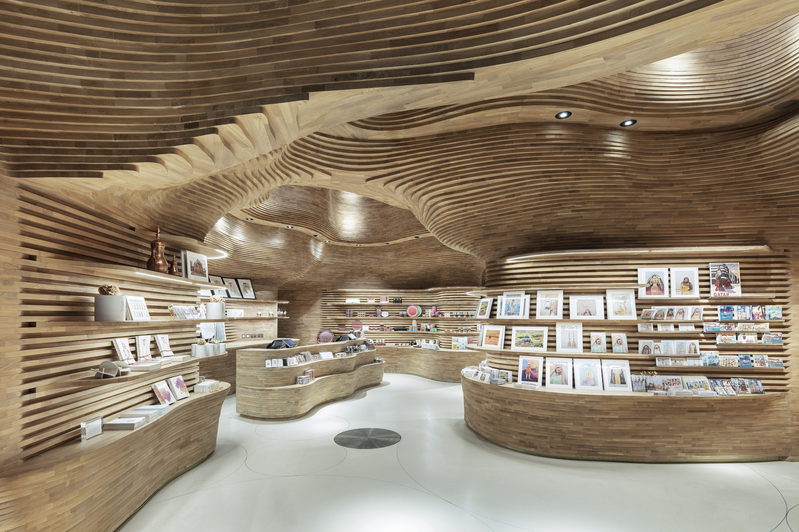
To celebrate the Dahl Al Misfir (Cave of Light), a beautiful underground landscape in central Qatar, the National Museum of Qatar’s gift shop recreates the natural picturesque with 40,000 pieces of timber. With the aid of 3D modelling and CNC cutting, the timber pieces are precisely crafted and form smooth curves without any visible fixings. With a surprisingly generous space overhead, the depth and massiveness of the original landscape are well replicated as a memorial of the natural heritage. The shops provide a unique shopping experience that cannot be found elsewhere.
2021: Velaa Sindhorn Village
Architects 49 Limited | Bangkok, Thailand
Popular Choice, 2021 A+Awards, Commercial – Retail
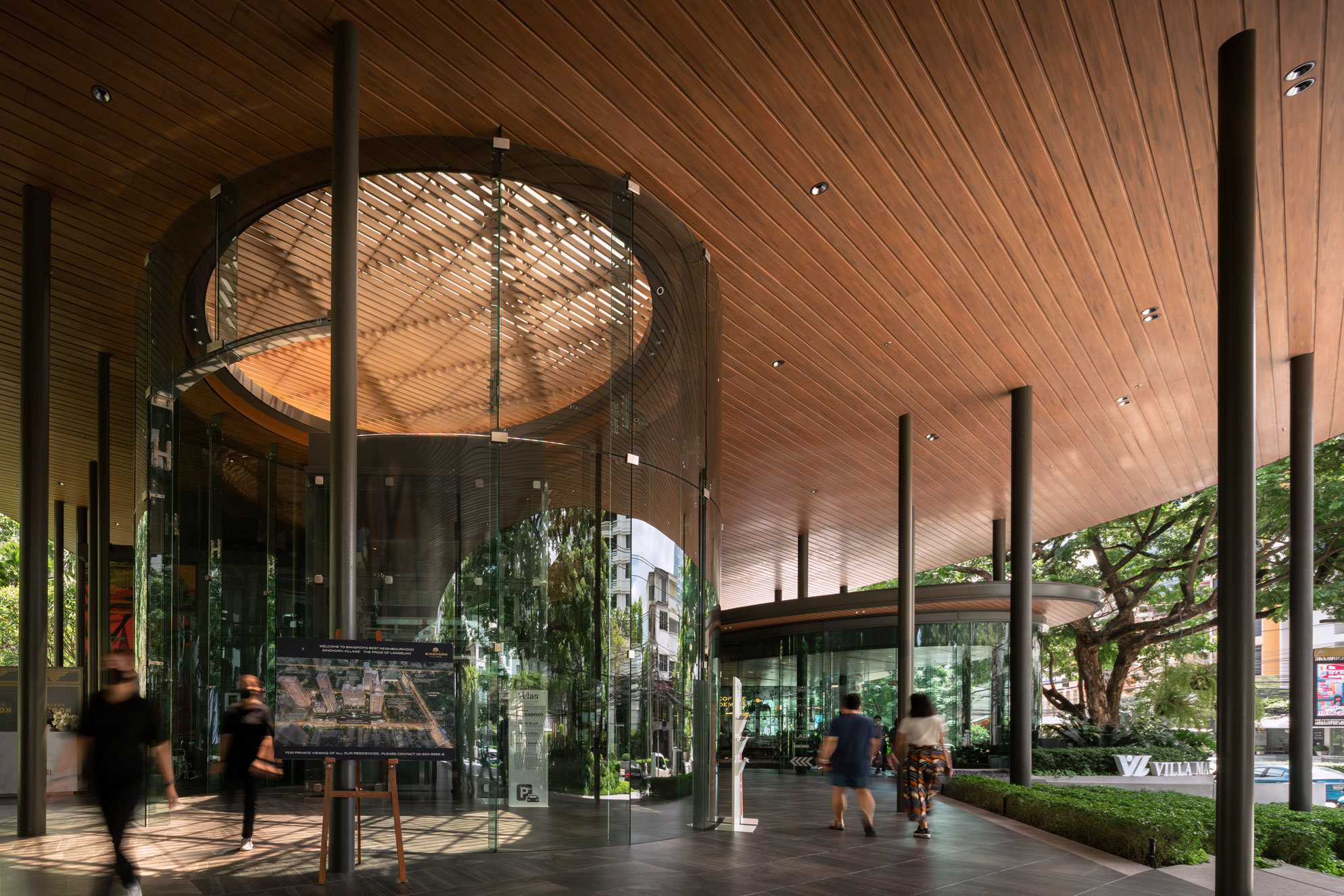
The Sindhorn Village is a commercial complex that provides an escape from the urban chaos and concrete jungles. Shops meander along Langsuan Road in a semi-outdoor space, embracing the urban green areas next to the complex. The experience of wandering among the shops feels like walking under the trees. The tall roof makes all shops visible from the street, keeps the area sheltered while allowing good ventilation for the tropical climate. The roof canopy is supported by columns resembling the thickness of the tree trunk. Furthermore, sunlight filters through the four louver openings on the canopy, mimicking the scenery of lights coming through the leaves.
2022: ???
Could your project complete our decade of inspirational design? Submit it for the 10th Anniversary A+Awards for a chance to take the final place in this collection! Enter your work before January 28th, 2021 to get your firm in the running for global recognition:
Enter the 10th Annual A+Awards
The post Designs of the Decade: The World’s Best Retail Spaces From 2012 to Today appeared first on Journal.
Did you miss our previous article…
https://thrivingvancouver.com/?p=967
BALDIRI I REIXAC COURTYARD RENOVATION, PARK GÜELL – UNESCO 1984 WORLD HERITAGE // Aquidos Arquitectes

Project Status: BuiltYear: 2020Size: 10,000 sqft – 25,000 sqftBudget: 100K – 500K
Text description provided by the architects.
Baldiri Reixac public school occupies Count Güell’s former residence and surroundings, where Park Güell was conceived in 1900. UNESCO World Heritage Site since 1984.TRANSFORMATION PROJECT1. PEDAGOGICAL REQUIREMENTSThe first strategy is to consider the courtyard as part of the educational unit through a great variety of amenities and routes as well as specific learning areas like music station, painting workshop, orchard, sports court, amphitheater and reading hammocks.2.
© Aquidos Arquitectes
© Aquidos Arquitectes
NATURAL ENVIRONMENT AND EXTRAORDINARY HERITAGE
Gaudí’s permanent research to merge work of art and nature in Park Güell is a starting point for this project’s formal language. This intervention explores on natural earthy colors, organic and polygonal geometries, ruled and parabolic surfaces, wooden furniture, Mediterranean vegetation, and the interpretation of natural elements with artificial materials. 3.
© Aquidos Arquitectes
© Aquidos Arquitectes
LEARNING PROCESSThe courtyard seeks to be a source of knowledge. Teaching about respect for the environment, awareness on water management, joint responsibility over a collective good, inclusion of gender, cultural and social diversity. The amphitheater and the hammock areas are perfect for sharing knowledge. The Biotope Garden’s water collection cycle promotes biodiversity: children can learn about flora and fauna.
© Aquidos Arquitectes
© Aquidos Arquitectes
The courtyard behaves as a small Mediterranean botanical garden: bush cover, tall shrubs, and humid undergrowth.4. SUSTAINABLE PUBLIC FACILITY MANAGEMENT
The project achieves low maintenance / long lifespan using heat-treated wood form selective logging of European trees, mass-colored concrete allowing polishing, use of low water consumption native vegetation, draining granular surfaces and LED lighting with photoelectric automation..
© Aquidos Arquitectes
© Aquidos Arquitectes
BALDIRI I REIXAC COURTYARD RENOVATION, PARK GÜELL – UNESCO 1984 WORLD HERITAGE Gallery
The post BALDIRI I REIXAC COURTYARD RENOVATION, PARK GÜELL – UNESCO 1984 WORLD HERITAGE // Aquidos Arquitectes appeared first on Journal.
Did you miss our previous article…
https://thrivingvancouver.com/?p=964
How China’s Top Architects Are Changing Perceptions and Winning Global Recognition
Architizer’s A+Awards, the world’s largest architectural awards program, has become one of the most significant platforms for Chinese architecture firms to gain recognition within their country and increase their visibility around the world. The iconic program is still open for entries for its 10th anniversary season, with jurors looking forward to reviewing submissions that will reveal the next creative forces emerging from across the country. With a Final Entry Deadline of January 28th, 2022, now is the perfect time to get started and put your firm in the running for publication in print and major press coverage this year:
Begin A+Awards Submission
The Western perception that China is some kind of ‘sleeping giant’ when it comes to architectural design has long since fallen away, with headline-grabbing projects on an extraordinary scale rising in Beijing, Shanghai, Guangzhou, Shenzhen and beyond. But it’s also notable that the types of projects receiving recognition are changing. A decade ago, China’s megatall commercial skyscrapers dominated coverage in architectural media, but today, cleverly crafted cultural, institutional and residential projects are now catching the eye of a global audience.

Yada Theatre by GOA, Jiangsu, China 9th Annual A+Awards Winner in the Unbuilt Cultural category.
For evidence, one need look no further than last season’s A+Awards, which saw no fewer than 22 different Chinese architecture and design firms receive prestigious accolades for their work. The rising prominence of the A+Awards in China has led Architizer to make the program more accessible to Chinese-speaking firms this season, with the addition of in-built translation on the submission site (simply click the ‘flag’ icon in the top right corner of the site to change languages).
So, how has the architectural profession evolved in China and made it one of the world’s top countries for A+Awards recipients? “The increased arrival of domestic architectural projects [in the A+Awards] reflects that architecture’s value is weaving into the development of public spaces and social environment in China,” said architectural designer Dylon Yang in conversation with the Global Times
“It is a progress that not only shows that we embrace international design aesthetics, but also a sign of a developed mentality — being able to see the difference between ‘buildings’ and ‘building designs’… designed architecture serves not only as shelter, but carries human responsibilities, preserves culture and community, strives for environmental sustainability, and so forth.”
Left: Yabuli Entrepreneurs’ Congress Center by MAD, 9th Annual A+Awards Winner in the Hall / Theater Category; right: Jingdezhen Imperial Kiln Museum by Studio Zhu Pei, 9th Annual A+Awards Winner in the Museum Category.
This deep understanding of context — both social and environmental — can be seen in the work of many innovative Chinese firms, large and small. And, while some of last season’s winning firms are already very well known — MAD Architects, for example, took home multiple A+Awards — others have used their A+Awards success as a launching pad for major recognition and a greater standing among their competitors.Firms like Studio Zhu Pei — the architects behind the stunning Jingdezhen Imperial Kiln Museum — and META-Project, which produced the tactile HeyTown Art Center in Beijing, are no strangers to success, but last season’s A+Awards saw their work thrown into the global spotlight. These projects are now held up as a creative benchmark — not just for other Chinese cultural centers, but for galleries and museums around the globe.
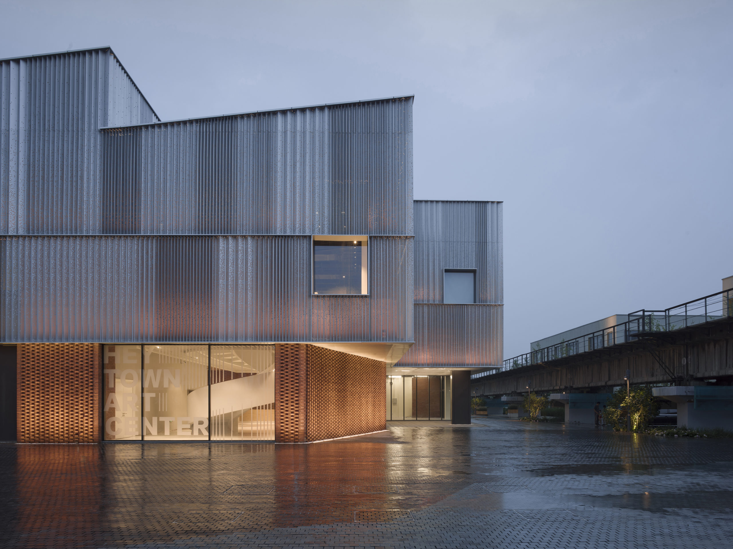
HeyTown Art Center by META-Project, 9th Annual A+Awards Winner in the Architecture +Metal category.
Perhaps the biggest factor giving rise to Chinese success in the A+Awards lies in the growing trend for firms to prioritize functionality and responsible design over flashy, formal structures. “Chinese architects around me, they have this attentiveness,” architect Wang Mian told the Global Times. “Most times, I hear people always judging a building by its appearance, but good design is far more than its aesthetics; it solves problems. In a true architect’s eyes, there is no such thing as only focusing on big ambitious ideas while neglecting to improve a situation a little bit better.”
The outcome of the 10th Annual A+Awards will be one of the highlights of 2022, and will bring with it plenty of creative surprises. One thing appears certain though — China’s most innovative architecture firms will feature prominently once again.
Get your work published internationally this year through the 10th Annual A+Awards! The Final Entry Deadline is January 28, 2022. Click here to start your entry today.Top image: Tea Leaf Market of Zhuguanlong by SUP Atelier, 9th Annual A+Awards Winner in the Architecture +New Materials category.
The post How China’s Top Architects Are Changing Perceptions and Winning Global Recognition appeared first on Journal.
Reader’s Choice: The 10 Most Popular Architecture Projects On Architizer in 2021
Architects: Want to have your project featured? Showcase your work through Architizer and sign up for our inspirational newsletter.
Architizer’s journal is fueled by the creative energy of the thousands of architects from around the world who upload their stunning work throughout the year. From conceptual designs to projects under construction to completed buildings, we are proud to serve as a platform for showcasing global architectural talent and the brilliance of visualizers, engineers, manufacturers, and photographers who are crucial members of the industry. A stellar drawing, rendering or photo, as well as a detailed project description, can go a long way in making a project stand out, as does tagging the stellar contributors on a project.
Firms who upload to Architizer share their work with professionals and design enthusiasts through our Firm Directory and Projects database. They also gain exposure by having their projects shared on our FacebookInstagram, and Twitter pages, as well as in our Journal feature articles. Indeed, through these various channels, hundreds of thousands of people in the global design community have come to rely on Architizer as their architectural reference and source of inspiration. As 2021 draws to a close, we’ve rounded up our database’s top 10 most-viewed, user-uploaded architecture projects:
1. Harbour Plaza Residences
architects–Alliance, Toronto, Canada


Harbour Plaza is a ‘vertical community’ aimed at transforming a former business district — a dead zone after dusk — into community for 9,000 residents, workers and visitors. A four-storey mixed use podium supports the elegant residential towers, whose bright white skin of pierced aluminum echos the rippling reflection of sunlight on the nearby Lake Ontario.
The façade’s woven texture can also be read symbolically, expressing the interrelationship between social, cultural, professional and recreational activity promoted by the development.
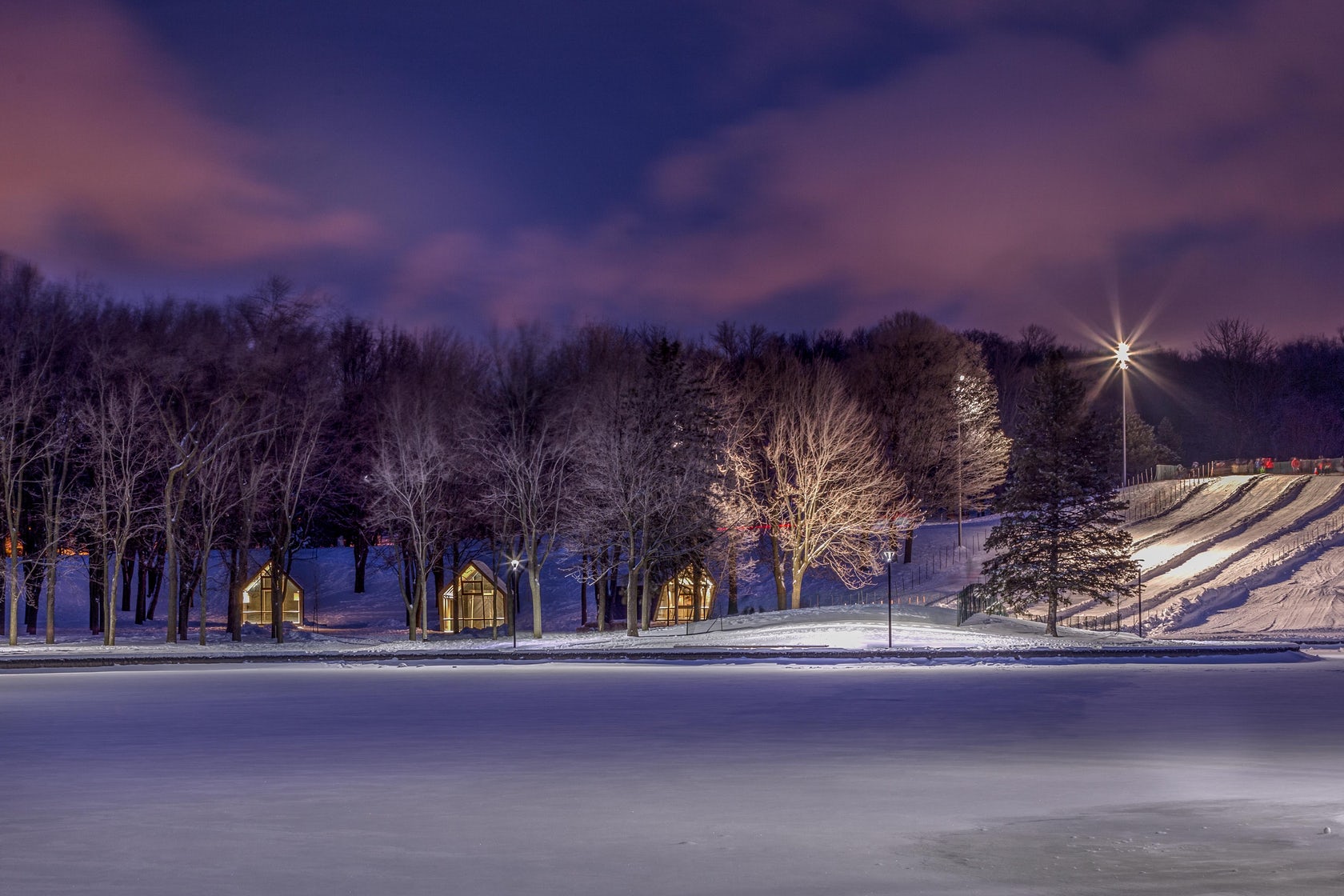
2. Beaver Lake Kiosks
perraultarchitecture (atelier urban face), Montreal, Canada
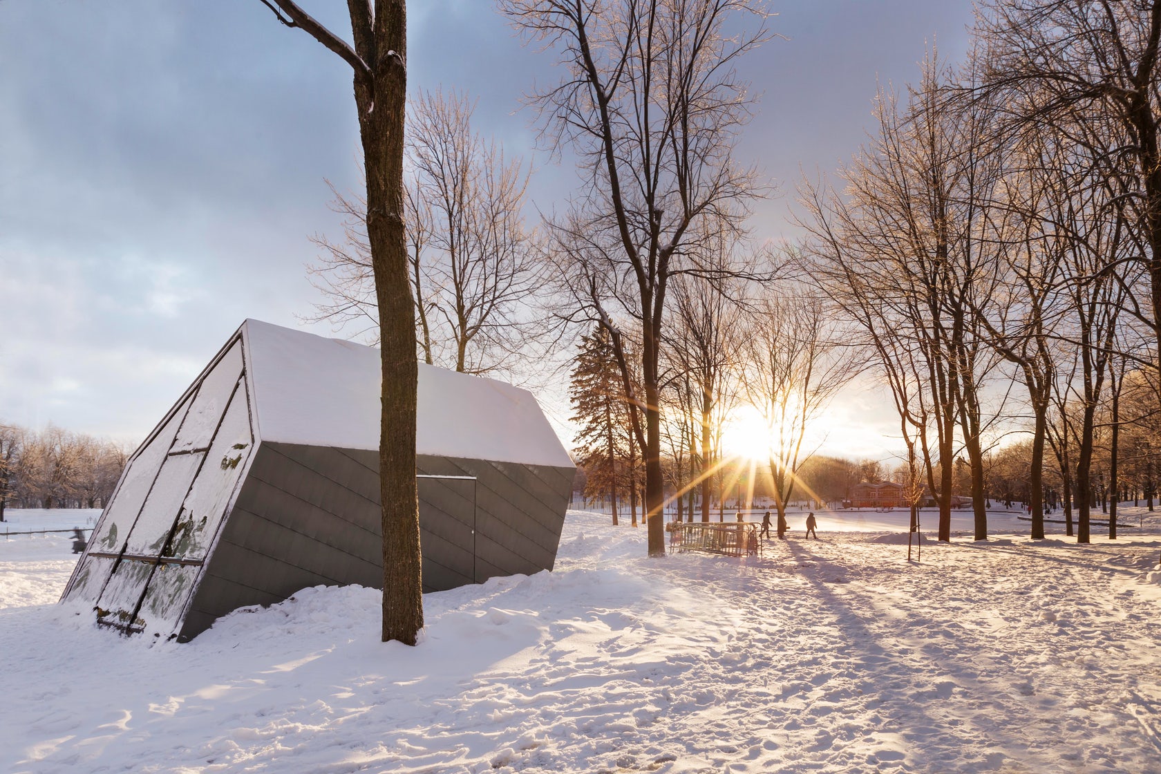
Mount Royal Park is to Montreal what Central Park is to New York. What is more, both were designed by Frederick Olmsted in the late 19th century. Fast forward to today, and 3 new kiosks at the Beaver Lake are reinvigorating the beloved Canadian green space.
Nestled in a glade on the top of the urban mountain, the trio imbues the natural surroundings with a poetic air. Their expressively slanted forms seemingly respond the elements, as if gusts of wind were pushing their volumes. Glazing at their front and rear ends transform the structures into glowing beacons that guide late night skaters and tubers in the dark.
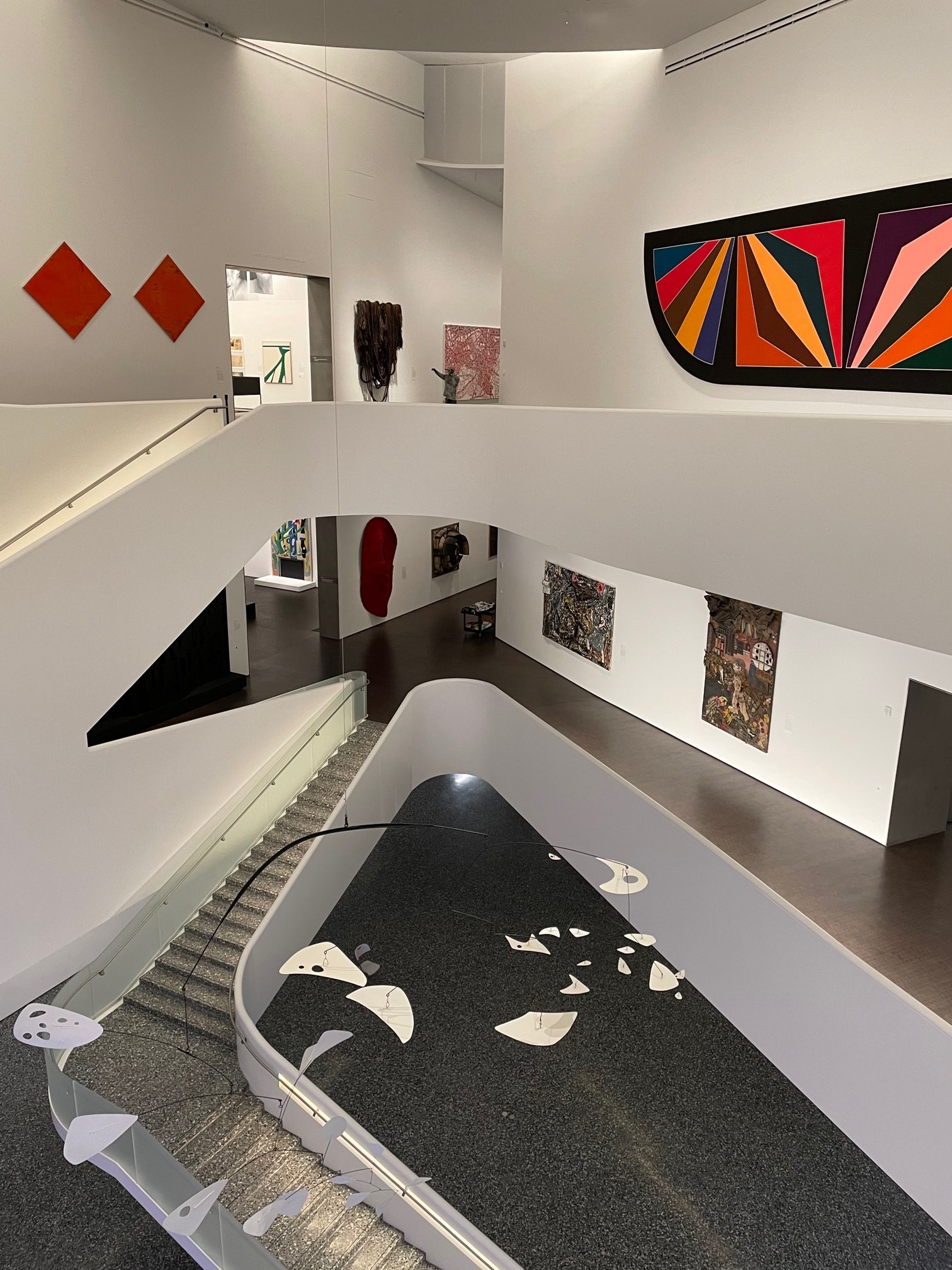
3. Nancy and Rich Kinder Museum Building – Museum of Fine Arts Houston
By Steven Holl Architects, L’Observatoire International, Kendall/Heaton Associates, Houston, TX
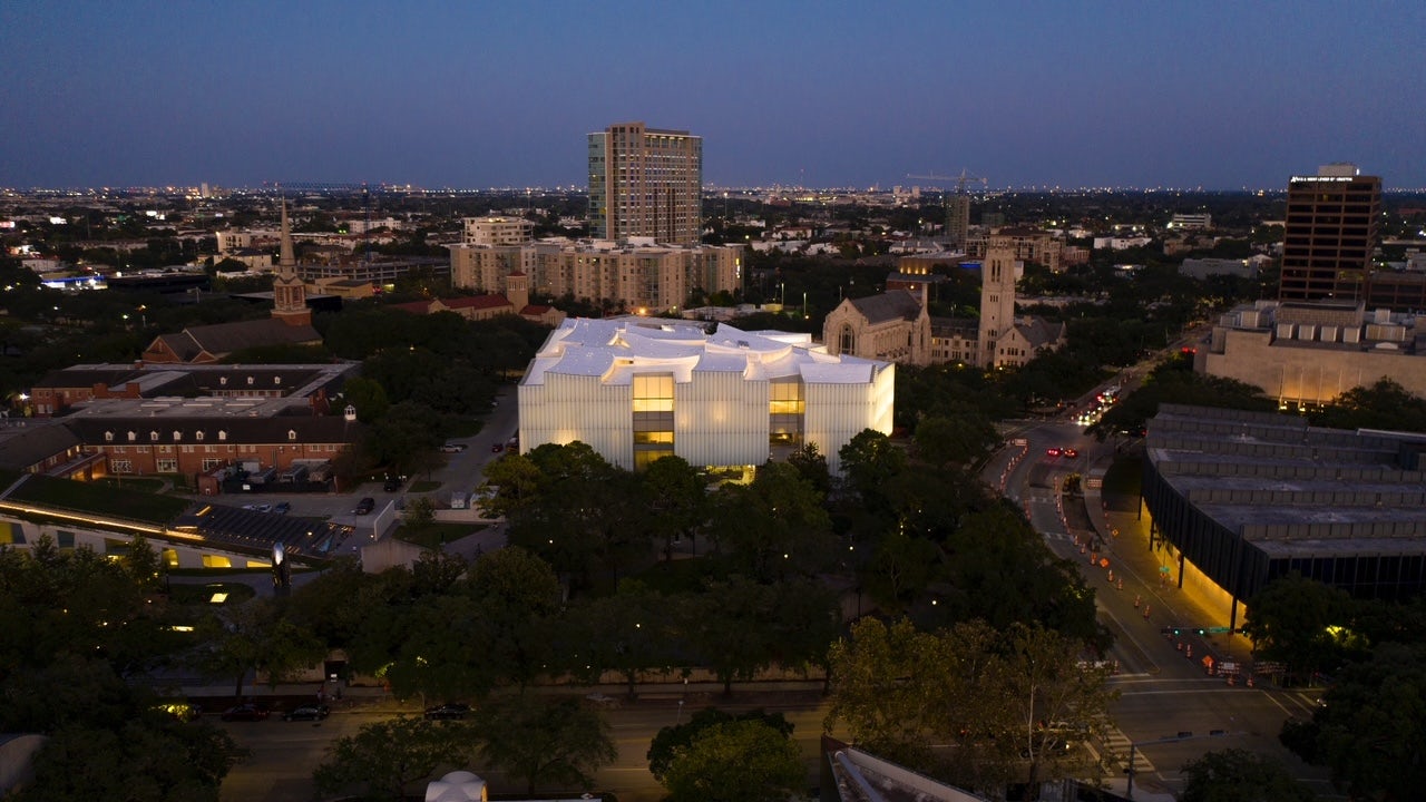
The new Nancy and Rich Kinder building stands as the central showpiece in the Museum of Fine Arts Houston campus redevelopment. The iconic structure is the final addition to the diverse portfolio of buildings on the Fayez S. Sarofim campus at the heart of Houston’s museum district.
The lighting concept for the new 164,000 square foot museum was carefully curated not to overpower this cultural district with its large scale. Its glass facade offers a muted backdrop for the lush green live oak trees of the museum grounds during the day, and softly glows as a lantern beacon at night.
4. Îlot Balmoral
Provencher_Roy, Montreal, Canada


This vibrant icon acts as a visual anchor for the pedestrians who wander through Montréal’s Quartier des spectacles — a favorite festival destination and the cultural heart of the vibrant northern city. The structure actually consists of two volumes, which are at once physically connected and visually separated by an emphatic, oblique fault line.
This divide is highlighted by large-scaled, bright red facets, which fold outwards and are oriented diagonally to the urban grid. This full-height atrium also invites light to deeply pierce into the building’s interior, revealing the zigzagging walkways that bridge the two volumes.
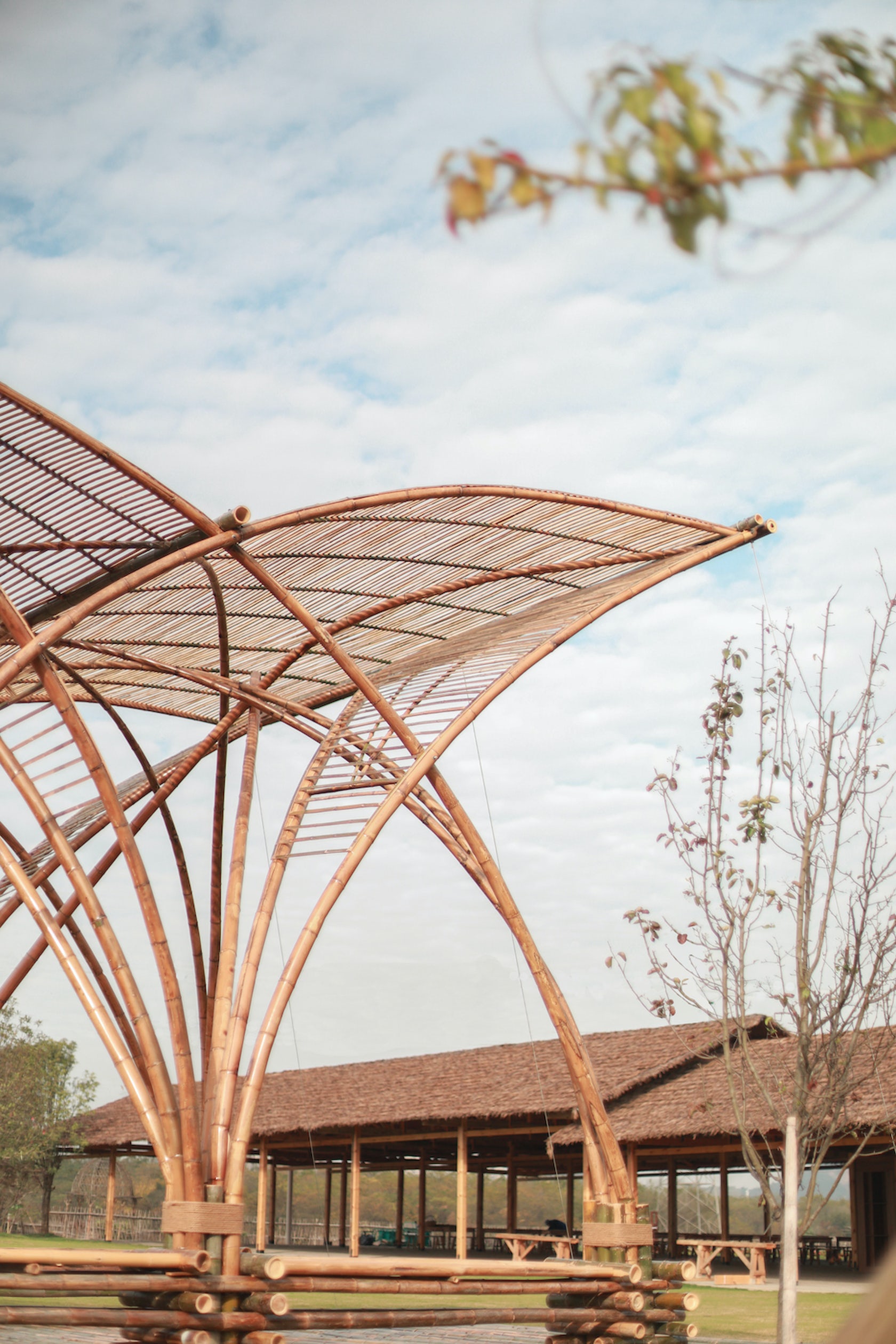
5. Phoenix Pavilion
Jiangzuo Studio of Huazhong University of Science and Technology, Gao Xin Da Dao, China
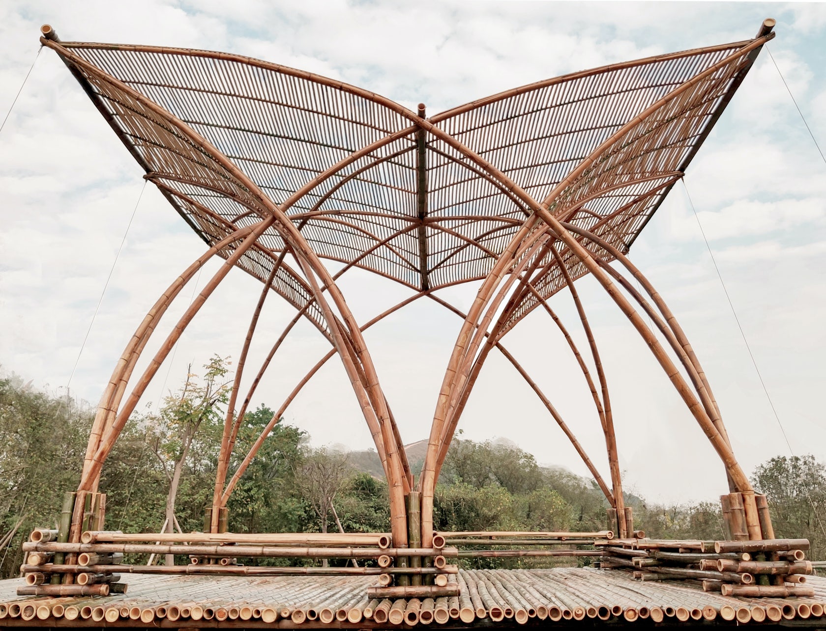
Sited on what was once a large refuse landfill, this pavilion marks the area’s transformation into an outdoor education place for students after its ecological restoration. Fittingly, the design of the Phoenix Pavilion articulates the intersection of three different lines of investigation: sustainable construction, heritage context and modern technology.
Bamboo grows abundantly in the area and it was thus used as the main built material. Exploring the possibilities of hot bending techniques, the large-span arch structure expresses the materials pliability and strength. Open and elegant, the pavilion takes the form of a phoenix spreading its wings in an allusion to traditional Chinese structures.
6. YAO Concept Restaurant
AAN Architests, Shenzhen, China
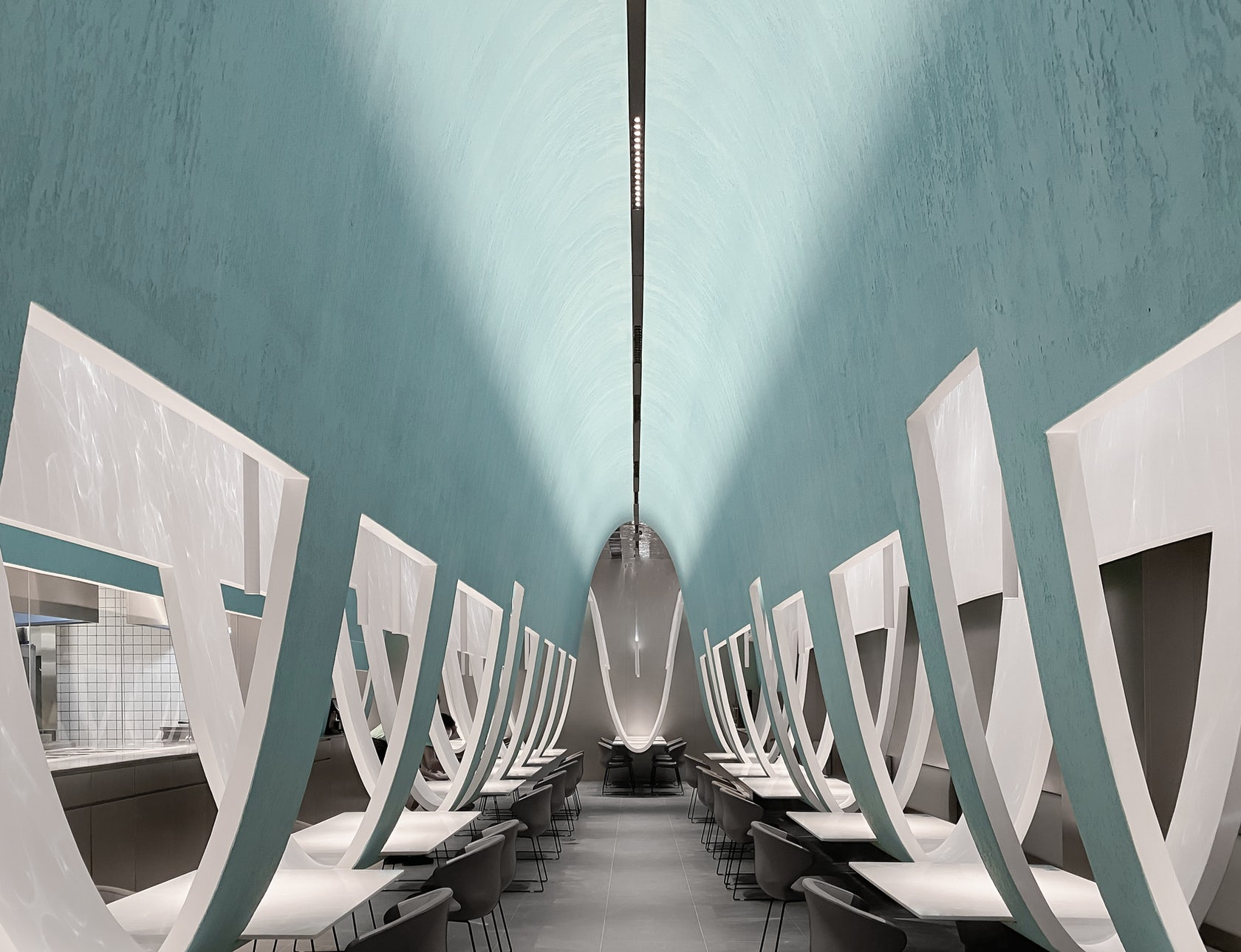
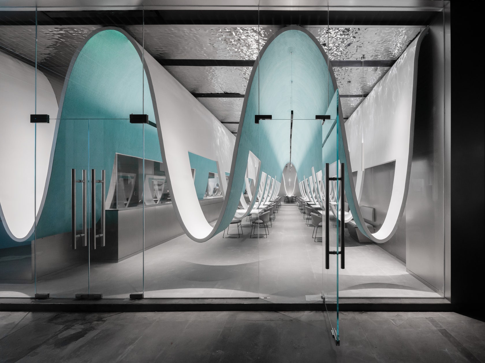
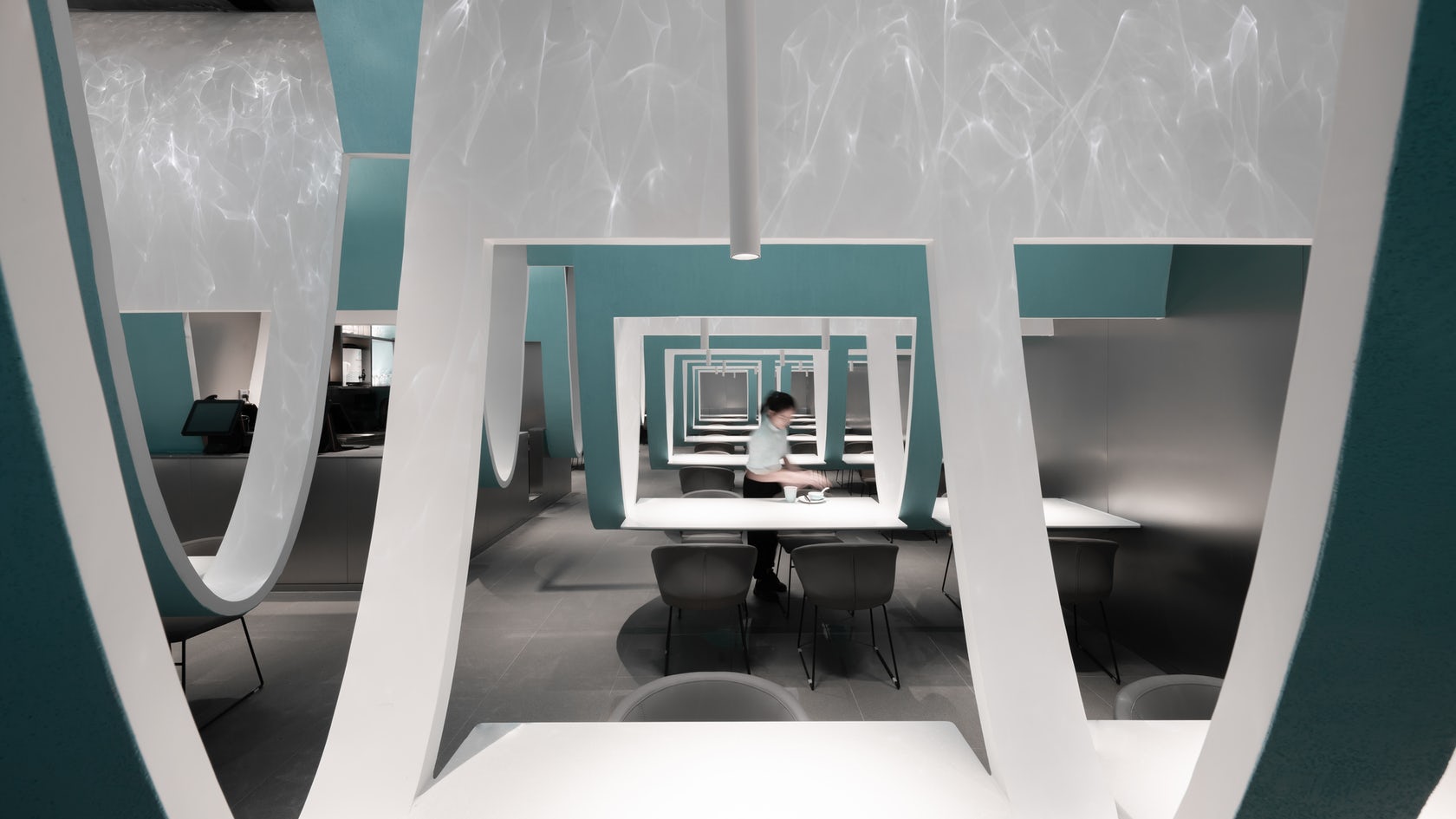
While interior architects are constantly advancing the spatial experience of hospitality interiors, tables and chairs are basic standards for most restaurants. This Chinese restaurant meditates on the expectation that diners eat at separately spaced tables. Curved partitions swoop down from the ceiling, simultaneously uniting and separating the various tables. The result is a net-like landscape which entangles hungry visitors and holding them together apart.
7. Cultural Center of Beicheng Central Park
Shenzhen HuaHui Design, Hefei, China

This cultural and educational facility reimagines the powerful tradition of the Chinese courtyard. Wall and corridor serves as interface for the courtyard, redefining the architectural space through a combination of different forms and modules that create rhythms of opened and closed space.
8. The Bicycle Garage
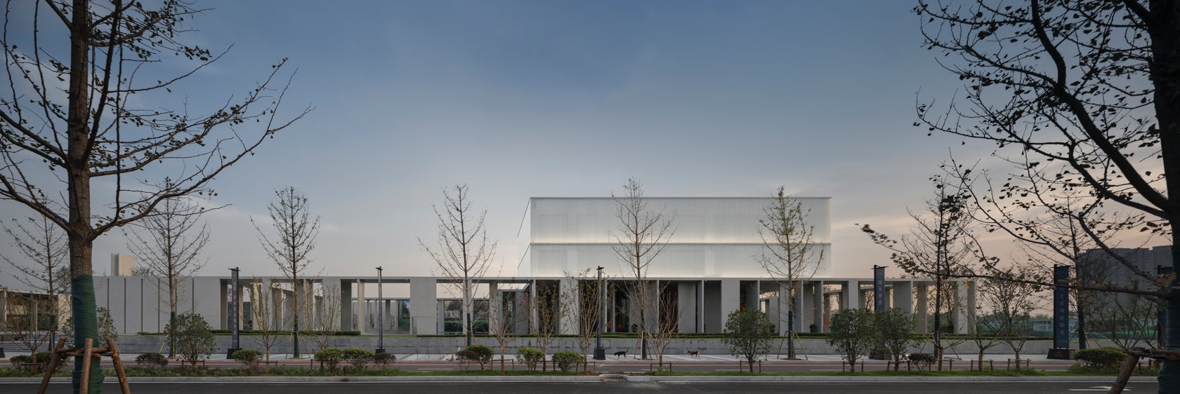
Tengbom, Uppsala, Sweden
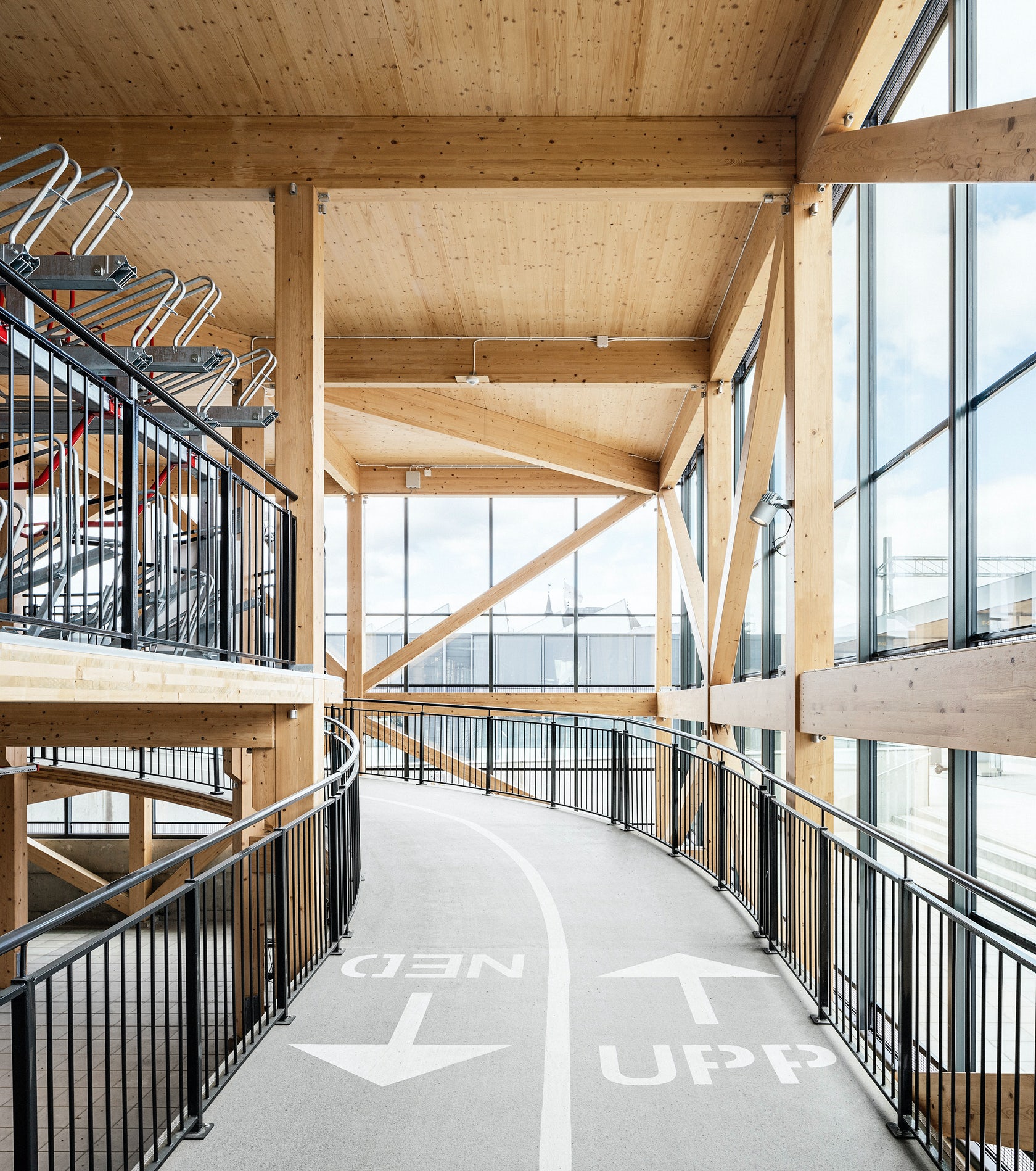
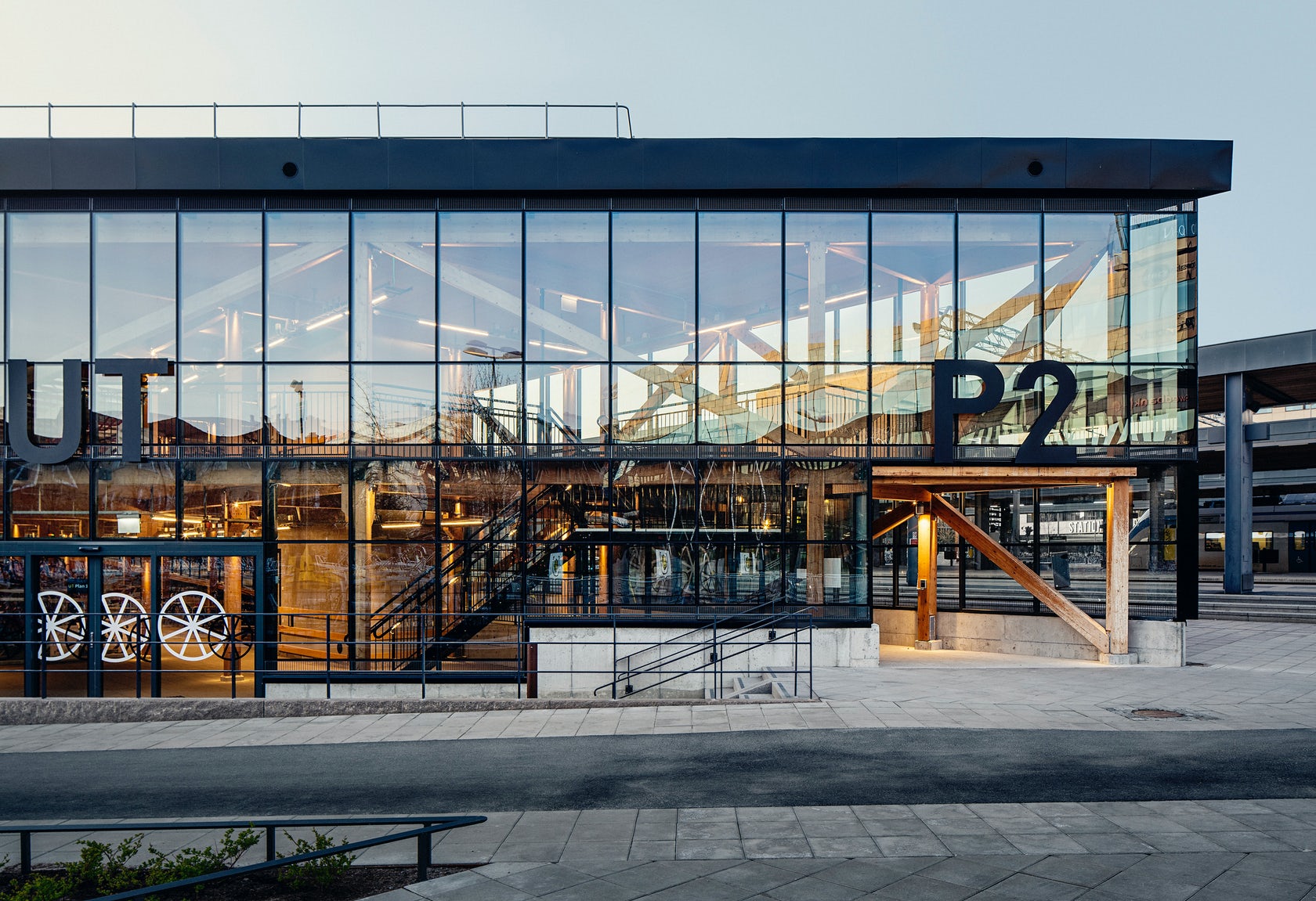
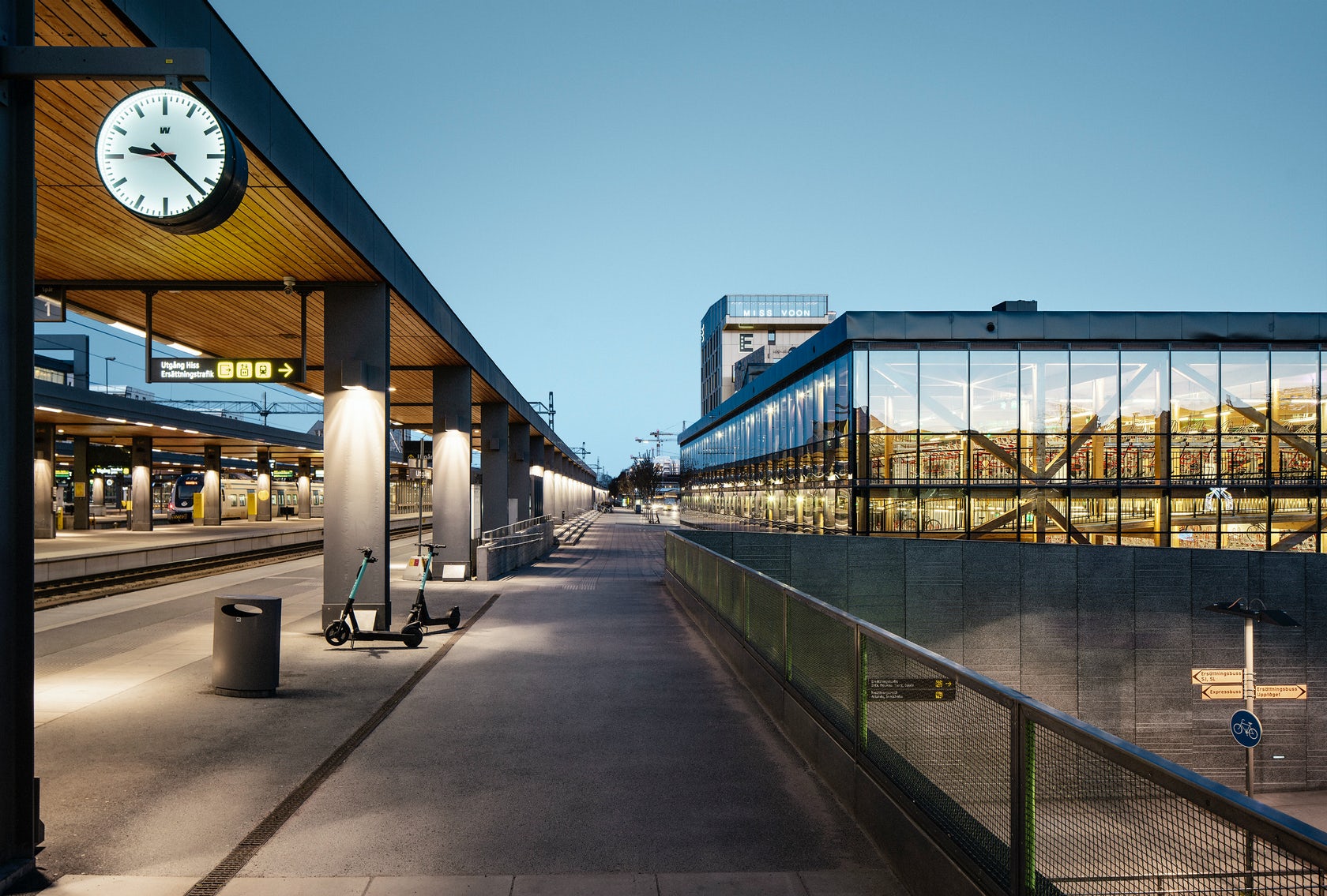
Located next to the platforms of Uppsala Central Station, this bicycle garage is both a symbol and an attestation of the city’s action-oriented sustainability ambitions. The building is a practical functionality piece of infrastructure, but at the same time, it powerfully represents a strong design concept. Two floors hold 1, 200 bicycles at once; they are connected by a wooden bike ramp which melds into the building’s exposed wood skeleton. Clad in glass façades with black steel moulding, the handsome building greets commuters at the platform of the city’s central railway station.
9. A Surfer’s House
Christiana Karagiorgi Architects, Peyia, Cyprus

This design ingeniously moves beyond the binaries of inside/outside to explore what it means to live in between indoor and outdoor space. Natural materials and claddings — including movable screens made of reeds — enclose exterior spaces, transforming the structure into a light and almost transparent cubical volume that overlooks the sea.
The building’s ground imprint is minimized in order to preserve the local microclimate and natural flora, while the timber slats visually elide the distance between the natural and built environments. The Akamas Peninsula is carpeted with plants and rocky fields. The house embraces both, inviting them to rest amongst the living spaces.
10. The Wall House
Guedes Cruz Architects, Lisbon, Portugal


Concrete, glass and wood form a protective but open barrier that cocoons the patio of this remarkable home. Privacy was less of a concern than the harsh Atlantic winds. To this end, extensive glazing opens the house to scenic sea views, which are visible from both interior and exterior spaces. The tour de force are two stacked, exterior pools that crisscross over one another on the patio — one in the ground and the other floating in the air.
Bonus: Toyath Residence
Webber + Studio, Architects, Austin, TX
Infrastructural issues, size constraints and stylistic inconsistencies plagued this twice-renovated Freedman’s cottage in Austin’s historic Clarksville neighborhood. Although it may be a common challenge, preservation is an art form, and this intervention is a masterclass in balancing modern updates and expansion with sensitivity to historic value. This project responds by reimagining the home as a series of smooth and luminous interconnected spaces that culminate a spacious, modern addition at the rear.
Architects: Want to have your project featured? Showcase your work through Architizer and sign up for our inspirational newsletter.
The post Reader’s Choice: The 10 Most Popular Architecture Projects On Architizer in 2021 appeared first on Journal.
Gosford Leagues Club Park // Turf Design Studio
Project Status: BuiltYear: 2021Size: 10,000 sqft – 25,000 sqftBudget: 5M – 10M
Text description provided by the architects.
Fundamentally this project is about connection; connection to environment; connection to ‘country’ and connection to community – making a place for all. Gosford, one of the earliest European settlements in New South Wales and now a thriving town, is undergoing significant revitalization, led by a number of State government initiatives including Gosford Leagues Club Park – an inauspicious cluster of underutilised playing fields on reclaimed waterfront separated from Brisbane Waters by Dane Drive, an arterial road.
© Turf Design Studio
Our brief was to provide a town green, a regional playground, conserve existing phoenix palms, extend Baker Street to provide frontage for new adjacent development, and lastly, provide a new and ‘community node’.Discovery of the early shoreline on historical surveys, located deep within the park, long buried, strongly influenced the park narrative and its overall physical form.
© Turf Design Studio
We saw an opportunity to not simply interpret, but also restore this lost shoreline in a kind of archaeological dig, revealing the bay floor as an estuarine wild play area, a ‘Tidal Terrace’– a place to play, to learn, to connect to nature.
Our approach was to codesign the project with the three key stakeholders: our client Hunter Central Coast Development Corporation (HCCDC), Central Coast Council (CCC) and Darkinjung Local Land Council; via a series of design workshops identifying key attributes, opportunities and options for site development.
Working with the Darkinjung, we learnt the site was once an important camp, a place of trade and cultural exchange, a meeting ground between the Darkinjung clans and with adjoining nations such as the Gadigal, Gomeroi and Wiradjuri.
© Turf Design Studio
The Darkinjung oral history recounts this place as an important point of first contact between the Darkinjung and Europeans – when charting the Brisbane Waters in the first months of settlement, Phillip’s exploration party found a large camp with a marina of canoes at the shoreline. We also learnt in these workshops the importance of ‘country’, both land and sea, as resource and spiritual connection.
© Turf Design Studio
Elder and artist Kevin Gavi Duncan shared important local rock carvings and asked if these could somehow be incorporated in the park.
The Tidal Terrace became a place to interpret these songlines and stories; the camp, first contact and carvings, in a new meeting ground for all. At its heart is a central community node, Norimbah – a dance ground defined by timber totems of both clans and nations.
© Turf Design Studio
Mythic sea creatures in the shape of local rock carvings, formed as stone terraces, swim in on the tide, reinhabiting the recovered coastline, encircling both the Norimbah and also Phillips’ Gig, approaching from the bay. Two songlines forever intertwined.The community is invited in; to experience and to play. The Tidal Terrace is the focal point, however the park offers more.
© Turf Design Studio
Play opportunities for all abilities and ages extend into adjoining spaces, the ‘Seed Pod’ play towers located atop the adjacent berm offer expansive views to the bay and active natural play. The ‘Fish Trap’, a communal rope structure invites immersive, imaginative play as it sways in space. To the north of the Tidal Terrace is Ray Maher Field, an open lawn framed by mature Date Palms, capable of accommodating everything from kicking a ball to a major civic event.To the east, Baker Street is extended as a pedestrian zone shared with slow moving vehicles, providing access to neighbouring buildings as well as key spaces, adjoining BBQs, picnic facilities, showers, amenities building and exercise area.
© Turf Design Studio
.
© Turf Design Studio
Gosford Leagues Club Park Gallery
The post Gosford Leagues Club Park // Turf Design Studio appeared first on Journal.
Did you miss our previous article…
https://thrivingvancouver.com/?p=930