Home » Articles posted by Kenneth Brown (Page 4)
Author Archives: Kenneth Brown
Pritzker Prize Winning Architect Richard Rogers Passes Away at 88
Renowned British architect Richard Rogers has passed away at the age of 88. The 2007 Pritzker Prize winner had a prominent career spanning more than five decades, and designed some of the most famous public buildings of the late 20th century. The designer stepped down from the board of Roger Stirk Harbour + Partners in June 2020; the firm is now led by Graham Stirk and Ivan Harbour, along with nine other partners.
Rogers became widely known following his and Renzo Piano’s 1971 competition-winning entry for the Centre Georges Pompidou in Paris, an iconic museum that at the time was a lightning rod for criticism. In this project one can already see the themes that would become prominent throughout Rogers’s career: high-tech systems, a concern for public space, and a new conception of context — what it means to fit in with existing urban fabric. We can add another theme that appears later in his career: Rogers arrived at an understanding of sustainability earlier than many others in the architecture profession, stressing its importance in his writings and projects.
Richard Rogers; image via Archisoup
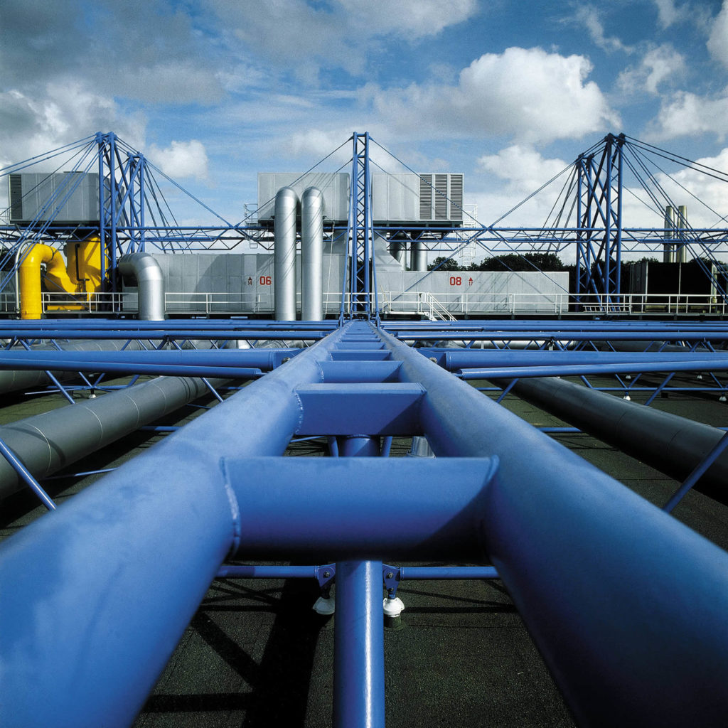
Rogers continued designing with a functionalist ethos through the height of postmodernism in architecture, allowing systems to be read as style. Later grouped into the historical umbrella of “high-tech architecture” by theorists like Reyner Banham, Rogers’s buildings bare their structural and mechanical systems, emphasize open, flexible spaces, and celebrate transparency between interior and exterior.
Part of this formal openness served to pull in urban energy, making interiors the extensions of public plazas and other urban centers. A strong concern for public space and the life of cities runs throughout Rogers’s career, eventually leading him to several roles advising the London and UK governments on urbanism. His urban design philosophy was based around the importance of piazza-like public spaces and the achievement of a new type of contextuality based on scale, height and connectivity. Both together enable buildings and environments that are stylistically very different — for example, the Centre Pompidou and Haussmann’s 19th-century Paris — to fit together within a city’s urban fabric.
Rogers’s concern for cities and for the public realm led to his 1995 lecture and 1998 book Cities for a Small Planet, which set out an agenda for sustainable urbanism and urbanization through viewing cities as metabolic systems. This pushed Rogers to the forefront of the movement for sustainability in construction, in avoiding suburban sprawl, and in efficient material and energy use, even before the full extent of the danger of climate change was understood.
An overview of some of his most compelling projects, below, demonstrates how Richard Rogers popularized a flexible, sustainable and public-minded design language for the 21st-century city.
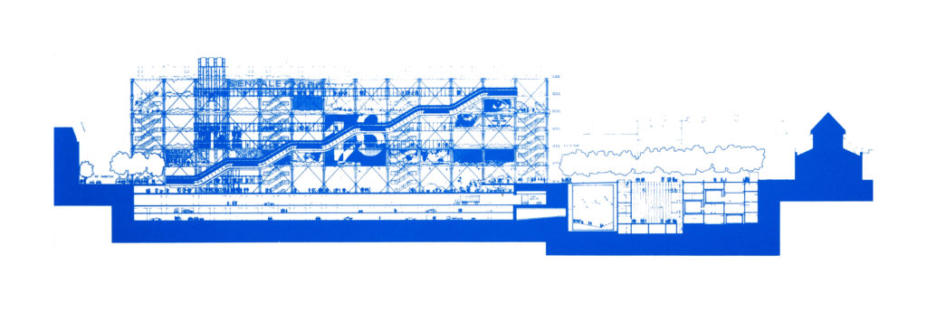
Image by Richard Rogers and Renzo Piano via Atlas of Places.
Centre Georges Pompidou, 1971-1977. With Renzo Piano.
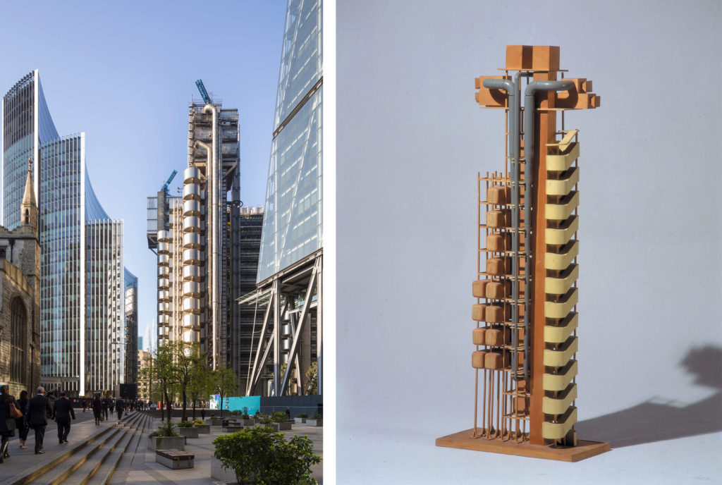
Lloyd’s of London, 1978-1986.
Inmos Microprocessor Factory, 1982-1987.
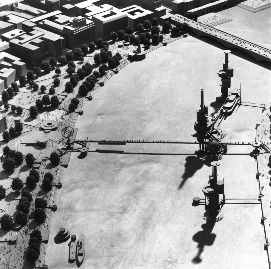
London as it could be, 1986.
European Court of Human Rights, 1989-1995.
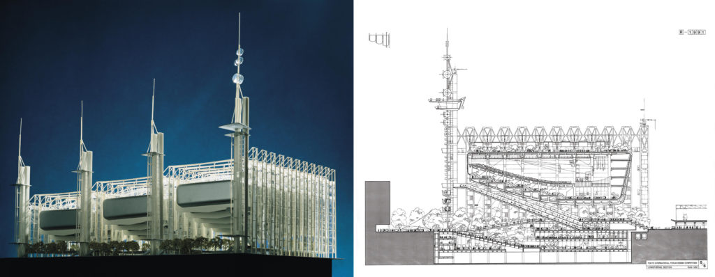
Tokyo Forum, 1990.
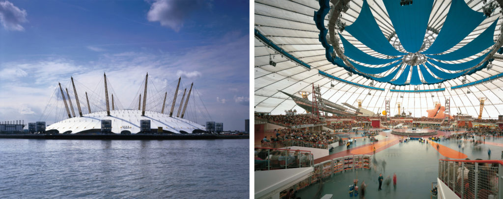
The Millennium Dome, 1996-1999.
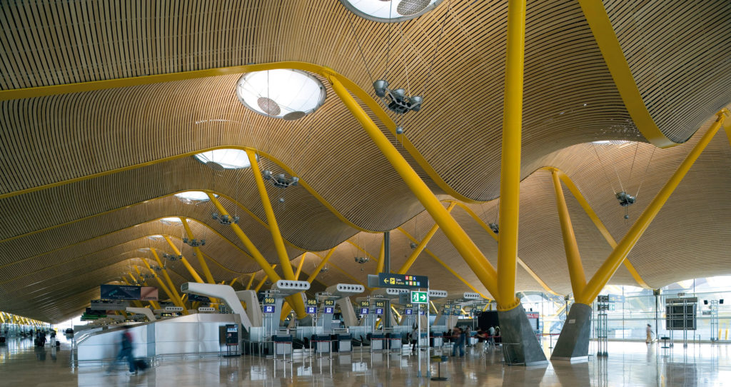
Terminal 4, Madrid-Barajas Airport, 1997-2005.
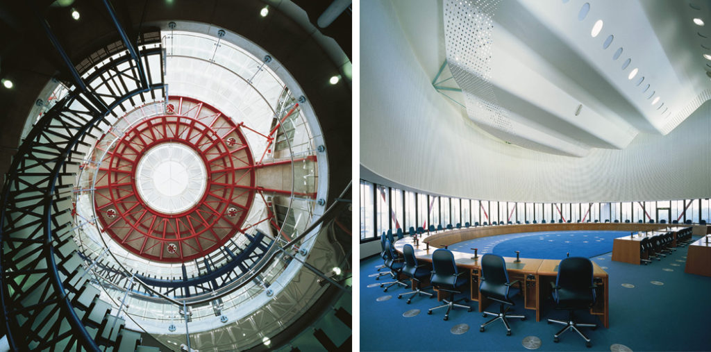
National Assembly for Wales, 1998-2005.
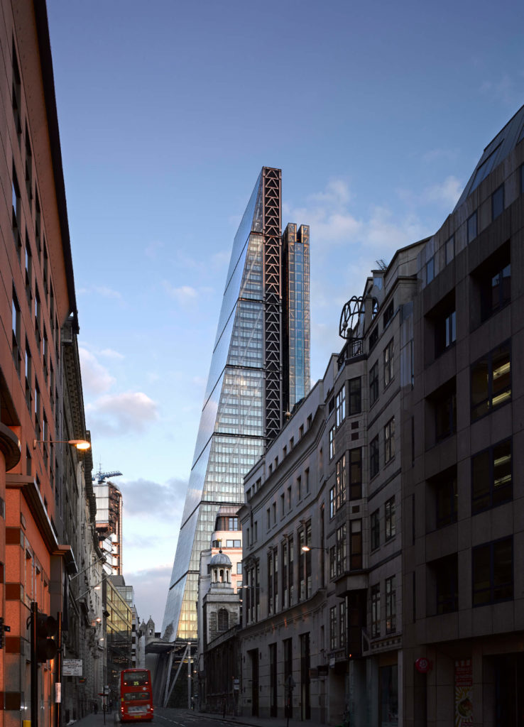
The Leadenhall Building, 2000-2014.
Copyright Jim Stephenson 2015.
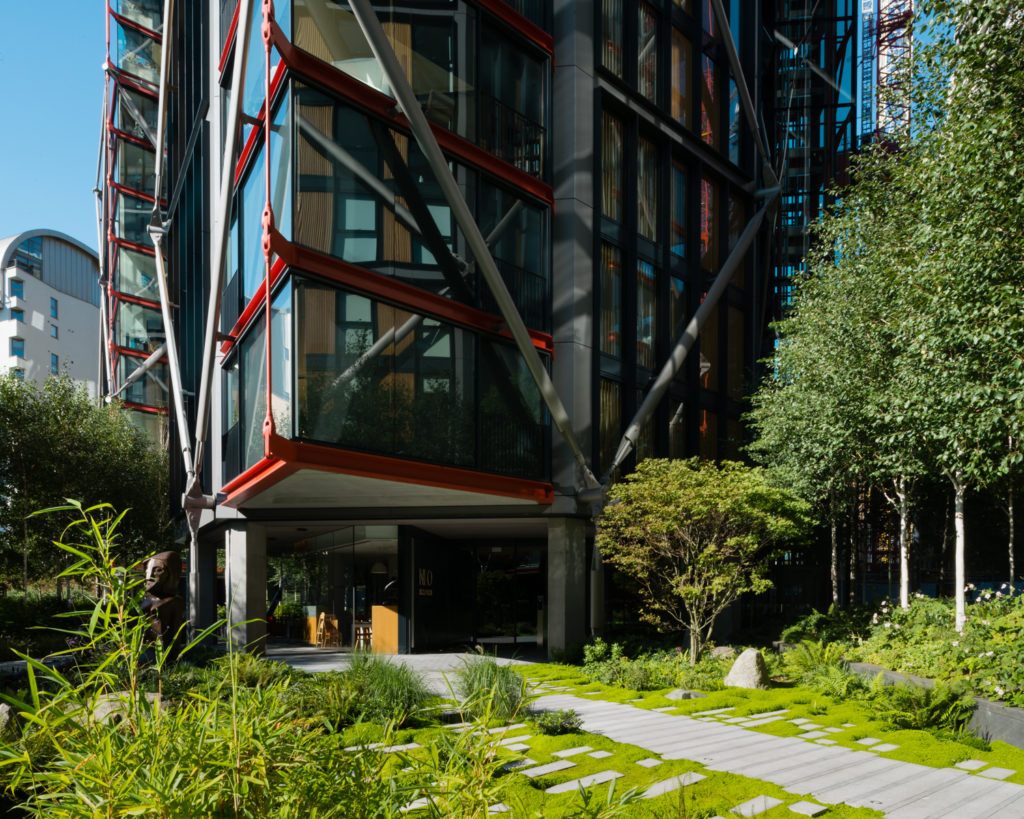
NEO Bankside, 2006-2012.
All images courtesy of Rogers Stirk Harbour + Partners unless otherwise noted.
The post Pritzker Prize Winning Architect Richard Rogers Passes Away at 88 appeared first on Journal.
Sharif Office Building // Hooba design
Project Status: BuiltYear: 2020Size: 5000 sqft – 10,000 sqft
Text description provided by the architects.
Commissioned by the University professors, Sharif office building was designed as a communal work space adjacent to the Sharif University of Technology. The design was developed over an existing structure which was already built up to the ground floor. The given criteria was to design a building in harmony with the main brick buildings in the university campus.
© Hooba design
© Hooba design
Therefore, the main challenge was to come up with a formula which takes the essence of 1960’s architecture of the university and combines it with the contemporary atmosphere of a technology based institution. The project site is next to a local park and in a close distance to Tarasht Public Park.
© Hooba design
© Hooba design
The green spaces on the façade are extensions of the greenery around the site, creating a homogenous entity in the urban scale. Moreover, connecting the two access roads on two sides of the building created an urban plaza within the building which fades the boundary between the building and the city.
© Hooba design
© Hooba design
The paradox between the world of software design and the real physical world, introduced contradictory topics such as introversion vs, extroversion, solidity vs. transparency, rigidity vs. flexibility in façade, consistency vs. variations in urban scenery, as well as public vs. private zone. It was decided to create a homogenous entity in terms of form and material to reach a state of uncertainty among paradoxes.
© Hooba design
© Hooba design
The hollow brick used in this project was formed by offsetting the outer edge of the traditional 10 * 20 cm brick used in the 1940’s buildings of Sharif University. The resulting module was a 19.5 * 32 cm brick with a 10* 20 cm hole covered in torques glazing.
© Hooba design
© Hooba design
Combination of the ancient brick blocks and software design technology resulted in the formation of a smart brick panel forming the entire façade of the building. These panels automatically adjust themselves based on sunlight exposure during the day. This system resembles digital technology both on the interior and the exterior sides of the building.
© Hooba design
© Hooba design
Non solidity (Transparency), sensoriality (connection to the outer world), and being multimedia (data transfer) are the characteristics of the electronic age. This project tries to create an intermediary vision to these contradictory topics in order to introduce a pioneer complex in the electronical industry. The connection between brick as a traditional building material and the high tech electronic world, requires an intermediator and this project tries to address this issue.
© Hooba design
© Hooba design
The closed and semi open interior spaces of the building were also designed to fade the boundary between inside and outside, to create different perceptions during day and night. The interior activities could become visible at night, converting the building from introverted to extroverted during each day. The working spaces in the building consist of open and semi open office, with green boundaries used to define and separate them..
© Hooba design
© Hooba design
Sharif Office Building Gallery
The post Sharif Office Building // Hooba design appeared first on Journal.
Did you miss our previous article…
https://thrivingvancouver.com/?p=877
Maggie’s Leeds // Heatherwick Studio
Project Status: BuiltYear: 2017Size: 3000 sqft – 5000 sqft
Text description provided by the architects.
Maggie’s Centres are places where people with cancer, and their friends and families, can go to find free practical and emotional support. They follow the approach to care set out by Maggie Keswick Jencks – a belief that people should not “lose the joy of living in the fear of dying”.
© Hufton+Crow Photography
Heatherwick Studio was commissioned to design a new centre at St James’s University Hospital in Leeds. Jimmy’s, as it is known locally, is Europe’s largest teaching hospital and home to the Leeds Cancer Centre, which serves a diverse community across Yorkshire. The hospital staff had been working to improve the experience for patients; bringing a piano into the Bexley Wing, for example, and hanging paintings from the city gallery.
© Hufton+Crow Photography
The studio wanted to support this by providing further respite from the clinical environment. The brief was to create “a home that people wouldn’t dare build for themselves” to welcome an expected 110 visitors each day.
The site chosen for the new Centre was the last patch of greenery at the hospital – a grassy hill next to the car park, bounded by roads on two sides and surrounded by large buildings.
© Hufton+Crow Photography
The six-metre difference in level across the site would typically dictate a building dug into the slope – instead, the studio chose to follow its natural contours, so that at the highest point, visitors would have views of the Yorkshire Dales, and a connection with the world beyond the hospital.
© Hufton+Crow Photography
The pillars of support at Maggie’s are the counselling rooms, so these were placed, like three pavilions, at different levels on the slope to support the roof. The space between them became the natural heart of the Centre, with views into each area, making it simple for visitors to find their way around and connecting every room with the garden – externally, this gives the building a different character from every angle.
© Hufton+Crow Photography
Two entrances were also created: a front door, and a rear entrance for staff and regular visitors. The challenge was to span and enclose the level changes and reinstate the greenery. Instead of a single, monolithic canopy, the roof is composed of three overlapping gardens, which step down and overhang to shelter communal areas.
© Hufton+Crow Photography
In this way, the hospital does not lose its last green space – it is lifted up, filled with woodland plants and made more accessible and inviting. The relationship between the Centre’s architecture and the experience for visitors extends beyond the uplifting effect of its garden. The front door, for example, is a psychological threshold – the point at which someone might start to accept a cancer diagnosis.
© Hufton+Crow Photography
Not everyone will be ready to open the door straight away, so there is a bench to sit outside, or a private path to wander quietly through the gardens. The entrance wall is transparent and the door is moved to the side, where it is less intimidating. Inside, visitors are not confronted by a conventional reception space; instead, they find a welcoming window seat, a noticeboard, and a view through to the heart of the Centre, with its communal table in the arc of a staircase leading to the kitchen.
© Hufton+Crow Photography
The kitchen table, a feature of all Maggie’s Centres, represents another threshold; the point where visitors feel ready to share their experiences. Everything is on display, so there is no awkward rummaging through cupboards to find a mug, and a clerestory fills the space with natural light. Above this, there is a private space for staff to rest and gather strength, and a sheltered roof garden.
The road running along the lowest point of the site presented a challenge for the building’s construction – as the main ambulance route, it could not be disrupted by months of heavy vehicles.
© Hufton+Crow Photography
The team designed a structure that could be built off-site and assembled quickly on a concrete slab and retaining wall, with minimal disruption. The pre-fabricated insulated timber cassettes were manufactured in Switzerland and fixed together on site in just eight weeks. These are supported by glulam fins, whose modulations give the feeling of trunks rising up from the ground to support the gardens overhead.
The structure is made entirely of sustainably forested spruce, a material that will expand and contract with the seasons, as if alive, and the floors are made of durable engineered timber (CLT). The studio looked at the qualities that make a building a home; the use of warm, natural materials, the way that objects are used to express individuality, the combination of private spaces and places where people can come together, and gentle lighting.
Between the timber fins are shelves, lined, as you might at home, with nick-knacks, pot plants and the interesting things that people bring to the Centre. When it came to lighting, the studio had the idea that the wooden fins could glow, as if they were emitting light. This is achieved by integrating the lighting with the shelves.
To achieve this, the designers had to work backwards, specifying how the lights, handrails and services would be integrated at an early stage in the process, as the building was still taking shape.
The rooftop garden, designed by award-winning landscape designers Balston Aguis, is inspired by Yorkshire woodlands and features native English species of plants, alongside areas of evergreen to provide warmth in the winter months.
Inspired by Maggie Keswick Jencks’ love of gardening, visitors are encouraged to participate in the care of the 23,000 bulbs and 17,000 plants on site..
The post Maggie’s Leeds // Heatherwick Studio appeared first on Journal.
States of Play: 8 Interactive Installations Found Around Europe
Architects: Want to have your project featured? Showcase your work through Architizer and sign up for our inspirational newsletter.
Back-to-back video calls, constant scrolling on social media and thousands of online shops have made it very easy for us to interact with others and get chores done from the comfort of our couches. But this has also reduced the need to actually go out and interact with people and the environment. The importance of being out was actively felt when the pandemic forced people indoors last year.
There are a lot of ways to create interest in public spaces so that people use them as more than just points to cross on the way home from work. Designs firms across the world have made attempts to revitalize such public places with interventions like LED installations, quirky seating, play areas for adults, and more. Below are a few such examples from Europe where architects have used electric colors, modular elements and, in one case, insects to attract people and make them part of a larger dialogue.


Gondwana by orizzontale, Terni, Italy
Part of the architectural festival Festarch.lab in 2012, this project activates the main square of the town Terni by adding a dynamic stage. The urban theatre is composed of several colored wooden platforms that can be put together to form a large square or broken apart into separate seating areas, much like pieces of a Tangram. These blocks have different heights, slopes and steps to facilitate different ways for the public to interact with them.
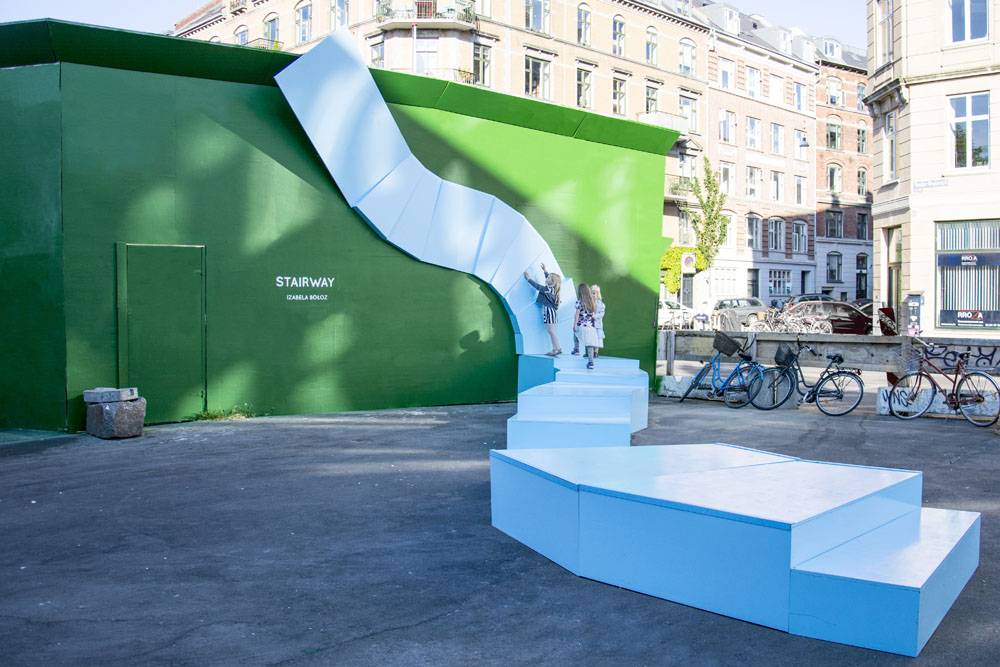
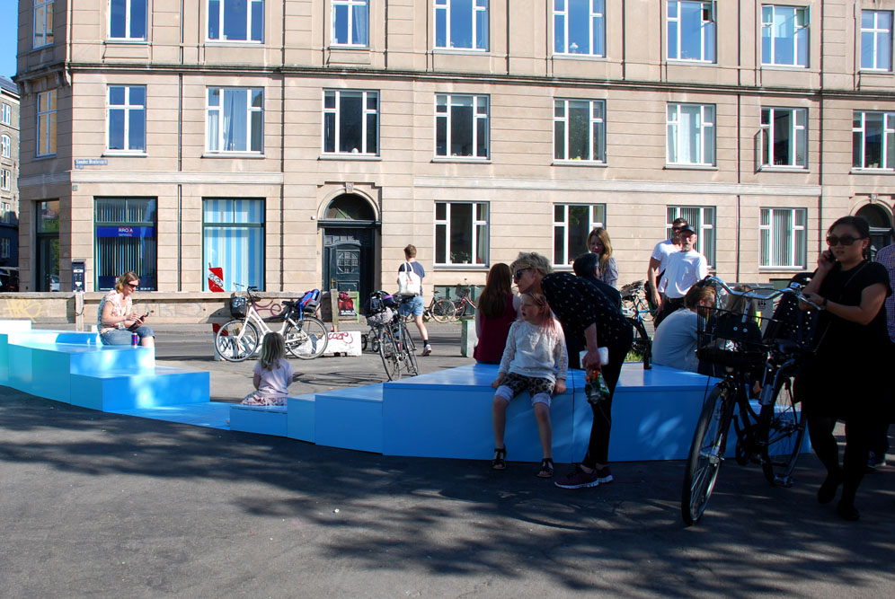
Stairway by IZABELA BOŁOZ, Copenhagen, Denmark
A hangout for families in the day and skating track in the evening, Stairway is one of the biggest 3D interventions in the Byens Hegn – Cool Construction city project. This surreal blue staircase lets users imagine a path to a mythical world beyond the door situated at its end. The path itself is composed of twenty-six blocks that are made of wood and metal. These blocks are created in varying heights to create different surfaces to sit or lie down.
Images by Ugo Salerno (Anotherstudio)
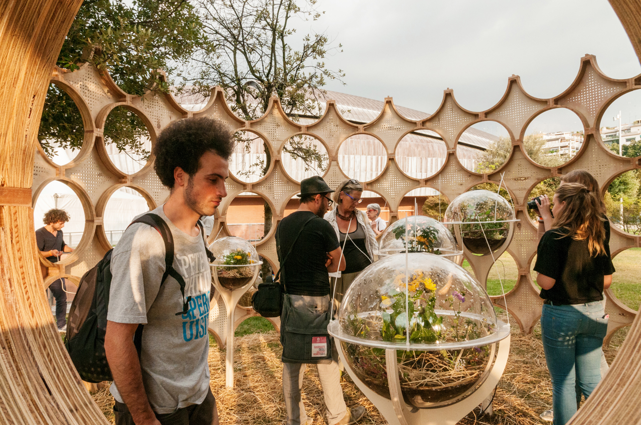
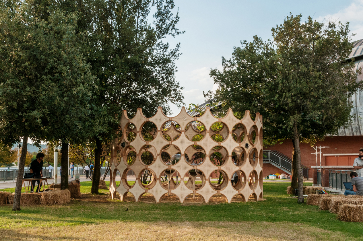
Wunderbugs by OFL Architecture, Rome, Italy
Popular Choice, 2015 A+Awards, Concepts – Architecture +Collaboration
Francesco Lipari and Vanessa Todaro from OFL Architecture used traditional and computer-based machines to create this interactive wooden installation. The form combines Roman Baroque forms with the geometries that are associated with insects. The six spherical ecosystems for insects comprise sensors that monitor environmental changes and visitor patterns to create musical compositions, showing the harmony between humans and insects.
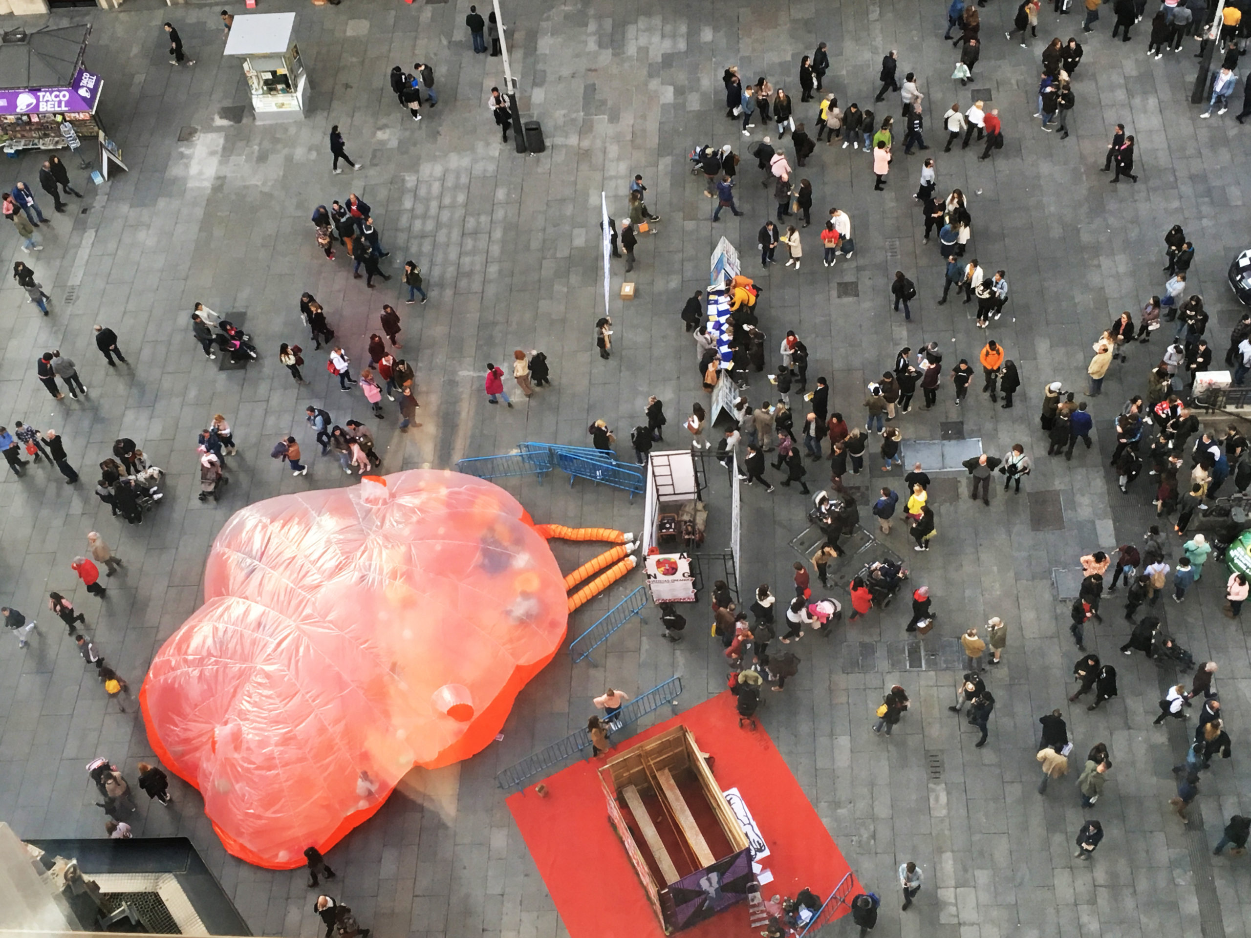

#estaesmiplaza by Conjuntos Empaticos, Madrid, Spain
This installation is part of a series created by the studio to increase activity in public spaces. The plastic bubble creates an enclosed space for small concerts or group activities for children. These inflatable modules are meant to act like organisms that invite users to interact with them and change the nature of existing urban pockets.

Images by Wojciech Ostrowski and Dominik Werner
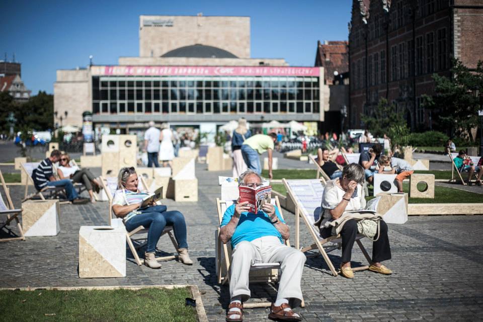
Targ Weglowy Square by Gdyby Group, Gdańsk, Poland
There was an opportunity to revamp the Targe Węglowy square after the removal of parking spaces there. The studio did this by creating modular cubic blocks that citizens can use to create custom seating and gathering nooks. Patches of grass are also added to create more defined seating areas. The aim of the design was to allow the users to determine how the space could be arranged or modified based on their specific needs, allowing adults to create reading or talking booths, and kids to customize playgrounds.


Images by Paul Kozlowski
Cloud Garden by Design Office Takebayashi Scroggin [DOTS], La Grande-Motte, France
The Cloud Garden originated as a competition-winning entry in the Festival des Architectures Vives (FAV) 2014 and was later installed in the Aedes Metropolitan Laboratory as part of the Water as Ritual symposium. The installation is a series of cloud-like soft clusters that visitors can play with or sit on. Each cluster is made using inflatable anti-burst PVC spheres that are bundled in a four-way stretch poly mesh to allow movement and flexibility.


Images by Carlos Lobão
GiRA by Micro Atelier de Arquitectura e Arte, Porto, Portugal
A colorful sphere is created using traditional S.João hammers to reference the Festa de São João do Porto – also referred to as the Festival of St John of Porto – where people hit each other with these soft plastic hammers. Instead of being a static décor piece, the installation also inspires play with its hollow cavity that users can occupy as the sphere rotates.

Images by Jelte Keur, Maria Turik, Yena Young and Marco Canevacci
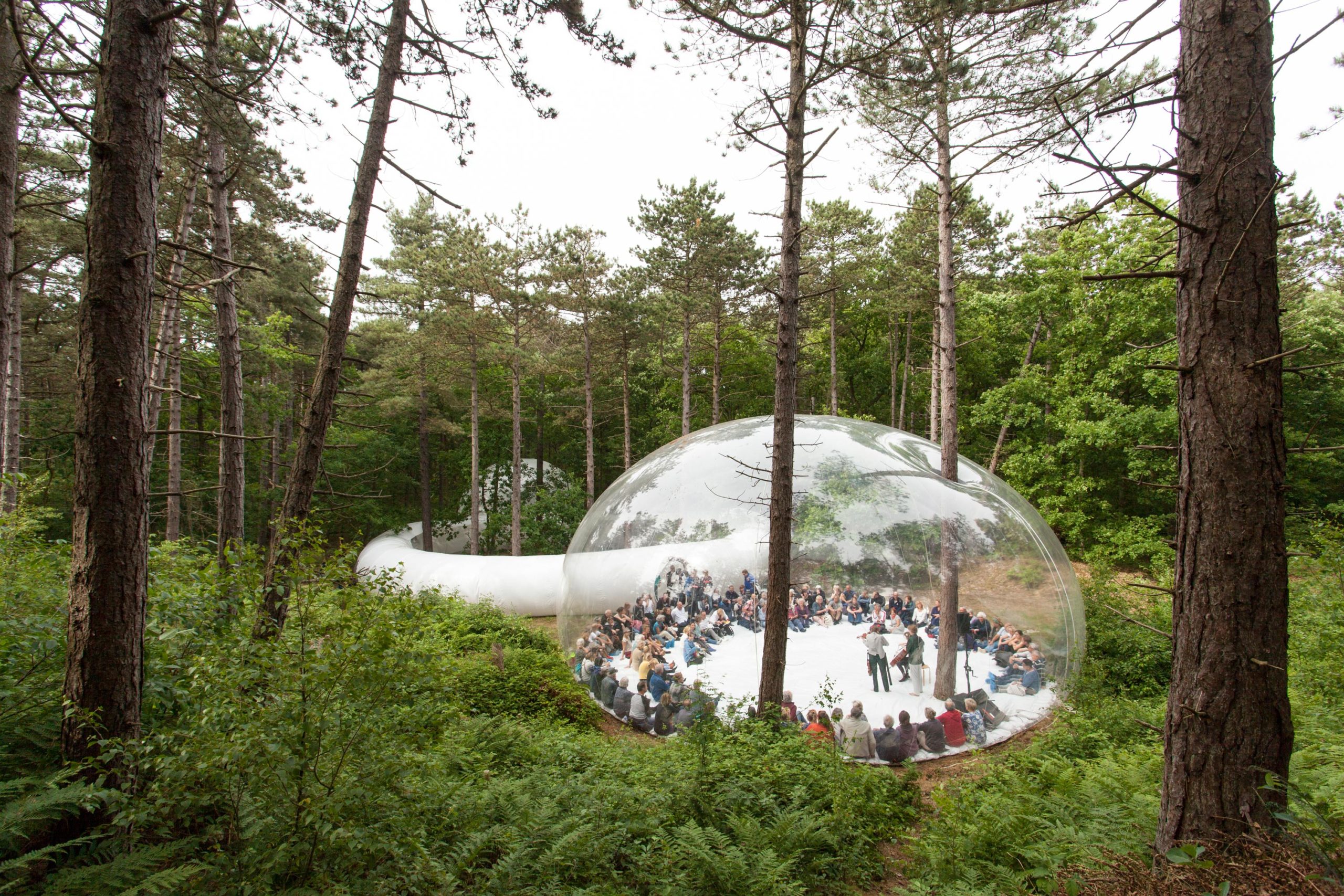
LOUD SHADOWS by Plastique Fantastique, Terschelling, Netherlands
Designed in collaboration with composer Kate Moore, The Stolz Quartet and the dance company LeineRoebana, this installation was part of the Oerol Festival in 2017. A large transparent membrane creates an informal performance space where viewers can circle around performers in the center. The see-through surface also allows users to connect with the environment beyond the bubble. A long white circulation tube with transparent viewing windows connects this bubble with another opaque globule and creates viewing spaces for outdoor performance areas in the middle.
Architects: Want to have your project featured? Showcase your work through Architizer and sign up for our inspirational newsletter.
The post States of Play: 8 Interactive Installations Found Around Europe appeared first on Journal.
Host Differently, Social Residence in Paris // CoBe Architecture & Paysage

Project Status: BuiltYear: 2020Size: 10,000 sqft – 25,000 sqftBudget: 1M – 5M
Text description provided by the architects.
TRANSFORMATION / UPGRADING
The project, at the corner of the Ridder and Vercingétorix streets in Paris 14th arrondissement, consists of the refurbishment and the raising three levels of a narrow mixed-use services building, into a 37-unit residence, being the first building managed by the Samu Social (helping homeless organization) in Paris.
The coated initial façade, its curved shape, mark the building of its design era.
© CoBe Architecture & Paysage
Its refurbishment gives it a more contemporary aspect, anchored it in its time, while nevertheless recalling the codes of a typical Parisian architecture, also allowing it to impose itself in its street, in its environment. The orange coating has been replaced by a strong grey brick, the tone of which changes according to the sun.
© CoBe Architecture & Paysage
The very narrow plot has led to a very strict optimization of the project, and the conservation of a large part of the existing structure. All these constraints have given rise to a sharp project, rigorously designed and executed.ORIGIN – SITINGIn 2015, Groupe Galia acquired a private property in the 14th arrondissement, at the intersection of the Ridder and Vercingétorix streets, on a very narrow plot, a five-storey building housing a training facility and offices.The choice quickly turned to the idea of creating a residence for the Samu Social of Paris, who mainly helps homeless people.For Galia and CoBe, the Ridder Street building is above all a story of understanding and cohesion between a designer and his client.
© CoBe Architecture & Paysage
It is a common research to build housing for social use, for families in need, so that the lodgers of the Samu Social not only find a roof, but a real place to live. Groupe Galia and CoBe were easily able to find an agreement on all architectural, technical, and financial choices.
The refurbishment of a services building into collective housing reinforces CoBe’s vocation to rethink the city over the city, to produce housing without urban sprawl, to meet needs on unused sites, to generate positive innovations, to create better living.
© CoBe Architecture & Paysage
For the first building managed directly by the Samu Social in Paris, for the first project development carried out for the attention of the Samu Social, Groupe Galia received this year the ESSEC Award of the Hospitable City, for the project developed in this building: “Host differently, towards a new form of social housing for homeless families.”
SHAPE – FACADES
Groupe Galia chose to give CoBe a carte blanche to redesign the building.
The choice of a mineral facade made of grey bricks was followed to give a visual strength to the building but also to ensure its durability by using a noble material already existing in its environment.
© CoBe Architecture & Paysage
In order to respect the minimum separation distances, and to optimize the narrow plot, the building has been raised by three additional levels of apartments above the six existing levels, thus freeing large terraces around the common living rooms. At the corner of the Ridder and Vercingétorix streets, the building is characterized by a beveled edge and thus draws an elegant prow in which are housed common living rooms with wide bays.
© CoBe Architecture & Paysage
At the top of the building, this same angle is treated as a reversed-curve and produces an architectural landmark recognizable from afar, as well as two frames of windows move forward slightly to startle the northern façade, inspired by the architectures of the great Parisian avenues of the twentieth century.
© CoBe Architecture & Paysage
The proportions of the windows and their layout have been redesigned to display a regular rhythm of bays. This gives the building a clearer and more powerful presence in its location, in order to allow it to reconnect itself with its surroundings and gives it a more Parisian appearance.CONSTRUCTIVE MODE – MATERIALSThe addition of three concrete levels above the existing building required a reinforcement of the existing infrastructure.
© CoBe Architecture & Paysage
In order to minimize the impact on the existing structure and surface, it was decided to create a second hand-moulded grey brick facade on the Ridder and Vercingétorix streets to allow outer insulation with glass wool between the original reinforced concrete façade and the new brick façade. The bays are treated with aluminum frames to support the grey and silver tones of the facade.
© CoBe Architecture & Paysage
The metal railings protecting all windows, balconies, and terraces, take up a recurring pattern of Parisian residential architectures. On the ground floor, some bricks are moving back from the nude of the building to create a discreet pattern that emphasizes the building at the corner of the two streets. On the other hand, the railings of the last three levels adapt their color into a copper oxide’s green-grey to throw the silhouette of the building to the sky.
USES
The “Host Differently” initiative carried out by Groupe Galia for the development of this operation is about designing a new type of accommodation center, close to housing, in the heart of Paris, providing a range of services adapted to the needs of families, and open to its neighborhood.
© CoBe Architecture & Paysage
The aim is to allow them autonomy while facing precarious situations, and to promote social inclusion in the city. Far from hotel accommodation and collective accommodation centers for families, it is a question of creating, with the technicality and the codes of a contemporary real estate project, a real place of life accessible to the poorest families with high quality standards.
© CoBe Architecture & Paysage
The place consists of private apartments and a shared apartment for young women (18-25 years old), thus combining for the first time two types of public to create a positive interaction. The design of the program, the responses to the needs of future users, were enacted by consulting the inhabitants of other similar shelters to ensure the quality of use of the residence.
Thus, the accommodations have been designed to preserve the intimacy of each family, especially through parent corners and well-defined children’s corners.
The accommodations are associated with common and shared premises: kitchen, dining room, offices, living rooms, children’s spaces, laundromat, furnished by an interior designer.
© CoBe Architecture & Paysage
The creation of additional windows to the original project made it possible to light up each dwelling as much as possible.
A maximum of accommodations has an outdoor space, whether it is a terrace, a balcony, or a garden..
© CoBe Architecture & Paysage
Host Differently, Social Residence in Paris Gallery
The post Host Differently, Social Residence in Paris // CoBe Architecture & Paysage appeared first on Journal.
Did you miss our previous article…
https://thrivingvancouver.com/?p=850
Centennial College – A-Block Expansion // DIALOG

Project Status: ConceptSize: 100,000 sqft – 300,000 sqft
Text description provided by the architects.
Located on Centennial College Progress Campus in Ontario, Canada, the A-Block Expansion Building’s design will be a new landmark with the objective of enriching the campus entrance, promoting the future of education in a diverse and inclusive environment and embodying the College’s deep commitment to Truth and Reconciliation.
When it is completed in 2023, this building is designed to become the first net-zero carbon, mass timber, LEED® Gold higher education facility in Canada.
The building includes classrooms, labs, spaces for student engagement, administration and faculty offices.
© DIALOG
© DIALOG
Over 133,000 sq ft of that space is new construction, and 16,000 sq ft is renovation of the existing facility. It will respond to a broad range of cultural and gender needs with spaces that include an Indigenous Commons, gender neutral washrooms, Indigenous offices, an elder room, a multi-faith room and lactation rooms.
© DIALOG
© DIALOG
The building form is inspired by Indigenous principles and the Mi’kmaq concept of two-eyed seeing. Across the North of the building, the Wisdom Hall emerges from east to west; a highly transparent, four-storey diagonal atrium space for faculty, staff, students and visitor engagement and study zones. Connected to the atrium at Level 2 is the Indigenous Commons, a large multi-purpose space that serves to organize the building program around it and forms the heart of the building.
The new building connects to the existing street edge including a large landscaped area with native plantings that transforms the south-west corner of the campus, forming a gateway, and yielding greater pedestrian connections that enhance the public realm.
Interior planning ensures equitable design for all.
© DIALOG
© DIALOG
It is characterized by flexible, engaging, diverse, inclusive and sustainable environments. Planning standardization and modularity are used to allow spaces to be reconfigured, while maximizing daylight, natural ventilation, and creating a place of community and networking for all..
© DIALOG
© DIALOG
Centennial College – A-Block Expansion Gallery
The post Centennial College – A-Block Expansion // DIALOG appeared first on Journal.
Did you miss our previous article…
https://thrivingvancouver.com/?p=844
Saint Joseph church // ENIA ARCHITECTES

Project Status: BuiltYear: 2019Size: 0 sqft – 1000 sqftBudget: 1M – 5M
Text description provided by the architects.
St. Joseph’s Church is a Catholic place of worship with a modular capacity of 200 to 400 places, complete with religious education rooms, additional spaces for celebrations and staff accommodation.The architectural design of this place is simple but recognizable. This simplicity expresses an abstraction: two rectangles touching each other at the corner, precisely; but also, a signifier, the stone rising to open the sepulcher.
© ENIA ARCHITECTES
© ENIA ARCHITECTES
Above, verticals of color project at night a light from within. The treatment of the building envelope, with sobriety and precision, conveys the public and the religious character of the building. A limited palette of materials – light-colored glass, wood, light-colored concrete brick, stained glass – gives a certain timeless abstraction to the volumetric composition and reinforces the symbolism of the building.
Inside the church, the light is modulated to accompany the hierarchy of spaces.
© ENIA ARCHITECTES
© ENIA ARCHITECTES
Through architectural devices, the sections of “matter” seem to detach themselves from each other to let the light in, always transformed. The ceiling does not touch the walls for the light must pass through, the choir wall stops because the light is there. The ceiling is pierced by skylights, the one of the altar lights, the one of the baptistery lights, and the walls are lined with 14 openings, a Way of the Cross of light.
© ENIA ARCHITECTES
© ENIA ARCHITECTES
This light is there to pass through us, to warm us. The stained-glass window expresses the “Space of Glory” which extends the mystical and gathering space; it transforms and converts light into the expression of the spiritual atmosphere.
The space articulates a contradiction: the church is a public space and a mystical space.
© ENIA ARCHITECTES
© ENIA ARCHITECTES
The space of the congregation is covered with wood to welcome the community of Montigny in its diversity. The back of the nave opens onto the garden to extend the space..
© ENIA ARCHITECTES
© ENIA ARCHITECTES
Saint Joseph church Gallery
The post Saint Joseph church // ENIA ARCHITECTES appeared first on Journal.
Did you miss our previous article…
https://thrivingvancouver.com/?p=823
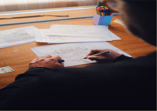
Enscape Brings Architectural Visualization to Everyday Design Workflows
Visualization plays a key role in every architectural and design project. But not all architects and designers are taking advantage of what the latest technology, real-time visualization, can offer.
Real-time visualization makes design information accessible and comprehendible to all those involved, including clients and stakeholders. It takes complex information and transforms it into 3D visualizations that enable anyone to instantly see and understand how a future space and building will look and function.
There is one tool in particular that is simplifying architectural visualization – Enscape. In this article, we take a look at what real-time visualization is, its benefits, and how Enscape’s real-time visualization tool is bringing architectural visualization into everyday design workflows.
What Is Real-Time Visualization?
Real-time visualization allows all parties to see and understand a design and engage in the decision-making processes.
It takes your modeling data, and enables you to quickly convert it into 3D-rendered visualizations such as still images, panoramas, orthographic projections, and animations in real time. Some tools even allow you to walk through a 3D-rendered version of your project on screen or through virtual reality.
The visualizations accurately represent your choice of materials, artificial lighting and daylight, and objects such as vegetation and furniture, providing a beautifully realistic view of your project.
But not all real-time visualization tools are created equal. Enscape is the only one that fully integrates into your modeling tool. This provides designers with the easiest and fastest way to bring visual exploration directly into Revit, SketchUp, Rhino, Archicad, or Vectorworks. This means that you can design and instantly see your rendered project appear within your modeling tool.
Enjoying the Benefits of Real-Time Visualization
Real-time visualization is fast becoming an integral part of the design process for architects and designers – transforming the way future projects are planned, presented, and understood. It provides many benefits, such as the ability to quickly iterate and test ideas within a 3D-rendered environment.
One of the most significant advantages that it provides is that it gives your clients and partners an unparalleled way to experience your designs. It enables you to rapidly generate renders that can easily be shared with others. You can create panorama galleries, virtual reality experiences, or export an entire rendered project for your clients to explore – without them needing to have special software or hardware installed.
Real-time visualization provides a collaborative approach to design. All parties can become part of the design process, helping to speed up decisions and accelerate project milestones.
Viewport Studio
One firm enjoying the benefits that real-time visualization brings is award-winning architectural and design firm, Viewport Studio. For a recent project, they used Enscape to help them design the interior of Spaceport America, the world’s first-ever purpose-built commercial spaceport. “…Enscape supported us in testing, experiencing, and presenting our concepts to the client with a speed in producing media that we never experienced before” explained Viewport Studio Director, Gautier Pelegrin.
Another firm, KeurK, used Enscape to help them design the new headquarters for the European Metropolis of Lille. Completed in just 18 months, much of this was due to the client’s involvement throughout the process.
“Because of the schedule we had, we had to consistently show our clients good content. Enscape really helped to make this possible,” explained Olivier Riauté, founder, KeurK. “We met with the clients every two weeks and the renders communicated what we thought was best for the design and this determined the decisions made. Enscape was a vital tool for this.”
Enscape 3.2 is out: What’s New?
Enjoying an Integrated Workflow With Enscape
Enscape develops real-time visualization software for architects, engineers, and construction (AEC) professionals and is an essential part of daily work for architectural firms in over 150 countries worldwide.
It integrates design and visualization workflows into one and gives designers the easiest and fastest way to turn building models into immersive 3D experiences. It plugs directly into modeling software, allowing users to design, document, and visualize simultaneously from one model.
Real time, easy-to-use, and quality of output are the key features of Enscape’s real-time visualization tool. This makes it an essential part of the design workflow for firms of all sizes. And unlike other visualization tools – no exporting or importing is required, helping users avoid disconnected workflows and design far more intuitively.
A new version of Enscape is available now, with new features and functionality to help users design dynamically and create vivid visualizations. Learn all about the latest version of Enscape and sign up for a free 14-day trial at enscape3d.com.
The post Enscape Brings Architectural Visualization to Everyday Design Workflows appeared first on Journal.
Did you miss our previous article…
https://thrivingvancouver.com/?p=818
Sir Michael Uren Hub // Allies and Morrison
Project Status: BuiltYear: 2020Size: 100,000 sqft – 300,000 sqft
Text description provided by the architects.
The Sir Michael Uren Hub is a new facility for Imperial College London on its White City Campus.
The building provides flexible accommodation for translational research initiatives at the interface of biomedical sciences and engineering, including research laboratories, a potential outpatient clinic, a 160 seat seminar room and a series of social spaces to encourage informal exchange of ideas between researchers.
© Allies and Morrison
© Allies and Morrison
The building’s triangular footprint is in response to its site geometry along London’s Westway.
It memorable exterior brings to life its prominent location along a busy motorway and railway with 1,300 precast concrete fins echoing the movement of the city below.
TEAM
Client: Imperial College London
Architects: Allies and Morrison
© Allies and Morrison
© Allies and Morrison
Services and façade engineering: Buro Happold
Structure: Curtins
Laboratory planning: Abell Nepp
Contractor: ISG
Project Manager: Turner & Townsend
Cost: Faithful + Gould
Façade subcontractor: Felix/ Loveld.
© Allies and Morrison
© Allies and Morrison
Sir Michael Uren Hub Gallery
The post Sir Michael Uren Hub // Allies and Morrison appeared first on Journal.
Did you miss our previous article…
https://thrivingvancouver.com/?p=806
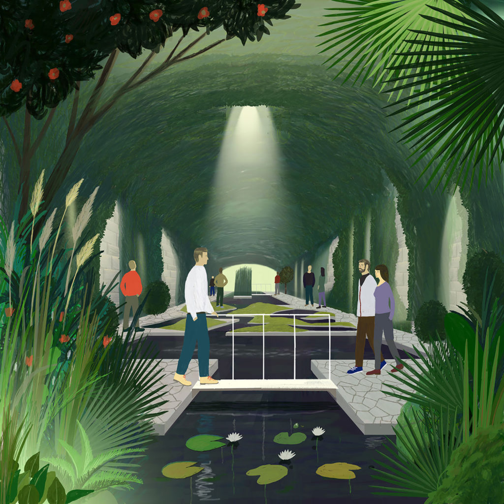
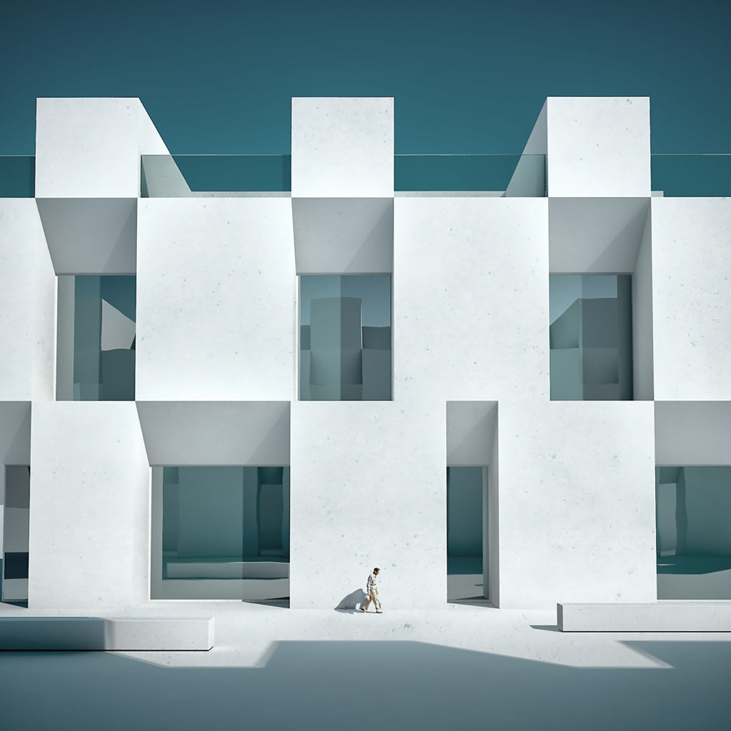
The Art of Rendering: 11 Trending Non-Realistic Styles in Architectural Visualization
Send us a rendering. Tell us a story. Win $2,500! Sign up for the next One Rendering Challenge competition for a shot at major prizes and global publication: Pre-register for the competition (launches January 2022)
Photo-realistic rendering has become a new standard in presenting architectural projects. Its proliferation has become controversial as its technical capabilities allowed architects to misrepresent their projects, often swaying business decisions based on . Beautiful realistic imagery engages laymen and professionals alike, and its role in real estate marketing, though legitimate, has greatly overshadowed other forms of architectural representation. Many of the traditional techniques like collages and drawings have taken a back seat in the process of selling ideas, though these are still used within studios whose work concerns itself with city development.
In partnership with
Explore Architectural Sketching Services
While hyperrealistic representation leaves little to the imagination (best case scenario, what you see is what you get), more abstract techniques have strong expressive capacity and often best communicate designers’ main concepts, visual style and ethos.
Here are some rendering styles that take a more abstract and artistic approach, often using realistic 3D elements to create surreal, otherworldly environments.
1. KooZA/rch Artists

Image by Olga Tarasova for Yury Grigoryan Studio
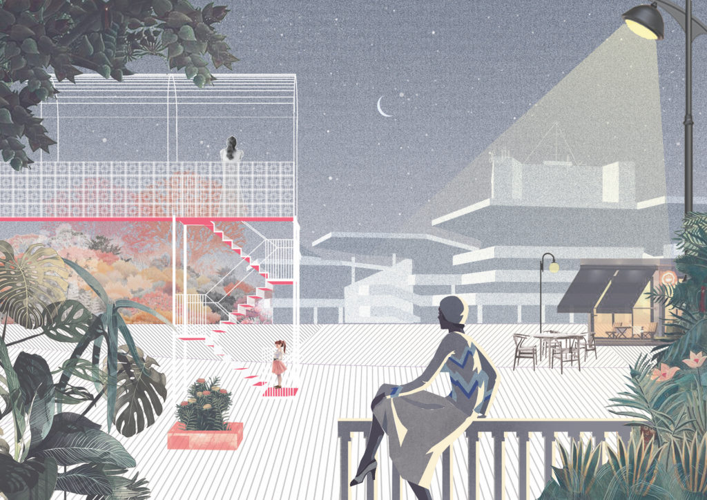
Image by Ekin Bilal
KooZA/rch is an experimental digital platform founded by architect Federica Sofia Zambeletti as a place where architectural drawing can evolve and stimulate architectural dialogue. The inspiration of the visual style of the content found on the website can be traced back to the 1960s visuals by Superstudio and Archigram.
In an Interview for Metropolis Magazine, Zambeletti explained the role drawing has in communicating architecture:’’… Here, the drawings enter a much larger dialogue, not only about the visual identity of the project but the narrative, context, and identity of both project and architect. The image produced is as much of the finished product as it is of the driving conceptual forces that developed it.”
2. Viar Estudio


Images by Viar Estudio Arquitectura
Spanish Viar Estudio creates beautiful abstract visuals and use different techniques to create something that’s in between diagram, axonometry and perspectival image.
3. OFFICE Kersten Geers David Van Severen

Image by OFFICE Kersten Geers David Van Severen
OFFICE Kersten Geers David Van Severen, an architectural practice based in Bruxelles, Belgium, often uses a painterly style to illustrate their more speculative projects. Pastel colors dominate their visual language and their drawings and collages form an independent body of work.
4. KOSMOS
Images by KOSMOS
Moscow-based KOSMOS Architects are a multidisciplinary studio that combines art and technology. Their visuals often take on the aesthetic of naïve art, fauvism, with hints of Mark Chagall. This image of their Hidden Park proposal in Switzerland channels Henri Rousseau’s jungle vibes.
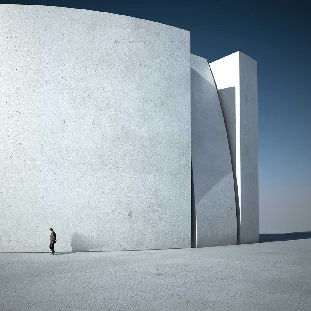
5. Massimo Colonna

Image by Massimo Colonna
When it comes to using 3D software to create surreal and abstract environments, Italian digital artist Massimo Colonna is a great example. He renders minimalist spaces that evoke a sense of melancholia, and is often inspired by film and painting.
6. Visual Citizens
Images by Visual Citizens
Visual Citizens create surreal architectural renderings that allow them to collaborate with designers across different disciplines. “Visualizations are an escape from the reality of practical design constraints, allowing us to render surreal environments and fill them with fantastical objects,” explained studio founders Shali Moodley and Adam Kelly in an interview for gestalten.
7. Michele Durazzi
Images by Michele Durazzi
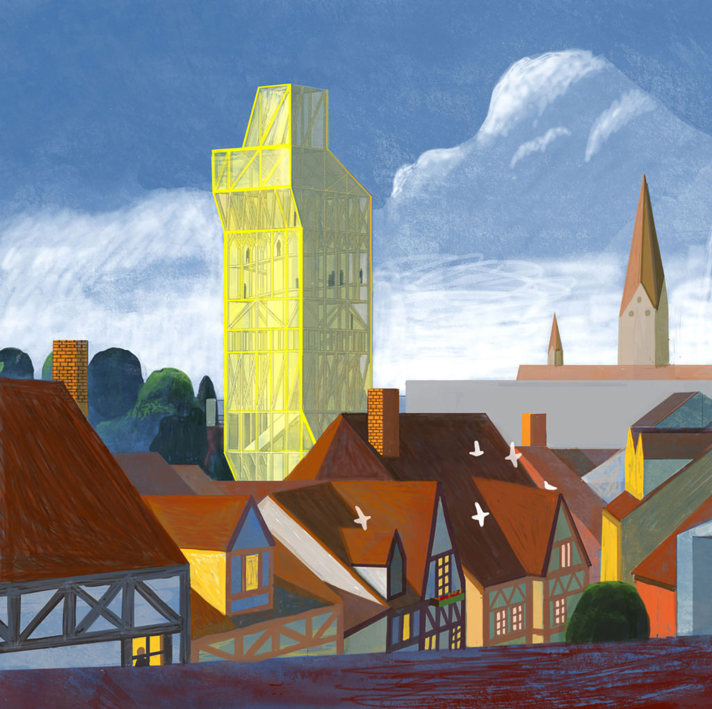
Italian designer Michele Durazzi creates imaginary cityscapes, focusing on the relationship between architecture and its users. Many of his images play with scale, placing humans at the center of the architectural narrative.
8. Alexis Christodoulou

Images by Alexis Christodoulou
Digital artist Alexis Christodoulou produces abstract architectural renders that have garnered him a huge social media following. He is one of the most successful artists to sell their work via crypto art marketplaces.
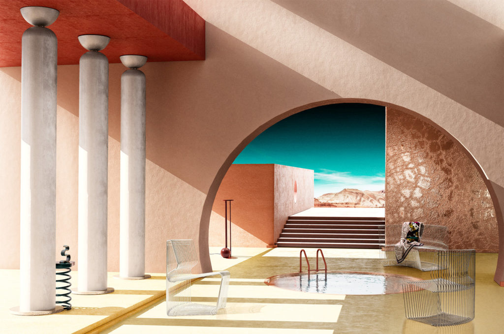
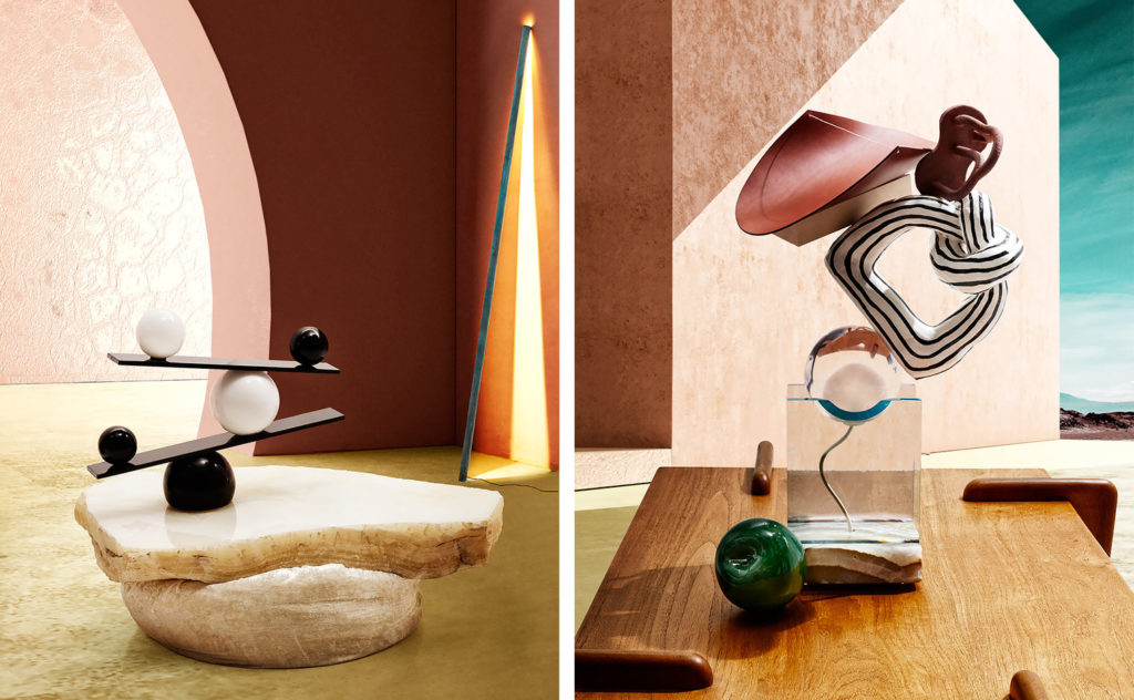
9. Paul Milinski
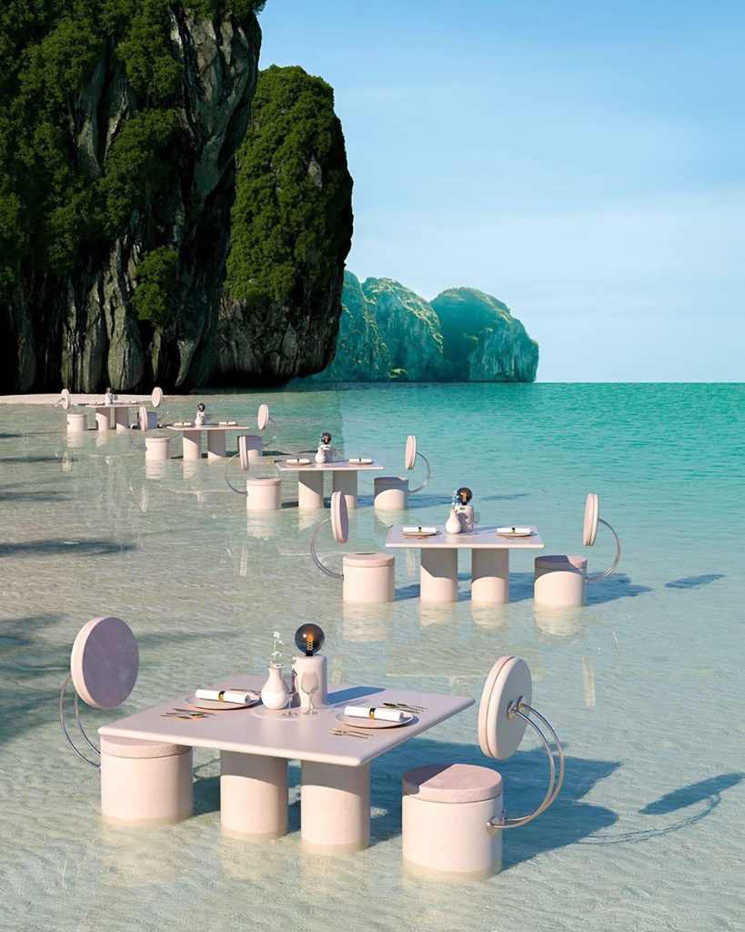
Image by Paul Milinski
If you have an Instagram account, chances are you’ve come across Paul Milinski’s retro futuristic dreamscapes. These images feature lush landscapes combined with man-made structures in unexpected ways.
10. Peter Tarka

Image by Peter Tarka
Peter Tarka’s abstract 3d compositions have become a staple in the area of digital design. He has collaborated with renowned brands- from car manufacturers to tech giants, using his recognizable artistic approach to 3D to create playful and immersive environments.
Send us a rendering. Tell us a story. Win $2,500! Sign up for the next One Rendering Challenge competition for a shot at major prizes and global publication: Pre-register for the competition (launches January 2022)
The post The Art of Rendering: 11 Trending Non-Realistic Styles in Architectural Visualization appeared first on Journal.
Did you miss our previous article…
https://thrivingvancouver.com/?p=772