Celebrate a decade of inspirational design with us! The 10th Annual A+Awards is officially underway, with an Early Entry Deadline of October 29th, 2021. Click here to start your entry today.
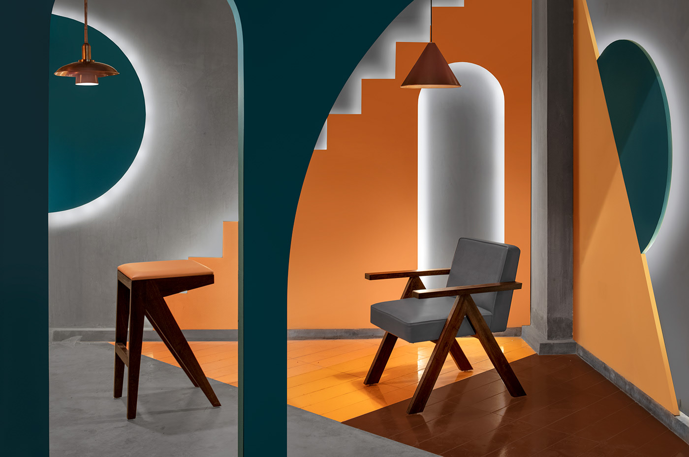
New Delhi-based Renesā is well-known for its eccentric projects that celebrate bold colors and geometric patterns. Led by Founder Sanjay Arora and his son, Sanchit Arora, this studio has worked on a variety of projects that range from simple residential interiors to neon storefronts.
The design firm gets its name from the French word Renaissance, symbolizing an architectural vision that combines the old with the new. This is a reference to the design practice’s desire to fuse the more traditional design ideology of the father with his son’s more contemporary language.

Images by Saurabh Suryan and Lokesh Dang
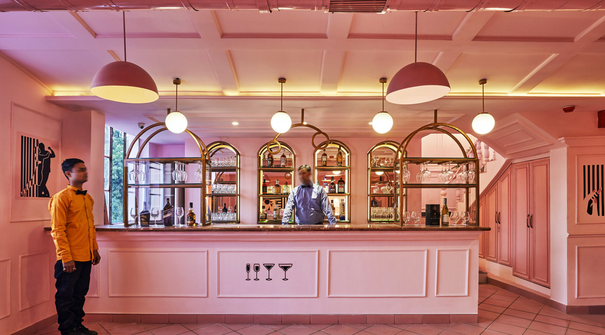
The Indian firm shot to fame with its project The Pink Zebra in 2018. This design uses elements of European grandeur and Art Nouveau to denote the significance of its location, Kanpur, to the British Administration in India. The firm made the most of their client’s love for quirk and the Wes Anderson aesthetic to create and pink and black vision that attracts visitors from all over the world.
That project is a great example of the firm’s design process. Sanchit Arora said that they try to ensure that every project is its own brand — with a unique name and signature color palette. Citing the example of McDonald’s and Domino’s Pizza, Arora said, “I always believe that brands should have their own color because the cognitive mapping of your brain will remember that color as well.”
Images by Niveditaa Gupta
When asked about the starting point, he said that it always depends on what the client wants and where his imagination takes him when on site. Some projects are demure whereas some take the maximalist route. There is no middle ground when it comes to their work. Reactions to Renesā’s commercial designs are similar. His philosophy about deciding which side to veer on is very simple:
“In a house, you see the same wall, the same ceiling every day. So that’s why the color of a house might be white. But a retail store can be black because you spend just two to three hours in a week,” he said. “That’s the road to the designing. The amount of time you spend, the duration that’s given to a project in terms of a visiting person.”
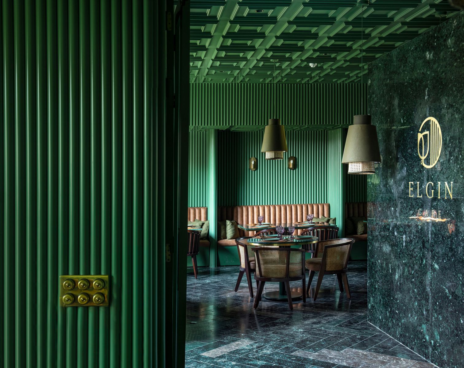
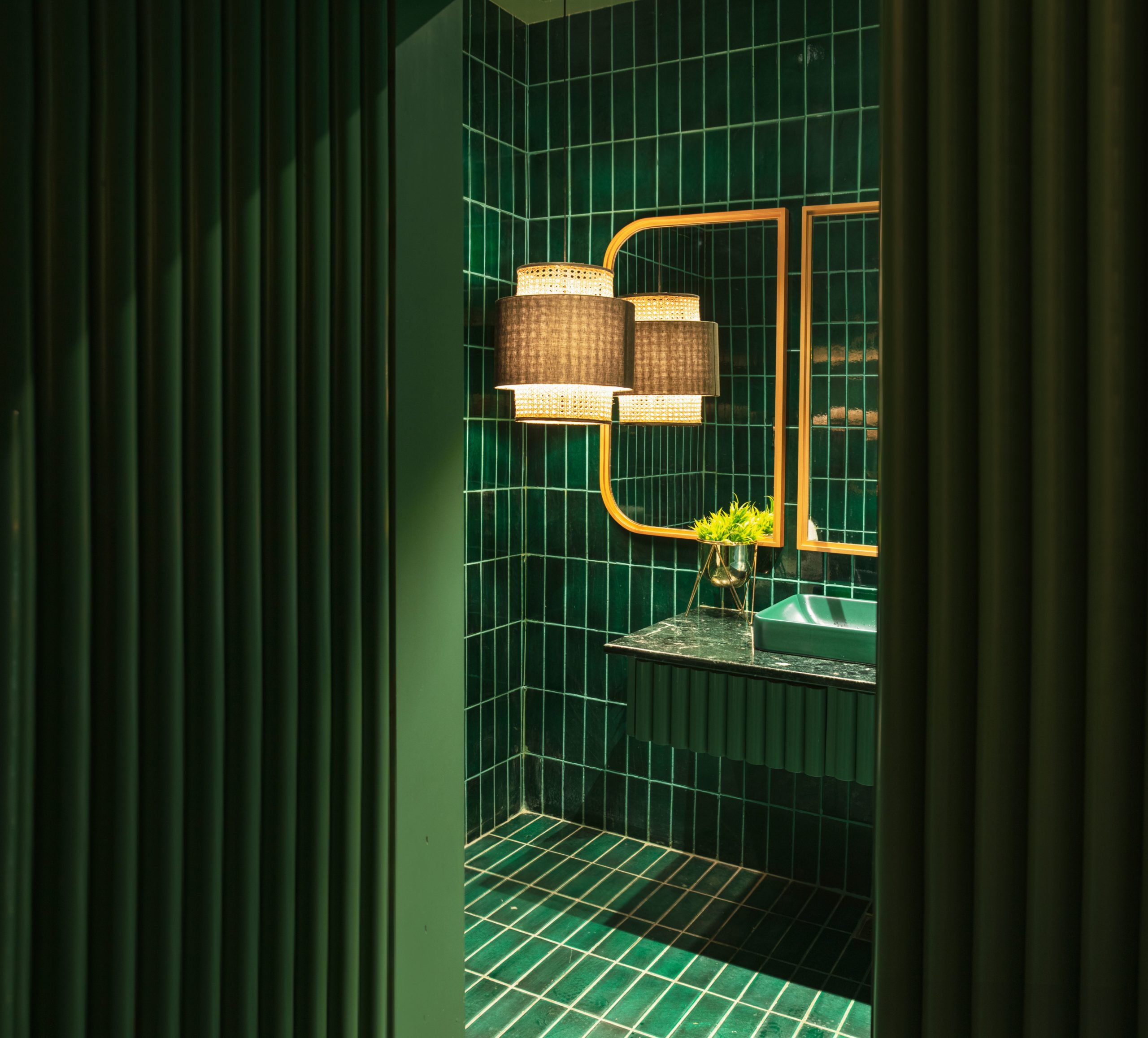
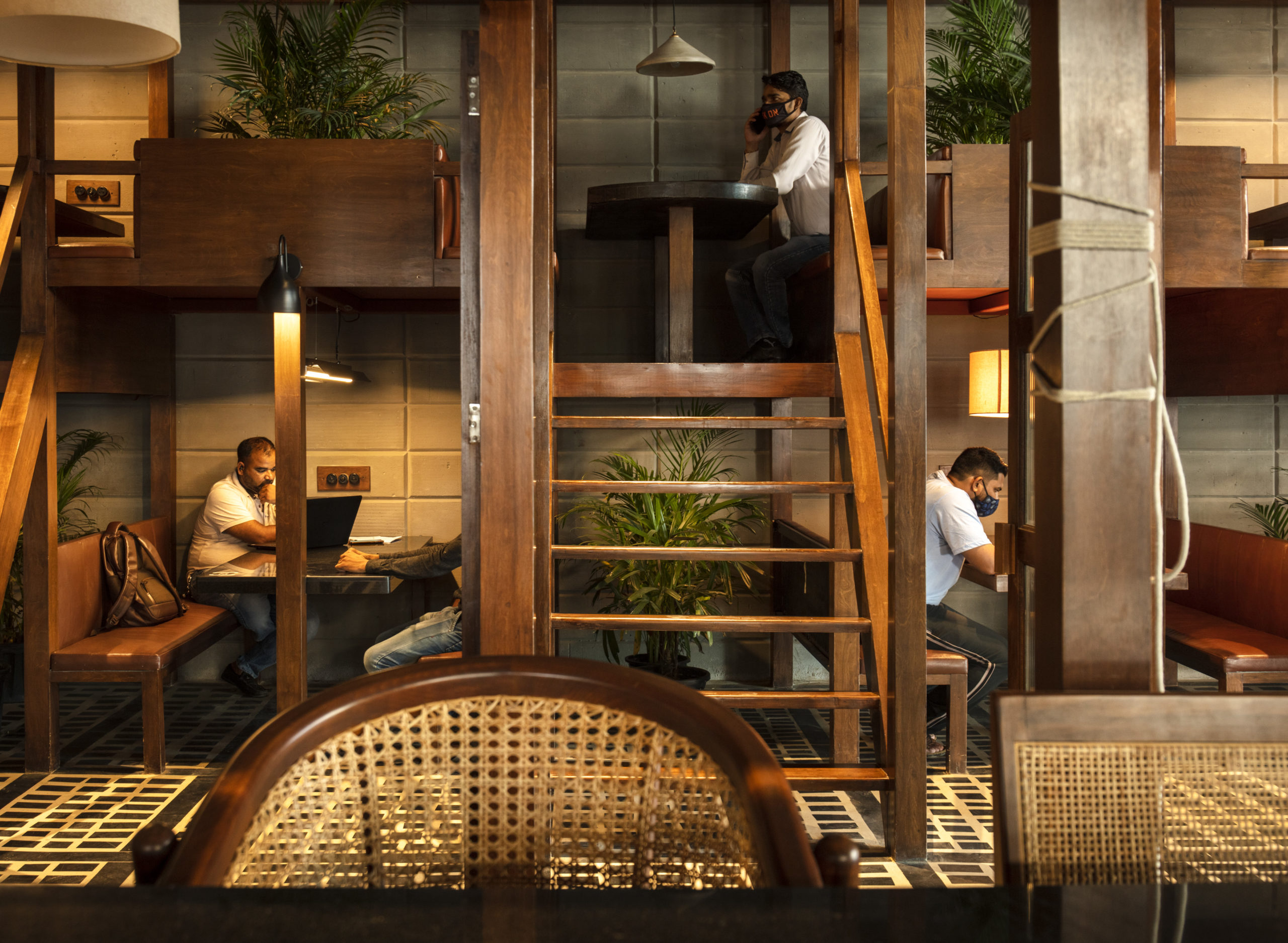
Their most recent project The Fluted Emerald is one such example of branding and maximalism. When Arora first saw the site, it was a dilapidated farmhouse. The lush vegetation on the site and a piece of Udaipur green marble lying in a corner gave rise to the rich green palette of this cafe design. The client’s fondness for paneling had them experimenting with different wall treatments that ultimately led to the fluting.
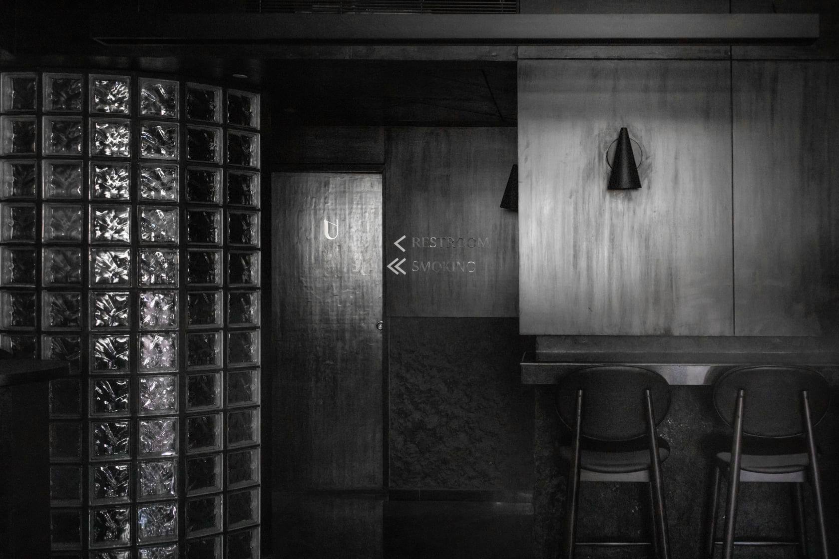
Once designed, the cafe was so successful that they had to extend the indoor seating outdoors. Another project that stays true to its color identity is The Black Concrete. The new take on a speakeasy features inky tones, glass brick and reflective surfaces to create a dramatic yet sophisticated lair.
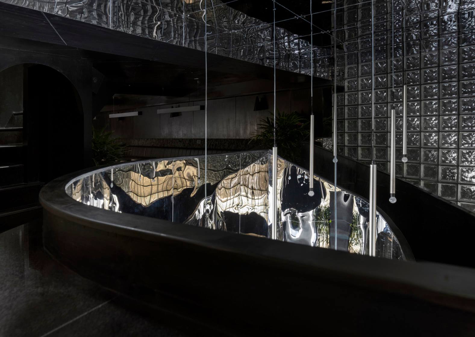
Images by Niveditaa Gupta
A made-in-India approach is another core principle of the firm. Arora believes that this is not only more cost-effective but also a lot more practical. The firm is currently working on a boutique in Amritsar where they have used the mud from Bikaner to make the bricks from scratch — step is taken in the direction towards sustainability.
Another example of their environmentally-conscious ideology is the House with 49 Trees, where the structure was shaped by the trees on site. The presence of these trees ensures the house remains cool on hot days and filters the direct harsh sunlight. Furthermore, the house is also self-sufficient in energy. In fact, the electricity generated by the solar panels exceeds the use and is now being given back to the government.
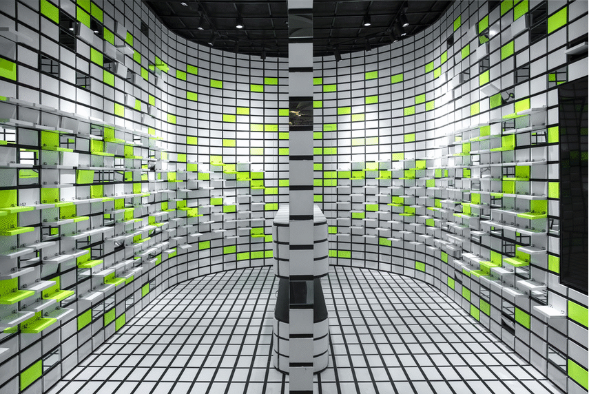
Some of their other projects include The TerraMater, a gallery space where red brick is the hero; The Flip Flop, a Neon green detailed popup store that makes passersby stop in their tracks; and The Geometrication, which draws inspiration from the game Monument Valley. The firm also recently unveiled a restaurant and bar called Social with Distancing. The original design was modified and built during the pandemic to create seating arrangements that work with the ongoing safety guidelines.
Arora claims that their most recent project — a Pan-Asian restaurant that is currently a work in progress — is the studio’s best work to date. When asked about upcoming projects, Arora said, “I know what is coming in the next six months from my end because it’s in progress. And it is revolutionary. I can vouch that it’s something that you haven’t seen across the world.”
If your firm has recently completed a boldly colored architectural project, enter it in the Architecture +Color category in the 10th Annual A+Awards! The Early Entry Deadline is October 29 — Get started on your submission.
The post Color-Coded: Studio Renesā Gives Every Architecture Project Its Own Brand Identity appeared first on Journal.
Did you miss our previous article…
https://thrivingvancouver.com/?p=211